


 Top Rated Course


We may not have the course you’re looking for. If you enquire or give us a call on +61 272026926 and speak to our training experts, we may still be able to help with your training requirements.
How to Create a Heat Map in Excel: A Step-by-Step Guide
Sophia Ellis 19 November 2024Wondering How to Create a Heat Map in Excel? It's a simple yet powerful way to visually represent data, highlighting patterns with colour gradients. This blog guides you through creating a heat map, customising color scales, and applying conditional formatting. Ready to transform your spreadsheet into a vibrant visual? Let’s dive in!

Training Outcomes Within Your Budget!
We ensure quality, budget-alignment, and timely delivery by our expert instructors.
Table of Contents

In a world brimming with data, how do you transform numbers into insights? The answer lies in the captivating world of Excel's Heat Maps. Are you ready to embark on a journey where colours narrate tales of trends and outliers, and each gradient holds a story waiting to be told? It's time to unlock the power of visualisation and discover How to Create a Heat Map in Excel!
Read this blog to explore How to Create a Heat Map in Excel and dive into the dynamic world of visualisations. Each checkbox and scrollbar unveils untapped insights. Together, we’ll reveal hidden patterns within spreadsheets and harness the power of colour to transform data into meaningful visuals with Excel's Heat Maps. Let’s dive in!
Table of Contents
1) What is a Heat Map in Excel?
2) Benefits of using Heat Maps
3) Creating a Heat Map in Excel
4) How to Create Dynamic Heat Maps in Excel
5) Conclusion
What is a Heat Map in Excel?
A Heat Map in Excel is a visual tool that uses colour coding to represent data values, making it easier to identify trends and patterns quickly. Typically, lighter colours indicate lower values, while darker shades represent higher values, though this can be customised.
For instance, you might use green to show higher conversion rates and red for lower ones, with intermediate values displayed in shades of orange. Alternatively, you can use a gradient fill to represent the data, with varying shades indicating different values. This approach allows you to analyse large datasets at a glance and spot both positive and negative trends efficiently.

Benefits of Using Heat Maps
The following are the benefits of using Heat Maps:
1) Quick data interpretation
Heat Maps allow for a rapid understanding of complex data sets. By using colour gradients, they visually highlight important information, making it easier to grasp the overall picture briefly.
2) Discerning trends and patterns
With Heat Maps, you can easily identify trends and patterns within your data. The colour variations help to pinpoint areas of high and low activity, facilitating the recognition of significant insights.
3) Enhancing presentations and reports
Incorporating Heat Maps into presentations and reports enhances their visual appeal and effectiveness. They make data more engaging and accessible, improving communication and understanding among stakeholders.
4) Simplifying decision-making
Heat Maps simplify the decision-making process by clearly showing areas that need attention. They provide a straightforward way to compare different data points, helping to make informed and timely decisions.
Join our Business Analytics with Excel Course to elevate your skills for informed decision-making!
Creating a Heat Map in Excel
Instead of manually colour-coding cells for a Heat Map in Excel, you can use conditional formatting. This feature allows you to automatically highlight cells based on specified rules, ensuring that the Heat Map updates dynamically when values change. Here’s how you can set it up:
1) Creating a Heat Map in Excel Using Conditional Formatting
Step 1: Select the data range:
Click and drag to highlight the cells you want to include in the Heat Map.

Step 2: Go to conditional formatting:
Click on the “Home” tab in the Ribbon at the top of Excel.
Step 3: Open the conditional formatting menu:
In the “Styles” group, click on “Conditional Formatting.”

Step 4: Choose a colour scale: Hover over “Colour Scales” in the drop-down menu
Select a predefined colour scale (e.g., Green-Yellow-Red)
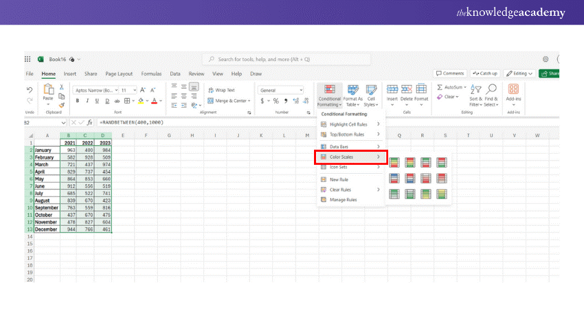
Step 5: Apply the colour scale:
Click on the chosen colour scale to apply it to the selected data range.

Step 6: Customise the colour scale (Optional):
a) If you want to customise, go back to conditional formatting and select “Manage Rules”

b) Click on the rule you applied and then click “Edit Rule”
c) In the “Edit Formatting Rule” dialogue, adjust the settings and colours for minimum, midpoint, and maximum values.
d) Click “OK” to apply the changes
2) Creating a Heat Map Using Scroll Bar
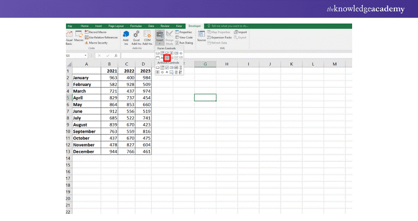
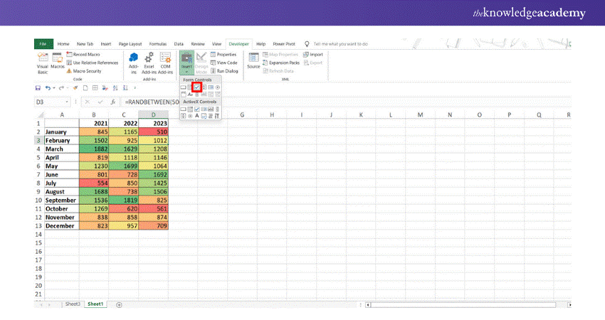
Step 1: Insert a scroll bar:
Go to ‘Developer’ → ‘Controls’ → ‘Insert’ → ‘Scroll Bar’. Click anywhere in the worksheet to insert the scroll bar.
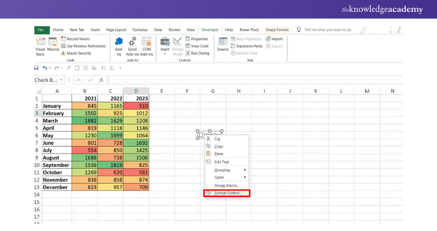
Step 2: Format the scroll bar:
a) Right-click on the scroll bar and select Format Control
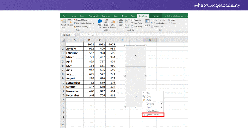
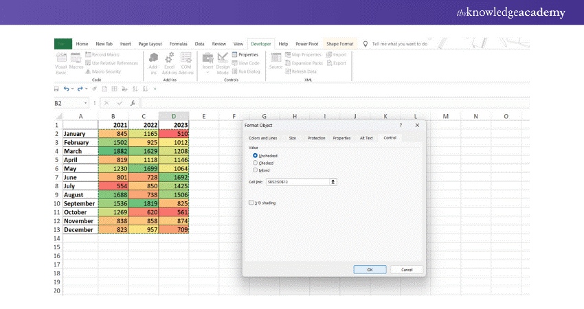
b) In the Format Control dialog box, set the following:
1) Minimum Value
2) Maximum Value
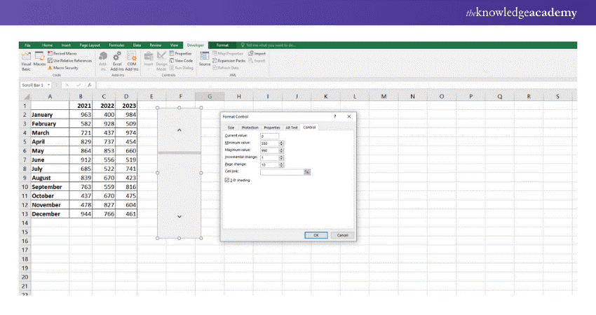
c) Select a cell (e.g., Sheet1!$J$1) to link to the scroll bar
Step 3: Set up the formula in cell B2, enter the formula:
=INDEX(Sheet1!$B$1:$H$13,ROW(),Sheet1!$J$1+COLUMNS(Sheet2!$B$1:B1)-1)
Step 4: Adjust the scroll bar:
Resize and place the scroll bar at the bottom of the data set
Now, when you use the scroll bar, the value in Sheet1!$J$1 will change, updating the formulas and the Heat Map accordingly. The conditional formatting will automatically adjust as well.
Enhance your Excel skills with Microsoft Excel Courses - join now for a transformative learning experience!
3) How to Create a Heat Map in Excel Using a Pivot Table?
Creating a Heat Map in a Pivot Table is like creating one in a normal data range by using a conditional formatting color scale. However, there's a caveat: when new data is added to the source table, the conditional formatting will not automatically apply to the new data. Here’s how to do it:
Step 1: Prepare your data:
a) Ensure your data is organised in a table format with headers
Step 2: Create a Pivot Table:
1) Select your data range
2) Go to the "Insert" tab and click "Pivot Table"
3) Choose where you want the Pivot Table to be placed (e.g., new worksheet)
Step 3. Build your Pivot Table:
1) Drag and drop fields into the Rows, Columns, and Values areas to organise your data as needed.
Step 4: Apply conditional formatting:
1) Click on any cell within the Pivot Table
2) Go to the "Home" tab and select "Conditional Formatting"
3) Choose "Color Scales" from the dropdown menu
Step 5: Customise your Heat Map
1) Adjust the color scale options to fit your preferences
2) You can also set specific rules by choosing "Manage Rules" under Conditional Formatting.
Step 6: Adjust Pivot Table settings (Optional):
1) To refine your Pivot Table, you can filter data, adjust layouts, and add totals or subtotals as needed.
Step 7: Finalise and save
1) Review your heat map for accuracy
2) Save your workbook
4) How to Create a Geographic Heat Map in Excel?
An Excel heat map can be created using the built-in “3D Maps” feature. Here’s a step-by-step process to create a geographic heat map in Excel:
Step 1: Prepare Your Data
1) Open Excel and enter your data. Your data should have at least two columns:
a) One for locations (e.g., country, state, or city names).
b) One for values (e.g., sales, population, etc.).
Step 2: Insert the Map
1) Select your data (including column headers).
2) Navigate to the Insert tab in the ribbon.
3) In the Tours group, click 3D Map, then select Open 3D Maps.
Step 3: Configure the Heat map
1) Launch the 3D Maps tool, and Excel will automatically plot your data on a map.
2) You can see the Layer Pane on the right. Here, drag the location column (e.g., Country) to the Location box and the value column (e.g., Sales) to the Height or Value field.
3) Change the chart type to a heat map by selecting the Layer Options button (gear icon) in the Layer Pane and choosing the Heat Map option.
Step 4: Customise the Heat map
1) Adjust the colour intensity using the settings on the right-hand side.
2) Zoom in or out to focus on particular regions.
3) Customise tooltips, labels, and map styles by clicking on the corresponding icons in the 3D Map window.
Step 5: View and Export
1) After configuring your heat map, you can either:
a) View it in 3D Maps, or
b) Export it by taking a screenshot or creating a video tour using the Export tool under the File option.
Enhance your Excel skills with Excel Training with Gantt Charts; sign up today for Excel mastery!
How to Create Dynamic Heat Map in Excel?
Conditional formatting in Excel updates automatically when cell values change, allowing you to create dynamic Heat Maps. Below are three examples of creating dynamic Heat Maps using interactive controls in Excel.
1) How to Create a Dynamic Heat Map in Excel with a Checkbox?
If you want to control the visibility of your Heat Map, you can use a checkbox to show or hide it as needed. Follow these steps to create a dynamic Heat Map using a checkbox:
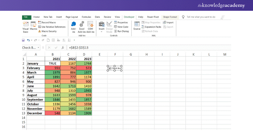
Step 1: Insert a checkbox:
a) Go to the ‘Developer’ tab
b) Click ‘Insert’ in the Form Controls section
c) Select ‘Checkbox (Form Control)’ and place it next to your dataset
Step 2: Link the checkbox to a cell:
a) Right-click the checkbox and select ‘Format Control’
b) In the ‘Control’ tab, enter a cell address in the ‘Cell link’ box
c) Click ‘OK’
d) When the checkbox is selected, the linked cell (O2) will display ‘TRUE’; otherwise, it will display 'FALSE’.
Step 3: Set up conditional formatting:
1) Apply conditional formatting:
a) Select your dataset
b) Go to the ‘Home’ tab
c) Click ‘Conditional Formatting’ → ‘Colour Scales’ → ‘More Rules’
2) Configure the custom colour scale:
In the ‘Format Style’ drop-down list, select ‘3-Color Scale’
Under ‘Minimum’, ‘Midpoint’, and ‘Maximum’, select ‘Formula’ from the ‘Type’ drop-down list.
3) Enter the following formulas in the ‘Value’ boxes:
a) Minimum: ‘=IF($O$2=TRUE, MIN($B$3:$M$5), FALSE)’
b) Midpoint: ‘=IF($O$2=TRUE, AVERAGE($B$3:$M$5), FALSE)’
c) Maximum: ‘=IF($O$2=TRUE, MAX($B$3:$M$5), FALSE)’
d) Choose the desired colours in the ‘Colour’ drop-down boxes
e) Click ‘OK’
Step 4: Hide the TRUE/FALSE value
a) Link the checkbox to a cell in an empty column
b) Hide that column to keep the TRUE/FALSE value out of view
2) How to Create a Dynamic Heat Map in Excel Using Radio Buttons
Step 1: Insert radio buttons:
Go to ‘Developer’ → ‘Controls’ → ‘Insert’ → ‘Option Button (Form Control)’. Insert as many radio buttons as needed.
Step 2: Format the radio buttons:
a) Right-click on each radio button and select ‘Format Control’
b) Link each radio button to a specific cell (e.g., Sheet1!$K$1) so that selecting a radio button changes the value in this cell.
Step 3: Set up conditional formatting:
a) Select the data range you want to format
b) Go to ‘Home’ → ‘Conditional Formatting’ → ‘New Rule’
c) Choose ‘Use a formula to determine which cells to format’
d) Enter a formula that uses the linked cell (e.g., to highlight the top 10 values if Sheet1!$K$1=1):
=RANK.EQ(A1,$A$1:$A$10)<=10
e) Set the desired formatting and click ‘OK’
Step 4: Adjust based on selection:
Create multiple conditional formatting rules for different radio button selections (e.g., top 10, bottom 10).
Now, selecting a radio button will update the linked cell, and the conditional formatting will change the Heat Map accordingly.
3) How to Create a Dynamic Heat Map Without Displaying Numbers?
To hide numbers in your dynamic Heat Map, follow these steps:
Step 1: Create the dynamic Heat Map:
Follow the steps above to create a dynamic Heat Map with a checkbox.
Step 2: Add a conditional formatting rule to hide numbers:
a) Select your dataset
b) Go to the ‘Home’ tab
c) Click ‘Conditional Formatting’ → ‘New Rule’ → ‘Use a formula to determine which cells to format’.
d) Enter the following formula:
=IF($O$2=TRUE, TRUE, FALSE)
e) Click ‘Format…’, switch to the ‘Number’ tab, select ‘Custom’, type ‘;;;’ in the ‘Type’ box, and click ‘OK’.
Step 3: Finalise the rule:
Click ‘OK’ to close the New Formatting Rule dialogue box
Master Microsoft Excel VBA And Macro Training to elevate your spreadsheet automation skills today!
Conclusion
Learning How to Create a Heat Map in Excel opens up powerful ways to visually analyse data. By using conditional formatting, colour scales, and custom options, you can easily highlight trends and patterns. Start turning raw data into valuable insights with these dynamic visualisation techniques today!
Join the Excel For Accounting Course- sign up now and master Excel for accountants!
Frequently Asked Questions
What is the Objective of a Heat Map?

The objective of a Heat Map is to visually represent data patterns and trends using colour gradients. It makes it easier to identify high and low values, outliers, and significant insights within the data.
What is a Heat Map in Business?
A Heat Map in business visually represents data using colour gradients, allowing quick identification of trends, patterns, or areas of concern. It's commonly used for analysing metrics like sales, customer behaviour, and efficiency.
What are the Other Resources and Offers Provided by The Knowledge Academy?
The Knowledge Academy takes global learning to new heights, offering over 30,000 online courses across 490+ locations in 220 countries. This expansive reach ensures accessibility and convenience for learners worldwide.
Alongside our diverse Online Course Catalogue, encompassing 17 major categories, we go the extra mile by providing a plethora of free educational Online Resources like News updates, Blogs, videos, webinars, and interview questions. Tailoring learning experiences further, professionals can maximise value with customisable Course Bundles of TKA.
What is The Knowledge Pass, and How Does it Work?
The Knowledge Academy’s Knowledge Pass, a prepaid voucher, adds another layer of flexibility, allowing course bookings over a 12-month period. Join us on a journey where education knows no bounds.
What are the Related Courses and Blogs Provided by The Knowledge Academy?
The Knowledge Academy offers various Microsoft Excel Courses, including Microsoft Excel Course, Microsoft Excel VBA And Macro Training and Business Analytics With Excel Course. These courses cater to different skill levels, providing comprehensive insights into Conditional Formatting in Excel.
Our Office Applications Blogs cover a range of topics related to Heat Maps in Excel, offering valuable resources, best practices, and industry insights. Whether you are a beginner or looking to advance your Microsoft Excel skills, The Knowledge Academy's diverse courses and informative blogs have you covered.
 If you wish to make any changes to your course, please


