We may not have the course you’re looking for. If you enquire or give us a call on +44 1344 203 999 and speak to our training experts, we may still be able to help with your training requirements.
We ensure quality, budget-alignment, and timely delivery by our expert instructors.
- Quick Powerful Graphics with Power View, PowerPivot, Power Query, Power Map and Power BI M55164
- Microsoft Power BI for End Users 55400AC
- Retired : Designing and Implementing Enterprise-Scale Analytics Solutions Using Microsoft Azure and Microsoft Power BI DP500
- Microsoft Power BI Data Analyst PL300
- Microsoft BI Training

Data is not just straightforward textual or numerical information on a page or screen-they can speak, revealing hidden insights and untapped opportunities for you and your organisation! One way to harness such power of data is through Power BI Reports. This powerful offering from Microsoft allows users to analyse key metrics, uncover trends, and explore datasets, turning raw data into visually compelling insights.
This blog explores the essential aspects of Power BI Reports, including how to create them and their advantages. So read on, see your data in a new light and plan a rock-solid business future!
Table of Contents
1) Understanding Power BI Reports
2) Types of Power BI Reports with Examples
3) How to Create Power BI Reports?
4) Advantages of Power BI Reports
5) Can I Share Power BI Reports With People Outside My Organisation?
6) How do I Ensure My Power BI Report Updates With the Latest Data?
7) Conclusion
Understanding Power BI Reports
A Power BI Report is like a special window that shows different aspects of a dataset. It uses pictures and visuals to help us understand what the data is telling us. Each picture or visualisation represents a different insight from the dataset. For example, we can see charts, graphs, and tables that show trends, comparisons, or patterns in the data. It's like having multiple lenses to look at the same data from different angles. With a Power BI Report, we can explore the data, make sense of it, and find important information that can help us make better decisions.
Power BI Reports allow users to configure and customise the visuals according to their unique requirements. With customisable properties like colours, labels, and formatting, users can enhance the presentation of the information to align with their preferred style or branding. Moreover, Power BI Reports enable the creation of calculated measures and columns, offering the ability to perform complex calculations or introduce additional context to the data. This flexibility allows users to personalise their reports, ensuring that the visuals and calculations accurately reflect their specific analysis needs and communicate insights effectively.

Types of Power BI Reports With Examples
Power BI provides several kinds of reports, some of which include:
1) Financial Reports: Financial reports focus on financial data and metrics, including income statements, balance sheets, cash flow analysis, and financial ratios. They provide a comprehensive view of an organisation's financial performance, helping users analyse profitability, revenue, expenses, and other financial aspects. For example, a financial report might include charts and tables summarising revenue, expenses, and cash flow, giving a clear view of the company's financial health.
2) Digital Marketing Reports: Digital marketing reports in Power BI give a clear overview of KPIs for your digital campaigns. These reports help Managers optimise their advertising budget and increase revenue potential. Power BI's features make it easy to identify issues and areas that need improvement. A digital marketing report in Power BI offers the following benefits:
a) Analysing and comparing the cost per click (CPC) and cost per thousand impressions (CPTM).
b) Tracking how much money is spent on advertisements during different time periods.
c) Visualising bounce rate (the percentage of visitors who leave a website without taking action) and cost per acquisition (the average cost of acquiring a new customer).
d) Understanding the average cost of each click.
e) Comparing the cost per acquisition with the total number of conversions (when a user completes a desired action).
3) Customer Profitability Reports: Customer profitability reports in Power BI are designed for business unit Managers. These reports provide a visual representation of important business metrics, such as products and gross margins. They offer a comprehensive view of the factors that impact profitability, all in one place. With customer profitability reports, Managers can easily access key company metrics, including:
a) Monthly gross margin of the organisation
b) A list of all existing customers
c) The sales ratio of the top five products
d) Revenue growth of products over the years
e) A list of regions that generate the highest revenue
4) Website Analytics Reports: Website Analytics reports provide insights into the performance and behaviour of website visitors. They provide information about user demographics, including their location, device type, and browsing habits. The additional features include:
a) They offer a comprehensive overview of key metrics like website traffic, page views, bounce rate, and conversion rates.
b) These reports help identify the sources of website traffic, such as organic search, Social Media, or referral links.
c) Website Analytics reports also track user engagement metrics, such as time spent on the site and the most popular pages.
d) They highlight conversion metrics, such as goal completions, e-commerce transactions, or form submissions.
e) These reports help identify areas for improvement, optimise marketing campaigns, and enhance user experience (UX) on the website.
f) They can be used to track performance over time, compare different marketing channels, and measure the impact of website changes.

5) Executive Reports: Executive reports are designed to present high-level insights and strategic information to decision-makers and executives. They include summarised visuals, key performance indicators (KPIs), and strategic analysis to support decision-making at the top level of an organisation. For instance, an executive report might display KPIs like revenue, profit margin, and customer satisfaction scores, helping executives assess overall company performance.
6) Performance Reports: Performance reports assess performance against predefined targets or benchmarks. They include visuals like gauges, sparklines, and trend analysis to measure and monitor progress towards goals or objectives. Examples include sales performance reports, employee performance dashboards, or marketing campaign effectiveness reports. For instance, a sales performance report might include visualisations that compare actual sales figures with sales targets, allowing you to assess how well sales goals are being achieved.
7)Sales and Analysis Reports: They provide a comprehensive view of sales performance and enable in-depth analysis of sales data. These reports offer insights into key sales metrics, such as revenue, units sold, and customer segments. For example, a sales and analysis report may include visualisations showing the monthly revenue trend, top-selling products, and sales performance across different regions or sales teams. These reports allow businesses to identify sales patterns, assess performance against targets, and make data-driven decisions to drive sales growth and optimise strategies.
8) Operational Reports: Operational reports give you the most up-to-date info on what's happening in your business. They help you keep an eye on things like inventory, sales, and production in real-time. These reports are like a quick check-up for your business, showing you how things are going right now and helping you make decisions based on the latest data. An example could be a production report that shows the current status of manufacturing processes, including production rates, inventory levels, and any bottlenecks.
9) Dashboard Reports:Power BI Dashboards offer a visually clear high-level summary of important metrics and performance indicators. To monitor a business’s overall performance and development, they frequently incorporate summary graphics like KPIs, scorecards, and important charts. For example, a sales dashboard might display key sales figures, top products, and sales trends on a single page.
10) Analytical Reports: Analytical reports are all about diving deep into data and finding interesting things. They use different kinds of pictures like charts and graphs that you can interact with. These reports let you dig into the details, filter the data, and look for patterns or trends. For instance, an analysis report on customer behaviour might include interactive charts that let you filter data by date, region, or customer segment to understand buying patterns.
Develop necessary skills for Data Analysis with Business Intelligence Reporting!
How to Create Reports in Power BI?
Creating a report in Power BI includes many steps. Let’s go through the process of creating a report in Power BI:
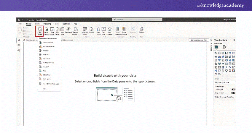
Step 1: Begin by connecting your data sources. Click on Get Data and import the files of your choice.
Step 2: Once connected, you can perform data transformation tasks like cleaning, shaping, and combining data from different sources. Use the Power Query Editor, which is integrated into Power BI, to apply transformations and prepare the data for visualisation.
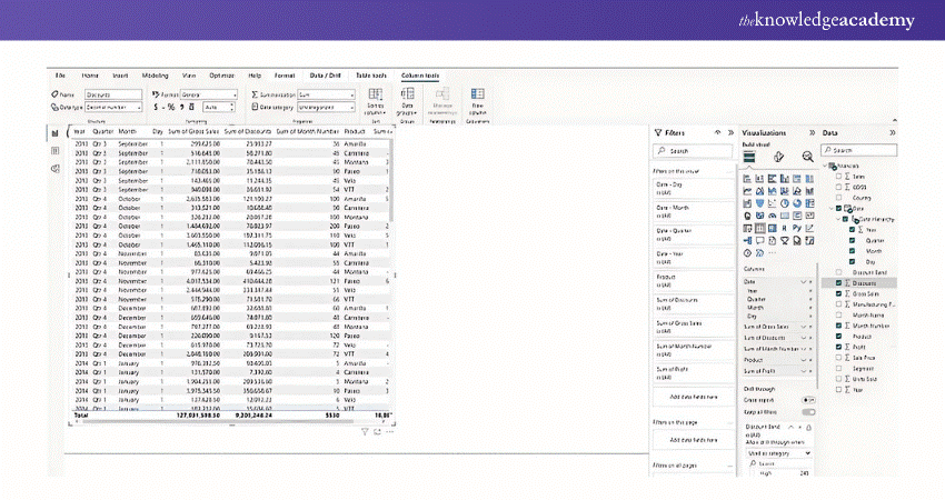
Step 3: After the data is imported, you can begin creating visualisations. Select the desired visualisations from the visualisation pane such as charts, graphs, tables, or maps. Drag and drop fields from your data fields into the visual canvas and configure properties like colours, labels, and formatting to customise the visual appearance.
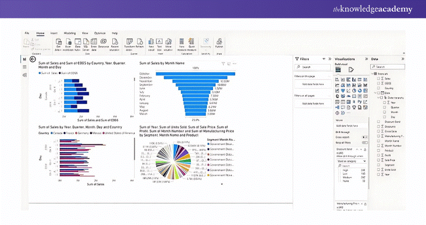
Step 4: Organise your visuals on the report canvas, arranging them in a logical manner. Adjust the layout, size, and alignment of visuals as needed. Apply formatting options to enhance the overall look and feel of the report.
Step 5: If your report requires multiple pages, you can create additional pages by clicking the "New Page" button. Each page can contain different visuals or focus on a specific aspect of the data.
Step 6: Apply filters that will be consistently applied across all report pages. This allows users to view the report with specific filters in place, providing a cohesive and consistent experience.
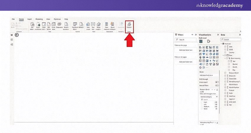
Step 7: Save your report locally in Power BI Desktop or publish it to the Power BI service for sharing and collaboration. When published, others can access the report, view the visuals, and interact with the data.
Advantages of Power BI Reports
Power BI offers many advantages that make them a popular choice for data visualisation and analysis. Let's talk about some of the key advantages of Power BI Reports:
a) Power BI Reports offer a customised and visual appeal with interactive visualisations that makes data easier to understand.
b) Users can drill down data, filter, and slice data to gain deeper insights and analyse specific aspects. This is known as data exploration with the help of Power BI Reports.
c) Power BI Reports can connect to real-time data sources, allowing users to view and analyse data based on real-time insights.
d) Power BI Reports support smooth collaboration and sharing with colleagues, stakeholders, or clients.
e) They can integrate data from various sources, providing an overall view for comprehensive analysis.
f) They have the ability to handle large volumes of data efficiently and respond quickly to user interactions.
g) Power BI Reports can be extended and customised with custom visuals, advanced Analytics, and integration with other tools and services.
Take control of your data with Power BI Slicer as you refine reports and drive business insights.
Can I Share Power BI Reports With People Outside My Organisation?
Yes, you can share Power BI reports with external users, but some permissions and licensing requirements apply. The recipient will need a Power BI Pro license, or the report can be shared through Power BI Premium features, such as secure sharing links or embedding in apps.
How do I Ensure My Power BI Report Updates With the Latest Data?
To keep your report updated with the latest data, ensure your data sources are connected, and schedule data refreshes. You can set up automatic refresh schedules if the data source supports it. Make sure you have the necessary gateway installed for on-premises data sources.
Conclusion
In conclusion, as data visualisation tools, Power BI Reports are a gateway to smarter decisions and deeper insights. Understanding the choice between Power BI Pro vs Premium helps you select the right solution based on your organisation’s needs. By turning raw numbers into compelling stories, these reports equip businesses with the ability to track performance, explore trends, and unlock new opportunities. With the flexibility and interactivity of Power BI Reports, the possibilities are endless for you and your organisation.
To become an expert in Power BI, the industry leader in Data Analysis tools, register for our Microsoft Power BI Data Analyst PL30 Course right away!
Frequently Asked Questions
What Power BI is Used for?

Power BI delivers a suite of tools for Business Analytics, allowing users to:
a) Visualise Data
b) Connect to Data
c) Model Data
d) Analyse Data
e) Share Insights
Power BI is used across industries to make data-driven decisions and streamline business processes.
Is Power BI Better Than Excel?

If your primary focus is on advanced data visualisation, real-time data updates, and handling large datasets, Power BI is a better option. However, Excel remains an excellent tool if you need flexibility for various tasks, complex calculations or extensive data manipulation.
What are the Other Resources and Offers Provided by The Knowledge Academy?

The Knowledge Academy takes global learning to new heights, offering over 3,000 online courses across 490+ locations in 190+ countries. This expansive reach ensures accessibility and convenience for learners worldwide.
Alongside our diverse Online Course Catalogue, encompassing 19 major categories, we go the extra mile by providing a plethora of free educational Online Resources like News updates, Blogs, videos, webinars, and interview questions. Tailoring learning experiences further, professionals can maximise value with customisable Course Bundles of TKA.
What is The Knowledge Pass, and How Does it Work?

The Knowledge Academy’s Knowledge Pass, a prepaid voucher, adds another layer of flexibility, allowing course bookings over a 12-month period. Join us on a journey where education knows no bounds.
What are the Related Courses and Blogs Provided by The Knowledge Academy?

The Knowledge Academy offers various Business Intelligence Reporting Courses, including the Microsoft Power BI Course and the Cognos BI Reporting Course. These courses cater to different skill levels, providing comprehensive insights into How to Update Power BI Desktop.
Our Office Applications Blogs cover a range of topics related to Power Bi, offering valuable resources, best practices, and industry insights. Whether you are a beginner or looking to advance your Power Bi skills, The Knowledge Academy's diverse courses and informative blogs have got you covered.
Upcoming Office Applications Resources Batches & Dates
Date
 Microsoft Power BI Course
Wed 11th Jun 2025
Wed 6th Aug 2025
Wed 8th Oct 2025
Wed 3rd Dec 2025


 Top Rated Course


 If you wish to make any changes to your course, please


