We may not have the course you’re looking for. If you enquire or give us a call on +44 1344 203 999 and speak to our training experts, we may still be able to help with your training requirements.
We ensure quality, budget-alignment, and timely delivery by our expert instructors.

A Pie Chart in Excel or a Circle Chart helps to represent statistical data in the form of parts of a circle. Each part or section displays a piece of the pie. This type of Chart in Excel is used to display only a single sort of data set. As a result, users find it easy to learn How to Make a Pie Chart in Excel and work with them.
Now, if you’re new to Excel and pie charts seem tricky, don’t worry! You’re about to become a Pie-chart pro. Just a few simple steps, and you’ll be slicing up data like a chef slices a pie. You can create Pie Charts by following a few simple steps. Read on to learn How to Make a Pie Chart in Excel.
Table of Contents
1) How to Make a Pie Chart in Excel?
2) What is a Pie Chart in Excel?
3) How to Make a Pie Chart in Excel?
4) How to Read a Pie Chart?
5) How to Edit a Pie Chart in Excel?
6) How to Customise a Pie Chart in Excel?
7) How to Explode an Excel Pie Chart?
8) How to Rotate an Excel Pie Chart?
9) Conclusion
What is a Pie Chart in Excel?
A Pie Chart, also known as a circle chart, is a valuable tool for visually representing simple statistical data. It displays information in the form of a circle, with each segment resembling a slice of pie. Unlike bar charts or line graphs, Pie Charts can only depict a single data series and cannot include zero or negative values. Negative numbers are displayed as their positive counterparts, while zero values are excluded from the chart.
In a Pie Chart, each segment is defined by a category, and its corresponding number is called the value. The total of all the categories will always amount to 100%, with each segment representing the proportion of its category in relation to the whole. Categories must remain distinct and not overlap. For instance, if one category is labeled "Men" and another "People Over Fifty," some men over 50 could potentially fall into both categories, resulting in duplicate counts.
How to Make a Pie Chart in Excel?
Creating a Pie Chart is simple with the use of Excel. Here's a complete breakdown of the steps to follow if you are confused about How to Make a Pie Chart in Excel:
Organising the Data for Your Pie Chart in Excel
To get started, you’ll have to organise the data in one row or column so that you can plot only a single data series in the Pie Chart. Your spreadsheet can also include a separate row or column representing category names. The category names are included in the first row or column that needs to be selected. These category names are displayed as data labels in the Pie Chart, which you can Create a Chart in Excel by organizing your data correctly. You should keep the following in mind when organising your data for an Excel Pie Chart:
1) Remember to plot only a single data series in your chart.
2) The data values should be more than zero.
3) Don't leave any column or row empty.
4) The number of categories should be at most seven or nine. A Pie Chart with multiple pie slices is challenging to analyse and understand.
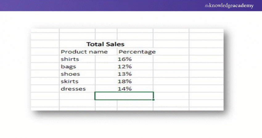
In our Excel Pie Chart tutorial, we are using the following data to create a pie graph:
Include a Pie Chart in the Excel Worksheet
Once your source data is organised properly, you’ll have to select it. Next, click on the Insert tab. Now, choose the type of chart you want. In our example, we will create a 2-D Pie Chart:
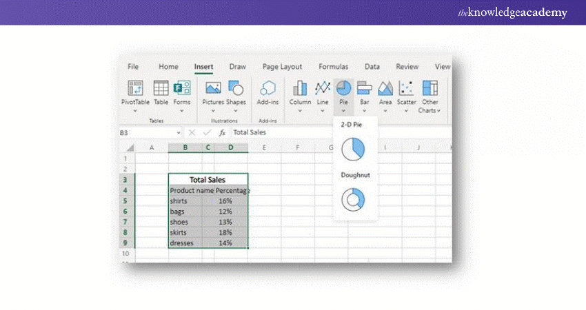
Tip: You can select the headings of the row and column if you want these headings to appear in the Pie Chart’s title.
Choose the Style of the Pie Chart You Want
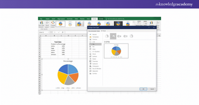
Once the Pie Chart is included in the worksheet, you can visit the Design tab > Change Chart Type. You can click on different Pie Chart styles and select the one that best suits your data.
Build your career as a Data Analyst - sign up for our Data Analysis Training Using MS Excel now!
How to Read a Pie Chart?
Pie Charts are easy to interpret, requiring minimal explanation. However, there are a few tips that can enhance their clarity. As mentioned earlier, the total of the data in a Pie Chart will always equal 100 percent. When data labels aren't visible, hovering the cursor over a segment (the technical term for a section or slice) will reveal the associated data.
In addition to being easy to understand, Pie Charts are efficient because they display a large amount of information in a compact space. They also provide an instant visual comparison of each category, highlighting its relationship to both the other segments and the entire dataset.
How to Edit a Pie Chart in Excel?
Editing a Pie Chart in Excel is simple and flexible, allowing you to customise its appearance and layout to suit your needs. From adjusting colours and fonts to modifying data labels and chart styles, Excel provides various tools to help you fine-tune your Pie Chart for better presentation and clarity. Here’s how you can edit a Pie Chart in Excel:
1) Quick Layouts, Styles, and Themes
Excel provides several Quick Layout and Chart Style options to help you easily customise the format of your Pie Chart. Quick Layout allows you to adjust the overall structure and add elements to the chart, while Chart Styles let you modify the appearance of the chart itself. You can browse through these styles to find one that suits your needs.
For Excel 2016 and later versions, themes are also available. Themes offer predefined collections of fonts and colours that will automatically apply to any Pie Charts you create after selecting the theme. To view these theme options, go to the Page Layout tab and click on either Colours or Fonts.
2) Moving the Chart
To reposition a Pie Chart within the same worksheet, simply click on the chart and drag it to your desired location. If you want to move the chart to a different sheet, right-click the chart, select "Move Chart," and choose either an existing sheet or create a new one.
3) Resizing the Pie Chart
To resize the chart, click on a corner of the chart and drag to make it larger or smaller. Keep in mind that Excel automatically adjusts the size of the pie within the chart area.
4) Rotating the Pie Chart
To rotate the Pie Chart (for example, to move a specific slice to the top), right-click on the chart, select "Format Data Series," click "Options," and then input a value in the "Angle of first slice" box. Experiment with different angles until you achieve the desired layout. If you want a particular slice at the top, rearranging the data rows with that category in the first row can be a simpler solution.
5) Adding Chart Titles
To add a title to your Pie Chart, navigate to the Charts section in the ribbon, click "Chart Layout," then "Chart Title," and choose where to place the title. If you need to further modify the title's appearance, go to "Chart Title Options" where you can adjust the font, colour, size, background, and more.
6) Pie Chart Legends
By default, a legend appears when you create a Pie Chart. To remove it, right-click on the legend and select "Delete." If you'd like to change its appearance, right-click the legend, choose "Format Legend," and make the necessary adjustments. If the legend has been deleted and you want to bring it back, go to the "Charts" tab, click "Chart Layout," then "Legend," and select its placement.
7) Colours, Fonts, and Backgrounds
If the preset themes or formats don't match your preferences, you can manually adjust the Pie Chart’s colours, fonts, and backgrounds. To change a slice's appearance, double-click on the slice to open the Format Data Point window, and select "Fill" to adjust its colour, texture, or even add a picture. Similarly, you can modify the font size, colour, and style of any text labels by right-clicking on the data labels and selecting "Format Text."
To change the chart’s background, right-click on an empty space in the chart, select "Format Chart Area," and customise the colour, texture, or pattern. You can also change the chart's border thickness and colour or add effects like shadows.
8) Creating Exploding Pies and Slices
An exploded Pie Chart helps clarify datasets with many values by separating the slices. You can create this effect in a few ways:
a) Select the "Exploded Pie" option while creating the chart.
b) After the chart is created, you can manually click and drag a slice outward to explode the pie.
c) To explode just one slice, select the pie, click on the desired slice, and drag it outwards.
9) Additional Pie Chart Formatting Options
There are many ways to customise your Pie Chart further. You can reorder slices, combine smaller categories into an "Other" category, or even add WordArt.
a) Resorting By Slice Size: If you want to sort the slices by size (e.g., from smallest to largest), use Excel’s sorting tool on your dataset. The Pie Chart will automatically update to reflect the new order.
b) Combining Small Slices into an “Other” Category: To combine smaller slices into an "Other" category, simply sum the smaller values and replace them with a single row in your data labelled "Other." Alternatively, you can create a Pie of Pie Chart and manually combine the smaller slices.
c) WordArt: Though WordArt can’t be applied directly to chart elements, you can create WordArt separately and then paste it into your Pie Chart as titles or data labels to add an artistic touch.
How to Customise a Pie Chart in Excel?
If the objective of the Pie Chart you are creating in Excel is to showcase trends in the data, you can create the default chart. However, if you want to create a professional graph for your next presentation, you should make a few enhancements. So, let’s learn about a few customisation tips:
1) How to Add Labels to Your Pie Chart?
A good Pie Chart should be easy to understand. You can add data labels to your Pie Charts as it will simplify the message of your graph. However, a Pie Chart with a data label can make calculating the exact percentage of the slices easier. Thus, you can include a title for the whole data series or each data point.
These labels can vary as per the data you’re willing to outline in the pie graph. You'll have to follow the below-mentioned steps to add data labels to an Excel Pie Chart:
2) Add Data Labels to an Excel Pie Chart
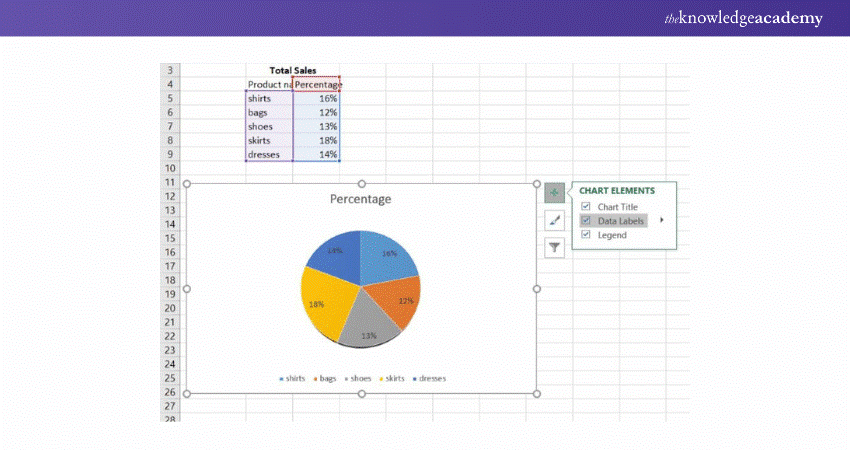
You can add labels to different data points. You’ll have to tap the Chart Elements button on the pie graph’s upper-right corner to add a label.
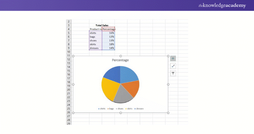
Now, you’ll have to choose the Data Labels option.
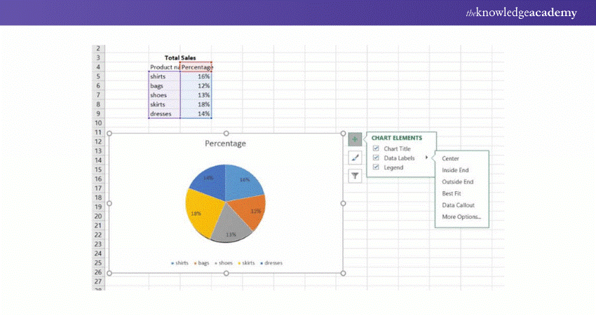
If you’re willing to change the location of labels on the Excel Pie Chart, you can get started by selecting the arrow near the Data Labels.
Show Data Categories on Various Data Labels
If the Excel pie graph you’ve created includes more than two-three slices, you should add levels to them directly. Then, your users will no longer have to browse between the pie and the legend to discover the description of each slice.
An easy way to show data categories on different labels is to choose the best-predefined chart layouts. You’ll have to select the Design tab > Chart Styles group> Quick Layout to do this. Then, choose the layouts that consist of data category labels.

Now, you can go to the Chart Elements > Data Labels to open the Format Data Labels panel on the worksheet’s right side. First, click on the Label Options tab. Next, click on the Category Name tab.
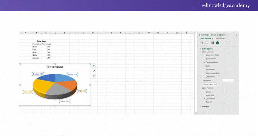
Besides, you’ll find the below-mentioned tips helpful:
a) Below the Label Contains tab, you can click on the data that should be showcased as labels.
b) You can click on the separator option. Now, from the drop-down list, you’ll have to choose ways to differentiate the data displayed on the labels.
c) Below Label Position, you’ll have to select where to put data labels.
Show Percentage on Pie Charts in Excel
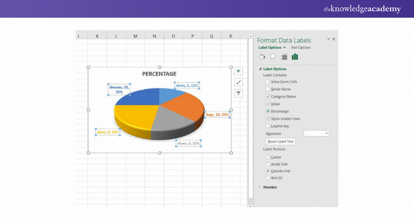
The source data you plot on your Pie Chart can include percentages. The % symbol will be shown automatically on the data labels. First, you’ll have to select Chart Elements and go to Data Labels. If the source data includes numbers, you’ll have to configure these data labels to represent either percentages or original values. Here's how you can do that:
a) Right-click on the slice of your Chart. Now, choose Format Data Labels.
b) Under the Format Data Labels pane, you can choose either the Percentage or Value box. Also, you can select both boxes at the same time. Excel will calculate the percentages automatically, where the value of the entire pie is 100%.
Organising the Pie Chart Slices as per Their Size
Pie Charts become easy to understand when their slices are arranged in descending order (i.e., from large to small). You can do this quickly by placing the source data. You can set your source data in descending order to get started.
Changing the Colours of the Pie Chart in Excel
If you don’t like the default colours shown in the Excel Pie Chart, you can choose from the two options listed below:
a) Change the colour of each slice
Or,
b) Modify the colour theme of your entire pie graph
Change the Colour of Each Slice
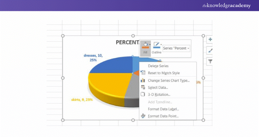
The number of colour themes available for an Excel chart is limited. So, if you want to create an attractive and professional Pie Chart, you’ll have to select the colour of each slice separately. For example, if you wish to include data labels inside each slice and the theme colour is dark, the black text is not visible. To get rid of this issue, you can choose a suitable colour theme for your text.
Additionally, if you want to modify the colour of a particular slice, select the slice and click on it. Now, click on the Format tab, choose Shape Fill, and select the colour you like.
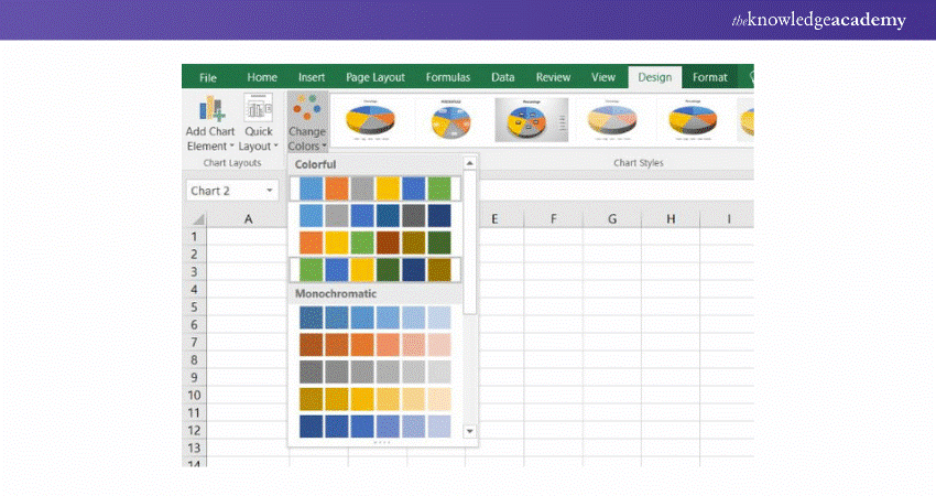
Modify the Colour Theme of Your Entire Pie Chart in Excel
You'll have to choose the Design ribbon if you want to select a new colour theme for the Excel pie graph. So, click the Change Colours button and browse through the colour themes. Finally, you can choose the colour theme you like.
Format a Pie Chart in Excel
When you want to create an Excel Pie Chart for presentation purposes or export it to a new application, you should make it more appealing. To use Excel’s formatting features, you can right-click on any slice of the Excel Pie Chart.
Next, you can open the Format Data Series panel by clicking on the Pie Chart. You'll have to choose the Effects tab from the Format Data Series pane. Now, you can apply and check effects such as Soft Edges, Glow, or Shadow. It will help you select the best one out of them. You can also browse through other options under the Format tab like:
a) Increase or decrease the width and height of the Pie Chart
b) Change the outline colours and shape fill
c) Use various shape effects
d) Use WordArt styles to modify the text elements
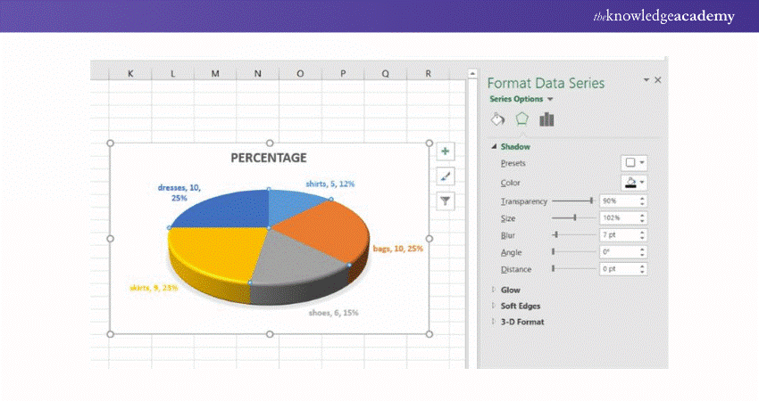
To use the formatting mentioned above features, you’ll have to choose the element in the pie graph that needs formatting. For example, Excel allows you to format features such as chart titles, slices, data labels, or legends. Now, click on the Format tab on this ribbon. This will activate the essential formatting features. On the other hand, the non-relevant features will be represented in grey.
Do you want to gain expertise in Data Visualisation? Register with our Microsoft Excel Associate MO200 today!
How to Explode an Excel Pie Chart?
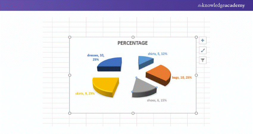
You can use the explode option if you want to highlight a particular section in the Pie Chart. You can get started by exploding a slice of the Pie Chart. To do this, you’ll have to double-click on the slice you want to extract. Next, you can pull away the slice by dragging it with the cursor. After you have completed these steps, your Pie Chart will look like the following image:
How to Rotate an Excel Pie Chart?
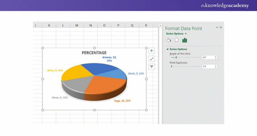
If you want to rotate a Pie Chart in Excel, you’ll have to click on the Pie Chart twice. Next, you’ll have to select the “Format Data Point” option. Next, you have to toggle the first slice’s Angle and rotate it to a certain degree.
Learn the top ten Excel shortcuts with our Microsoft Excel Course – join now!
Conclusion
Through this blog., now you know How to Make a Pie Chart in Excel; Well, creating and editing a Pie Chart is simple and highly effective for presenting data. A Pie Chart is ideal for providing readers with an easy-to-understand visual representation, particularly for illustrating the breakdown of financial figures or showing the value and proportion of different items in a dataset. It offers a clear pictorial representation of categories with minimal explanation needed.
Learn how to create advanced formulas in MS Excel by joining our Microsoft Excel Expert Course – Join now.
Frequently Asked Questions
How Can Mastering Pie Chart Creation in Excel Enhance my Career?

Mastering Pie Chart creation in Excel can boost your career by improving your ability to visually present and communicate data effectively. This skill is highly valued across many industries for making data-driven decisions more accessible.
Why is Knowing How to Make a Pie Chart in Excel Beneficial for Organisational Success?

Knowing How to Make a Pie Chart in Excel is beneficial for organisational success because it allows teams to quickly understand data distributions and make informed decisions. Effective Data Visualisation supports better strategic planning and resource allocation.
What are the Other Resources and Offers Provided by The Knowledge Academy?

The Knowledge Academy takes global learning to new heights, offering over 3,000 online courses across 490+ locations in 190+ countries. This expansive reach ensures accessibility and convenience for learners worldwide.
Alongside our diverse Online Course Catalogue, encompassing 19 major categories, we go the extra mile by providing a plethora of free educational Online Resources like News updates, Blogs, videos, webinars, and interview questions. Tailoring learning experiences further, professionals can maximise value with customisable Course Bundles of TKA.
What is Knowledge Pass, and how does it work?

The Knowledge Academy’s Knowledge Pass, a prepaid voucher, adds another layer of flexibility, allowing course bookings over a 12-month period. Join us on a journey where education knows no bounds.
What are related courses and blogs provided by The Knowledge Academy?

The Knowledge Academy offers various Microsoft Excel Training & Certification Course, including Microsoft Excel Masterclass, Excel for Accountants Masterclass, and Business Analytics With Excel Masterclass. These courses cater to different skill levels, providing comprehensive insights into Excel methodologies.
Our Office Applications Blogs cover a range of topics related to Microsoft Excel, offering valuable resources, best practices, and industry insights. Whether you are a beginner or looking to advance your Excel skills, The Knowledge Academy's diverse courses and informative blogs have you covered.
Upcoming Office Applications Resources Batches & Dates
Date
 Microsoft Excel Course
Mon 10th Mar 2025
Mon 7th Apr 2025
Mon 9th Jun 2025
Mon 8th Sep 2025
Mon 1st Dec 2025


 Top Rated Course


 If you wish to make any changes to your course, please


