We may not have the course you’re looking for. If you enquire or give us a call on 01344203999 and speak to our training experts, we may still be able to help with your training requirements.
We ensure quality, budget-alignment, and timely delivery by our expert instructors.

Whenever we hear the word “Contrast” related to art and design, the first word that strikes our minds is colours. Colours are the correct answer, but Contrast encompasses a broader range of sizes, shapes, and typography as well. They play a key role in enhancing the value of the designs by making them more realistic and relevant to the End User. Additionally, studies indicate that effective contrast can boost user engagement by up to 50% on digital interfaces.
In this blog, we will discover the fundamental Contrast Principles of Design and provide you with an overview of how to use these techniques and the adjoining best approaches. Let’s get straight to the topic.
Table of Contents
1) Understanding What is Contrast
2) Understanding the Principles of Design Contrast
3) How to Utilise Contrast Principles in Your Design?
a) Layout Contrast
b) Texture Contrast
c) Style Contrast
4) What’s the Best Approach to Implementing the Contrast Principle in Your Designs?
5) Conclusion
Understanding What is Contrast
Contrast is a design technique that makes certain features distinct from others using the colour, size, textures, shape, and typography variations on the same design or picture. By applying such techniques, designers can easily emphasise key elements, establish a visual hierarchy, and instantly establish a viewers’ attention.
For example, you place a white object on a completely black surface to direct the eye to the most important element of the design.
Understanding the Principles of Design Contrast
Design contrast is a principle that emphasises differences between elements to create visual interest and focus. It involves using variations in elements like colour, size, tone, and texture to make specific parts of a design stand out. For example, bold colour contrast can make text more legible, while size contrast can direct attention to key elements, establishing a visual hierarchy.
The purpose of design contrast is to create emphasis and guide the viewer’s eye effectively. Whether through differing shapes, typography, or spatial arrangement, contrast helps make a design more dynamic, engaging, and clear to the audience.
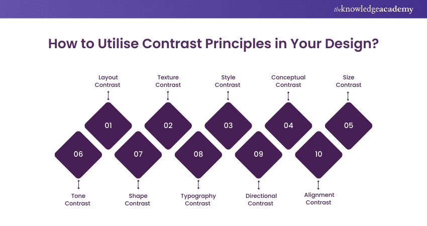
How to Utilise Contrast Principles in Your Design?
There are numerous ways you can utilise Contrast Principles in Your Design to make certain design elements distinguishing and appealing to the users. Below, we have described ten ways in which you can utilise this technique to make the most of your design (apart from the Colour Contrast, which we have already discussed in the introduction section).

Layout contrast refers to the way designers arrange different elements on a page to make some parts more noticeable than others. It uses differences in spacing, alignment, and positioning to create a clear structure and visual hierarchy.
For example, placing a large image next to small text instantly draws attention to the image. Alternatively, keeping one part of a design filled with elements while leaving another part empty (negative space) creates a strong contrast, making the filled area stand out.
2) Texture Contrast
Texture Contrasts refer to combining rough and smooth textures to add depth and interest in the design. An example of Texture Contrast could be putting a rough, grainy surface next to a smooth, shiny one.
Suppose we take a real-world application, a rough, bumpy rock placed on top of a glossy, polished table. The difference in how the two surfaces feel and look makes the roughness of the rock stand out more against the smoothness of the table.
3) Style Contrast
Style Contrast is a technique often seen in graphic design, fashion, interior design, and even branding. It involves using the applications of different styles blended together in a design for enhanced creativity and attractiveness.
The process of blending different styles successfully requires careful planning, experimentation, and precision. For this reason, the Style Contrast is a long-term process and requires a high-level of precision and creativity to make things perfect.
4) Conceptual Contrast
Conceptual Contrasts involve using different ideas or themes to make design thought-provoking and engaging. These designs are typically used in designing a website or something more inclined towards artistic representations.
For example, for a mechanical products webpage, you might include gears and other machinery in the background to add attractiveness and conceptual Contrast to the design.
5) Size Contrast
As per the name, the Size Contrasts typically revolve around design element differences based on size. For the webpage, you might slightly enlarge the Call-to-Action (CTA) to encourage the user to click on that link.
Such approaches also help elevate profitability. They further boost SEO ranking by optimising the user's dwell time on a particular website.
Unlock your creative writing potential with our Writing and Editing Course- register now!
6) Tone Contrast
Tone Contrast refers to using different brightness levels to make certain elements more engaging and noticeable. In some cases, Tone Contrast can establish a specific mood. High contrast (strong difference between light and dark tones) often creates drama or intensity, while low contrast (subtle differences in tones) evokes calmness or subtlety.
For instance, a portrait photo with a well-lit face (bright tones) against a dark background (dark tones) can make the face stand out sharply. This aspect draws the viewer’s attention immediately to the subject.
7) Shape Contrast
Shape Contrast is making features distinguishing and noticeable through different geometrical shapes, including circle, square, cube, and trapezium.
For example, in a logo, you might have a circular icon next to a rectangular text box. The contrast between the round and sharp edges immediately draws attention to the difference, making each element more noticeable.
8) Typography Contrast
Typography Contrast is primarily used to distinguish texts by creating different fonts. Contrast principles are commonly used to differentiate headlines from other texts.
For example, you might use bold letters to communicate the importance of that text, like in a blog where you separate the titles, H2s, and H3s using different typographical variations.
9) Directional Contrast
Directional Contrasts are most prominently used in diagrams and engineering drawings. You might have seen the arrows to label a particular part of the human body and the machine’s component. This helps users to identify the parts shown in the design.
For instance, you might see an animal cell labelled in a diagram, such as Cytoplasm, Ribosomes, or Cell Walls.
10) Alignment Contrast
Alignment contrast refers to positioning elements in different alignments to create a visual distinction. In simple words, it’s when items are arranged unevenly, like having some text aligned to the left and other text aligned to the right or centre.
An example of alignment contrast is a magazine layout where the main headline is aligned to the centre, while the subheadings or body text are aligned to the left. This difference in alignment makes the headline more prominent, drawing immediate attention to it.
Drive results with data-driven social campaigns- sign up for our Virtual Social Media Manager Training today!
What’s the Best Approach to Implementing the Contrast Principle in Your Designs?
It's important to apply contrast thoughtfully and strategically to make your designs more engaging and effective. Here is the list of best approaches to implementing the Contrast Principle in Your Design:
1) Decide which element you want the viewer to notice first (e.g., key message, shape, or colour).
2) Use contrast in colour, size, shape, or texture to make that element stand out.
3) Create balance by not overdoing the contrast, as too much can make the design chaotic.
4) Aim for a clear visual focus while maintaining harmony in the overall design.
Analyse products with expert review techniques with our Online Product Reviewer Training- sign up today!
Conclusion
We hope you get an overview of the Contrast Principle of Design. The contrast principle of Design is a vast and versatile field that finds applications across all domains today. Learning about ways to use this principle can help designers smoothen their processes and provide them with a competitive advantage in the corporate ecosystem. Additionally, it adds an element of attraction to viewers and helps them identify the right entity from complex designs and engraved ideas.
Optimise your remote work productivity with advanced tools- kickstart this Virtual Assistant Course today!
Frequently Asked Questions
What is Contrast in an Image?

Contrast in a technique that refers to the difference between light and dark areas, colours, or tones. It enhances details, depth, and clarity, making the image more visually striking. High Contrast creates bold distinctions, while low Contrast offers a softer, more muted look, influencing the overall mood of the image.
What is the Rule of Contrast?

The rule of contrast in design emphasises creating visual differences between elements, such as colour, size, or shape, to make specific features stand out. This principle helps guide viewers' attention, establish hierarchy, and enhance readability, making the design more effective and engaging.
What are the Other Resources and Offers Provided by The Knowledge Academy?

The Knowledge Academy takes global learning to new heights, offering over 3,000 online courses across 490+ locations in 190+ countries. This expansive reach ensures accessibility and convenience for learners worldwide.
Alongside our diverse Online Course Catalogue, encompassing 19 major categories, we go the extra mile by providing a plethora of free educational Online Resources like News updates, Blogs, videos, webinars, and interview questions. Tailoring learning experiences further, professionals can maximise value with customisable Course Bundles of TKA.
What is The Knowledge Pass, and How Does it Work?

The Knowledge Academy’s Knowledge Pass, a prepaid voucher, adds another layer of flexibility, allowing course bookings over a 12-month period. Join us on a journey where education knows no bounds.
What are the Related Courses and Blogs Provided by The Knowledge Academy?

The Knowledge Academy offers various Virtual Online Job Roles Training, including Virtual Graphic Designer Training, Writing and Editing Course, and Virtual Assistant Course. These courses cater to different skill levels, providing comprehensive insights into Graphic Design vs. Visual Communication: Know the Difference.
Our Business Skills Blogs cover a range of topics related to professional development, offering valuable resources, best practices, and industry insights. Whether you are a beginner or looking to advance your business skills, The Knowledge Academy's diverse courses and informative blogs have got you covered.
Upcoming Business Skills Resources Batches & Dates
Date
 Virtual Graphic Designer Training
Fri 28th Mar 2025
Fri 23rd May 2025
Fri 25th Jul 2025
Fri 26th Sep 2025
Fri 28th Nov 2025


 Top Rated Course


 If you wish to make any changes to your course, please


