We may not have the course you’re looking for. If you enquire or give us a call on 01344203999 and speak to our training experts, we may still be able to help with your training requirements.
We ensure quality, budget-alignment, and timely delivery by our expert instructors.

Cascading Style Sheets (CSS) play an essential role in the domain of Web Development, when it comes to the designing and styling of websites. One of the main aspects of CSS are images, which add visual appeal and enhance the overall User Experience. However, images must be sized right to ensure an enhanced User Experience. In this blog, we will delve into the concept of CSS Image Size and its importance, as well as expand on how to control the image size.
Table of Contents
1) Understanding the importance of CSS Image Size
2) Getting started with CSS Image Sizing
3) Controlling image aspect ratio
4) Responsive image sizing with CSS
5) Best practices for CSS Image Size
6) Conclusion
Understanding the importance of CSS Image Size
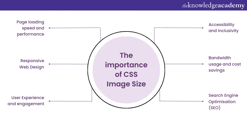
CSS image Size is of paramount importance in modern Web Design for a variety of reasons. Let's explore in more detail as to why CSS Image Size holds such significance:
Page loading speed and performance

Properly sized images using CSS directly impacts the loading speed and performance of your website. Large images with unnecessary dimensions can significantly increase page load times, causing frustration for users and potentially leading them to abandon your site. By optimising image sizes with CSS, you ensure faster loading times, improving the User Experience and encouraging visitors to stay engaged with your content, while also leveraging techniques like CSS Overflow to manage content visibility and layout.
Responsive Web Design
With the multitude of devices and screen sizes used to access websites today, responsive Web Design is essential. CSS Image Sizing enables you to create a flexible and adaptable layout that automatically adjusts images based on the user's screen size. This ensures that your website looks visually appealing and functions optimally across various devices, from desktop computers to smartphones and tablets.
User Experience and engagement
The visual profile of your website plays a crucial role in user engagement. Images that are too large or too small can disrupt the overall layout and negatively impact the User Experience. By utilising CSS Image Sizing, you create a harmonious and aesthetically pleasing User Interface, encouraging visitors to interact with the elements, stay longer on your site, and return in the future.
Search Engine Optimisation (SEO)
The size of image in CSS indirectly affects your website's SEO performance. Faster loading times resulting from optimised sizes contribute to better search engine rankings. Additionally, search engines increasingly consider mobile-friendliness and responsive design as ranking factors. By ensuring that your images resize correctly for different devices, you improve your website's chances of ranking higher in mobile search results.
Bandwidth usage and cost savings
Efficient image sizes help manage bandwidth usage, which is particularly important for websites with high traffic. Large files can consume excessive bandwidth, leading to increased hosting costs. By optimising sizes, you reduce data transfer, resulting in more efficient bandwidth usage and potential cost savings.
Accessibility and inclusivity
Properly sized images contribute to a more accessible and inclusive website. When images are responsive, they adapt well to different devices, making your content more accessible to users with disabilities. Additionally, descriptive alt text improves accessibility for visually challenged users who rely on screen readers to interpret web content.
Join our CSS Introduction & Intermediate Course now to master CSS and create stunning Web Designs!
Getting started with CSS Image Sizing
Getting started with CSS Image Sizing is a fundamental step towards optimising your website's visual content. Proper image sizes not only improve the overall aesthetics of your web pages but also has a significant impact on User Experience and page loading speed. In this section, we'll delve deeper into the basics of CSS Image Sizing and explore essential techniques to ensure your images look great and load quickly across various devices.
Inline styles vs. external CSS
When it comes to defining the size of your images with CSS, you have two main options: using inline styles or external CSS. Inline styles involve directly embedding CSS properties within the HTML tags of your images. While this method is straightforward, it can quickly become troublesome to manage, especially if you have numerous images scattered throughout your website. Additionally, inline styles may result in code duplication and hinder the separation of content and presentation.
On the other hand, employing external CSS is a more structured and organised approach. By creating a separate CSS file, you can centralise the sizing rules, making it easier to maintain and update your website's design. This method also promotes a cleaner HTML structure, enhancing readability and maintainability. It is generally advisable to use an external CSS file for sizing to ensure a scalable and efficient Website Design. Additionally, when styling elements, learning how to add a background image in HTML through external CSS can further improve design consistency and flexibility.
Using the 'width' property
One of the primary CSS properties for controlling image size is 'width'. The 'width' property allows you to specify the horizontal dimension of an image. For instance, using width: 300px; sets the width to 300 pixels, regardless of its original size. This technique is useful for setting the size of images uniformly and providing consistency across your website.
However, it is necessary to exercise caution when using fixed widths, as resizing images downwards could lead to a reduction in quality. Ideally, you should opt for images with dimensions close to the desired display size to maintain clarity and sharpness.
Utilising the 'height' property
Complementary to the 'width' property is the 'height' property, which controls the vertical dimension of the image. Like 'width', you can set the height using specific units, such as pixels, ‘em units’, or percentages. When using the 'height' property, it's essential to remember that altering the height without preserving its aspect ratio may result in distorted visuals.
In situations where it is necessary to adjust the height, it is best to do so in tandem with the 'width' property to maintain the original aspect ratio. This approach ensures that the image is proportionally resized, preventing any unnatural stretching or squashing.
Combining 'width' and 'height'
To achieve precise and balanced control over image dimensions, you can use both the 'width' and 'height' properties together. By specifying both properties, you ensure that the image retains its aspect ratio during resizing. For example, setting width: 400px; height: 300px; ensures the image is 400 pixels wide and 300 pixels high, maintaining its original proportions.
The 'width' and 'height' properties are particularly useful when dealing with images of varying aspect ratios, as they allow you to resize and display them consistently across your website. Utilising these properties together is a recommended practice for achieving a visually appealing layout and maintaining integrity.
Take your Mobile App Development skills to new heights – join our Mobile App Development Training Course today!
Controlling image aspect ratio
Controlling image aspect ratio is a crucial aspect of Web Design, as it ensures that images retain their original proportions and look visually appealing across various devices and screen sizes. Aspect ratio refers to the relationship between width and height. For, an image with an aspect ratio of 4:3 means that its width is four units, and its height is three units.
When images are resized without maintaining their aspect ratio, they can appear stretched or squished, leading to a poor User Experience. Let's explore some effective techniques for controlling image aspect ratio using CSS:
The 'aspect-ratio' property
With the advent of CSS4, the 'aspect-ratio' property was introduced, offering a convenient way to explicitly set an element's aspect ratio. By specifying the desired aspect ratio, you can ensure that an image maintains its original proportions regardless of its container size.
For instance, let's consider an image with a 16:9 aspect ratio, commonly found in widescreen formats. By applying the 'aspect-ratio' property to the CSS, you can achieve this aspect ratio with ease:
|
.image-container { |
Now, regardless of the image's original dimensions, it will always scale proportionally to fit the container while preserving the 16:9 aspect ratio.
Preserving aspect ratio with 'padding'
Another effective technique for controlling image aspect ratio involves using 'padding.' By cleverly setting equal padding on all sides of an image container, you can create a space that maintains the image's aspect ratio. Consider the following example:
|
.image-container { |
In this example, the 'padding-top' value is set to 56.25% (which is the result of 9/16 * 100), representing the 16:9 aspect ratio. As a result, the image will scale appropriately, maintaining its original aspect ratio within the container.
Fluid sizing techniques
In the realm of responsive Web Design, fluid sizing is a vital aspect of ensuring images fit well for different screen sizes and orientations. By employing fluid sizing techniques, you can create a seamless User Experience across various devices. One approach is to use percentages for both the width and height, like:
|
.image-container { |
In this example, the image's width is set to 50% of its container, allowing it to scale proportionally as the container size changes. The 'height: auto;' property ensures that the aspect ratio remains intact.
Responsive image sizing with CSS
Responsive image sizing with CSS is a fundamental aspect of modern Web Design, ensuring that images adapt seamlessly to various devices and screen sizes. Let's explore in detail how CSS enables responsive sizing and its impact on user engagement and overall website performance.
Fluid image sizing
One of the primary techniques for responsive sizing is using fluid dimensions. Instead of specifying fixed pixel values for width and height, you can use percentage values, allowing images to scale proportionally based on their container's size. For instance, setting an image's width to width: 100%; ensures it will always occupy the full width of its container, regardless of the screen size.
|
.img-fluid { |
By setting ‘height: auto;’, the image retains its original aspect ratio, preventing distortion and maintaining visual integrity. This fluid approach enables images to resize smoothly and fit well on any screen, providing a seamless and visually appealing experience for users.
Media queries for different viewports
Media queries are another essential component of responsive image sizing with CSS. Media queries allow you to apply specific CSS rules based on the characteristics of the user's device, such as screen width, height, orientation, and resolution. This empowers you to create custom sizes and layouts tailored to different viewports.
|
@media screen and (max-width: 768px) { |
In the above example, we use media queries to adjust the width to 80% for screens with a maximum width of 768 pixels, and 60% for screens between 769 and 1024 pixels wide. By utilising media queries, you can optimise image sizes for different devices, ensuring a seamless experience across various screen resolutions.
High-DPI displays and 'image-set'
High-DPI displays, such as Retina screens, have higher pixel density, requiring higher-resolution images to maintain visual sharpness. CSS provides the 'image-set' property, which enables you to serve different versions based on the user's screen resolution, along with CSS Background Image for optimising background visuals.
|
.img-fluid { |
In the above example, 'image.jpg' is served for regular displays (1x), while 'image@2x.jpg' is provided for high-DPI displays (2x). This ensures that users with Retina screens or other high-DPI devices receive images with higher resolution, resulting in crisper visuals.
Art direction for various devices
Art direction involves using different images for different devices or orientations, ensuring the most appropriate image is displayed based on the user's context. CSS Image Sizing allows you to implement art direction effectively.
|
.img-fluid { |
In this example, we use a larger image for larger screens and swap it for a smaller version for screens with a maximum width of 768 pixels. This optimisation ensures that users on smaller devices receive a lighter and more suitable image, reducing unnecessary data usage and improving page loading speed.
Best practices for CSS Image Size
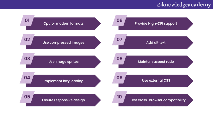
Following to these best size practices will ensure you get the best of CSS Images:

1) Opt for modern formats: Use modern formats like WebP for better compression and higher quality.
2) Use compressed images: Reduce file sizes without compromising quality using compression tools.
3) Use image sprites: Combine multiple images into one file to reduce server requests and improve loading speed.
4) Implement lazy loading: Delay loading for off-screen images to enhance initial page load speed.
5 )Ensure responsive design: Utilise fluid sizing and media queries for seamless adaptation to different devices.
6) Provide High-DPI support: Provide higher resolution images for high-DPI displays like Retina screens using 'image-set'.
7) Add alt text: Include descriptive alt text for accessibility and better SEO.
8) Maintain aspect ratio: Avoid distortion by preserving the aspect ratio when resizing.
9) Use external CSS: Centralise styling in external CSS for efficient management and updates.
10) Test cross-browser compatibility: Ensure images display consistently across different web browsers.
Conclusion
All in all, understanding and controlling CSS Image Size is essential for creating visually appealing and high-performing websites. By following the best practices and implementing the techniques discussed in this guide, you can enhance your website's User Experience, improve search engine rankings, and leave a positive and lasting impression on your audience.
Want to unlock your potential in App and Web Development? Join our App & Web Development Training Courses now!
Upcoming Programming & DevOps Resources Batches & Dates
Date
 Introduction to HTML
Fri 23rd May 2025
Fri 25th Jul 2025
Fri 26th Sep 2025
Fri 28th Nov 2025


 Top Rated Course


 If you wish to make any changes to your course, please


