


 Top Rated Course

We may not have the course you’re looking for. If you enquire or give us a call on 01344203999 and speak to our training experts, we may still be able to help with your training requirements.
10 Best Data Visualisation Tools: A Complete Overview
Sienna Roberts 07 November 2022Are you looking for the best Data Visualisation Tools for your business? They turn complex data into visual insights, making analysis easier. This blog offers a curated list of the best tools for Data Visualisation that will help you effortlessly transform complex information into insightful visuals. Read on to learn more!

Training Outcomes Within Your Budget!
We ensure quality, budget-alignment, and timely delivery by our expert instructors.
Table of Contents
In the age dominated by data, turning raw numbers into insightful visuals is both an art and a science. As data floods through diverse industries and online platforms, effective Data Visualisation grows more vital for interpreting complex information and making informed decisions. This is where Data Visualisation Tools step in as the guiding light helping you navigate the sea of ever-increasing Big Data.With the global Data Visualisation market size projected to reach £14.9 Billion by 2027, Data Visualisation Tools will continue to surf the wave of demand for the foreseeable future. This blog provides a comprehensive overview of the 10 best Data Visualisation Tools, highlighting their types, features, and benefits. Whether you're a marketer, a Data Analyst, or a business leader, read on and find the perfect tool to transform your data into actionable insights and weave compelling visual narratives.
Table of Contents
1) What are Data Visualisation Tools?
2) Best Data Visualisation Tools to use
a) Tableau
b) Sisense
c) Zoho Analytics
d) Looker
e) Qlik Sense
f) Plotly
g) Datawrapper
h) Microsoft Power BI
i) Google Charts
j) RAW
3) Conclusion
What are Data Visualisation Tools?
A Data Visualisation Tool is software designed to represent data visually. While features may vary, these tools essentially allow users to input and graphically modify datasets. Many of them provide pre-built templates for creating straightforward visualisations. These tools support various visual styles, are user-friendly, and can handle extensive data.
As data becomes increasingly vital for organisations in decision-making, the importance of Data Visualisation grows. This is evident from the significant attention that modern Data Visualisation Tools and advanced software are gaining.
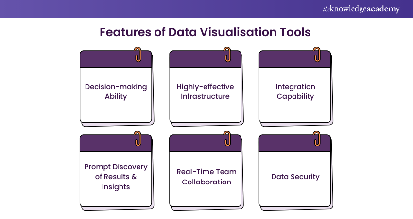
Here are some key features of Data Visualisation Tools:
1) Decision-making Ability: These tools help users make informed decisions by presenting data clearly.
2) Highly-effective Infrastructure: A robust infrastructure ensures that the tool can handle large datasets efficiently.
3) Integration Capability: The ability to integrate with various data sources and other software is vital.
4) Prompt Discovery of Results & Insights: These tools quickly generate insights from data.
5) Real-Time Team Collaboration: Features that allow multiple users to work together in real-time enhance productivity.
6) Data Security: These tools ensure that data is protected and secure.
Best Data Visualisation Tools to use
Further, we shall look at the most popular Data Visualisation Tools available in the market. These tools can effectively increase the efficiency of the Data Scientist. Let’s explore them below:
1) Tableau
Tableau has to be the first choice for a Data Scientist, because of its excellent visualisation capabilities. It allows you to create interactive graphs, charts and maps and supports connectivity with many data sources to quickly produce visuals.
It is simple to use, mobile responsive and has an informative community. Create graphics using drag-and-drop, thanks to Tableau’s flexibility. User can take the advantage of AI-driven statistical modelling, and storytelling dashboards, which integrates well with Slack and you can ask a question in a common language. This Data Visualisation Tool is available in two versions:
a) Tableau Desktop: The original product is Tableau Desktop, designed to produce static visualisations that may be published on one or more web pages. But the backdrop is, it cannot create interactive maps.
b) Tableau Public: This version of Tableau is free to use. It is similar to the desktop product but comes with a few limitations. This version doesn’t allow the users to keep their data analyses private.
Transform your data into actionable insights – Join our Tableau Training today!
2) Sisense
Sisense is trusted to be one of the best agile Data Visualisation Tools as it is ideal for projects involving massive datasets. It offers a highly robust interface that is basic and intuitive, allowing you to drag and drop your data into the canvas and quickly produce visualisations.
The advantage of using the Sisense Visualisation Tool is that it provides:
a) Flexibility in customisation
b) A user-friendly interface
c) Excellent customer support
d) Quick upgrade
The disadvantage is that it does not support time formats and has limited visualisation versions, making it difficult to develop analytic cubes. Sisense provides coordinated review program with a wide range of information.
3) Zoho Analytics
Zoho Analytics, also known as Zoho Reports, helps with creating custom reports and dashboards with drag-and-drop ease. Data Scientists can get insights into the data with interactive charts and graphs. You can share these reports and dashboards with anyone in minutes.
Additionally, the powerful visualisation tool facilitates the import of Big Data from well-known databases and programmes. Also has an inbuilt function for email scheduling and plenty of room for data. Enables easy collaboration on reports for you and your team.
4) Looker
The Looker Data Visualisation Tool digs deep into the data and analyses to provide users with valuable insights. It provides real-time dashboards, enabling executives to take instant decisions based on the insights obtained.
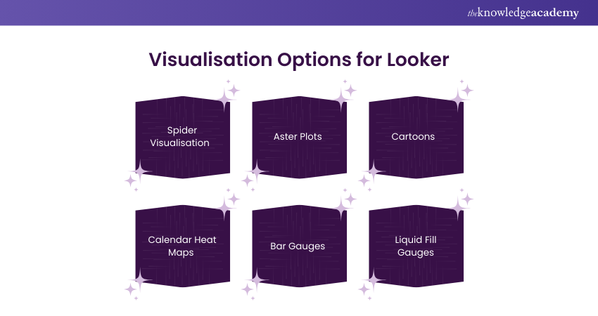
You can discover a collection of several visualisations here, including:
a) Spider visualisation
b) Aster plots
c) Cartoons
d) Calendar heat maps
e) Bar gauges
f) Liquid fill gauges
It offers built analytical blocks that users could use as templates for particular datasets or studies, which speeds up analytics. In addition, it also has stunning visuals and a plugin database for various sorts of Data Visualisation.
5) Qlik Sense
The Qlik Active Intelligence Platform, of which Qlik Sense is a component, provides scalability and analytics performance to organisations of all sizes. With its associative Data Analytics engine, sophisticated Artificial Intelligence system, and scalable multi-cloud architecture, Qlik Sense is a Data Visualisation platform that assists businesses in becoming data-driven enterprises.
It enables users to deploy any combination of SaaS, on-premises, or a private cloud. Additionally, this visualisation tool offers a drag-and-drop interface and automated action triggers.
Unlock the power of data with our Qlik Sense Training – sign up today!
6) Plotly
Plotly is a Data Visualisation Tool that is commonly used to create interactive graphs, charts, and maps. Users can employ Plotly to visualise a dataset and then post the visualisation's link to your blog or on social media to share with your audience.
It provides excellent features for exporting high-quality images and allows online editing of charts. Plotly will help you save time, with its easy-to-use interface. It also provides the free version, but with some limitations. Complex visualisations are made possible by Plotly's full integration with analytics-focused programming languages like Matlab, Python, and R.
7) Datawrapper
Datawrapper is an open-source tool with versatile features and is very simple to use with its intuitive user interface. Users can quickly generate charts and maps and embed them in the reports.
Unlike other tools, this visualisation tool does not require installation for chart creation. It's a freely available tool for anyone. With, Datawrapper building complex charts like Sankey is challenging. Given that it is an open-source programme, security is a concern.
8) Microsoft Power BI
Microsoft Bi, commonly known as Power Bi, is an easy-to-use tool, especially for beginners. This visualisation tool is available for both on-premise installation and cloud infrastructure deployment. Many enterprises use this tool for their Business Intelligence requirements.
It integrates easily with existing applications and offers personalised dashboards. Users will not have any problems related to speed or memory constraints when using Power BI. The only backdrop is that it is challenging to work with multiple datasets on this visualisation tool.
Transform your career with our expert-led Microsoft Power BI Training – Sign up today!
9) Google Charts
Google Charts is one of the biggest players in the Data Visualisation market. Coded with HTML5 and SVG, this tool is famed for its capability to produce pictorial and graphical Data Visualisations.
Google Charts offers Zoom functionality and provides users with unmatched cross-platform compatibility with Android, iOS, and even earlier versions of the Internet Explorer browser.
The features of Google Charts include:
a) Easy to integrate data
b) User-friendly platform
c) Visually attractive data graphs
d) Compatibility with Google products.
10) RAW
RAW, or RawGraphs, works with delimited data such as CSV or TSV, linking Data Visualisation and spreadsheets. It is a web-based application featuring a range of conventional and non-conventional layouts, yet it provides vital data security.
Features of RAW include:
a) Simple interface
b) Easy-to-use mapping feature
c) Offers a high-level platform for arranging, keeping, and reading user data
d) Super-fast visual feedback
e) Excellent readability for visual graphics
f) Excellent scalability option
Conclusion
In conclusion, picking the right Data Visualisation Tool can transform your data into powerful insights and interesting visuals. With the top 10 tools outlined in this blog, you can confidently choose the one that best suits your needs. We hope this blog helps you enhance your ability to communicate data-driven stories effectively.
Want to understand the importance of Data Visualisation in Business Intelligence? Sign up for our Data Analysis and Visualisation with Python.
Frequently Asked Questions
What are Data Visualisation Techniques?

Data Visualisation techniques include plots (bubble or scatter), charts (line, bar, or pie), maps (heat maps, geographic maps, etc.), diagrams, and matrices. Based on the data you are working with; you can use many variations on these techniques to meet specific visualisation needs.
Why do we use Data Visualisation?
Discerning information from extensive data sets with millions of data points is almost impossible unless some visualisation is employed, such as an interactive dashboard or even a basic graph.
What are the Other Resources and Offers Provided by The Knowledge Academy?
The Knowledge Academy takes global learning to new heights, offering over 30,000 online courses across 490+ locations in 220 countries. This expansive reach ensures accessibility and convenience for learners worldwide.
Alongside our diverse Online Course Catalogue, encompassing 17 major categories, we go the extra mile by providing a plethora of free educational Online Resources like News updates, Blogs, videos, webinars, and interview questions. Tailoring learning experiences further, professionals can maximise value with customisable Course Bundles of TKA.
What is The Knowledge Pass, and How Does it Work?
The Knowledge Academy’s Knowledge Pass, a prepaid voucher, adds another layer of flexibility, allowing course bookings over a 12-month period. Join us on a journey where education knows no bounds.
What are the Related Courses and Blogs Provided by The Knowledge Academy?
The Knowledge Academy offers various Big Data and Analytics Courses including the Big Data Architecture Training and the Big Data Analysis Course. These courses cater to different skill levels, providing comprehensive insights into Data Pipeline Architecture.
Our Data, Analytics & AI Blogs cover a range of topics related to Big Data, offering valuable resources, best practices, and industry insights. Whether you are a beginner or looking to advance your Data Analytics skills, The Knowledge Academy's diverse courses and informative blogs have got you covered.
Upcoming Data, Analytics & AI Resources Batches & Dates
Date
 Data Analysis and Visualisation with Python
Data Analysis and Visualisation with Python
Fri 27th Dec 2024
Data Analysis and Visualisation with Python
Fri 3rd Jan 2025
Data Analysis and Visualisation with Python
Fri 7th Mar 2025
Data Analysis and Visualisation with Python
Fri 2nd May 2025
Data Analysis and Visualisation with Python
Fri 4th Jul 2025
Data Analysis and Visualisation with Python
Fri 5th Sep 2025
Data Analysis and Visualisation with Python
Fri 7th Nov 2025
 If you wish to make any changes to your course, please


