


 Top Rated Course

We may not have the course you’re looking for. If you enquire or give us a call on 01344203999 and speak to our training experts, we may still be able to help with your training requirements.
Why Data Visualization is Important: Unlocking Insights
Sienna Roberts 15 November 2024Discover why data visualization is important. Learn how it enhances data understanding, decision-making, and communication. Read more! Read this blog to understand the Importance of Data Visualisation. Learn how it enhances data understanding, decision-making, and communication. Let’s dive in!

Training Outcomes Within Your Budget!
We ensure quality, budget-alignment, and timely delivery by our expert instructors.
Table of Contents
In today’s data-driven world, businesses and organisations are swimming in vast oceans of information. Making sense of this data is crucial, and that’s where Data Visualisation comes in. By transforming raw data into clear, impactful visuals like charts and graphs, Data Visualisation makes it easier to spot trends and gain insights. This not only simplifies complex information but also enhances decision-making.
According to Statista, the amount of data generated is forecasted to increase to 180 zettabytes by 2025. Data Visualisation is a daily tool in fields like finance and healthcare, helping professionals understand and analyse massive amounts of data. In this blog, we’ll explore the importance of Data Visualisation and how it boosts communication, analysis, and understanding across various sectors.
Table of Contents
1) What is Data Visualisation?
2) Importance of Data Visualisation
3) Tools and Techniques Used for Data Visualisation
4) Benefits of Data Visualisation
5) Types of Data Visualisation Techniques
6) Tips for Leveraging Data Visualisation
7) Conclusion
What is Data Visualisation?
Data Visualisation turns complex data into visual formats that are easier for the human brain to understand. This can include various visual tools such as:
a) Charts: Bar charts, line charts, pie charts, etc.
b) Graphs: Scatter plots, histograms, etc.
c) Maps: Geographic maps, heat maps, etc.
d) Dashboards: Interactive platforms that combine multiple visualisations.
The main goal of Data Visualisation is to make data more accessible and easier to interpret. It helps users quickly identify patterns, trends, and outliers. This is especially important in big data, where the large volume of information can be overwhelming without effective visualisation techniques.

Importance of Data Visualisation?
Data Visualisation simplifies data into visual or graphical forms, making it easier for businesses or organisations to understand. It mainly consists of graphs, pie charts, maps, etc. These visual representations can be used in various contexts, including business operations and conducting scientific explanations.
You can understand the Importance of Data Visualisation better through the following points:
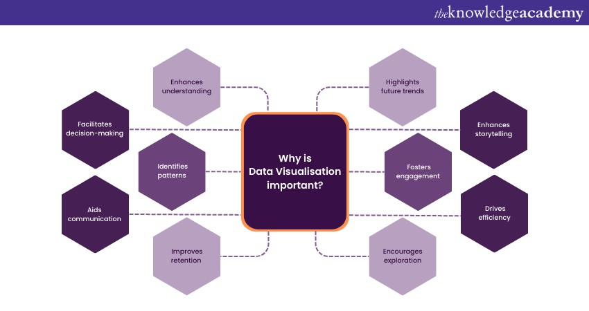
a) Data Visualisation uncovers trends from raw data. It becomes easy for companies to understand trends when the data is simplified and presented in the form of graphics or visuals. For example, if you have an e-commerce business, you will want to know which of your products are selling well or which products are less in demand.
It would be best if you made decisions according to the data that has been generated so that you do not incur any considerable loss. You can input the raw data using any of the best Data Visualisation tools to show you the upcoming trends and even get a summary of your sales. From this visual representation, you can also uncover which products may be trending in the next month or even in the next quarter.
b) Data Visualisation helps a lot in the healthcare industry. The primary purpose of the healthcare industry is to analyse patients' data so that the administration can make decisions regarding the supply of medicines, what types of equipment they can buy to aid the patients, the cost of the treatments, etc.
For example, suppose a hospital is present in an area where the general demography of people is between 50 years and 80 years, and their average economic condition is sub-par. In that case, the administration can take some measures to give them the best treatments so that they can afford those treatments, and they can decide on the price of medicines, insurance policies, etc. These data representations help them avoid significant economic losses by considering these criteria.
c) It helps to understand massive amounts of data by mapping them into relevant graphical representations. For example, if your manager wants to know how one branch of the company is performing in one area and the second branch is performing in a different location, they will need help comprehending the rows and rows of data. When you put this massive amount of data into Data Visualisation tools, they convert it into graphs, charts, or maps, which are considerably more accessible and easier to comprehend.
Interested in elevating your Data Visualisation skills more? Sign up now for our course on Data Visualisation Training with D3. Join now!
d) Data Visualisation is an integral part of Data Analysis. With the help of Data Visualisation tools, the Data Analysts are able to comprehend the rows and rows of data. They can advise businesses on how to streamline their operations smoothly.
With the help of Data Visualisation, these Analysts can draw relations and compare differences and similarities against past and recent trends. This comparison helps them give a forecast of future trends so that businesses are better equipped when they are delivering products or services.
e) The primary role of data analysts is to convert complex data into accessible insights that are easy to comprehend. Here, you will understand the Importance of Data Visualisation. In addition to converting complex data into visual representations which are easy to understand, it also helps to reduce the time that would have been wasted unnecessarily by comprehending that complex data.
For example, you want to present a representation of the areas where your company is incurring losses. If you had just delivered the data in a simple chart or Excel Sheet, it would have been difficult for you to make your team and your manager understand the pain points. However, with Data Visualisation tools, you can easily distinguish the pain points that will be highlighted in your visual representation.
f) Data Visualisation is an essential tool that can be used for storytelling. Wondering how? Let's take an example. You have to present a detailed business analysis to the senior management. If you don't use Data Visualisation in your presentation, there is a high chance that people will be left confused and bored.
However, with Visualisation, you will be able to create exciting and interactive colourful charts, graphs, maps, etc. These visual representations will highlight the pain points in the business operations, profits incurred in spite of the disadvantages and strategies on how you can improve those pain points. Using Data Visualisation will also help you to simplify many technical jargon.
g) There has been a lot of conflict on how Data Visualisation in Data Science can be used to extract essential insights from large datasets. However, it has been proven that Data Visualisation plays a crucial role in Data Science. It helps Data Scientists understand and visualise their data.
There are several Data Visualisation techniques that these scientists can utilise to group their data and categorise them accordingly. For example, suppose you are a Data Scientist, and you want to understand the anomalies in genetics. In that case, you can utilise Data Visualisation techniques to separate and group them according to your requirements.
h) With a large amount of data that is generated every day, businesses must analyse and understand them. Machine Learning (ML) has become one of the most popular tools to analyse these datasets. However, ML algorithms work better when the data is of high quality and clean. Data Visualisation helps these algorithms by making the data more readable, constructed and simplified.
For example, you want to understand how Netflix increases its subscriber count, and you want to use ML. However, the massive and clustered data generated globally can pose a hindrance in the process. You can simplify and sort the data that you need to work with. After implementing the techniques in Data Visualisation, you are now able to draw trends, patterns, and even processes that can be utilised, which might have been lost during other analyses.
i) The importance of Data Visualisation can be understood better when it is used in Business Analytics. For instance, if you are trying to predict the probable sales growth of your company, you will require past sales data as well as present data. If you want to analyse the sales data for the last ten years, you can imagine the amount of data you have to simplify to derive information. There is going to be a massive amount of data, which is practically only possible to study by using tools or techniques of Data Visualisation.
However, after you utilise the tools, you will be able to spot the dips and rise in your company's sales curve. These points will help you to study and analyse them so that you can understand and formulate strategies. Moreover, Data Visualisation will also help you explore and compare the sales reports from the last ten years to the present time. This is especially helpful if you are deciding to change your sales and marketing tactics to promote your products or services and improve the brand image of your organisation.
Discover your full potential in Data Science and Analytics with Data Science Analytics Training!
Tools and Techniques Used for Data Visualisation
To utilise Data Visualisation, here are some tools and techniques that you can use:
Tools for Data Visualisation
Data Visualisation tools are essential for transforming complex data sets into easily understandable visual representations. These tools enable businesses, researchers, and individuals to gain valuable insights from their data. Here are some various tools used for Data Visualisation:
a) Microsoft Power BI: A powerful tool for creating interactive dashboards and reports, integrating seamlessly with various data sources.
b) Tableau: Known for its user-friendly interface, Tableau allows users to create interactive and shareable dashboards with diverse data sets.
c) Google Data Studio: Offers collaborative features and integrates with Google's suite of products, allowing real-time Data Visualisation and sharing.
d) D3.js: Used for creating interactive Data Visualisations in web browsers, providing complete control over the visual elements.
e) Matplotlib: It is a popular Python library for creating static, interactive, and animated plots and charts.
f) Plotly: Provides interactive, web-based visualisations with support for multiple programming languages, including Python, R, and JavaScript.
g) QlikView/Qlik Sense: Qlik tools offer associative data modelling and allow users to explore and visualise data dynamically.
h) Excel: Widely used for basic Data Visualisation through charts and graphs, suitable for small-scale data analysis.
i) R programming language: Offers various packages like ggplot2 for creating high-quality, customisable visualisations.
j) SAS Visual Analytics: Allows businesses to explore and visualise data for better decision-making using an intuitive interface.
Techniques used for Data Visualisation
Data Visualisation techniques are essential for transforming raw data into meaningful insights. This helps in decision-making processes across various fields. Here are crucial techniques that can be employed in Data Visualisation:
a) Bar Charts: These are used to compare data across different categories. Bar charts represent data with rectangular bars. The lengths of these bars are proportional to the values they depict.
b) Line Charts: Ideal for showing trends over a continuous interval or time. It connects data points with lines to illustrate patterns and changes.
c) Pie Charts: Depict parts of a whole, representing data in a circular graph. Here, each slice represents a percentage or proportion of the total.
d) Scatter Plots: Display relationships between two variables, plotting data points on a two-dimensional graph to reveal patterns or correlations.
e) Heat Maps: Visualise data in a matrix format, using colours to represent values. They are helpful for displaying complex data sets and spotting trends.
f) Histograms: Represent the distribution of a dataset by providing a visual summary of the underlying frequency distribution of continuous or discrete data.
g) Bubble Charts: Extend the capabilities of scatter plots by introducing a third variable. This can be done by representing data points with bubbles of varying sizes, allowing you to visualise more complex relationships.
h) Treemaps: Display hierarchical data using nested rectangles. This enables viewers to understand the proportions and relationships between categories.
i) Box Plots: Show the distribution of a dataset and highlight its central tendency. This provides insights into variability and potential outliers.
j) Choropleth maps: Use colour shading or patterns to represent statistical data in specific geographic areas, allowing for regional comparisons.
Learn how to transform raw information into actionable insights only with our Big Data and Analytics Training. Join now!
Benefits of Data Visualisation
Data Visualisation does more than simplify complex concepts. It can also help businesses stay ahead with accurate, timely information. Experienced data scientists can provide precise analysis and structured feedback. This helps companies find connections and create profitable relationships.
Data Visualisation opens up exploration opportunities and allows for automated systems with detailed, contextualised data. Here are five other benefits of using Data Visualisation:
1) Support Visual Learning
The human brain processes visual information most effectively. Around 65% of people learn best through visual stimulation, making Data Visualisation crucial for understanding. Modern technologies like AI and machine learning turn data into engaging, interactive charts and graphs.
2) Analyse Data Faster
Processing massive data sets can be daunting and time-consuming. Visual content is easier and faster to understand than text. Data Visualisation helps us see the bigger picture by tapping into our natural learning styles. Use it to build models, create algorithms, and generate displays that motivate or educate.
3) Develop Accurate Customer Sentiment Analyses
Understanding your target audience is crucial for business ethics, operations, and marketing. Use Data Visualisation to analyse customer sentiments and explain changes to your team. Data scientists can help set up parameters and clean data to avoid mistakes. This reveals the true nature of your audience for better service and sales.
4) Inspire People to Interact with Your Business
Data Visualisation can increase sales and traffic by pinpointing customer sentiments and market trends. It enhances metric capabilities and simplifies goal tracking. Use it to create tools like polls, charts, graphs, and concept maps. Identify trends, discover patterns, and build brand recognition.
5) Encourage Investors to Show Interest
Good Data Visualisation shows thorough market research and hidden patterns in consumer behaviour. Data scientists can demonstrate industry projections and variables, attracting investors. Use it to ease concerns about your company's future and streamline communication with templates for proposals. Real-time data sets can continuously update specific metrics.
Data Visualisation is a powerful tool for businesses to understand complex information, make better decisions, and engage with customers and stakeholders effectively.
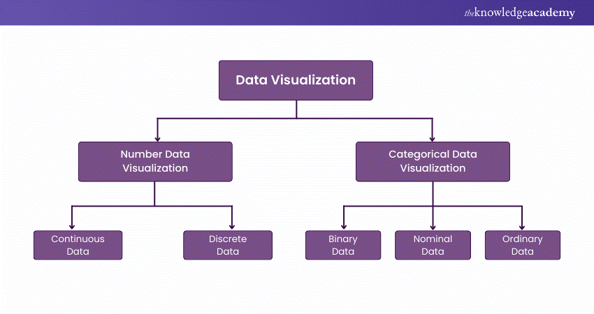
Types of Data Visualisation Techniques
Accurate Data Visualisation is crucial for market research. It allows both numerical and categorical data to be visualised, enhancing insights and reducing analysis paralysis.
Data Visualisation is categorised into:
1) Numerical Data
2) Categorical Data
Let's understand Data Visualisation and its categories through the diagram given below.
Tips for Leveraging Data Visualisation
Take full advantage of Data Visualisation tools to enjoy multiple benefits. Choose the best charts and graphs for each project or audience. Start with simple patterns and metrics, but let your data tell compelling stories with clear cues and context.
Teams often use size, colours, and shapes to help viewers understand data during strategic planning. This allows people to think about values and concepts without extra prompting. Follow these five steps to enhance your Data Visualisation skills:
a) Decide What You Want to See: Know what to look for before collecting or analysing data. Discuss options and priorities with your team first.
b) Determine a Suitable Audience: Create visual content based on your users' needs. Ensure your data is useful.
c) Gather Data from Multiple Sources: Avoid restricting your research with tight metrics and unrealistic expectations. Double-check and use plenty of sources.
d) Hire a Data Scientist: Let experienced data scientists collect, clean, and collate your data before creating visual aids. They can help remove mistakes and reveal hidden patterns.
e) Ask for Feedback from Staff: Get insights from your team before using Data Visualisation tools. Have a data scientist implement the most effective approach.
These steps will help you make the most of Data Visualisation.
Conclusion
With this blog, we hope that you understand the Importance of Data Visualisation. The graphical and visual representations will help you and your organisation to understand trends and patterns and even formulate strategies to relieve the pain points of your organisation. You can also utilise the various tools and techniques to use Data Visualisation easily.
Frequently Asked Questions
What are the 6 Benefits of Data Visualisation for Businesses?

a) Simplifies complex data for quick understanding.
b) Enhances decision-making with clear insights.
c) Identifies trends, patterns, and relationships.
d) Improves communication with stakeholders.
e) Boosts efficiency by speeding up analysis.
f) Detects anomalies and potential issues early.
What are the 3 Main Goals of Data Visualisation?
a) Simplification: Presenting complex data in an easy-to-understand format.
b) Insight Generation: Identifying patterns, trends, and outliers for better analysis.
c) Effective Communication: Clearly conveying data-driven insights to inform decisions and engage stakeholders.
What are the Other Resources and Offers Provided by The Knowledge Academy?
The Knowledge Academy takes global learning to new heights, offering over 30,000 online courses across 490+ locations in 220 countries. This expansive reach ensures accessibility and convenience for learners worldwide.
Alongside our diverse Online Course Catalogue, encompassing 19 major categories, we go the extra mile by providing a plethora of free educational Online Resources like News updates, Blogs, videos, webinars, and interview questions. Tailoring learning experiences further, professionals can maximise value with customisable Course Bundles of TKA.
What is The Knowledge Pass, and How Does it Work?
The Knowledge Academy’s Knowledge Pass, a prepaid voucher, adds another layer of flexibility, allowing course bookings over a 12-month period. Join us on a journey where education knows no bounds.
What are the Related Courses and Blogs Provided by The Knowledge Academy?
The Knowledge Academy offers various Big Data and Analytics Training, including the Advanced Data Analytics Certification, Certified Artificial Intelligence (AI) for Data Analysts Training, and Data Analytics With R. These courses cater to different skill levels, providing comprehensive insights into Data.
Our Data, Analytics & AI Blogs cover a range of topics related to Big Data, offering valuable resources, best practices, and industry insights. Whether you are a beginner or looking to advance your Data Analytics skills, The Knowledge Academy's diverse courses and informative blogs have got you covered.
Upcoming Data, Analytics & AI Resources Batches & Dates
Date
 Data Analysis and Visualisation with Python
Data Analysis and Visualisation with Python
Fri 27th Dec 2024
Data Analysis and Visualisation with Python
Fri 3rd Jan 2025
Data Analysis and Visualisation with Python
Fri 7th Mar 2025
Data Analysis and Visualisation with Python
Fri 2nd May 2025
Data Analysis and Visualisation with Python
Fri 4th Jul 2025
Data Analysis and Visualisation with Python
Fri 5th Sep 2025
Data Analysis and Visualisation with Python
Fri 7th Nov 2025
 If you wish to make any changes to your course, please


