We may not have the course you’re looking for. If you enquire or give us a call on 01344203999 and speak to our training experts, we may still be able to help with your training requirements.
Training Outcomes Within Your Budget!
We ensure quality, budget-alignment, and timely delivery by our expert instructors.

In today's business era, having a logo that people remember is super important for success. This kind of logo helps create a trustworthy image for your brand. But there are some simple rules for making a unique logo. Only a carefully planned logo can really help your business grow.
Want to know which businesses make it through and which ones struggle? It's noticed that entrepreneurs who put in extra effort to establish a strong visual brand identity in the market tend to succeed. Discover top Logo Design Principles in this blog, from simplicity to scalability and memorability. Elevate your brand with an impactful visual identity!
Table of Contents
1) Key principles of Logo Design
a) Prioritise simplicity
b) Tailor to your target audience
c) Cultivate memorability
d) Aim for timelessness
e) Ensure versatility and scalability
f) Employ high-quality typeface
g) Be strategic in colour selection
h) Optimise for monochrome presentation
i) Achieve visual balance
j) Align with brand identity
2) Conclusion
Key principles of Logo Design
Logo Design is guided by several key principles that contribute to creating a memorable and effective brand symbol. Here, we will discuss 12 important Logo Design Principles.
1) Prioritise simplicity
Simplicity stands as a cornerstone in the realm of Logo Design. The principle of prioritising simplicity in logo creation is rooted in the understanding that a straightforward and uncomplicated design is more likely to be memorable and easily recognisable. A simple logo lacks unnecessary elements and complexities that distract or confuse the audience.
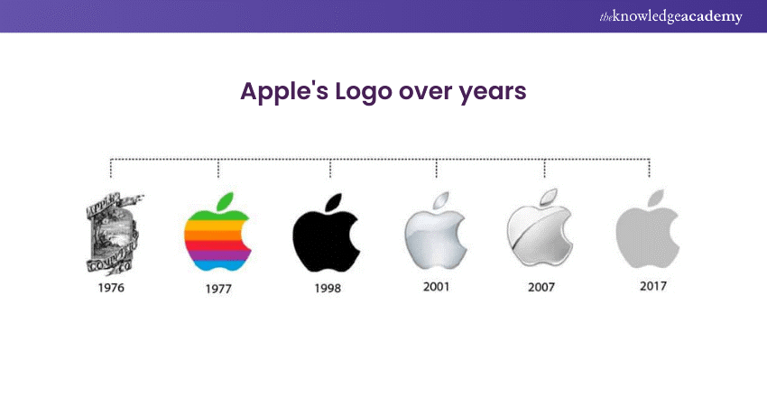
Clean lines, minimalistic shapes, and a lack of irrelevant details characterise it. This simplicity ensures that the human brain can quickly process the logo, making it more likely to leave a lasting impression. A simple logo cuts through the noise in a world bombarded with visual stimuli, improving brand recognition and association. Below is an example of Apple’s logo, which has been simple yet effective over decades.

The design can be expressed through the visual language and expanded in various applications, but the core mark must be simple. While it doesn't have to be excessively basic, the mark should possess a level of simplicity that allows for seamless translation across diverse platforms. This requirement underscores the importance of a clear and recognisable design regardless of its size or the medium in which it is presented.
2) Tailor to your target audience
The success of a logo hinges on its ability to resonate with the intended audience. Tailoring a logo to suit the target demographic's preferences, tastes, and expectations is a pivotal design principle. Understanding the demographic's cultural nuances, preferences, and lifestyle is crucial in crafting a logo that appeals to them and fosters a sense of connection.
Whether it's through colour choices, symbolism, or overall design aesthetics, a logo that aligns with the target audience's sensibilities has a higher likelihood of creating a positive and lasting impression. By speaking the visual language of the audience, a well-tailored logo can establish a meaningful connection between the brand and its consumers, fostering brand loyalty and recognition.
Empower your e-learning journey today with our Articulate Storyline Training Masterclass – unleash interactive and engaging course content. Sign up now!
3) Cultivate memorability
Memorability is an indispensable aspect of effective Logo Design. A memorable logo leaves a lasting imprint in the minds of consumers, facilitating instant brand recall. Achieving memorability involves creating a unique and distinctive design that distinguishes the brand from competitors.
This uniqueness can stem from the clever use of symbols, fonts, or colours. Consistency in design elements across various brand materials also contributes to memorability. A logo that is easy to remember is more likely to be shared, talked about, and recognised in diverse contexts, contributing to the brand's overall success.
A memorable logo becomes a powerful tool in building brand awareness and loyalty through careful consideration of visual elements and strategic design choices. Conveying a business's story through its logo is the ultimate goal in branding.
Unleash your creativity with our courses on Animation and Design Training – fuel your passion, master new skills, and shape a vibrant career in animation and design!
4) Aim for timelessness
A timeless design is a crucial principle in logo creation. A timeless logo transcends fleeting design trends, ensuring its relevance and appeal across generations. This longevity is achieved by avoiding design elements that are excessively trendy or linked to a specific era. Instead, a timeless logo incorporates enduring aesthetics and classic design principles.
By withstanding the test of time, the logo maintains its relevance, preventing the need for frequent redesigns that could dilute brand identity. Timelessness is an investment in the enduring strength and recognisability of the logo, contributing to the brand's sustained success.
5) Ensure versatility and scalability
Versatility and scalability are paramount considerations in Logo Design, reflecting the need for a logo to adapt seamlessly across various applications and sizes. A well-designed logo should remain clear and impactful, whether displayed on a grand billboard or reduced to a small digital icon. The versatility of a logo ensures its effectiveness across a spectrum of media, from print to online platforms.
Scalability, conversely, guarantees that the logo's design elements retain their integrity and legibility irrespective of size. This adaptability ensures a consistent and robust brand presence in large-scale promotional materials or more confined digital spaces.
6) Employ high-quality typeface
The choice of typeface holds significant weight in Logo Design, and employing a high-quality typeface is essential for effective communication. A well-crafted typeface contributes to the overall aesthetic appeal of the logo and enhances the legibility of the brand name or tagline. High-quality typefaces convey a sense of professionalism and attention to detail, reflecting positively on the brand's image.
The selected typeface should align with the brand's personality and values, complementing the overall design. Whether sleek and modern or classic and timeless, the typeface is crucial in creating a distinctive and impactful logo that resonates with the target audience. In an ideal scenario, creating a completely custom typeface would be perfect, but there's no harm in utilising an existing one
7) Be strategic in colour selection
Strategic colour selection is a pivotal aspect of effective Logo Design. Each colour evokes specific emotions and associations, impacting how the brand is perceived. When choosing colours, it's essential to consider each hue's psychological and cultural implications. The selected colours should align with the brand's personality, values, and target audience.
Additionally, it's prudent to consider the practicality of colour reproduction across various mediums. A well-thought-out colour palette enhances the logo's visual appeal and communicates a cohesive and meaningful message about the brand.
Master VLSI digital design and ignite innovation in electronics. Join Essentials Of Professional VLSI Digital Design Training Course today!
8) Optimise for monochrome presentation
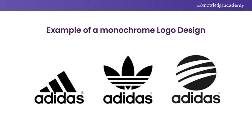
While colour is significant, a logo's design should also be optimised for monochrome presentation. This means the logo should remain clear and distinguishable when presented in black and white or shades of grey.
Optimising for monochrome ensures that the logo retains its integrity when colour reproduction is limited or when a simplified representation is necessary. A strong Logo Design should be recognisable even in its most basic form, allowing for versatile application across various contexts and mediums.
A brand's logo often appears in black and white, especially in situations like sponsorships alongside other logos. So, a logo must look good in shades of grey or black and white. A logo should work well even without colour.

9) Achieve visual balance
Visual balance is a fundamental principle in Logo Design that contributes to its overall harmony and effectiveness. Achieving visual balance involves distributing the design elements in a stable and aesthetically pleasing way. This can be achieved by carefully arranging shapes, colours, and text within the logo.
An imbalanced logo can be visually jarring and may not communicate the intended message effectively. Striking the right balance ensures no element overpowers the others, creating a cohesive and visually appealing logo. Whether symmetrical or asymmetrical, visual balance is crucial for making the logo visually engaging and memorable.
Even though things may look balanced mathematically, they might seem different to your eyes. So, it's essential to make adjustments based on what you see, and feel is visually balanced.
10) Align with brand identity
Ensuring a logo aligns seamlessly with a brand's identity is a fundamental principle in effective Logo Design. The logo serves as a visual representation of the brand, encapsulating its values, personality, and overall identity. To achieve this alignment, the designer must deeply understand the brand's essence.
This involves considering the brand's mission, target audience, and unique selling points. The logo should reflect the character and aspirations of the brand, creating an immediate and lasting connection with consumers. By maintaining consistency with the brand's identity, the logo becomes a powerful tool for brand recognition, fostering consumer trust and loyalty.
Unleash creativity with Design Patterns Training – empower your skills to create innovative and efficient design solutions for a dynamic professional landscape. Sign up today!
11) Strategically integrate colours
Strategic integration of colours is vital in crafting a visually impactful and meaningful logo. Colour choices can evoke specific emotions and convey particular meanings, influencing how the brand is perceived. The selection of colours should be aligned with the brand's personality and the emotions it aims to evoke in its audience.
Moreover, it's crucial to consider the cultural associations of colours, ensuring that they resonate positively with the target audience. The strategic use of colours can enhance the logo's visibility, communicate brand messages effectively, and set the brand apart from competitors. Thoughtful colour integration contributes to a cohesive and memorable brand image, reinforcing the brand's identity in the minds of consumers.
For instance, red can evoke aggression, love, energy, and passion. Therefore, incorporating red into your logo might be a fitting choice if your business caters to products or services aimed at a younger audience.
Blue, on the other hand, is linked with intelligence and friendliness, making it a common choice for social networking sites like Facebook and LinkedIn. Meanwhile, pink is often associated with tenderness.
12) Choose typography thoughtfully
The thoughtful selection of typography is a critical aspect of Logo Design, influencing the overall tone and perception of the brand. The typeface chosen should align with the brand's personality and values, complementing the visual elements of the logo. Different typefaces convey distinct emotions – modern, traditional, playful, or sophisticated.
The typography should be legible and appropriate for the intended audience, ensuring the brand message is communicated clearly. Additionally, the spacing, size, and arrangement of text elements should be carefully considered to achieve visual balance and harmony within the logo.
Thoughtful typography enhances the overall design aesthetic and contributes to creating a distinctive and recognisable logo. This means that the logo can effectively communicate the essence of the brand.
Industries such as sports, entertainment, music, and movies often prefer creating promotional visuals with a specific style. Another option is choosing a handcrafted logo style to provide a unique appearance to your logo. This design approach frequently draws inspiration from techniques like humour, minimalism, and vintage elements to craft a fresh and distinct look for the logo.
Conclusion
Logo Design principles are about making something unique that fits your business vibe. You've got to think about colours and fonts for looks and to tell people what your brand is all about. And here's the trick – your logo must be flexible and work well on anything from billboards to tiny phone screens.
Transform your creativity into captivating logos with our Logo Design Training – Master the art and principles of logo creation for a visually impactful brand presence.
Frequently Asked Questions
Upcoming Business Skills Resources Batches & Dates
Date
 Logo Design Course
Wed 18th Dec 2024
Fri 3rd Jan 2025
Fri 7th Mar 2025
Fri 2nd May 2025
Fri 4th Jul 2025
Fri 5th Sep 2025
Fri 7th Nov 2025


 Top Rated Course


 If you wish to make any changes to your course, please


