We may not have the course you’re looking for. If you enquire or give us a call on 01344203999 and speak to our training experts, we may still be able to help with your training requirements.
We ensure quality, budget-alignment, and timely delivery by our expert instructors.
Logos are incredibly significant. Although they can be difficult to design, they are essential for any company and the basis of any strong corporate or personal brand. You want your Logo to communicate who you are, what you do, why you do it, and how you do it. It will appear on social media posts, presentation decks, marketing materials, business cards, and other materials. Discover effective Logo Design Tips for impactful branding, capturing attention, and embedding your brand in the minds of your audience. Read more!
Table of Contents
1) Tips for designing an effective Logo
a) Ensure the relevance of your Logo design
b) Take into account the broader brand identity
c) Embrace public criticism of your Logo design
d) Utilise negative space for a clean design
e) Embrace shapes to stay structured
f) Envision your Logo in real-world scenarios
g) Leverage the significance of colour
h) Emphasise literal elements in your Logo
i) Project authority through your design
j) Introduce visual impact with strategic colour choices
2) Conclusion
Tips for designing an effective Logo
If you're looking for guidance on How to Design a Logo, these tips will provide valuable insights into the key elements of effective logo creation. Discussed below are a few Logo Design Tips:
1) Ensure the relevance of your Logo Design
A Logo should align with the concepts, values, and pursuits it represents. For instance, a sophisticated font suits a high-end restaurant more than a children's nursery. Similarly, using fluorescent pink and yellow may not resonate well with male pensioners. It's evident that crafting a design resembling a swastika is inappropriate across all industries.
Beyond these obvious considerations, a deeper understanding of appropriateness is crucial. The more reasoned your design choices, the smoother the process of presenting and selling the idea to a client—underscoring that designers are not just creators but also communicators and persuaders.

2) Take into account the broader brand identity
A Logo is seldom viewed in isolation but is typically presented across various platforms such as websites, posters, business cards, and app icons. In a client presentation, it is essential to showcase relevant touchpoints, illustrating how potential customers perceive the Logo in different contexts.
This approach, akin to gaining perspective in a challenging situation, ensures a comprehensive understanding of the Logo's impact across diverse applications. Designers should always assess the broader identity, considering how it functions when the Logo is absent. While a Logo is crucial, its reach is limited, making a bespoke typeface a valuable tool for achieving consistency. This typeface can extend beyond the Logo, enhancing cohesive visuals when applied to marketing headlines.
3) Embrace public criticism of your Logo Design
In the age of social media, everyone, from professionals to the general public, holds opinions on every Logo Design in the spotlight. Critique is no longer an occasional inconvenience but a constant reality, particularly for those engaged in high-profile rebranding efforts.
While a comprehensive branding strategy extends beyond the Logo, on platforms like Twitter, the Logo often becomes the focal point of public scrutiny, encapsulating the entire project. This inevitability must be acknowledged and prepared for by those involved.
Explore creativity with Design Patterns Training – Transform your skills to create innovative and efficient design solutions for a dynamic professional landscape. Sign up today!
4) Utilise negative space for a clean design
In Logo Design, the artful use of negative space is a powerful technique that contributes to a clean and impactful visual identity. Negative space refers to the empty or unmarked space around and between the main elements of a design. By strategically incorporating negative space, designers create a sense of balance and clarity, allowing the viewer's focus to be directed towards the essential elements of the Logo.
This minimalist approach not only enhances aesthetics but also aids in effective communication. A clean design, achieved through the thoughtful use of negative space, ensures that the core message of the Logo is conveyed crisply and memorably. This technique is particularly valuable in preventing visual clutter, making the Logo versatile and suitable for various applications while maintaining a timeless quality.
5) Embrace shapes to stay structured
Shapes play a pivotal role in maintaining structure and visual coherence in Logo Design. Choosing and arranging shapes thoughtfully can contribute to the overall balance and recognisability of a Logo. Geometric shapes often convey stability and order, while organic shapes can evoke a more dynamic and fluid feel.
The strategic integration of shapes helps define the visual hierarchy within the Logo, guiding the viewer's eye and creating a harmonious composition. Moreover, well-defined shapes facilitate scalability, ensuring the Logo remains clear and identifiable across different sizes and platforms. By embracing shapes with purpose and precision, designers enhance the structural integrity of the Logo, making it a resilient and versatile element in the brand's visual identity.
6) Envision your Logo in real-world scenarios
Visualising your Logo is a crucial step in ensuring its practicality and effectiveness. Imagine your Logo on various mediums, such as business cards, signage, packaging, and digital platforms. Think about how it will appear in different sizes, from a small social media profile picture to a large billboard. Consider the diverse colour palettes of these contexts and ensure your Logo remains clear and impactful across all.
For instance, picture your Logo on a storefront, catching the attention of passersby, or on a product, conveying the essence of your brand on the shelves. Think about its presence in digital spaces – as a favicon, app icon, or website header – ensuring seamless integration with the online user experience.
Consider the adaptability of your Logo to different backgrounds, whether it's a dark background on a website or the clean canvas of a promotional banner. Envisaging your Logo in these real-world applications allows you to anticipate how it will resonate with your target audience and whether it effectively communicates your brand message.
By immersing yourself in these scenarios, you can identify potential challenges and make informed design decisions. This process ensures that your Logo isn't just visually appealing in isolation but thrives in dynamic environments where it will represent your brand, fostering recognition and connection with your audience.
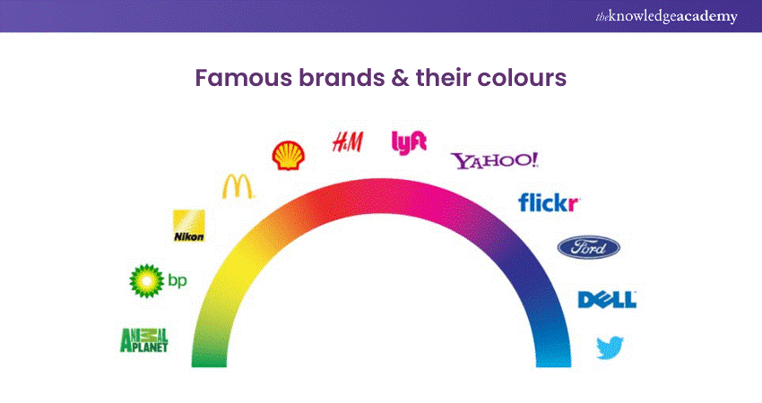
7) Leverage the significance of colour
Colour has the remarkable ability to convey emotions, establish identity, and leave a lasting impression on your audience. When selecting colours for your Logo, consider the emotions and associations each colour evokes. Warm colours like red and orange can signify passion and energy, while cool colours like blue and green often convey calmness and reliability.
The choice of colour should also align with the nature of your business or brand. For example, vibrant and playful colours might be suitable for a children's brand, while more muted and sophisticated tones could be fitting for a luxury brand. The Contrast Principle of Design between colours within your logo can enhance visibility and make your design more memorable.
Consider the cultural connotations of colours as well. Certain colours may carry different meanings in various cultures, so it's essential to be mindful of this, especially if your brand has a global presence. By leveraging the significance of colour, you can create a Logo that not only visually appeals but also resonates profoundly with your target audience, leaving a lasting and positive impression.
Learn VLSI digital design and ignite innovation in electronics. Sign up for our Essentials Of Professional VLSI Digital Design Training Course today!
8) Emphasise literal elements in your Logo
Highlighting literal elements in your Logo Design involves incorporating clear and straightforward symbols or representations that directly relate to your brand or message. This approach ensures instant recognition and understanding from your audience.
Imagine a bakery Logo that includes a stylised loaf of bread or a chef's hat – these direct, visual elements immediately convey the nature of the business. By emphasising literal components, you create a visual shorthand, making it easy for people to connect with and remember your brand.
Furthermore, focusing on the literal ensures that your Logo remains timeless and versatile. Trends may come and go, but a Logo built on clear, tangible elements withstands the test of time. This clarity also aids in adaptability across various platforms and applications, from business cards to digital platforms, ensuring consistent and effective brand representation.
9) Project authority through your design
Instilling authority in your design is about communicating a strong and confident message through visual elements. Begin by choosing bold and commanding colours that evoke a sense of power. Dark blues, deep reds, or rich blacks can create a commanding presence. Incorporate clean and sharp lines to convey precision and control in your design.
Consider the font choice carefully; opt for strong and sturdy typefaces that command attention. The typography should be clear and easy to read, reinforcing a sense of authority. Ensure that spacing and alignment are consistent to maintain a polished look.
Incorporate symbols or imagery that symbolise strength and reliability. Icons like shields, lions, or columns can evoke a sense of authority. However, simplicity is key; overcrowding with details can dilute the impact.
Lastly, consider the overall composition. A well-balanced design exudes authority. Whether it's a Logo, website, or any visual representation, a harmonious layout enhances the perceived strength of your brand. Remember, clarity and simplicity reinforce authority.
10) Introduce visual impact with strategic colour choices
When you pick colours, think about what they convey and how they connect to your brand's personality. For example, vibrant red might shout excitement, while calming blue whispers trust. The key is strategic harmony – colours that work together like a well-choreographed dance.
Consider your audience, too; different colours resonate with different people. Picture a playful palette for a kids' brand and a more sophisticated one for a high-end product. It's like dressing your Logo in the right outfit for the right occasion.
Now, let's talk about contrast – making elements stand out. Dark on light or vice versa creates visual pop. This isn't just about being eye-catching; it's about guiding the viewer's eyes to what matters most in your design.
Lastly, simplicity is a powerful ally. Don't overwhelm with a rainbow; instead, pick a few colours that speak volumes. Think of your Logo as a conversation starter, and let your colours do the talking.
11) Learn from existing designs—don't completely redefine
When creating a new Logo, it's wise to draw inspiration from existing designs rather than attempt a complete overhaul. This doesn't mean copying; instead, it involves understanding successful elements and incorporating them thoughtfully. By learning from what works, designers can tap into proven strategies for visual impact and brand recognition.
Studying existing designs provides valuable insights into what resonates with audiences and fits within industry norms. It's about recognising patterns and styles that have stood the test of time. This approach doesn't stifle creativity but rather guides it in a direction that aligns with the expectations of the target audience and the industry.
Moreover, existing designs offer lessons in functionality and practicality. Effective Logos are not just about aesthetics; they must work well across various platforms and applications. Learning from the successes and potential pitfalls of other designs helps in creating a Logo that is not only visually appealing but also versatile and adaptable.
Expand your creativity with our courses on Animation and Design Training – fuel your passion, master new skills, and shape a vibrant career in animation and design!
12) Be open to refinement in Logo Design
Remaining open to refinement is a fundamental mindset in Logo Design. It means being willing to make changes and improvements even after the initial design phase. In simple terms, it's like shaping a piece of clay until it becomes the perfect sculpture. Designers should embrace feedback and be ready to tweak elements for better results.
Just as a chef adjusts a recipe to enhance its flavour, a designer adjusts a Logo for maximum impact. It's about continuous improvement, ensuring the Logo resonates with the intended audience. This flexibility in the design process is like a compass, guiding the creation towards excellence. So, in the world of Logo Design, being open to refinement is a key ingredient for success.
13) Prioritise simplicity in Logo creation
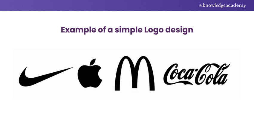
Simplicity is key when creating a Logo. Simple Logos are like clear messages that everyone can understand. Imagine you're telling a story with just a few words – that's what a simple Logo does. It quickly speaks to people without confusion. Simple designs use fewer elements, making them easy on the eyes and memorable.
Think of famous Logos like Apple or Nike – they're not complicated, yet they stick in your mind. Simple Logos are versatile; they work well on big billboards or tiny phone screens. They're like the superheroes of branding, powerful and adaptable.
Simplicity doesn't mean boring; it means clarity. So, when you're designing a Logo, remember: Less is often more. Keep it simple, and your Logo will communicate your message loudly and clearly, leaving a lasting impression. The image given below shows the power of simplicity in Logos.
14) Maintain proportions for visual harmony
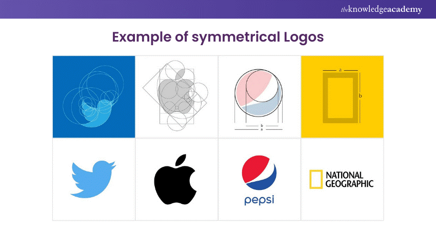
Maintaining proportions is crucial for achieving visual harmony in Logo Design. Imagine your Logo as a puzzle – each part should fit neatly with the others. When elements are proportionate, the Logo appears balanced and pleasing to the eye. This balance ensures that no single part overpowers the others, creating a sense of unity and coherence.
Consistent proportions contribute to clarity, making it easy for people to recognise and remember your Logo. Whether your Logo is big on a billboard or small on a business card, maintaining proportions guarantees that it remains recognisable and effective across various sizes and platforms.
15) Explore the potential of negative space
Negative space, the unoccupied area surrounding and between the main elements of a composition, is a powerful tool that can elevate the impact and clarity of a design. By deliberately incorporating negative space, designers create a dual narrative—the visible forms and the spaces in between. This duality not only fosters a sense of balance but also allows for a nuanced storytelling that engages the viewer's imagination.
Negative space serves as a silent yet compelling communicator. In Logo Design, it can be harnessed to convey hidden meanings or create optical illusions, adding depth and sophistication. This technique is a masterstroke in minimalism, enabling a clean and uncluttered aesthetic. By strategically utilising negative space, designers guide the viewer's focus, emphasising the essential aspects of the design and facilitating instant recognition.
Transform your e-learning journey today with our Articulate Storyline Training Masterclass – unleash interactive and engaging course content. Join now!
16) Establish contrast for a striking presence
Establishing contrast is a fundamental principle in Logo Design and is crucial for creating a striking and memorable presence. This concept involves the deliberate use of differences in elements like colour, shape, size, and texture to make certain aspects stand out. By strategically employing contrast, designers enhance the visual impact, guiding the viewer's attention and creating a dynamic and engaging composition.
A carefully crafted Logo with established contrast not only captures attention but also communicates the brand's identity with clarity and precision. It creates a visual hierarchy that communicates the essential message effectively, making the Logo not just a symbol but a powerful tool for brand communication. Through the strategic use of contrast, designers ensure that their Logos leave a lasting impression, forging a distinct and recognisable presence in the competitive market.
17) Contemplate the addition of a tagline
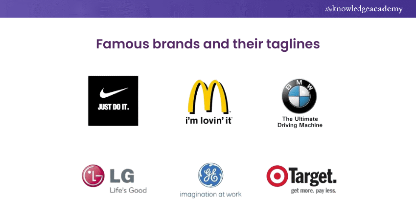
A tagline is like a short and memorable summary of what your brand is all about. It adds extra meaning and depth to your Logo, giving more information about your brand's values, mission, or what makes it special. Creating a tagline is like narrating a brief story that connects with your audience, making your Logo more powerful in telling your brand's aim. It's a clear and concise way to share your brand's message and make it stick with the people you want to reach.
Ensure that the tagline complements the visual elements of the Logo, creating a harmonious synergy between words and imagery. Look for clarity of thought in the tagline, avoiding unnecessary complexity and ensuring that it is easily understood by your audience. Here’s an example of a tagline in Logos.
Conclusion
Finally, mastering Becoming a Logo Designer is an artful combination of strategic thinking and creative flair. By incorporating the logo design tips shared in this blog—such as relevance, holistic brand consideration, openness to criticism, and clever use of design elements—designers can create logos that resonate with audiences. These tips align with Logo Design Principle, ensuring the logos not only look great but are functional and impactful.
Convert your creativity into captivating Logos with our Logo Design Training – Master the art and principles of Logo creation for a visually pleasing brand presence.
Frequently Asked Questions
What are the Other Resources and Offers Provided by The Knowledge Academy?

The Knowledge Academy takes global learning to new heights, offering over 3,000 online courses across 490+ locations in 190+ countries. This expansive reach ensures accessibility and convenience for learners worldwide.
Alongside our diverse Online Course Catalogue, encompassing 19 major categories, we go the extra mile by providing a plethora of free educational Online Resources like News updates, Blogs, videos, webinars, and interview questions. Tailoring learning experiences further, professionals can maximise value with customisable Course Bundles of TKA.
Upcoming Office Applications Resources Batches & Dates
Date
 Logo Design Course
Fri 2nd May 2025
Fri 4th Jul 2025
Fri 5th Sep 2025
Fri 7th Nov 2025


 Top Rated Course


 If you wish to make any changes to your course, please


