


 Top Rated Course

We may not have the course you’re looking for. If you enquire or give us a call on 01344203999 and speak to our training experts, we may still be able to help with your training requirements.
An Introduction to Power BI Dashboard: A Brief Guide
Gracey Smith 25 March 2025Read this blog to discover how the Power BI Dashboard revolutionises Data Management and Analysis for organisations and individuals. It offers a real-time, comprehensive view of crucial data, enabling quick and informed decision-making. Its intuitive design allows users to gain valuable insights that drive success.
Training Outcomes Within Your Budget!
We ensure quality, budget-alignment, and timely delivery by our expert instructors.
Table of Contents

The Power BI Dashboard is an integral feature of Power BI, enabling users to craft a personalised data view that highlights essential metrics and supports informed, data-centric decision-making. In the modern era where data management is paramount, organisations are on a constant quest for effective data handling solutions.
Microsoft’s Power BI stands out as a formidable business analytics tool that aids organisations in Data Analysis and visualisation. Infoclutch’s research indicates that approximately half of the global companies have adopted Microsoft Power BI. This blog aims to demystify Power BI Dashboards, offering an exhaustive tutorial on their creation and utilisation, exploring practical use cases, and discussing their benefits and potential drawbacks.
Table of Contents
1) What is Power BI?
2) Features of Power BI Dashboard
3) How to create a Power BI Dashboard?
4) What to consider before creating a Dashboard in Power BI?
5) Real-world applications of Power BI Dashboards
6) Advantages and disadvantages of Power BI Dashboards
7) Differences between Power BI Reports and Dashboards
8) Conclusion
What is Power BI?
Microsoft Power BI is a robust analytics and business intelligence platform that empowers professionals to handle, scrutinise, and present large quantities of data. It facilitates the derivation of insights, formulation of conclusions, and dissemination of findings through reports and dashboards across different organisational divisions. Its user-friendly interface allows for simple drag-and-drop actions and offers diverse interactive Data Visualisation tools for crafting reports and dashboards.
These singular pages of multiple visual diagrams of data are called Canvases. The dashboards generate the diagrams from reports and abridged into a one-page format based on datasets.
Users can interact with the Power BI Dashboard by drilling down on data points, filtering data and highlighting trends. It enables them to identify patterns and make data-driven decisions quickly. Power BI Dashboards are customisable and can be shared with other users, either internally or externally, with all stakeholders involved.
They can also be accessed via mobile, enabling users to view critical data from anywhere. In the context of Power BI Interview Questions, understanding the capabilities of Power BI Dashboards is essential, as they are a powerful tool for organisations to gain insights into their operations and enhance their decision-making process.

Features of Power BI
Attributes of Power BI include:
a) Elevated speed and efficiency with small data sets.
b) A user-oriented interface, similar to the one known by Microsoft Office 365, that is highly intuitive and easy to use.
c) Compatibility with data sources such as Excel, Text/CSV, JSON, SQL Server databases, IBM DB2, MySQL, etc.
d) Integration with R programming language together with DAX measure and functions.
e) Integration of the solution with the Microsoft Azure cloud platform allows the identification of insights and patterns within the data sets.
Simplify Data Analysis! Power BI Cheat Sheet for Faster, Smarter Reporting.
How to create Power BI Dashboard?
Creating a Power BI Dashboard involves a series of steps that enable you to transform raw data into a comprehensive visual representation. To gain a deeper understanding and hands-on experience, Power BI Tutorial provides a step-by-step guide on building and customizing dashboards effectively. Here’s a detailed breakdown of how to create a Power BI Dashboard:
a) Sign In to Power BI service: Start by logging into the Power BI service. If you don't have an account, you'll need to create one.
b) Connect to data sources: Use the ‘Get Data’ option from the ‘Home’ tab to connect to your data sources. These could be Excel spreadsheets, CSV files, or cloud services like Azure and Amazon Web Services.
c) Import and transform data: Import your data into Power BI once connected. You may need to use Power Query to clean and transform your data to ensure it’s in the right format for analysis.
d) Create relationships: Under the' Data' tab, set up relationships between different tables. This step is crucial for accurate data representation and analysis.
e) Design your report: Before creating a dashboard, you must design a report with visualisations. Use Power BI’s visualisation tools to create charts, graphs, and other visual elements.
f) Pin visuals to dashboard: After creating your report, you can create a dashboard by pinning these visuals. Hover over a visualisation and click the pin icon to add it to a dashboard.
g) Create a new dashboard: If you don’t have a dashboard, you’ll be prompted to create a new one. Give your Dashboard a name and pin the visual to it.
h) Arrange your dashboard: Once you have pinned the visuals, arrange them on your Dashboard. You can resize and move them to create a layout that effectively tells your data story.
i) Customise with filters and slicers: Add filters and slicers to your dashboard to make it interactive. This allows users to drill down into specific data points.
j) Share your dashboard: Finally, once your dashboard is complete, you can share it with others in your organisation. Power BI provides options to share and collaborate on dashboards securely.
Remember, a well-designed dashboard is not just about displaying data; it’s about presenting it in a way that’s easy to understand and actionable for the end-users. It should highlight the most important metrics and trends clearly and concisely. This is a perfect opportunity to Create a Strong Power BI Resume by demonstrating your ability to design dashboards that turn complex data into accessible insights.
Unlock actionable insights today with our Business Intelligence Reporting Courses - Elevate your decision-making!
What to consider before creating a Dashboard in Power BI?
Prior to crafting a Power BI Dashboard, consider these key points:
a) Identify key metrics: Decide what data needs to be highlighted, for example, the total sales, top products, and regional sales for a company focused on sales.
b) Customisation: Tailor your dashboard to your company's intentions and operations; avoid generic templates.
c) Power BI service: Understand that dashboards are exclusive to the Power BI service and cannot be accessed by Power BI Desktop.
Real-world applications of Power BI Dashboards
Power BI Dashboards can come in all forms and cover various industries and topics. Here are some real-world industrial applications of Power BI Dashboards:
a) Sales and marketing analytics: The sales and marketing teams can utilise Power BI Dashboards to monitor and analyse sales performance, marketing campaigns, consumer behaviours and product performance. Through these data, they may identify which aspects should be improved or developed into data-driven and more working plans.
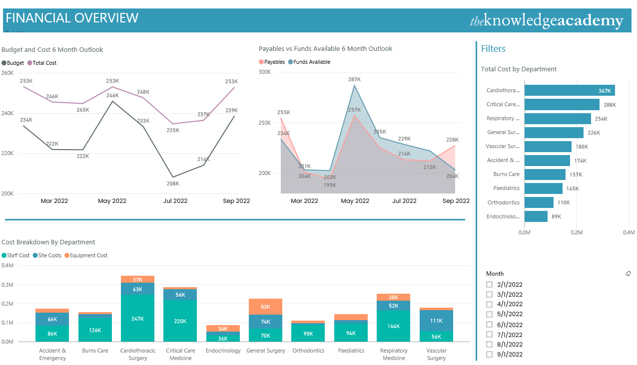
b) Financial reporting and analysis: Financial departments can use Power BI Dashboards to track revenue, costs, and other financial indicators. They can generate customised reports and track metrics such as cash flow, profit and loss, variance of budget, etc.
c) Supply Chain Management: Through Power BI Dashboards, one can analyse the supply chain data including inventory levels, supplier performance and delivery time. It can be designed to produce dashboards that give a clear view of the supply chain and let managers notice and solve problems promptly.
d) Human Resources: Power BI Dashboards could be used to analyse Human Resources (HR) Data such as employee turnover, performance metrics, and recruitment data. Besides that, they allow for the creation of dashboards that offer a real-time perspective of crucial HR metrics, so managers can proceed with data-driven decisions about recruitment, retention, and performance management, as outlined in the HR Metrics Guide.
e) Healthcare: Healthcare sector can leverage Power BI Dashboards for patient Data Analysis, tracking disease outbreaks and monitoring hospital performance. It can also be employed in building Dashboards showing real time information such as length of stay, readmission rate and patient satisfaction.
6) Education: Power BI Dashboards can be used in the education and education technology sector to track student performance, analyse test scores and monitor teacher performance. They can also be used to create Dashboards that provide a more profound outlook into key education metrics such as student attendance, graduation rates, and teacher effectiveness based on results. This can be further enhanced by insights from a Power BI Book, offering detailed guidance on data analysis and visualization techniques.
Advantages and disadvantages of Power BI Dashboards
As established, Power BI Dashboards can connect to a wide range of data sources and provides a drag-and-drop interface to create visualisations, analyse data and create custom and flexible Dashboards. However, despite its many advantages, Power BI Dashboards have some disadvantages that need to be considered before choosing it as a Data Analysis tool:
Advantages
This table provides a focused view of the key benefits of Power BI Dashboards:
|
Aspect |
Description |
|
Ease of use |
Features a user-friendly interface with drag-and-drop functionality for easy dashboard customisation, even for those with limited technical skills. |
|
Data integration |
Supports connections to a wide range of data sources, including cloud services, databases, and Excel spreadsheets, facilitating comprehensive dashboard creation. |
|
Customisation |
Offers a broad range of customisation options for dashboard appearance and custom visualisations to meet specific user needs. |
|
Collaboration |
Enables users to create, share, and collaboratively edit dashboards in real-time, enhancing team-based Data Analysis and decision-making. |
|
Real-time data |
Provides real-time data updates, ensuring users have the most current data view for quick, informed decision-making, accessible across multiple devices. |
|
Mobile friendly |
Optimised for mobile devices, allowing for remote data access and interaction using applicable credentials. |
|
Security |
Utilises strong security measures, including end-to-end encryption, two-factor authentication, and Azure Active Directory integration, to protect data and regulate access. |
Disadvantages:
These tables provide a focused view of the disadvantages of using Power BI Dashboards:
|
Aspect |
Description |
|
Cost |
The free version offers limited features, and the paid version can be expensive, posing a challenge for individuals or small businesses on a tight budget. |
|
Learning curve |
New users, especially those unfamiliar with Microsoft products or Data Analysis tools, may face a steep learning curve. |
|
Data modelling |
While easy to use, Power BI has limited data modeling capabilities compared to other dedicated tools, potentially complicating the development of complex models. |
|
Data storage limits |
Faces an upper limit on data storage, which can restrict analysis of large datasets unless additional storage is purchased. |
|
Formula rigidity |
The use of DAX formulas for data modelling and exploration is somewhat restrictive, limiting what can be achieved within the dashboard. |
|
Bulky User Interface |
Despite being user-friendly, the interface is often considered cluttered with icons and options, which can obscure Data Visualisation clarity. |
|
Limited integration |
Power BI Dashboards have minimal integration capabilities with non-Microsoft products, limiting data connectivity options for users outside the Microsoft ecosystem. |
Get yourself familiar with the most influential expression language in Power BI with DAX Training!
Differences between Power BI Dashboards and Reports
Power BI Reports and Dashboards are two essential components of the Power BI suite for data visualisation and analysis. While they may seem similar at first glance, the two have significant differences. Below are the major differences between Power BI Dashboards and Reports:
|
Points of Difference |
Power BI Dashboards |
Power BI Reports |
|
Purpose |
Power BI Dashboards are designed to provide high-level overviews of key metrics and trends. |
Power BI Reports are designed to provide detailed information about specific data points. |
|
Data Sources |
Can integrate and transform data from multiple data sources into a single view. |
They are typically created from a single data source, as it extracts extremely detailed insights from the source used. |
|
Design |
Power BI Dashboards are designed to be customisable and flexible and can contain a wide range of visuals. |
Power BI Reports are specifically structured around a question or a business problem and are not customisable. |
|
Interactivity |
Power BI Dashboards are designed to be clicked on and allow for data manipulation while data updates are in real-time. |
Power BI Reports are more static and often require users to refresh the page to see updates on the report. |
|
Layout |
The layout is flexible and allows the users to move the visualisations around and customise the look and feel of the Dashboard. |
Power BI Reports are rigid and only allow for a detailed statistical analysis of the data within the source linked. |
|
Sharing |
Can only be shared as read-only Dashboards to other users. |
Can be shared as read-only or with edit access to other users. |
|
User Access |
Power BI Dashboards can be made accessible to a wide range of audiences and can be made accessible via public platforms. |
Power BI Reports can only be accessible to a limited range of users. |
|
Filtering |
Power BI Dashboards cannot be sliced or filtered. It can be temporarily filtered on focus mode, but the transformed Dashboard cannot be saved. |
Power BI Reports can be sliced, filtered and highlighted in various ways to benefit users looking for a specific portion of the data. |
|
Availability on Power BI Desktop |
Power BI Dashboards are unavailable on Power BI Desktop. |
Power BI Reports can be built and modified on Power BI Desktop. |
|
Data Visualisation |
Power BI Dashboards can automatically transform data from linked sources into visuals such as trend lines and charts. |
Power BI Reports should be pinned to a Dashboard to drill down data into visuals. |
Interested in data consulting? Explore How to Become a Power BI Consultant and tap into lucrative opportunities!
Conclusion
Overall, the applications of Power BI Dashboards are almost limitless. However, understanding the difference between Alteryx and Power BI will help you better determine when to use each tool for data visualization and decision-making. When comparing Power BI with other tools like Cognos, Power BI stands out for its simplicity and ease of use. Dashboards in Power BI provide a valuable tool for businesses and organizations seeking summarized data and insights based on the data on a singular canvas.
Enlist yourself in Microsoft Power BI Data Analyst PL300 Training now to become an expert in Power BI, the market leader in Data Analysis tools!
Frequently Asked Questions
How can Power BI Dashboards enhance decision-making?
Power BI Dashboards aggregate critical data into a single view, enabling quick insights and informed decisions by highlighting trends, outliers, and patterns in real-time.
Can Power BI Dashboards be customised for individual roles?
Yes, Power BI Dashboards offer extensive customisation options, allowing the creation of role-specific views that focus on metrics relevant to particular job functions or departments.
What are the other resources and offers provided by The Knowledge Academy?
The Knowledge Academy takes global learning to new heights, offering over 3,000 online courses across 490+ locations in 190+ countries. This expansive reach ensures accessibility and convenience for learners worldwide.
Alongside our diverse Online Course Catalogue, encompassing 19 major categories, we go the extra mile by providing a plethora of free educational Online Resources like News updates, Blogs, videos, webinars, and interview questions. Tailoring learning experiences further, professionals can maximise value with customisable Course Bundles of TKA.
What is the Knowledge Pass, and how does it work?
The Knowledge Academy’s Knowledge Pass, a prepaid voucher, adds another layer of flexibility, allowing course bookings over a 12-month period. Join us on a journey where education knows no bounds.
What are related courses and blogs provided by The Knowledge Academy?
The Knowledge Academy offers various Business Intelligence Reporting Courses, including Microsoft Power BI Course, Tableau Desktop Training, and DAX Training. These courses cater to different skill levels, providing comprehensive insights into Power BI Slicers.
Our Office Applications Blogs cover a range of topics related to Power BI, offering valuable resources, best practices, and industry insights. Whether you are a beginner or looking to advance your Power BI skills, The Knowledge Academy's diverse courses and informative blogs have you covered.
Upcoming Office Applications Resources Batches & Dates
Date
 Microsoft Power BI Data Analyst PL300
Microsoft Power BI Data Analyst PL300
Mon 12th May 2025
Microsoft Power BI Data Analyst PL300
Mon 2nd Jun 2025
Microsoft Power BI Data Analyst PL300
Mon 7th Jul 2025
Microsoft Power BI Data Analyst PL300
Mon 4th Aug 2025
Microsoft Power BI Data Analyst PL300
Mon 1st Sep 2025
Microsoft Power BI Data Analyst PL300
Mon 6th Oct 2025
Microsoft Power BI Data Analyst PL300
Mon 3rd Nov 2025
Microsoft Power BI Data Analyst PL300
Mon 1st Dec 2025
 If you wish to make any changes to your course, please


