We may not have the course you’re looking for. If you enquire or give us a call on +1800812339 and speak to our training experts, we may still be able to help with your training requirements.
Training Outcomes Within Your Budget!
We ensure quality, budget-alignment, and timely delivery by our expert instructors.
The Tableau Stacked Bar Chart is a powerful visual representation that showcases the composition and comparison of sub-categories within a main category. Moreover, it allows for easy identification of patterns, highlighting of differences, and effective communication of insights.
However, if you are someone new to the field of Data Visualisation, and still haven’t started to use this powerful tool, it is time you get familiar with it. Read this blog to learn about Tableau Stacked Bar Chart, the types of charts it uses, its benefits and how to create a Stacked Bar Chart in Tableau.
Table of Contents
1) A brief overview of Tableau
2) What is the Tableau Stacked Bar Chart
3) The benefits of the Tableau Stacked Bar Chart
4) Creating a Stacked Bar Chart in Tableau
5) Creating a Tableau Stacked Bar Chart using multiple measures
6) Conclusion
A brief overview of Tableau
Tableau is a Data Visualisation tool that lets users analyse and present data in a visually appealing and interactive manner. It provides a user-friendly interface and robust features, which have helped it become one of the popular Business Intelligence tools for companies and individuals.
Furthermore, this Tableau Data Visualisation Tool enables users to connect with various data sources, such as spreadsheets, databases, or cloud services, and create stunning visualisations with just a few clicks. It offers various visualisation options, including charts, graphs, maps, and dashboards, which can be customised to suit specific needs.
More importantly, one of the key strengths of Tableau is its ability to handle massive volumes of user data efficiently. It employs advanced data processing techniques to quickly process and analyse vast datasets, allowing users to gain valuable insights and make data-driven decisions.

What is the Tableau Stacked Bar Chart?
The Tableau Stacked Bar Chart visualises categorical data that compares different categories within a single bar. It consists of multiple bars stacked on each other, where the height of each segment represents the proportion or value of a sub-category within the main category.
This Chart is useful for users who want to illustrate the composition and distribution of data across different sub-categories. It allows viewers to easily compare the relative sizes of the sub-categories within each main category and analyse the overall contribution of each sub-category to the whole.
Discover the Pros and Cons of Tableau! Maximize Your Data Strategy with Informed Choices.
Tableau Stacked Bar Chart types
The following are the types of Tableau Stacked Bar Charts:
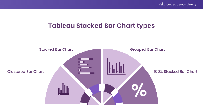
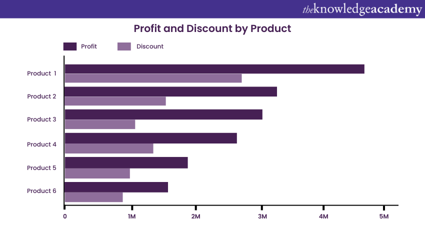
a) Clustered Bar Chart: This Stacked Bar Chart compares different categories side by side. Here's how:
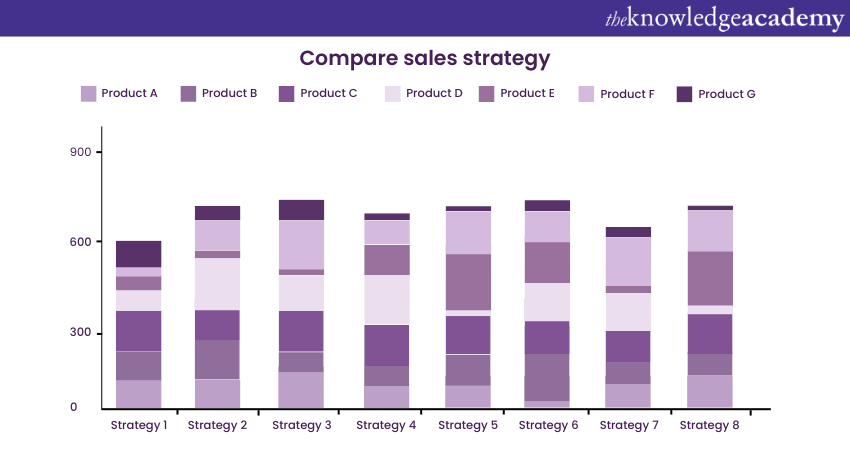
b) Stacked Bar Chart: This Bar Chart shows the composition of sub-categories within a main category. Here's how:
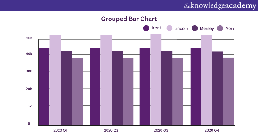
c) Grouped Bar Chart: This Tableau Stacked Bar Chart groups bars of the same category together. Here's how:
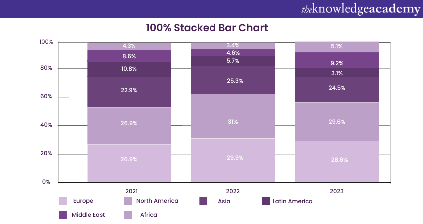
d) 100% Stacked Bar Chart: This Stacked Bar Chart in Tableau displays the proportion of each sub-category as a percentage of the whole category. Here's how:
Learn the fundamentals of Data Analytics for your projects, by signing up for the Data Analytics for Project Managers Training now!
Benefits of Tableau Stacked Bar Chart
The Tableau Stacked Bar Chart offers numerous benefits for visualising and interpreting data effectively. Here are some of its key advantages:
The Tableau Stacked Bar Chart offers numerous benefits for visualising and interpreting data effectively. Here are some of its key advantages:
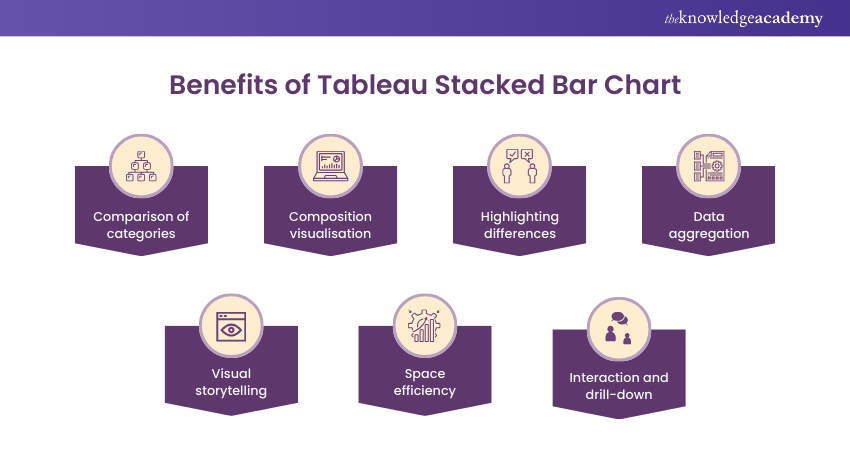
a) Comparison of categories: The Stacked Bar Chart in Tableau allows for easily comparing different categories within a single bar. It enables viewers to visually assess each sub-category's relative proportions or values within the main category. This comparison is particularly useful for identifying patterns, trends, or discrepancies across various groups.
b) Composition visualisation: This Chart type illustrates the composition or distribution of data across sub-categories. Stacking bars on top of each other visually represents the cumulative contribution of each sub-category to the whole. This helps in understanding each sub-category's relative importance or significance within the main category.
c) Highlighting differences: The Stacked Bar Chart effectively highlights variations between sub-categories. The contrasting colours used for different sub-categories make it easy to identify outliers or categories with significantly different values. This highlighting aids in identifying areas of strength or concern and facilitates data-driven decision-making.
d) Data aggregation: Tableau makes the process of data aggregation simpler at different levels. The main category represents the total or overarching value, while the sub-categories showcase the breakdown or components of that value. This aggregation allows users to grasp both the overall picture and the individual contributions of the sub-categories simultaneously.
e) Visual storytelling: Stacked Bar Charts are visually appealing and can be powerful tools for storytelling. Using appropriate colours, labels, and annotations can effectively convey insights and key messages to a broad audience. The visual impact of this Chart type helps engage viewers and improve their understanding of the presented data. The visual impact of this Chart type helps engage viewers and improve their understanding of the presented data.
f) Space efficiency: Stacked Bar Charts maximise the use of space on the visual canvas. Instead of cluttering the display with multiple separate bars, these Chart types stacks them within a single bar, resulting in a compact data representation. This efficient use of space allows for the inclusion of additional information or dimensions without overwhelming the viewer.
g) Interaction and drill-down: Tableau's interactive capabilities enable users to explore data in a Stacked Bar Chart further. Viewers can interact with the chart by hovering over or selecting specific segments to reveal more detailed information or drill down into underlying data. This interactivity promotes a much deeper understanding of the data and facilitates data exploration.
Learn how to crack interviews with our Tableau Interview Questions and become a successful professional in Data Analytics!
Creating a Stacked Bar Chart in Tableau
To create a correct Stacked Bar Chart in Tableau, you need to put the fields in the right rows and columns and choose the shape you want from the visualisation panel. You can do this by dragging and dropping the fields where you want them. There are other means to create a Tableau Stacked Bar Chart as well. These include the following:
Create a vertical Stacked Bar Chart Tableau
Creating a vertically Stacked Bar Chart in Tableau is a simple process that involves dragging and dropping fields onto the shelves and selecting the appropriate mark type. Here's a step-by-step guide:
a) Connect to your data: Connect your data source to Tableau. This could be a spreadsheet, database, or other data source.
b) Drag your dimension field to the Rows shelf: The dimension field represents the categories you want to compare, such as region, product category, or customer segment.
c) Drag your measure field to the Columns shelf: The measure field represents the values you want to display on the chart, such as sales, profit, or quantity.
d) Change the mark type to "Bar": On the Marks shelf, change the mark type from the default "Automatic" to "Bar". This will create a bar chart with individual bars for each category.
e) Drag the dimension field to the Colour shelf: This will add colour to the bars, allowing you to differentiate between the categories.
f) Customise the chart: You can further customise the chart by adding labels, titles, and other formatting options.
Leverage Tableau CRM for Next-Level Customer Insights. Transform Your Data Today!
Create a horizontal Stacked Bar Chart Tableau
Here are the steps to create a horizontal Stacked Bar Chart in Tableau:
a) Connect to your data. You can connect to various data sources, including Excel spreadsheets, CSV files, and databases.
b) Drag the dimensions you want for the bars onto the Rows shelf. This will create the categories for your chart.
c) Drag the measure you want to use for the values onto the Columns shelf. This will create the bars for your Chart.
d) Right-click on the measure pill on the Columns shelf and select "Dual Axis." This will create a second axis for your chart.
e) Drag the same measure pill onto the second axis. This will create the second set of bars for your Chart.
f) Right-click on the second measure pill on the Columns shelf and select "Synchronise Axis." This will ensure that the two axes are on the same scale.
g) Right-click on the second measure pill on the Columns shelf and select "Blend Measures." This will stack the bars on top of each other.
h) Format your chart as desired. You can easily change the colours of the bars, add labels, and change the font size.
Do you want to learn to visualise relevant data and combine databases? Then register now for our Tableau Desktop Training now!
Diverging Stacked Bar Chart
Diverging Stacked Bar Charts represent a type of Data Visualisation which are used to manipulate bar charts. Such bar charts are used for displaying the composition of data across different categories same as a common midpoint, zero, or an average. First and foremost, this chart stand-alone visually as to illustrate how parts of total are similar toward each other and diverge in positive or negative sense from the core point.
In a Diverging Stacked Bar Chart, each segment represents an amount, split into segments which are separated opposite from the (central) axis. The squares will serve to illustrate each subset or dimension, such as a positive/negative contribution to budgeting, sustainability, environmental ethics, etc. In this structure, the user can identify and monitor the sub-categories that are minus or positive and the respective contribution made to the total deduction or addition as well.
The business context would discourse a case of a diverging Stacked Bar whereby profit and loss items are compartmentalised for different departments, and the bar reflects profit by extending to the right of the central axis and loss by extending to the left of the same axis.
In this case, the evocation of the form and placement incorporates a quick detection of those departments delivering profit over the break-even level and to what extent they are overloading the general financial condition.
Unlock the Full Potential of Tableau for Your Business Analytics. Get Started Today!
Creating a Tableau Stacked Bar Chart using multiple measures
There are two main ways to create a Stacked Bar Chart using multiple measures in Tableau:
Method 1: Using a separate bar for each dimension
Let's see how separate bar dimensions can help in creating a Stacked Bar Chart:
a) Drag a dimension to Columns.
b) Drag Measure Names to Color on the Marks card.
c) On Colour, right-click Measure Names, select Filter, and then select the check boxes for the measures to display, and then click OK.
d) From the Measures pane, drag Measure Values to Rows.
e) On the Marks card, change the mark type from Automatic to Bar.
Method 2: Using a separate bar for each measure
Let's see how using a separate bar for each measure can help create a Chart:
a) Drag a dimension to the Color shelf.
b) Drag Measure Names to Columns.
c) On the Columns shelf, you have to right-click Measure Names, select Filter, select the check boxes for the measures to display, and then click OK.
d) From the Measures pane, drag Measure Values to Rows.
Boost Your Dashboard Functionality with Action Filters in Tableau. Explore Now!
Conclusion
We hope you enjoyed reading this blog and understood what Tableau Stacked Bar Chart is and how it helps visualise and analyse data. It enables effective comparison, composition visualisation, and highlighting of differences between sub-categories. More importantly, its interactive features allow users to explore data in-depth and uncover insights.
Learn to use the reporting functions of Business Intelligence solutions by signing up for our Business Intelligence Reporting Courses now!
Frequently Asked Questions

In Tableau, the bars of a bar chart are used to show data separately for each category, which is best used for comparing individuals from one category to another. A Stacked Bar Chart has bars added to one another within each category and can help present the total amount while dividing the contribution by sub-categories at the same point.

Some of the disadvantages of a Stacked Bar Chart are:
a) Difficulty in telling the size of each segment
b) It can be difficult to read
c) Difficult to detail out segments.

The Knowledge Academy’s Knowledge Pass, a prepaid voucher, adds another layer of flexibility, allowing course bookings over a 12-month period. Join us on a journey where education knows no bounds.

The Knowledge Academy takes global learning to new heights, offering over 30,000 online courses across 490+ locations in 220 countries. This expansive reach ensures accessibility and convenience for learners worldwide.
Alongside our diverse Online Course Catalogue, encompassing 17 major categories, we go the extra mile by providing a plethora of free educational Online Resources like News updates, Blogs, videos, webinars, and interview questions. Tailoring learning experiences further, professionals can maximise value with customisable Course Bundles of TKA.

The Knowledge Academy offers various Business Intelligence Reporting Courses, including Tableau Desktop Training, Microsoft Power BI Course and DAX Course. These courses cater to different skill levels, providing comprehensive insights into Data Visualisation with Tableau.
Our Office Applications Blogs cover a range of topics related to Data Visualisation offering valuable resources, best practices, and industry insights. Whether you are a beginner or looking to advance your knowledge on Data Visualisations, The Knowledge Academy's diverse courses and informative blogs have you covered.


 Top Rated Course


 If you wish to make any changes to your course, please


