We may not have the course you’re looking for. If you enquire or give us a call on +44 1344 203999 and speak to our training experts, we may still be able to help with your training requirements.
We ensure quality, budget-alignment, and timely delivery by our expert instructors.
Turning casual clicks by fleeting visitors into confirmed leads and loyal customers is the dream of any digital store! The proven way to achieve this is by crafting an exceptional landing page that grabs attention, hooks interest, conveys urgency and drives action. If you are looking for inspiration for your business, dive into this blog as it assembles more than 10 brilliant examples of High-converting Landing Pages from diverse brands.
From compelling headlines and eye-catching visuals to powerful social proofs and mobile optimisation, these examples demonstrate how a high-converting landing page can make a difference between visitors and customers. Read on, learn from the best in the business and supercharge your own landing page!
Table of Contents
1) What Defines a High-converting Landing Page?
2) High-converting Landing Pages Examples
a) Hip2Keto
b) Airbnb
c) Superprof
d) Curology (Beauty)
e) ExpressVPN
f) Women of Silicon Roundabout
g) Mailchimp
h) Paramount Plus
i) Spotify
j) CarMax
3) Seven High-converting Landing Page Best Practices
4) Conclusion
What Defines a High-converting Landing Page?
In simple terms, a High-converting Landing Page is a landing page that boasts a higher-than-average conversion rate. It’s a vital component of any modern digital marketing strategy and got all the elements that get visitors to take action including:
1) Persuasive copy with an irresistible value proposition
2) Attractive design and structure with perfectly chosen images
3) Ample amount of social proof
There’s no single formula for creating High-converting Landing Pages, as it involves a combination of goals, creativity, and strategic planning. An important point to remember is that if a page is getting large traffic from poorly targeted ads, the conversion rate will be lower than it would be with more qualified visitors.
High-converting Landing Pages Examples
To craft the ideal landing page, it's important to first examine high-converting landing pages that have won the competition and analyse the key elements contributing to their success. The 30 landing pages explored below will offer a unique opportunity to understand these factors and improve your digital marketing strategies.
1) Hip2Keto
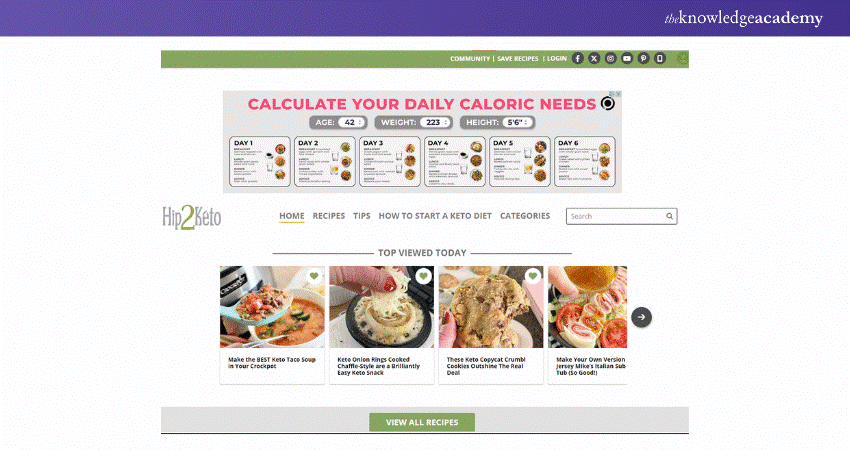
The landing page for Hip2Keto is an excellent example of a High-converting Landing Page in the health and wellness segment, specifically for ketogenic diet enthusiasts. This page effectively utilises a straightforward, visually appealing design that communicates its offering and the value it brings.
2) Airbnb
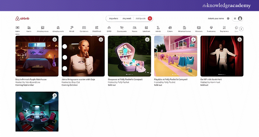
Airbnb’s landing page exemplifies a high-converting design tailored towards homeowners interested in renting out their properties. The page is meticulously crafted, blending aesthetic appeal with functional design and ensuring a seamless user experience (UX) from start to finish.
3) Superprof
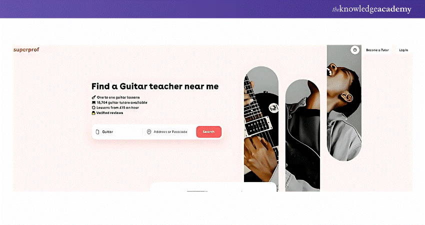
The Superprof landing page for guitar lessons exemplifies a High-converting Landing Page specifically tailored for those seeking private guitar tutors. This page clearly states the value proposition at the top, with a compelling headline spotlighting the accessibility of guitar teachers near the prospective student's location.
Confidently craft effective online marketing campaigns through our Digital Marketing Tools Training – Sign up now!
4. Curology (Beauty)
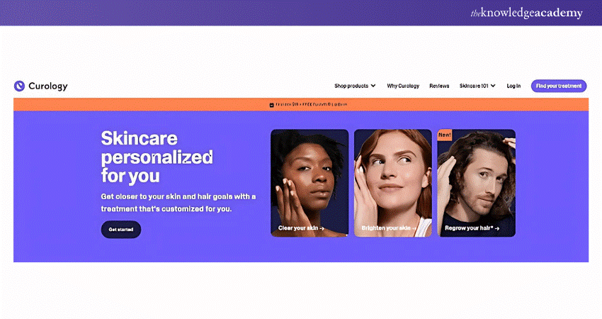
Curology’s landing page is clean, visually appealing, and to the point, including the copy, which is less than 50 characters long. Users immediately understand what the website offers and how it can benefit them. Even for first-time visitors, the message is clear, Curology provides personalised solutions for various skin concerns. This highlights the key differences in design and purpose when comparing a Landing Page vs Website, as landing pages focus on direct engagement and conversions.
5) ExpressVPN
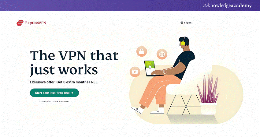
The ExpressVPN landing page's crucial element is the absence of a navigation bar. By removing it, ExpressVPN emphasises the primary CTA. Navigation bars usually distract visitors and lead them away from the intended action. Research has shown that removing navigation links from landing pages increases conversion rates. Additionally, ExpressVPN's landing page is a good example of design best practices.
6) Women of Silicon Roundabout
The landing page for Women of Silicon Roundabout is an exemplary high-converting event landing page designed for a technology-focused female audience. Event landing pages must be visually attractive and informative, and this page effectively leverages the principles of clear messaging, compelling design, and strategic user engagement to maximise conversions.
![]()
7) Mailchimp
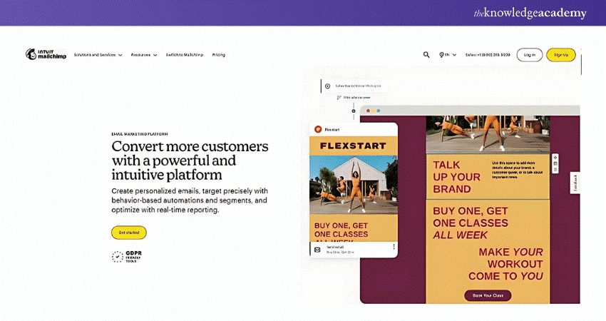
The two yellow calls to action (CTAs) on the Mailchimp landing page are impossible to ignore. It seems like a bold departure from its more subdued home page, yet it's still on brand. The CTA placement is admirable too, as it displays a consistent CTA (Such as 'Get started' or 'Book Your Class') serving as a gateway for converting clients. It must be available to visitors as they move down the page, not just once on the top fold.
8) Paramount Plus
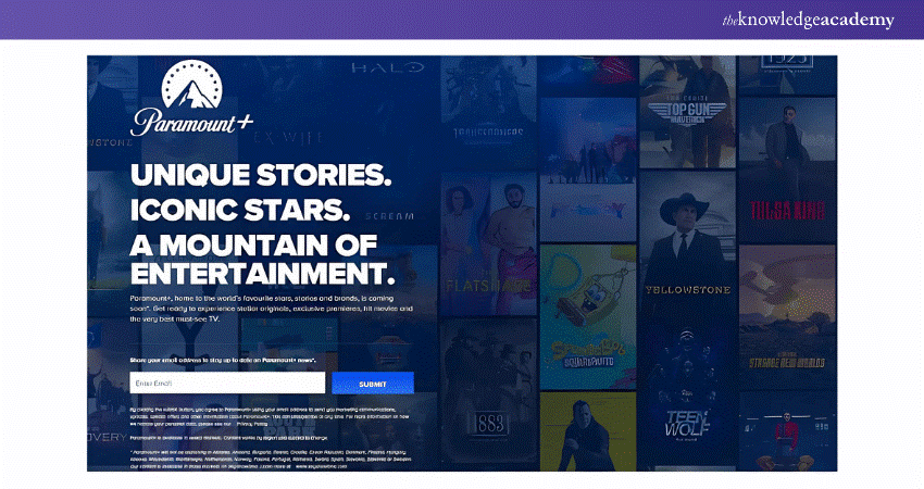
This landing page design is interactive, visually appealing, and offers scannable yet descriptive headers. Additionally, the background creates a captivating scrolling experience. The ‘Submit’ CTA, coupled with the background featuring diverse content, entices visitors to take action.
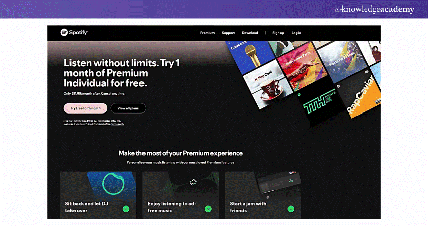
9) Spotify
This landing page deviates from Spotify‘s classic black and green colours, signalling to visitors that it serves a purpose different from its other content. The stark colour contrast emphasises the text and CTAs, and the different pricing plans for diverse audience segments entice visitors even more.
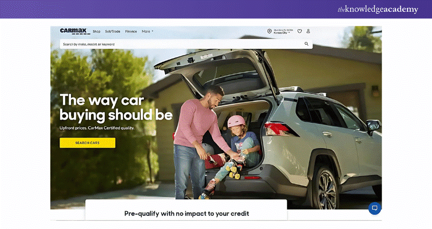
10) CarMax
CarMax empowers visitors to research right on the landing page. It features a search bar leading to an extensive car database and a calculator, enabling visitors to estimate their ideal monthly budget. Additionally, it includes a form for anyone looking to sell their car, which can be filled out to receive a quote. CarMax clearly wants the buying or selling experience to be as effortless as possible by translating the organisation’s customer-centric approach on its landing page.
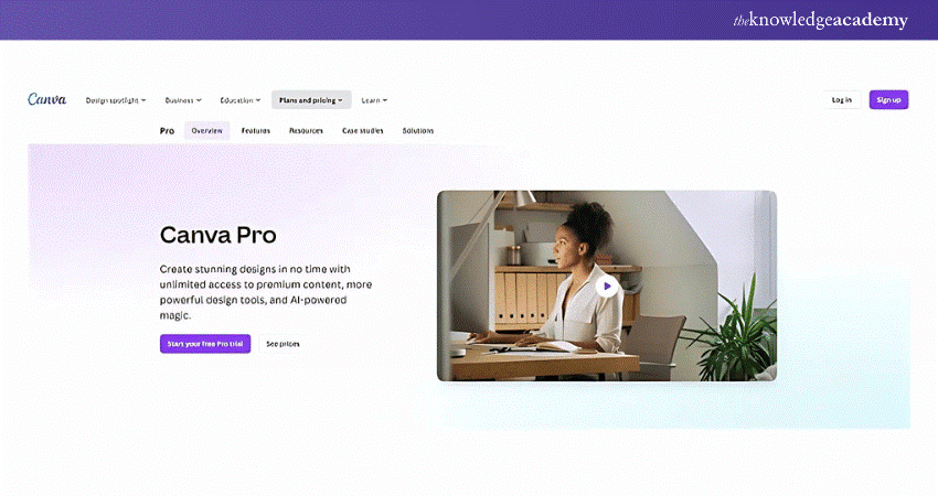
11) Canva
A landing page with an attractive and straightforward design can be very effective, as exemplified by the Canva landing page. This one features abundant white space that accentuates the text and balances the bright colours. The page wraps up with a FAQ section. It sends a message that the company is open to questions and enables potential customers to understand what they are trying to sell.
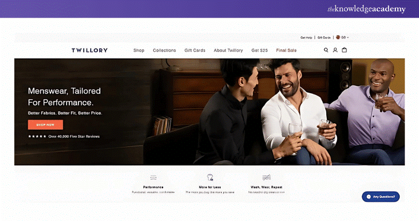
12) Twillory
On the desktop, the Twillory landing page includes an extensive collection of images, GIFs and customer reviews that increase visitor engagement and help drive conversions. On mobile, you get a stripped-down version that maintains the visual appeal of its desktop counterpart while ensuring lightning-fast load times on cellular connections.
Hone your website performance optimisation skills with our Google Search Console Training -Sign up now!
Seven High-converting Landing Page Best Practices
Before creating a landing page, you must understand your target audience and clarify the page's objective. To turn a landing page into a high converting digital marketing tool, consider incorporating the proven strategies detailed below that combine compelling messaging, effective design and user experience principles
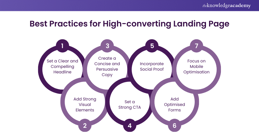
1) Set a Clear and Compelling Headline
The first practice for High-converting Landing Pages is setting a clear and compelling headline that instantly conveys the unique value proposition of an offer. After all, it’s the first thing a visitor sees, and the goal is to connect with their needs or problems and present the offer as a solution.
Additionally, the headline must align closely with the messages in ads or other promotional materials that direct visitors to the page. This consistency helps reinforce the visitor’s expectation and maintain clarity, smoothing the path toward taking the desired action (whether it’s signing up, purchasing, or downloading a resource).
2) Add Strong Visual Elements
Visual content is vital in making an initial impact, drawing in the viewer. Beyond being eye-catching, these visuals must be relevant and aligned with the page's overall goals. When choosing visuals, consider using high-quality graphics, images, or videos that spotlight the benefits of the product or service.
For example, if you’re promoting a physical product, HD images showing the product in use can help visitors visualise themselves benefiting from it. Short explainer videos or infographics can quickly communicate complex information for other services. Additionally, it's important to remember that colours can evoke emotions. Vibrant colours can imply urgency or excitement, while softer tones convey trust or comfort.
3) Create a Concise and Persuasive Copy
Creating concise and persuasive copy is the third best practice pertaining to High-converting Landing Pages. A concise copy goes with the assumption that online visitors generally have short attention spans. They prefer to scan content quickly rather than read through dense paragraphs.
To accommodate this, break down your content into digestible fragments using icons with short descriptions, bullet points, and short text blocks coupled with engaging visuals. Another critical component is persuasiveness. The copy must inform the visitor, evoke emotions in a few words, and create a sense of urgency, which can be achieved by focusing on the benefits rather than just the features of the product or services.
4) Set a Strong CTA
Another best practice for powerful landing pages involves setting a strong CTA. The CTA button's design must make it the most noticeable element on the page, which can be accomplished using contrasting colours. The CTA button's messaging must be action-oriented and must create a sense of urgency.
The placement of the CTA is also vital. It must be in a spot that naturally draws the visitor’s attention. Ideally, it should appear above the fold after some compelling visuals that prepare the visitor to take action.
5) Incorporate Social Proof
Incorporating social proof, such as customer reviews, video testimonials, or logos of well-known clients, is essential for High-converting Landing Pages. These elements can build credibility and trust, showing prospective customers that others like them had positive experiences.
Consider adding the experience section with figures such as the number of satisfied customers, years of experience, and the number of products sold. Along with these numbers, award badges or logos of partners and renowned brands can prove your brand's impact on the industry.
6) Add Optimised Forms
Optimised forms are critical in the conversion process, as they’re the point at which a visitor directly interacts with the page to become a lead. The forms should be kept as simple as possible. However, request only essential information to reduce friction and simplify the process.
The form must be easy to navigate and visually appealing, with each field clearly labelled with easy-to-understand instructions. You must implement real-time validation to send immediate feedback in case a user enters information incorrectly. Additionally, it's important to include links to your privacy policy, security badges, or statements about data protection.
7) Remember Mobile Optimisation
The final best practice for High-converting Landing Pages involves mobile optimisation. Given the ever-increasing reliance on mobile devices for internet access, the landing page must perform flawlessly on mobile. A mobile-optimised landing page enhances user experience and drives better conversion rates, as users are more likely to complete an action if the process is intuitive on their device.
This involves several techniques as listed below:
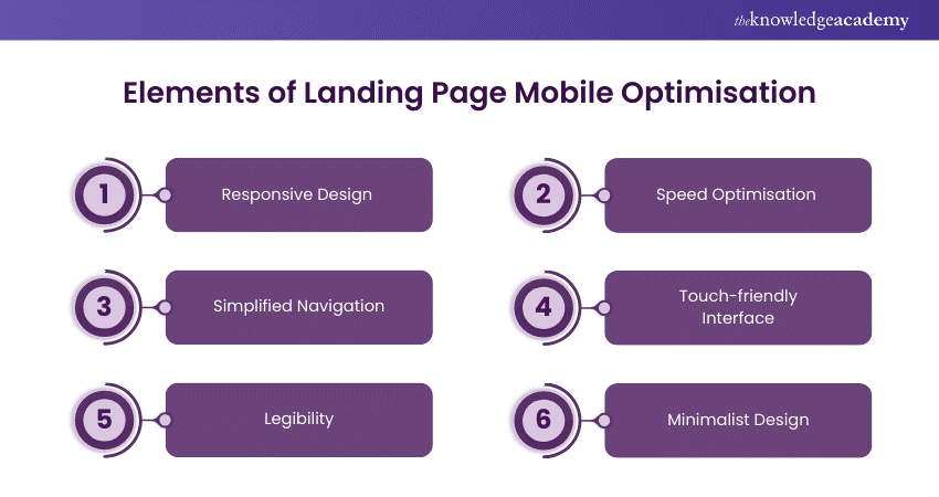
a) Responsive Design: This ensures the page automatically adjusts to fit any device's screen size and resolution, from desktops and tablets to smartphones.
b) Speed Optimisation: This can involve leveraging browser caching, compressing images, and minimising heavy scripts that can slow down the page load time.
c) Simplified Navigation: To save space, the navigation must include only essential items through dropdown menus or hamburger icons. This helps users focus on the
relevant content and not get overwhelmed with too many options.
d) Touch-friendly Interface: All links, buttons, and form fields must be easy to interact with a touch screen. This means making buttons big enough to be tapped with a finger without any risk of hitting the wrong target.
e) Legibility: Text size and spacing are especially important on mobile devices to ensure readability without zoom. The fonts must be easy to read on small screens.
f) Minimalist Design: A minimalist approach to design provides clarity to users, directing their attention to the most important parts of your landing page, such as the CTA.
Conclusion
In conclusion, the 10+ High-converting Landing Pages outlined in this blog prove that the combination of creativity, clarity and compelling design is key to transforming clicks into customers. By applying the insights from these examples and focusing on the best practices associated with exceptional landing pages, you can boost conversions and create a seamless user experience for your business.
Struggling to craft SEO-friendly content? Sign up for our comprehensive SEO Course and captivate your target audience!
Frequently Asked Questions
How do I Increase Conversions on My Landing Page?

You can increase conversions on your landing page by taking the following steps:
a) Optimising your Call-to-action (CTA)
b) Improving page load speed
c) Using social proof, especially video testimonials
d) Optimising the page for mobile devices
e) Ensuring clear navigation
f) A/B testing of headlines, images, CTAs, and layouts
What Website has the Highest Conversion Rate?

While there is no single definitive answer as to which website has the highest conversion rate, the food and beverage industry has the highest conversion rate.
What are the Other Resources and Offers Provided by The Knowledge Academy?

The Knowledge Academy takes global learning to new heights, offering over 3,000 online courses across 490+ locations in 190+ countries. This expansive reach ensures accessibility and convenience for learners worldwide.
Alongside our diverse Online Course Catalogue, encompassing 19 major categories, we go the extra mile by providing a plethora of free educational Online Resources like News updates, Blogs, videos, webinars, and interview questions. Tailoring learning experiences further, professionals can maximise value with customisable Course Bundles of TKA.
What is The Knowledge Pass, and How Does it Work?

The Knowledge Academy’s Knowledge Pass, a prepaid voucher, adds another layer of flexibility, allowing course bookings over a 12-month period. Join us on a journey where education knows no bounds.
What are the Related Courses and Blogs Provided by The Knowledge Academy?

The Knowledge Academy offers various Digital Marketing Courses, including the Landing Page Optimisation Course and the Digital Marketing Tools Course. These courses cater to different skill levels, providing comprehensive insights into How to Generate Leads.
Our Digital Marketing Blogs cover a range of topics related to marketing, offering valuable resources, best practices, and industry insights. Whether you are a beginner or looking to advance your Digital Marketing skills, The Knowledge Academy's diverse courses and informative blogs have got you covered.
Upcoming Digital Marketing Resources Batches & Dates
Date
 Landing Page Optimisation Training
Fri 4th Apr 2025
Fri 6th Jun 2025
Fri 26th Dec 2025


 Top Rated Course


 If you wish to make any changes to your course, please


