We may not have the course you’re looking for. If you enquire or give us a call on +34 932716793 and speak to our training experts, we may still be able to help with your training requirements.
Training Outcomes Within Your Budget!
We ensure quality, budget-alignment, and timely delivery by our expert instructors.

In this technically advanced era, many people, including receptionists, accountants, Data Engineers, and Human Resources experts, use Excel to do tasks effectively. Investment banks and Financial Analysts also prefer this software for various tasks, including data processing and financial modeling. If you are one among them, there will be times when you'll be required to analyse large amounts of data. You will also be producing easy-to-read and understandable reports. Pivot Chart in Excel will come in handy at these times. It enables us to analyse data and produce reports that meet business requirements.
Table of Contents
1) What is a Pivot Chart in Excel?
2) Steps to create a Pivot Chart in Excel
3) How to change Pivot Chart types in Excel?
4) Advantages of Pivot Chart
5) Limitations of Pivot Chart
6) Extra tips on Pivot Charts
7) Conclusion
What is a Pivot Chart in Excel?
Pivot Chart is a built-in programming tool that summarises your Pivot table data in an interactive dataset in an Excel spreadsheet. It is the visual depiction of a pivot table in Excel.
A Pivot Chart is a valuable tool, particularly when working with big volumes of data. For example, an XYZ corporation employs 200 people, and each candidate's working hours have been recorded in Excel by HR. They want to locate the employee who has taken the least amount of leave in the entire year. By doing this, they can honour them for sincerity and loyalty to the firm.
Manually going through the complete list would be time-consuming, and the findings may be erroneous. Here Microsoft Excel offers a built-in function called "Pivot Table" or "Pivot Chart" to help with similar jobs. Charts provide rapid visual restructuring and understanding of your data, easing the entire process.
Steps to create Pivot Chart in Excel
There are two ways to create a Pivot Chart. One is to add Chart to your existing table, and the other is creating a Chart from scratch.
Create a Pivot Chart from Scratch
Creating a Pivot Chart from scratch is as simple like creating a Pivot table. All you need is a data sheet.
Step 1: choose any cell in the data sheet and click on the Insert tab, then go to charts and select Pivot Chart
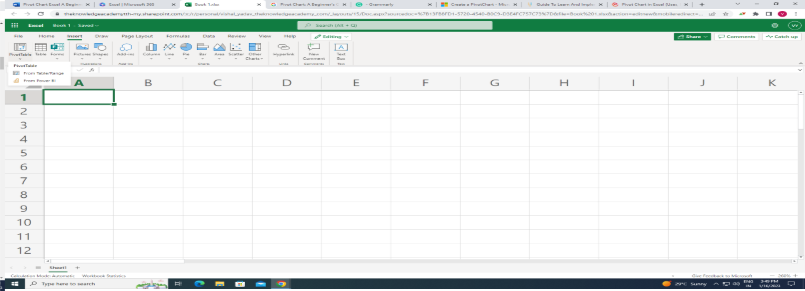
Step 2: The pop-up window automatically selects the entire data, and you have the option to choose the area where you want to insert the Pivot Chart

Step 3: Click OK. Now you have a blank Pivot Chart in a worksheet

In a Pivot Chart, we have four components:
a) Axis: The axis in the Pivot Chart is the same as the rows in the Pivot Table
b) Legend: The legend in the Pivot Chart is the same as the columns in the Pivot Table
c) Values: We are using quantity as values
d) Report filter: It is used to filter your Pivot Chart

Learn the fundamentals of Microsoft Excel VBA and Macro. Sign up for our Microsoft Excel VBA and Macro course now!
Create a Pivot Chart from the existing Pivot Table
If you already have a pivot table in your worksheet, follow these simple steps to insert a pivot chart.
Step 1: Select any cells from the Pivot Table

Step 2: Click on the Insert tab - Chart - Pivot Chart and click on the chart which you want to use
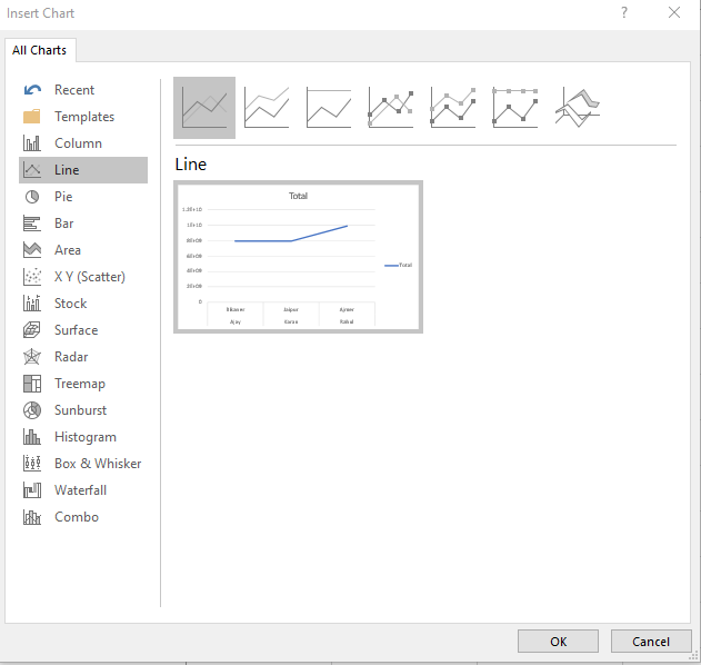
Step 3: Click OK
It will create a new Pivot Chart in the same worksheet. In addition, the Pivot Chart will use the rows of the pivot table as the axis and the columns as the legend.
Learn the fundamentals of Microsoft Excel. Sign up for our Microsoft Excel Training course now!
How to change Pivot Chart types in Excel?
You can use any of the Pivot Charts provided by Microsoft Excel to depict your Pivot Table data graphically. It helps to make data analysis more productive and aesthetically appealing. As a result, knowing how to build and filter a Pivot Chart is just as important as picking the right Pivot Chart for data presentation. You can alter the kind of Pivot Chart at any time.
Follow the given steps to change the Pivot Chart type in Excel:
Step 1: Select the previously created Pivot chart
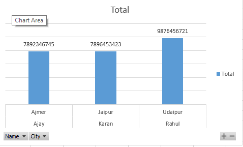
Step 2: Go to the Menu Bar - Design Tab - Type - Chart Type

Step 3: The following window will open. Select the chart type to represent your data more visually. Then, click on Ok

Step 4: Pivot Chart will be changed. MS Excel will immediately replace the existing Pivot Chart
Learn the fundamentals of Microsoft Excel. Sign up for our Microsoft Excel Masterclass course now!
Advantages of Pivot Chart
Here are some advantages of Pivot Charts:
1) The Pivot Chart helps to analyse a large amount of data sets and efficiently summarise the data using an aggregate function
2) Pivot Charts convert thousands of cell data into pictorial form.
3) It presents drops, highs, lows, and everything in a single graph
4) It helps the team or higher-level management to make reliable decisions faster in the organisation
Limitations of Pivot Chart
Here are some of the limitations of using Pivot Charts:
1) Pivot Chart Excel does not enable you to create reports based on checkbox field types.
2) When you introduce a new cell into a previous Pivot Table for which a Pivot Chart has already been produced, Excel automatically adds the new field to the last column. It is impossible to modify this sequence or to place the new field (column or row) in the middle of the others.
Extra Tips on Pivot Charts
Learn three useful tips for Pivot Chart to create an interactive Excel Dashboard by reading further.
Add expand/collapse button
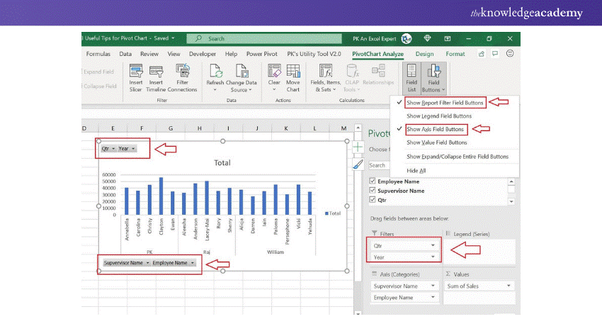
We can add an expand/collapse button on a Pivot chart to expand the Chart to the next level hierarchy. For instance, we can show the Agent and Supervisor wise chart or Year and Quarter-wise chart.

1) Choose the Pivot Chart and go to the PivotChart Analyze.
2) Go to the Fields Buttons.
3) Check the Expand/Collapse Entire Field Buttons
Add filter buttons
Filter buttons are useful for filtering the data on the Chart. These buttons are available on the Chart.
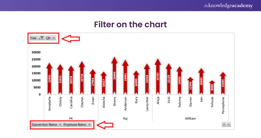
1) In the Pivot Charts Fields, there are option to add the Filters box
2) Check the Show Report Field Buttons in the Field Buttons

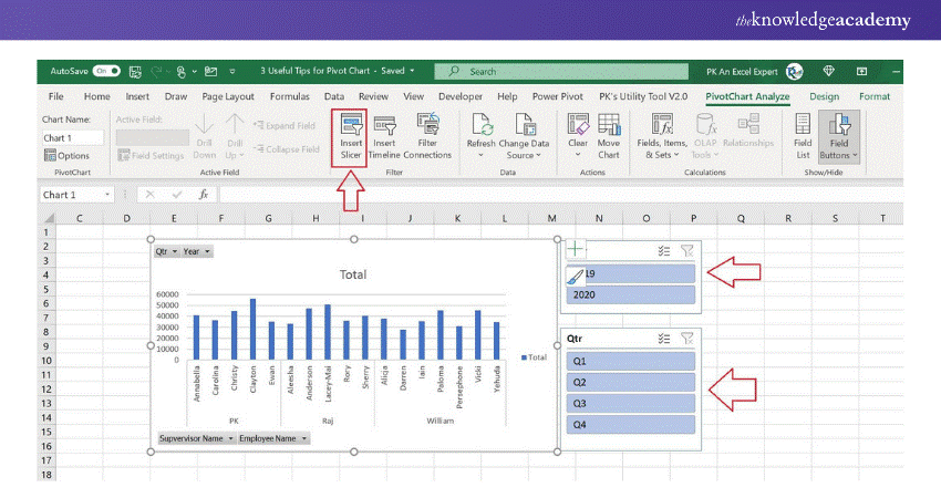
Connect with the Slicer
1) Go to the PivotChart Analyse after selecting the Pivot Chart
2) Click on Insert Slicers
3) Choose the Field name in the Insert Slicers window.
Learn to create and prepare Gantt charts by registering for our Excel Training With Gantt Charts course!
Conclusion
In this blog, we have learned about Pivot Chart in Excel. It is a graphical depiction of a pivot table or a data source. It allows us to display the summary data in a graphical way using several chart types.
There are several possibilities for filtering, formatting, customising charts, and adding alternative layouts. When working with a large quantity of data, an Excel Pivot Chart comes in handy. It's quite beneficial during a business presentation, with one-click filtering, time-based filtering, customisable computations, etc.
Enhance your professional skills with our Microsoft Excel Training & Certification Course – register today!
Frequently Asked Questions

Users can drill down into specific data points or categories in a Pivot Chart by double-clicking on the element they wish to explore further. This action breaks down the selected category into more detailed parts, allowing for deeper analysis.

Pivot Charts in Excel are specifically designed to handle and analyse large datasets more efficiently than traditional charts. They provide dynamic data aggregation and can quickly update to reflect changes, making them better suited for managing and visualising large amounts of data.

The Knowledge Academy takes global learning to new heights, offering over 30,000 online courses across 490+ locations in 220 countries. This expansive reach ensures accessibility and convenience for learners worldwide.
Alongside our diverse Online Course Catalogue, encompassing 17 major categories, we go the extra mile by providing a plethora of free educational Online Resources like News updates, Blogs, videos, webinars, and interview questions. Tailoring learning experiences further, professionals can maximise value with customisable Course Bundles of TKA.

The Knowledge Academy’s Knowledge Pass, a prepaid voucher, adds another layer of flexibility, allowing course bookings over a 12-month period. Join us on a journey where education knows no bounds.

The Knowledge Academy offers various Microsoft Excel Training & Certification Course, including Microsoft Excel Masterclass, Excel for Accountants Masterclass, and Business Analytics With Excel Masterclass. These courses cater to different skill levels, providing comprehensive insights into Excel methodologies.
Our Office Applications Blogs cover a range of topics related to Microsoft Excel, offering valuable resources, best practices, and industry insights. Whether you are a beginner or looking to advance your Excel skills, The Knowledge Academy's diverse courses and informative blogs have you covered.
Upcoming Office Applications Resources Batches & Dates
Date
 Microsoft Excel Course
Mon 13th Jan 2025
Mon 10th Mar 2025
Mon 7th Apr 2025
Mon 9th Jun 2025
Mon 8th Sep 2025
Mon 1st Dec 2025


 Top Rated Course


 If you wish to make any changes to your course, please


