We may not have the course you’re looking for. If you enquire or give us a call on +34 932716793 and speak to our training experts, we may still be able to help with your training requirements.
We ensure quality, budget-alignment, and timely delivery by our expert instructors.

Data is arguably the most important resource for any modern-day organisation. Organisations can use data to their advantage by analysing and contextualising it to gain better insights into the company’s operation. Companies often use data visualisation tools such as Tableau Heatmap to enhance Business Intelligence.
As per EnLyft, Tableau has a market share of 16.23% in the Business Intelligence category – as more than 45,000 companies are using this data analysis tool. This shows us the growing prevalence of Tableau and why aspiring Tableau Developers need to know the different types of visualisations it offers. In this blog, you will learn everything about the Tableau Heat Map, its advantages, limitations, importance and how to create one. Read below to learn more!
Table of Contents
1) What is a Tableau Heat Map?
2) Why you should use Heat Maps?
3) What are the advantages of using a Tableau Heat Map?
4) Tableau Heat Map and its importance
5) How to create a Tableau Heat Map?
6) Limitations of Tableau Heat Map
7) Conclusion
What is a Tableau Heat Map?
Heat Maps are visualisations where marks on a chart are represented as colours. A Heat Map depicts values for a main variable of interest across two axis variables as a grid of coloured squares. The axis variables are divided into different ranges like a bar chart or a histogram, and each cell’s colour depicts the value of the main variable in the corresponding cell range.
A Heat Map, also known as Density Heat Map, is used to analyse the areas in a plot where the data points are dense or scattered. These Heat Maps are generally used where there is a huge set of data with overlapping data values.
As the data “heats up” due to their higher value or density of records, a more intense colour is displayed to represent it. These colours can be displayed in a matrix/crosstab, which creates a highlight table. Additionally, it can also be shown on a geographical map or even a customised image – for example, a webpage used to show where users are clicking.
You can use a Heat Map to visualise patterns or trends in dense data with many overlapping marks. Tableau achieves this purpose by grouping the overlapping marks and colour-coding them based on the number of marks in the group.

Why you should use Heat Maps?
Discussed below are some of the reasons why you should use Heat Maps to represent your data.
a) Visual clarity: Heat Maps use colours to show the concentration of data. This makes it easy to see areas with large volume of data or a little volume of data. It helps you find patterns and outliers in your data easily.
b) Efficiency: Heat Maps presents a large amount of information in an easy-to-understand format by bringing together large data points in a single view. This eases the process of understanding data sets and helps to make informed decisions based on your findings.
c) Versatility: Heat Maps can work with different kinds of data, such as categorical data or geographical data. This makes them versatile and compact for various industries and situations.
Learn step-by-step how to create a stunning donut chart in Tableau with this detailed guide!
What are the advantages of using a Tableau Heat Map?
There are quite a few advantages of using Tableau Heat Maps. They can be understood and worked with by anyone and everyone, even professionals who do not possess heavy technical knowledge. Yet, comprehensibility is not where the benefits of a Heat Map end. Some of the reasons why you should use a Heat Map for data analysis are listed below:
1) Heat Maps provide a comprehensive view of your website’s performance, alerting the appropriate parties about any issue straight away.
2) It conveys the necessary information and insights much quicker than pages of data. Thus, it quickly lets you root out the problem and invent a solution.
3) Heat Maps offer a better middle ground between publishers and advertisers or any other party concerned with conveying the information more conveniently than with bland and confusing numbers.
4) Heat Maps are a key tool in measuring growth. Thus, it helps companies get better with lead conversions, increasing engagement and so on.
5) One can get firsthand information from their already available users on how to do better than taking advice from a professional.
6) Heat Maps are a great way to get real feedback on what captures your audience’s attention and what frustrates your audience about your website.
Get ready for analytical and strategic roles with our Business Intelligence Reporting Course!
Tableau Heat Map and its Importance
Tableau Heat Maps are a type of data visualisation tools. They use coloured points on a chart to show the movement on a webpage. When there are more users in a particular spot, the Heatmap increase its density. This helps you track your web pages and understand what your users like or don't like with just a few clicks.
Heat Maps are useful when you have a lot of data with overlapping values. Using Heatmaps to analyse this data helps you find areas with more activity. It also helps you discover important trends in the data.
Another importance is that it offers flexibility as it is highly customisable. You can choose the colours and the size of the density data easily. This customisation can make your visualisations more valuable, depending on the kind of analysis you want to perform.
Here are Tableau Interview Questions and Answers You Should Go Through Before your Interview.
How to create a Tableau Heat Map?
This section of the blog will instruct you on how to create a Tableau Heat Map. But before we delve deeper into the step-by-step process, you need to make sure you take care of the points and requirements stated as follows:
1) Columns: At least one continuous measure
2) Rows: At least one measure or dimension
3) Mark type: Density
4) Marks card: At least one dimension
In Tableau, you can generate a chart using the density mark by placing at least one continuous measure on the columns shelf and at least one dimension or measure on the Rows shelf, then adding a field to the Marks card.
Master the different types of joins in Tableau and learn how to blend your data like a pro!
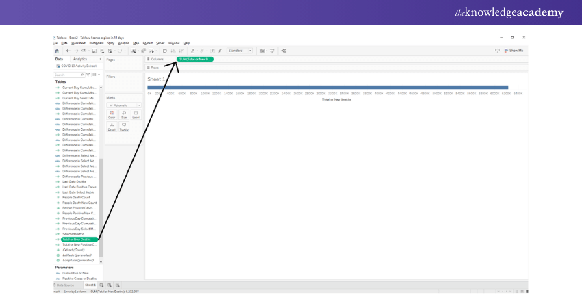
Add Measure Profit
To begin with, we add Measure Profit to the columns section.

We select the aggregation type as AVG, meaning an average of the field values. We will also make sure that our measure is Continuous type.

Prepare Like a Pro! Master These Essential Tableau Interview Questions.
Add Measure to rows section
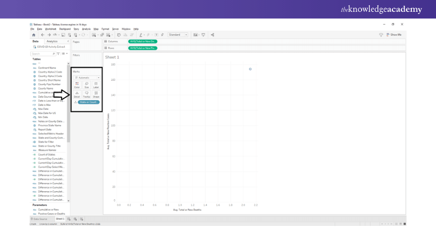
Next, we must add one more measure of field sales to the rows section and select the average of the field values. You can choose the aggregation type as per your liking and analytical requirements. As you can see in the image below, an empty plot with two axes appears for you to fill in the values on the canvas.

Add dimension field
In the next step of the process, we put a dimension field, State into Detail card present in the Marks section. Doing this will add a group circle representing different states on the plot showing each state's average sales and profit.

Select Density Mark
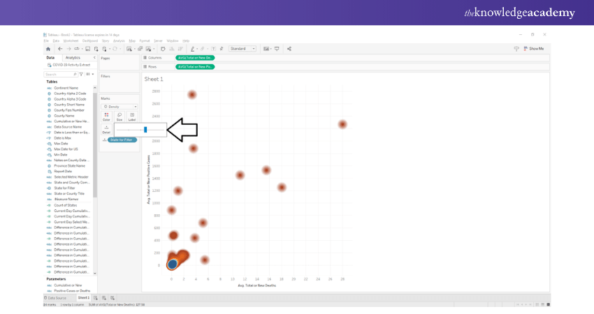
Next, we will convert this plot into a Density Heat Map by selecting the shape as “Density.” Doing this will change the shape of the data points from circles to density spots, which essentially means that the colour scheme of the data points will follow a density gradient.
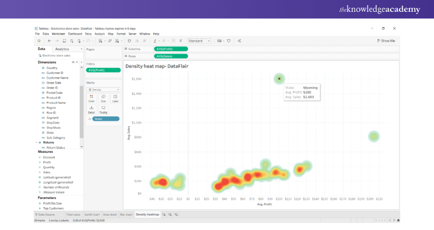
The regions with the most data points or dense regions will be in red/orange, whereas those with lesser or scattered data points will appear in a greenish-blue shade. You can then select colour schemes of your choice for Heat Maps.

Discover the key differences between Google Data Studio and Tableau to choose the best tool for your needs!
Set Intensity and Opacity
In order to select a colour scheme of your choice, right-click on the “Colour” card to explore the options. From here on, we can also set the intensity, opacity and other border effects for our Tableau Heat Map.

We can select the colour scheme of our choice from a long list of available options.

Set the Size of the Tableau Heat Map
We can also increase or decrease the size of the density spots.

Create Final Tableau Heat Map
In this way, we can create a Heat Map or Density Heat Map of our choice in Tableau. In order to see more details of the data points in the map, you will need to hover your cursor on the density points. We can now see all the relevant details on the text label.

Limitations of Tableau Heat Map
So far, we have discussed why Tableau Heat Maps are useful and how to make them. It is also important to be aware of the drawbacks of Heatmap.
When you use spatial smoothing in Heat Maps, it can create confusing patterns. These Heat Maps can show data in places where there's actually no data. Hence, new users have to be careful when adding smoothing to the Tableau Heat Maps.
Heat Maps are not the best choice when you need to work with precise patterns. For example, you can’t use Heat Map to figure out collision densities on road networks. In this case, the Heat Map might show a bump that isn't really there and give you incorrect information.
Heat Maps don't work effectively on most of the modern dynamic web pages. This is because of the irregularities and aggregation of Heat Maps for such pages. They're best suited for static pages to get a reliable overall view.
Learn the latest concepts and upskill with Microsoft BI Training, Now!
Conclusion
All in all, a Tableau Heat Map is one of the most popular visualisations currently used by developers in the market right now. It is an accurate representation that is easy to create and offers plenty of comprehension to the viewer and advantages to the organisation making use of it. Hope this blog helped you gain all the insights you needed on Tableau Heat Maps!
Transform data into actionable insights by registering for our Tableau Desktop Training course!
Frequently Asked Questions
Upcoming Office Applications Resources Batches & Dates
Date
 Tableau Desktop Training
Fri 28th Mar 2025
Fri 23rd May 2025
Fri 25th Jul 2025
Fri 26th Sep 2025
Fri 28th Nov 2025


 Top Rated Course


 If you wish to make any changes to your course, please


