We may not have the course you’re looking for. If you enquire or give us a call on 0800 446148 and speak to our training experts, we may still be able to help with your training requirements.
We ensure quality, budget-alignment, and timely delivery by our expert instructors.

Feeling overwhelmed by the intricate details of your project’s financial progress? Want to dazzle your audience at your next presentation? Look no further—Excel’s Waterfall chart is your secret weapon! This powerful tool vividly illustrates cumulative changes across various categories, making complex data easy to understand.
Whether you’re tracking budgets, analysing profits, or managing projects, a Waterfall chart brings clarity to your numbers. Dive into this blog to learn How to Create a Waterfall Chart in Excel and let your data flow effortlessly!
Table of Contents
1) What is Waterfall Chart in Excel?
2) When are Excel Waterfall Charts Used?
3) How to Create Waterfall Chart in Excel?
a) Step 1: Rearrange the Data Table
b) Step 2. Insert Formulas
c) Step 3. Create a Standard Waterfall Chart
4) Major Features of Excel Waterfall Charts
5) Conclusion
What is Waterfall Chart in Excel?
A Waterfall Chart, also known as Cascade Chart, Bridge Chart, Waterfall Graph, or Flying Bricks Chart, is a column graph that plots the increasing result of data points as a graphical running total when we add or remove data values.
It helps users analyse how the ongoing positive and negative changes affect the initial value of a data series. The start and end values are displayed as columns in a Waterfall Chart, and the specific negative and positive changes are indicated as floating steps.
When are Excel Waterfall Charts used?
The use of Waterfall Charts in excel is widespread in financial and business sectors. They are excellent for visualising the positive and negative changes within a measurable quantity orKey Performance Indicators (KPIs), such as your Monthly Net Profit or Cash Flow. You can use Waterfall Charts for several purposes, like visualising financial data to even census data. Let's see what the other scenarios are where Waterfall Charts in excel are used:
1) To evaluate company’s profit and loss
2) To compare sales earnings
3) To highlight budget changes in a project
4) To create executive dashboards
5) To track consulting jobs
6) To show the product value over a period of time
7) To keep track of retail inventory
8) To analyse inventory over a period of time
9) To document contracts
10) To show how operating costs have changed over a period of time
Waterfall Charts are used by:
1) Sales organisations and groups
2) IT experts and developers
3) Retailers and online businesses
4) Legal professionals and departments
5) Construction firms
6) Teachers and test-scoring companies
Leverage the power of Excel to tackle your Accounting challenges - Sign up for our Excel for Accounting Course now!
How to create Waterfall Chart in Excel?
Even though Excel is primarily a spreadsheet editor, it allows users to create simple and effective Waterfall Charts easily. However, it’s important to note that the modern, straightforward creation of Waterfall Charts is possible only with Excel 2016 and subsequent versions. Here we will see how you can create Waterfall Charts for your data.
Here we will take the example of the sales data of an imaginary company. We will insert random data with positive and negative values.
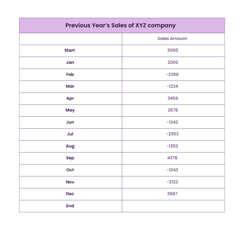
Here we are analysing the sales flow of the company XYZ over the period of 12 months. Next, you have to rearrange your data for visualising in Waterfall Chart in excel. Here the end row is added to calculate the change between starting point and at the end of the year in sales.
Step 1: Rearrange the Data Tables
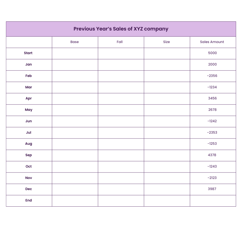
Here you have to add three more columns, namely- Base, Fall and Rise. The base column is the amount used as the starting point for calculating the Fall and Rise in the Waterfall Chart in excel. Here are stating amount is 5000. All the negative sales amounts in the above table will be put in the Fall column. The positive amounts will go in the Rise column.
Sign up and learn the top 10 Excel shortcuts with our Microsoft Excel Course!
Step 2: Insert Formulas
We will start by selecting the C3 column in the Fall section and entering the formula:
=IF(E3<=0, -E3,0). Change the formula based on the row and column address of your sheet.
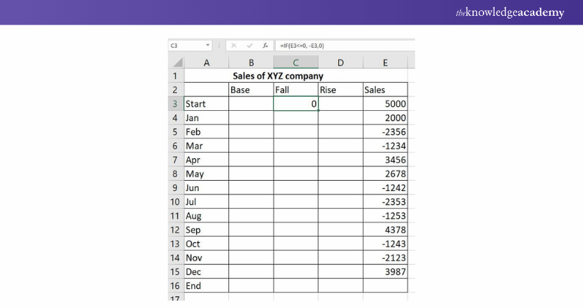
According to this formula - =IF(E3<=0, -E3,0), if the E3 value is less or equal to zero, then the negative number will be displayed as positive and the positive number will be displayed as zero. You need to understand that if you need all the values above zero in your Waterfall Chart, then you need to put minus sign (-) before the cell address in the formula. This will make two minuses a plus.
Next, you can use the fill handle to fill the Fall column by copying the same formula till the last month in the Fall column.
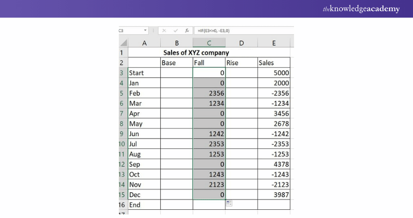
Now, let's move on to the Rise section. Here you will insert the formula - =IF(E3>0, E3,0). If the E3 value is greater than zero, then this formula will display all the positive numbers as positive and negative numbers as zero.
Again, use the fill handle to complete the Rise column.
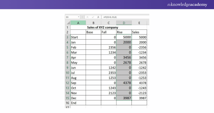
At last, there is one more formula - =B3+D3-C4 and use the fill handle to fill the entire Base column till the end row.
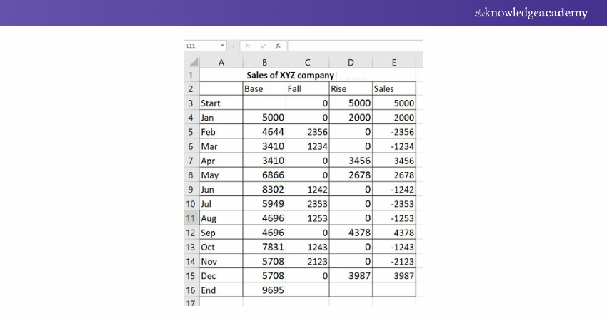
The base value tells the addition to the business in the particular month and by the end of the year by computing the rise and fall together.
Step 3: Create a Standard Waterfall Chart
Moving on to finally get all of the stats on the Waterfall Chart in excel.
First – Select the complete data table excluding the sales column. Then go to the insert tab and choose the stacked column.
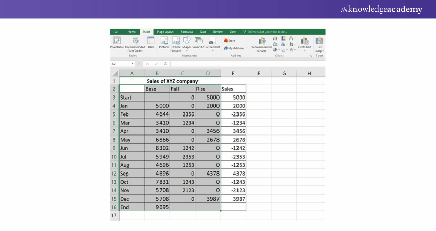
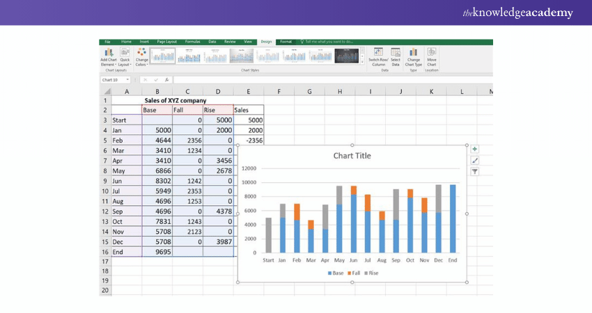
Second – Remove the base point from the table.
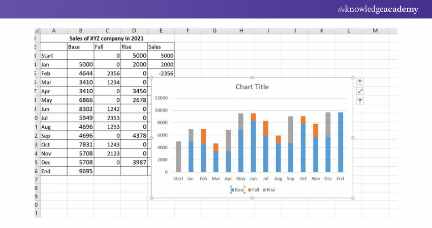
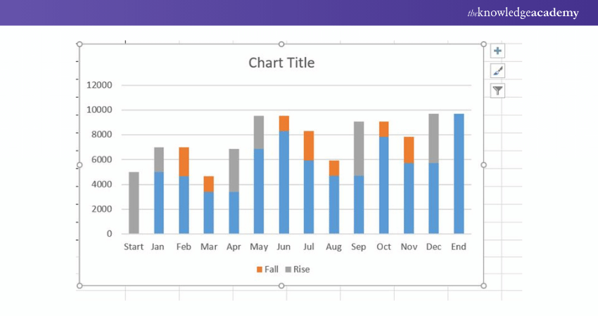
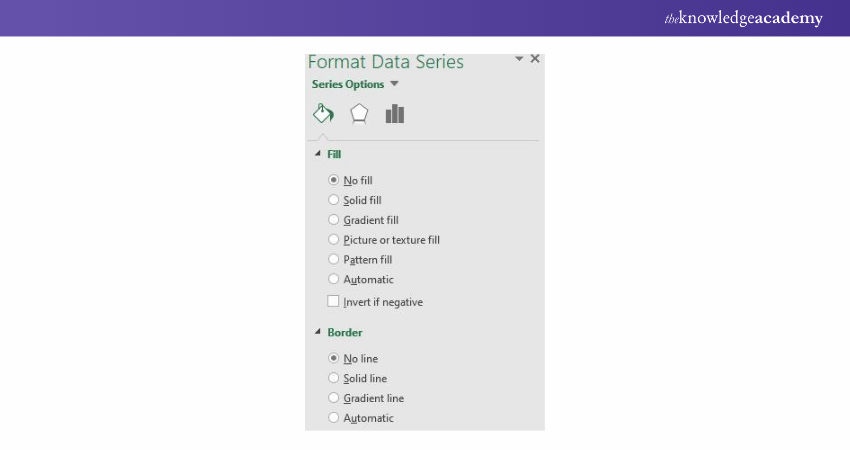
Third – Next remove all the base portions in blue from the waterfall charts. To do this, you have to select all the blue portion in the waterfall chart and remove it by selecting No Fill and NO line at the right option from the paint-like icon.
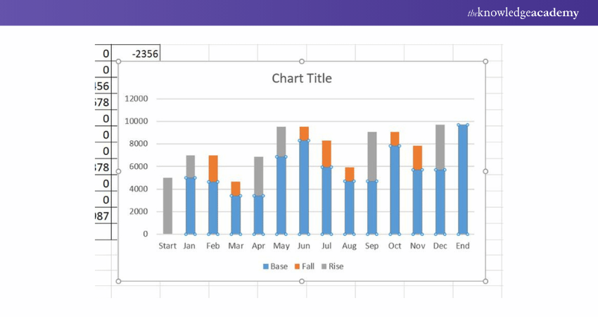
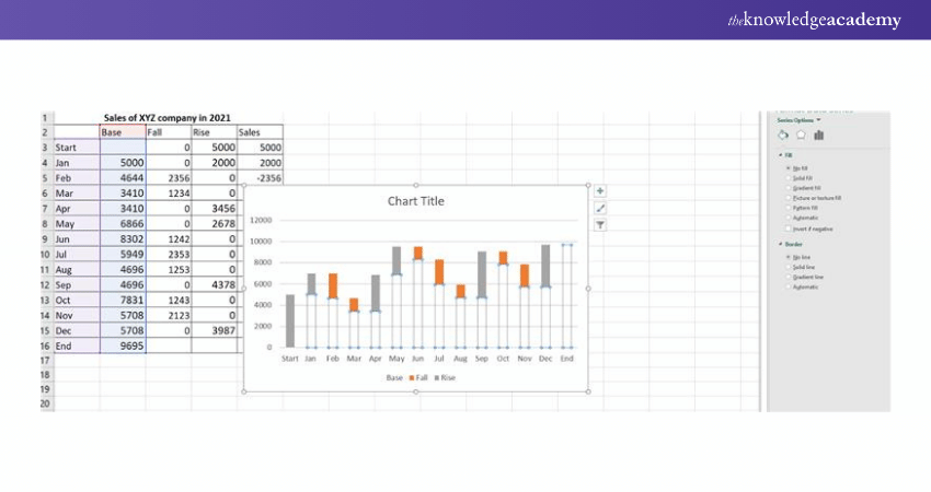
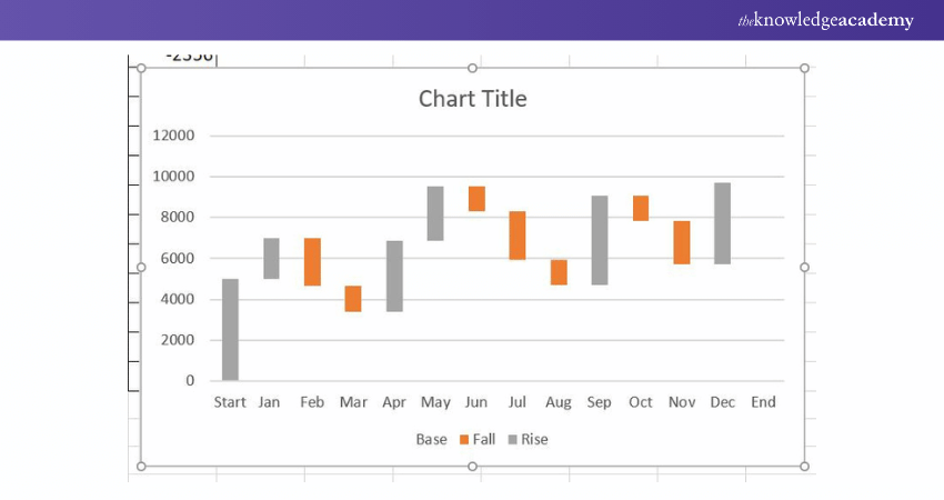
Now, this is how your table should look after removing the base portion.
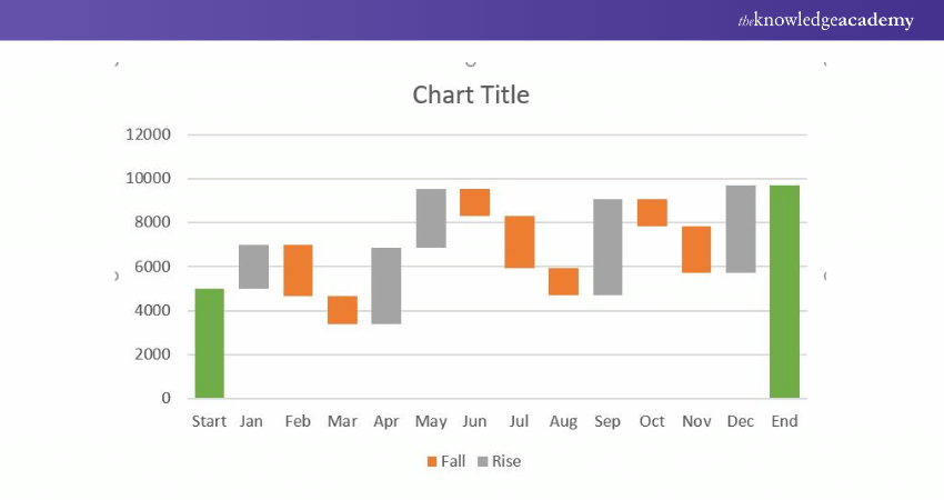
Fourth – Select the End and start potion and change the colours to differentiate from the start to the end point t in the waterfall charts. You can do this by clicking on them, right click and fill different colours.
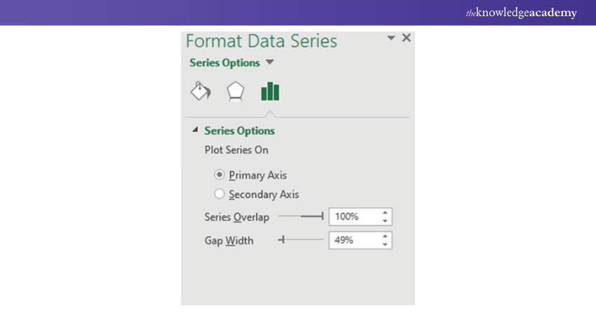
Fifth – The last step is if you want to increase the width of the bars in your waterfall charts. Just click on these bars and at the right side of the page, you will have a stack icon – click on this. You will get the option the increase the gap width and you can choose the width size based on your requirements.
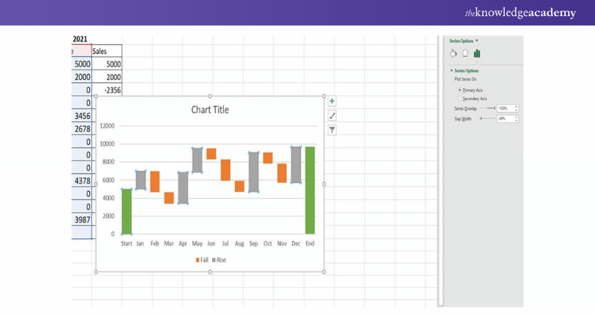
This is how your final waterfall chart in excel should look like:

Additionally, you can change colours, and width or even insert numbers and format all the bars in the waterfall charts based on your preference. You can also save your favourite Waterfall chart in Excel template for future use.
Build your career as a Data Analyst, and learn to prepare tables. Charts, sheets and reports with our Data Analysis Training Using MS Excel!
Major features of Excel Waterfall Charts
Depending on the kind of data you select to present, each Waterfall Chart will have a somewhat distinctive appearance. However, the following features are likely to be present in your final Waterfall charts:
Floating column: The floating columns (also known as plot or plotted values) show the positive and negative changes made to the original value in order to immediately provide a visual into the state of a value over time.
Crossover: There are various situations when the values will move across the x-axis, depending on the data you're charting on your Waterfall Charts. The Waterfall Charts should automatically change to reflect movement across the axis; therefore, this is a significant feature.
Connector lines: The connections between the floating columns are depicted by the connector lines, commonly referred to as the datum. Connector lines can be advantageous to enhance the overall appearance of your Waterfall Charts, even though they may not be required for all Waterfall Charts in Excel.
Spacer: The columns in a waterfall chart must be offset because they don't all start at zero. The spacer or padding is the term for this section.
Colour Coding: You can colour code the columns based on your preference in Waterfall Charts. You can immediately distinguish between positive and negative numbers and give a quick visual of the movement over time by giving particular colours to the various column types.
Explore more on Microsoft Excel VBA and Macro; register for our Microsoft Excel VBA And Macro Training course now! Sales of XYZ company in 2021
Conclusion
In conclusion, learning How to Create Waterfall Chart in Excel is essential for business owners and project managers as it transforms data into a compelling visual journey. As outlined in this blog, be it tracking project progress, costs or profits, this tool helps make sense of complex numbers and data.
Want to learn how to create advanced formulas and macros in MS Excel? Sign up for Microsoft Excel Courses!
Frequently Asked Questions
Why is the Waterfall Chart not Showing up in Excel?

The following reasons could be why the Waterfall Chart isn’t showing up in Excel:
a) Using a version of Excel that doesn't support Waterfall Charts, like the ones before Excel 2016.
b) Poorly formatted data structure
c) Missing totals
How do You Add Error Bars to a Waterfall Chart in Excel?

The following steps will help you add error bars:
a) Click anywhere in the chart.
b) Click on the 'Chart Elements' button beside the chart and check the 'Error Bars' box.
c) If you want to change the error amount, click the arrow next to 'Error Bar and then select an option.
What are the Other Resources and Offers Provided by The Knowledge Academy?

The Knowledge Academy takes global learning to new heights, offering over 3,000 online courses across 490+ locations in 190+ countries. This expansive reach ensures accessibility and convenience for learners worldwide.
Alongside our diverse Online Course Catalogue, encompassing 19 major categories, we go the extra mile by providing a plethora of free educational Online Resources like News updates, Blogs, videos, webinars, and interview questions. Tailoring learning experiences further, professionals can maximise value with customisable Course Bundles of TKA.
What is The Knowledge Pass, and How Does it Work?

The Knowledge Academy’s Knowledge Pass, a prepaid voucher, adds another layer of flexibility, allowing course bookings over a 12-month period. Join us on a journey where education knows no bounds.
What are the Related Courses and Blogs Provided by The Knowledge Academy?

The Knowledge Academy offers various Microsoft Excel Courses, including the Excel for Accounting Course and the Excel Training with Gantt Charts Course. These courses cater to different skill levels, providing comprehensive insights into Data Validation in Excel.
Our Office Applications Blogs cover a range of topics related to Microsoft Excel, offering valuable resources, best practices, and industry insights. Whether you are a beginner or looking to advance your Excel skills, The Knowledge Academy's diverse courses and informative blogs have got you covered.
Upcoming Office Applications Resources Batches & Dates
Date
 Microsoft Excel Course
Fri 4th Apr 2025
Fri 16th May 2025
Fri 11th Jul 2025
Fri 19th Sep 2025
Fri 21st Nov 2025


 Top Rated Course


 If you wish to make any changes to your course, please


