We may not have the course you’re looking for. If you enquire or give us a call on +08000201623 and speak to our training experts, we may still be able to help with your training requirements.
We ensure quality, budget-alignment, and timely delivery by our expert instructors.
Turn your data into interactive visuals with Donut Charts in Tableau! These charts provide quick, clear insights while engaging your audience. In this blog, we'll show you how to create dynamic Donut Charts using Tableau, a top data visualisation tool. Ready to make your data come alive? Let's dive in!
Donut Charts, a variation of pie charts, are especially useful when you want to display categorical data along with the corresponding percentages in a circular format. They provide a clear comparison between different categories while also showing the proportion of each category relative to the whole.
Whether you're visualising sales data, survey responses, or any other categorical data set, mastering Donut Charts in Tableau will elevate your data storytelling abilities and help you communicate insights effectively. Let's dive in and unleash the full potential of Donut Charts in Tableau!
Table of Contents
1) What is a Donut Chart in Tableau?
2) Creating Donut Charts in Tableau
3) Best practices for Donut Charts
4) What are the benefits of using Donut Charts in Tableau?
5) What are the differences between Donut Chart and Pie Chart?
6) Conclusion
7) FAQ
What is a Donut Chart in Tableau?
Donut Charts, also known as Donut Charts, are a type of circular visualisation in Tableau that feature a central hole surrounded by coloured segments. Some examples include Pie Charts, which represent data proportions. However, their unique structure adds an extra layer of visual appeal. A Donut Chart's central hole creates a more pronounced focus on the data, allowing for easier comparison of parts to the whole.
The segments surrounding the hole represent different categories or groups in Tableau, with the size of each segment representing the proportion it holds within the total dataset. This visual representation helps viewers grasp the distribution and relative significance of the data categories. Donut Charts are particularly effective in Tableau when you want to emphasise comparing parts to a whole or showcase the breakdown of data by categories.

Creating Donut Charts in Tableau
Following the steps give below can help you Visualise Data and create Donut Chart in Tableau. So, let’s get started:
Step 1: Creating two aggregate measure fields
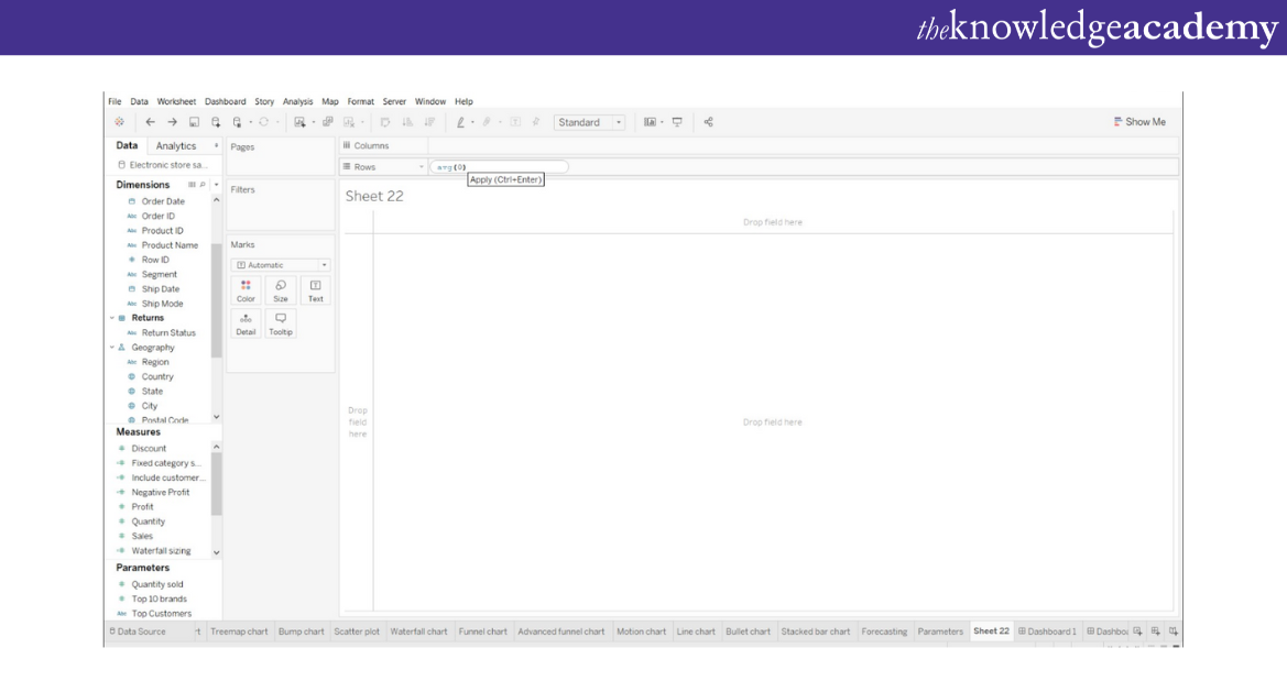
In Tableau Donut Chart, first start by creating two aggregate measure fields which are in the “Rows” section. Then double-click and write avg(0). Finally, click the “Enter” button.
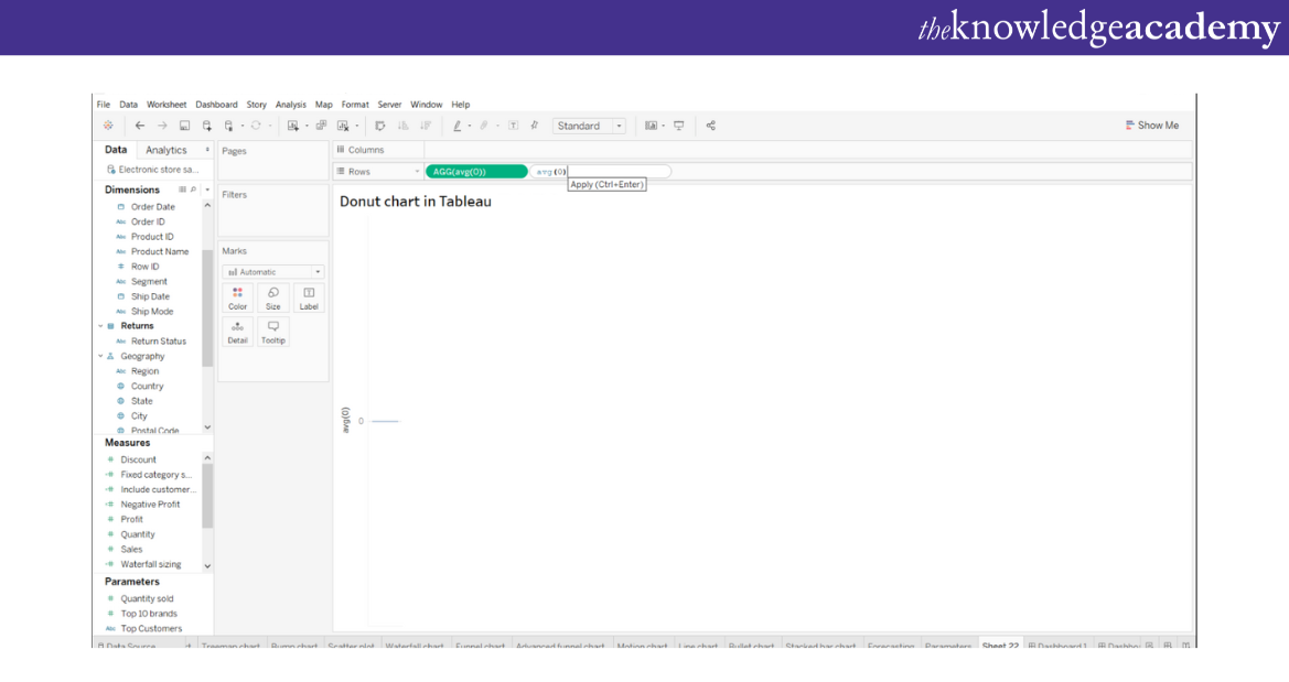
Then enter another similar aggregate measure like the following image:
Step 2: Selecting mark type for measures
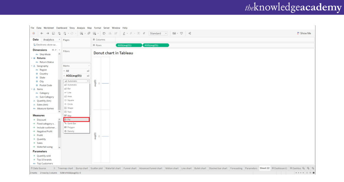
After you have entered an aggregate measure in Tableau Donut Chart, select the mark type for the first measure as “Pie”. You can find it in the “Marks” list.
Step 3: Adding set of fields to get the Pie Chart
In this step, customisethe Pie Chart. Add a set of fields in “Colour”, “Angle”, and “Label” cards which are available in the “Marks” section. Now,add these fields in the first AGG (avg(0)) field column. You can understand this from the image given below:
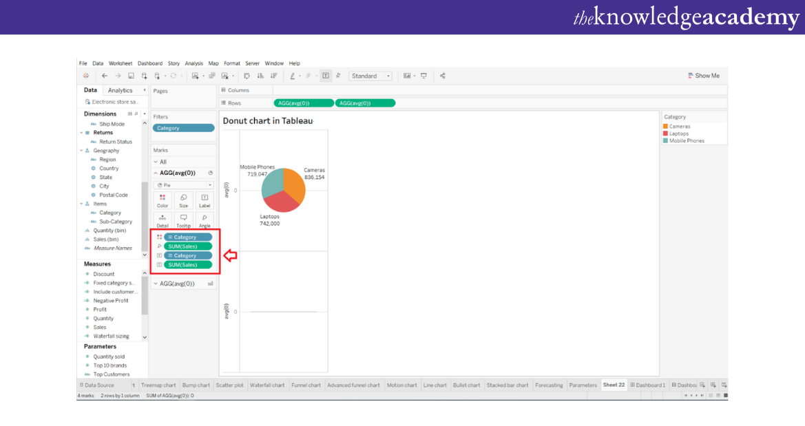
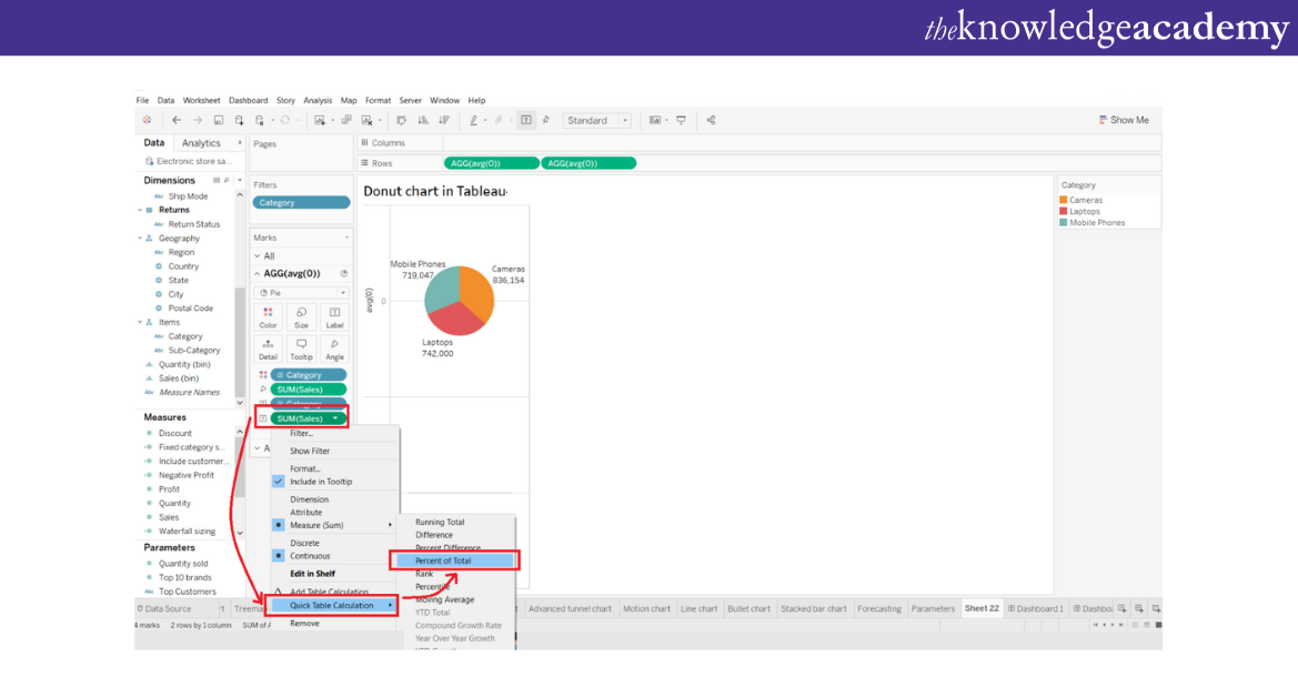
If you want to make a SUM of the sales (as provided in the example),right click on the SUM option. Then, select the “Quick Table Calculation” option and then you can select “Percent of Total”. The following image will help you to understand the process better:
Master the different types of joins in Tableau and learn how to blend your data like a pro!
Step 4: Selecting ”Circle” from the drop-down list
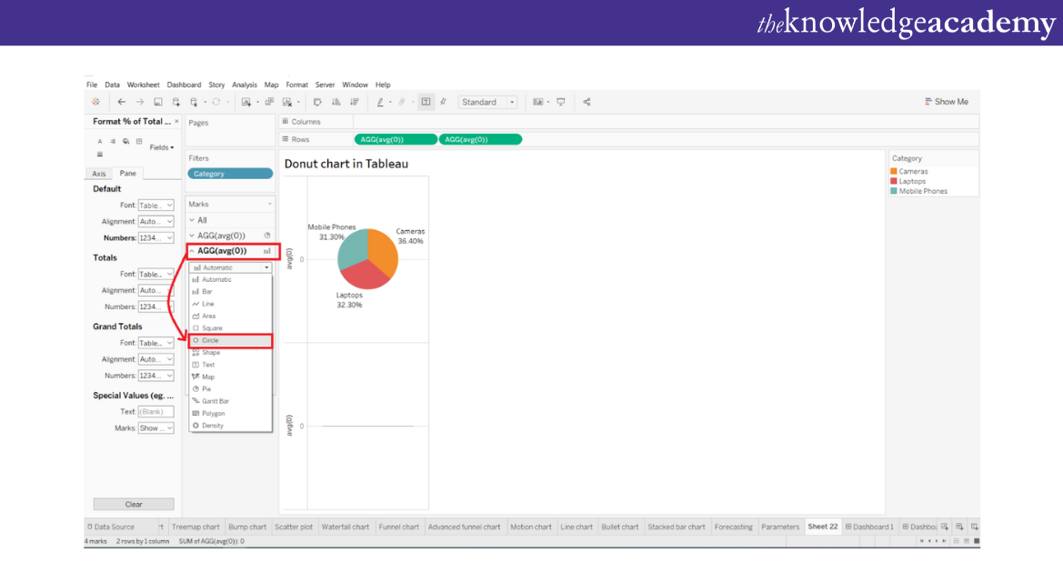
After you have added the fields in the Pie Chart, right-click on the second measure field, which is the AGG (avg(0)), in the “Marks” section. Then select the option “Circle” as the desired mark type from the drop-down list.
Step 5: Changing colour
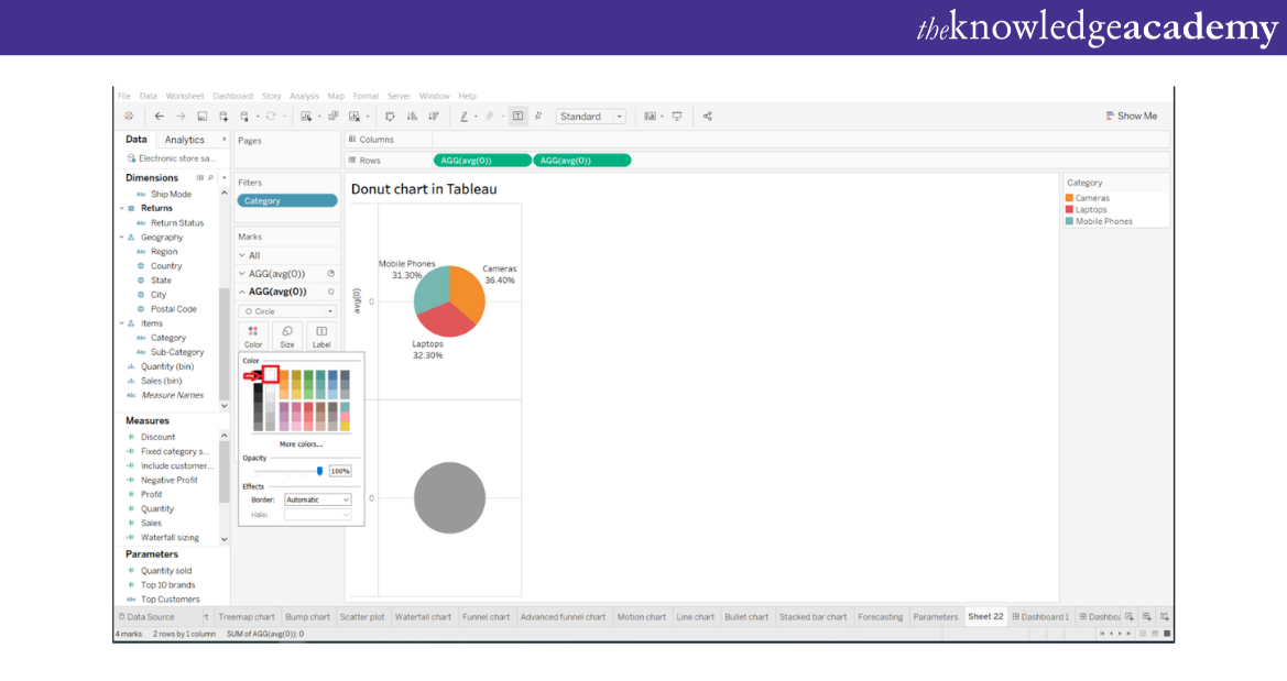
If you want to change the colour of the circle from grey to white or any other colour of your choice, click on the “Colour” option. Now, select white from the colour palette. However, before you perform this step, ensure that you are performing this on the second measure field.
Step 6: Adding measure field into the Label card
It is important that you add value by showing the total sales for all three categories, which are below the white circle. You can do this by creating a white circle on the lower half of the plot area. Then add a measure field which is “Sales” into the “Label” card of the second aggregate measure section.
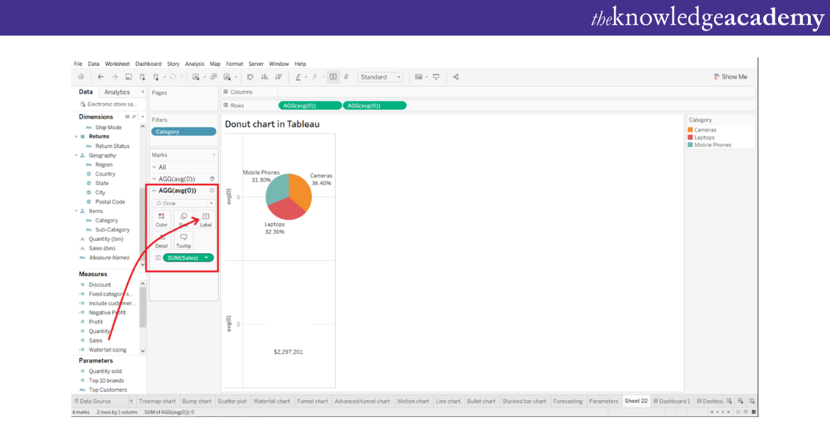
Step 7: Getting a closer look at the Charts
If you want a closer look at the two chats,right click on the measure field, which is present in the “Rows” section. Then select “Dual Axis” from the drop-down menu.
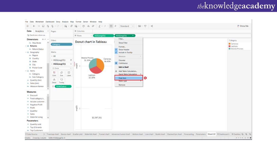
Step 8: Reducing card size
To make your charts more precise bring the second chart in the front so that it is not anymore overlapped with the first chart. Select the“Size” card. Finally, then reduce the size of the white circle.
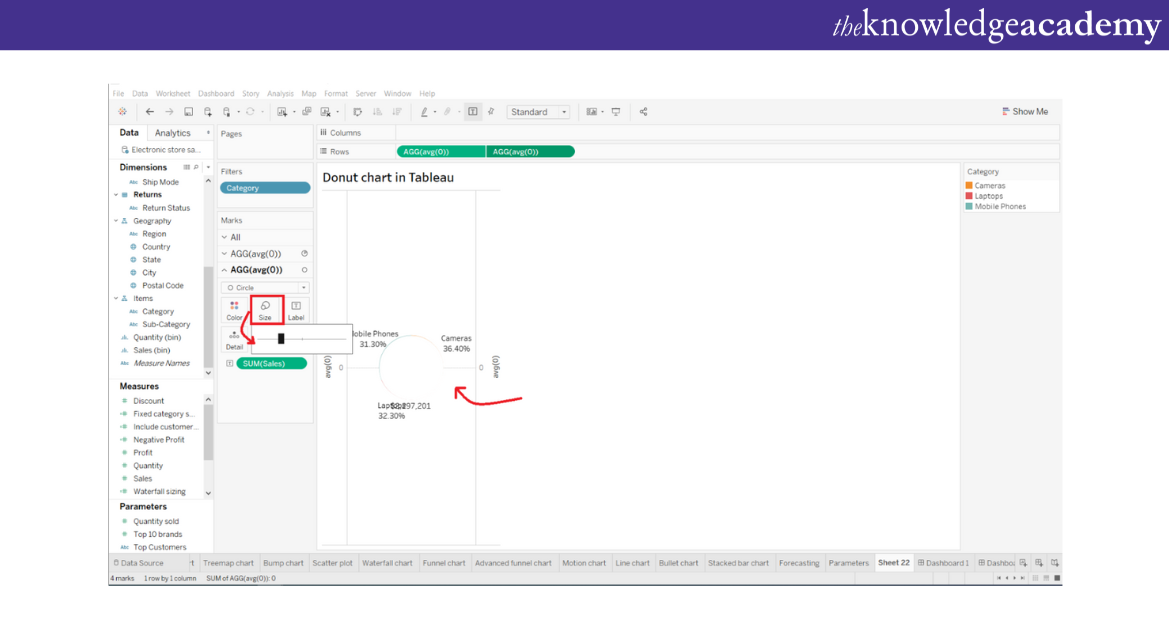
Step 9: Finalising the chart
After you have reduced the size of the inner white circle, you can see a donut-shape forming. This donut-shape has three sections and data labels. At the centre of the donut circle you can see the total sales.
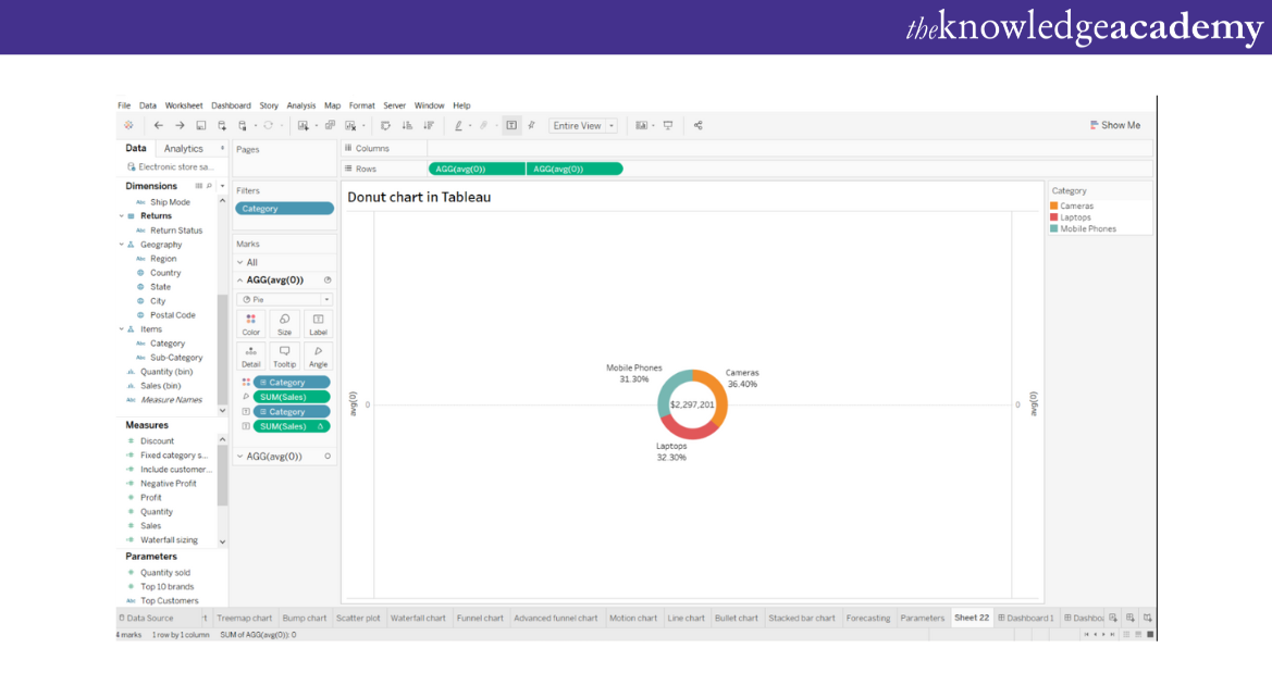
Prepare Like a Pro! Master These Essential Tableau Interview Questions.
Step 10: Changing the colour of the chart
To make your presentation more interesting, you can change the colour of your Donut Chart. To do this, select the “Colour” card in the first measure field section.
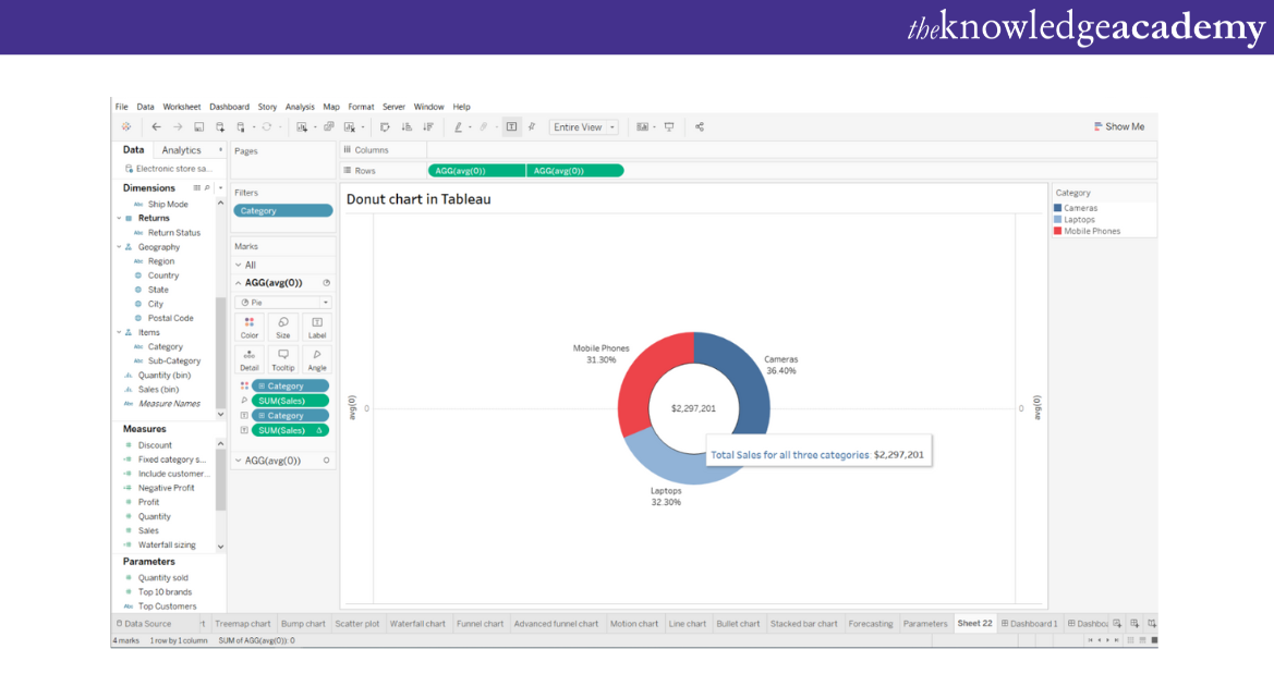
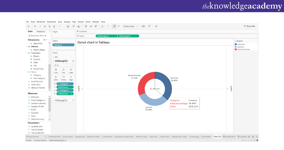
In the image provided above you can see that you can also format your tooltip from the “Tooltip” card. This will help you show the total sales in all three categories, sales value for each category and the total sales percentage for each category. This categorisation can in turn help you to identify each data separately.
Get ready for analytical and strategic roles with our Business Intelligence Reporting Course!
Best practices for Donut Charts
Following are some best practices which are essential to create impactful Donut Charts in Tableau:
a) For starters, remember to keep your Charts simple, focusing on the key information and avoiding clutter.
b) Ensure clear labelling to help viewers understand the data proportions accurately.
c) Choose colours thoughtfully, considering both aesthetics and accessibility.
d) You should avoid overcrowding the Tableau Charts with too many segments, as it can lead to confusion.
e) Provide context and annotations to assist in interpreting the chart.
Applying these best practices can allow you to create visually appealing and informative charts that effectively communicate your data insights.
Learn data visualisation in Power BI with Microsoft Power BI Training & Certification Course!
What are the benefits of using Donut Charts in Tableau?
The following are some benefits of using Donut Charts in Tableau:
a) These Charts are quite easy to interpret as they are visually simple. Thus, it is one of the most used options to help a broader audience understand minute details.
b) These Donut Charts effectively emphasises proportions from a dataset, which allows viewers to quickly understand the lengthy and complex data quickly.
c) These Charts provide an easy and effective way to compare values, which helps the users to understand several different patterns and trends.
d) These Charts are more space efficient. Therefore, these are used more in dashboards and reports.
e) Using Donut Charts in Tableau give the users lot of customisation options. These options help users to tailor these Charts according to the datasets and follow their corporate aesthetics or preference.
f) Tableau has many interactive features which allows users to create a dynamic visualisation according to their choice. These Charts help them to gain deeper insights and filter options accordingly to get more detailed insights.
g) The Donut Charts in Tableau can be integrated with other visualisations available in Tableau, so that users can create dashboards and reports which comprise an overview yet detailed view of data.
Don’t miss our Handpicked Tableau Interview Questions and Answers from our Expert team to crack Interviews Easily.
Drawbacks of using Donut Chart in Tableau
1) The Donut chart in Tableau cannot be comprehended when there is an overabundance of slices or categories of data.
2) Tableau will only reveal the negative data if they have all been marked. Since Donut Chart does not support negative values, it is preferable to use some other chart when you have negative values in your data.
3) However, it is a good tool for comparing data. But it is not useful for analysing data because when you look at one Donut, you can’t keep all the data points in your mind at the same time.
4) The worth pinpointing is impossible to do by just glancing at the Donut Chart.
Discover the key differences between Google Data Studio and Tableau to choose the best tool for your needs!
What are the differences between Donut Chart and Pie Chart?
Refer to the following table to understand the differences between Donut Chart and Pie Chart. It will help you choose the correct visualisation tool that you want to use for your organisation:
|
Features |
Donut Chart |
Pie Chart |
|
Central hole |
It has a central hole |
It does not have a central hole |
|
Representation |
It displays data in a ring-shape | It is displayed in a circular shape |
|
Proportions |
It emphasises relative proportions according to categories |
It emphasises both the whole and in individual slices |
|
Data comparisons |
It can compare data belonging in one or more categories |
It can compare data between the whole category and from each category |
|
Space required |
Occupies little amount of space |
Occupies a larger area |
| Interactivity | Is highly interactive | Less interactive |
Create insightful heat maps in Tableau and uncover hidden patterns in your data!
Conclusion
As we conclude this blog, understand that mastering how to create Donut Chart in Tableau opens a world of possibilities for visually representing data proportions and patterns. Following the step-by-step guide provided above and harnessing the customisation options, you can create compelling Donut charts that captivate your audience and enhance data-driven decision-making. So, start exploring the creative potential of Donut Charts in Tableau today.
Gain various Visual Data a Analysis skills with our Tableau Desktop Training!
Frequently Asked Questions
How do I change a pie chart to a Donut Chart in Tableau?

1) Create a pie chart visualisation.
2) Drag the "Size" shelf to the "Marks" card and adjust it to create an inner circle.
3) Adjust the size to create the desired thickness for the Donut Chart.
4) You may need
How do I create a percentage Donut Chart in Tableau?

1) Create a pie chart using data.
2) Drag measures to represent percentages onto "Label" shelf.
3) Create a calculated field to calculate segment percentages.
4) Drag calculated field onto "Label" shelf.
5) Adjust formatting for visual appeal and informativeness.
What are the other resources and offers provided by The Knowledge Academy?

The Knowledge Academy takes global learning to new heights, offering over 3,000 online courses across 490+ locations in 190+ countries. This expansive reach ensures accessibility and convenience for learners worldwide.
Alongside our diverse Online Course Catalogue, encompassing 19 major categories, we go the extra mile by providing a plethora of free educational Online Resources like News updates, Blogs, videos, webinars, and interview questions. Tailoring learning experiences further, professionals can maximise value with customisable Course Bundles of TKA.
What is the Knowledge Pass, and how does it work?

The Knowledge Academy’s Knowledge Pass, a prepaid voucher, adds another layer of flexibility, allowing course bookings over a 12-month period. Join us on a journey where education knows no bounds.
What are related courses and blogs provided by The Knowledge Academy?

The Knowledge Academy offers various Business Intelligence Reporting, including Microsoft Power BI Training, Business Objects Reporting Course and Crystal Reports Masterclass. These courses cater to different skill levels, providing comprehensive insights into Most Essential 10 Objectives of Business Reports.
Our Office Applications Blogs covers a range of topics offering valuable resources, best practices, and industry insights. Whether you are a beginner or looking to advance your skills, The Knowledge Academy's diverse courses and informative blogs have you covered.
Upcoming Office Applications Resources Batches & Dates
Date
 Tableau Desktop Training
Fri 11th Apr 2025
Fri 13th Jun 2025
Fri 8th Aug 2025
Fri 26th Sep 2025
Fri 21st Nov 2025


 Top Rated Course


 If you wish to make any changes to your course, please


