We may not have the course you’re looking for. If you enquire or give us a call on +44 1344 203 999 and speak to our training experts, we may still be able to help with your training requirements.
We ensure quality, budget-alignment, and timely delivery by our expert instructors.

Having problems representing numerical data within predefined bins. All you need is a blog on How to Make a Histogram in Excel. But What is a Histogram in Excel? A Histogram is an effective tool for displaying data distribution, helping to spot patterns, trends, and outliers more easily. If you're working with large sets of data in Excel, creating a Histogram can simplify complex information into a clear, visual format.
Whether you're analysing business data, academic research, or personal projects, learning How to Make a Histogram in Excel is a valuable skill that improves your data analysis. Read this blog and take the next step towards becoming an Excel maestro.
Table of Contents
1) What is a Histogram?
2) Steps on How to Make a Histogram in Excel?
3) Creating a Histogram using Data Analysis Toolpak
4) Create Histogram
5) Conclusion
What is a Histogram?
Before diving into the methods, let's establish what a Histogram is and why it's a crucial component of data analysis.
A Histogram is a graphic representation of numerical data that showcases the frequency or count of values within predefined bins. Unlike traditional bar charts, Histograms group data into intervals, offering insights into the distribution's shape, spread, and potential outliers. The primary goal is to provide a visual representation that aids in understanding the patterns inherent in the data.
Steps on How to Make a Histogram in Excel?
Excel offers a built-in Histogram chart option, making it easy to visualise data distribution. Here's how to add a Histogram chart:
1) Select the desired range of cells.
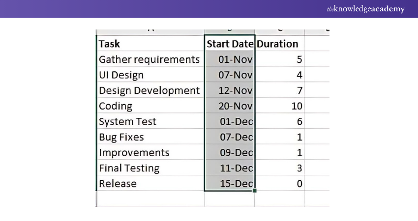
2) Go to the Insert tab, locate the Charts Group, and select the Histogram symbol.
3) Click on Histogram.
Result:
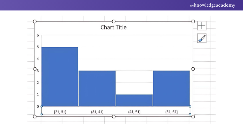
To adjust the bin size and number of bins:
4) Right-click the horizontal axis and choose Format Axis.
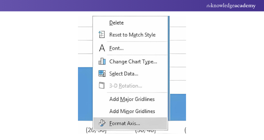
The Format Axis pane will open, allowing you to edit the bin width and number of bins as needed.
A bin range defines the value limits for each column of the Histogram, helping to organise data distribution.
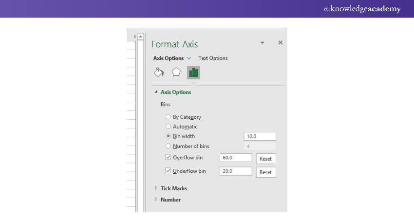
Result:

Creating a Histogram Using Data Analysis Toolpak
The Analysis ToolPak is a data analysis add-in available in all modern versions of Excel, starting from Excel 2007. However, it doesn't load automatically, so you'll need to enable it manually.
How to Load the Analysis ToolPak:
To enable the Data Analysis add-in, follow these steps:
1) In Excel 2010 - 365, click File > Options. For Excel 2007, click the Microsoft Office button, then Excel Options.
2) In the Excel Options dialogue, select Add-Ins from the left sidebar. In the Manage box, choose Excel Add-ins and click Go.
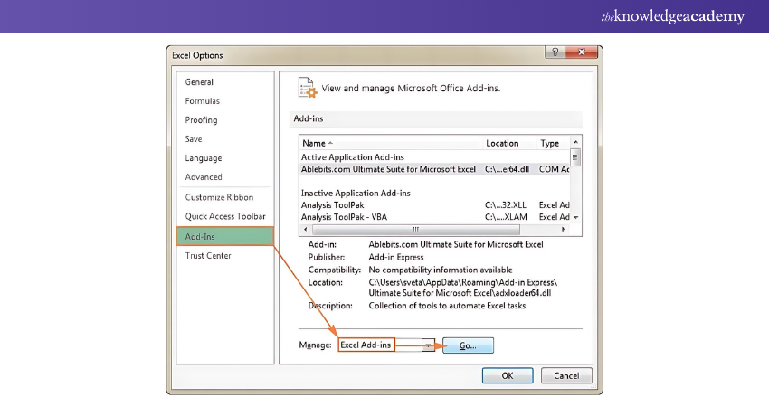
3) In the Add-Ins list, check the Analysis ToolPak box, then click OK. If prompted to install it, click Yes to complete the installation.
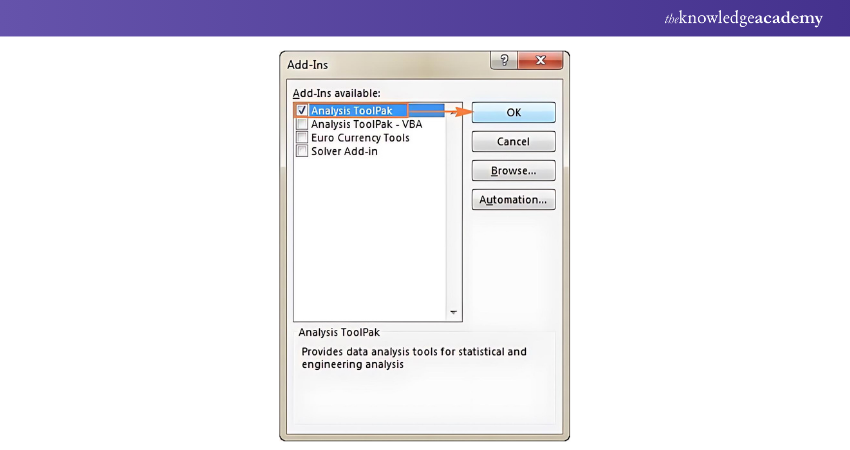
Once loaded, the Analysis ToolPak will be available under the Data tab in the Analysis group.
How to Specify the Histogram Bin Range?
Before creating a Histogram, you’ll need to define your bin range in a separate column. Bins are numerical intervals that group your input data. These intervals must be consecutive, non-overlapping, and typically of equal size.
The Excel Histogram tool categorises data as follows:
1) Values are included in a bin if they are greater than the lowest bound and less than or equal to the highest bound of that bin.
2) Any values greater than the highest bin will be grouped in a "More" category.
3) If no bin range is specified, Excel automatically creates evenly distributed bins based on the input data's minimum and maximum values.
To set the bin range, enter the numbers in ascending order in a separate column, ensuring they correspond to the intervals you want to display. For example, if you’re tracking delivery times, you might create bins for 1-5, 6-10, 11-15, 16-20 days, and so on.
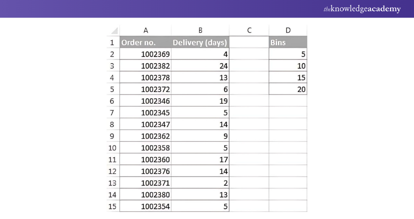
Creating a Histogram with Excel's Analysis ToolPak:
With the ToolPak enabled and bins defined, follow these steps:
1) Go to the Data tab and click Data Analysis.
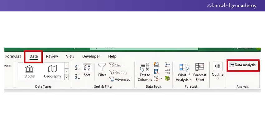
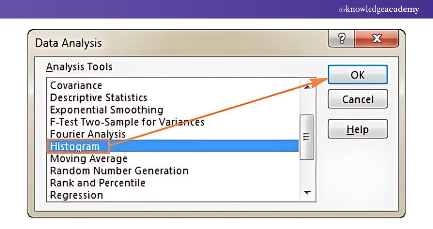
2) Select Histogram from the options and click OK.

3) In the Histogram dialogue, specify the Input Range and Bin Range by selecting the corresponding cells on your worksheet.
If your data includes headers, check the Labels box.
4) Choose your Output Options:
a) Select Output Range to display the Histogram on the same sheet.
b) Choose New Worksheet Ply or New Workbook if you prefer the output on a new sheet or workbook.
Additional options include:
a) Pareto (sorted Histogram): Displays data in descending frequency.
b) Cumulative Percentage: Adds a cumulative percentage line.
c) Chart Output: Creates an embedded Histogram chart.
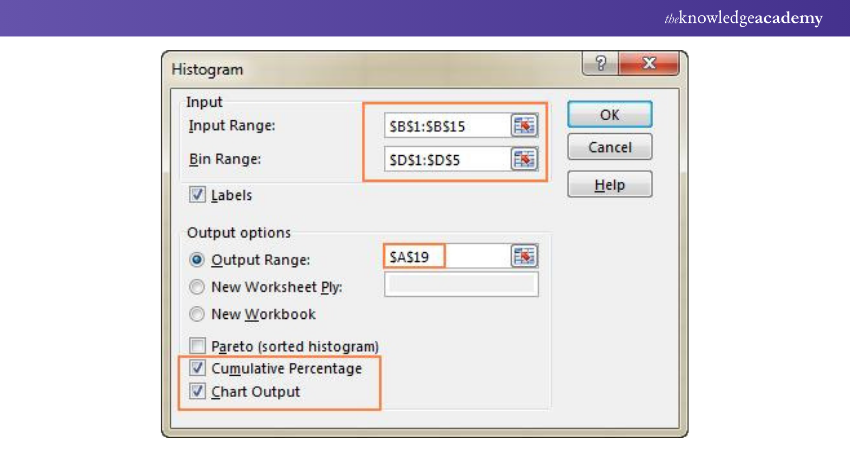
After configuring these options, click OK to generate your Histogram.
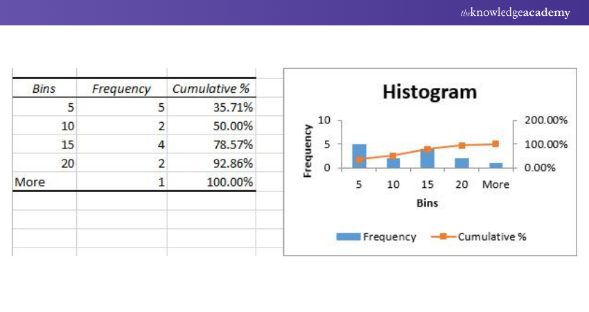
Customising Your Histogram
You can refine your Histogram by adjusting axis titles, legends, and design elements using the Chart Tools in Excel. For example, you can remove gaps between columns or add custom labels for better clarity.
Note: A limitation of this method is that the Histogram is static, so any changes to the input data will require recreating the Histogram.
Create Histogram
Follow these steps to create a Histogram:
1) Navigate to the Data tab and click on Data Analysis.

2) In the Data Analysis dialogue box, choose Histogram.

3) In the Histogram dialogue, specify the Input Range, Bin Range, and Output Range, and ensure the Chart Output option is checked.
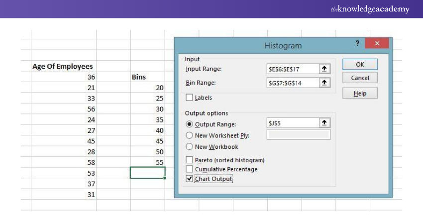
4) Click OK.

The first bin represents all values below its specified range. For example, if the bin is 20, it shows there are no values below 20, indicating there are no employees under the age of 20.
Conclusion
Hope you read the blog thoroughly and understood How to Make a Histogram in Excel. Whether you opt for the Data Analysis tool, the insert chart feature, or the FREQUENCY function, you now have the tools at your disposal to analyse and visualise your data effectively. Personalising your Histograms enhances their communicative power, making data interpretation more accessible and insightful.
Want to expand your knowledge of Microsoft applications? Sign up for our Microsoft Access Training!
Frequently Asked Questions
What Is a Histogram vs a Bar Graph?

A Histogram displays the distribution of numerical data by grouping values into bins, showing how frequently each range occurs. A bar graph, on the other hand, compares different categories using rectangular bars of equal width. Histograms display continuous data, while bar graphs show categorical data.
What is the Real-life Application of Histogram?

Histograms are commonly used in quality control processes to analyse product measurements, such as weight or size, identifying deviations from standards. They also help in understanding data distribution in finance, such as income brackets, and in healthcare to visualise patient age groups or treatment outcomes.
What are the Other Resources and Offers Provided by The Knowledge Academy?

The Knowledge Academy takes global learning to new heights, offering over 3,000 online courses across 490+ locations in 190+ countries. This expansive reach ensures accessibility and convenience for learners worldwide.
Alongside our diverse Online Course Catalogue, encompassing 19 major categories, we go the extra mile by providing a plethora of free educational Online Resources like News updates, Blogs, videos, webinars, and interview questions. Tailoring learning experiences further, professionals can maximise value with customisable Course Bundles of TKA.
What is the Knowledge Pass, and how does it work?

The Knowledge Academy’s Knowledge Pass, a prepaid voucher, adds another layer of flexibility, allowing course bookings over a 12-month period. Join us on a journey where education knows no bounds.
What are related courses and blogs provided by The Knowledge Academy?

The Knowledge Academy offers various Microsoft Excel Courses, including Microsoft Excel Course, Excel for Accounting Course, and Excel Training with Gantt Charts. These courses cater to different skill levels, providing comprehensive insights on Excel methodologies.
Our Office Applications Blogs cover a range of topics related to Microsoft Excel, offering valuable resources, best practices, and industry insights. Whether you are a beginner or looking to advance your Excel skills, The Knowledge Academy's diverse courses and informative blogs have you covered.
Upcoming Office Applications Resources Batches & Dates
Date
 Microsoft Excel Course
Fri 11th Apr 2025
Fri 13th Jun 2025
Fri 8th Aug 2025
Fri 26th Sep 2025
Fri 21st Nov 2025


 Top Rated Course


 If you wish to make any changes to your course, please


