We may not have the course you’re looking for. If you enquire or give us a call on +918037244591 and speak to our training experts, we may still be able to help with your training requirements.
Training Outcomes Within Your Budget!
We ensure quality, budget-alignment, and timely delivery by our expert instructors.

Are you eager to elevate your Web Design skills? Do you wish to create visually appealing websites that captivate your audience? If yes, then consider using CSS (Cascading Style Sheets). The CSS Padding feature can help you shape the visual appeal of websites, making them aesthetically pleasing and user-friendly.
CSS Padding is more than just an empty space between content and borders. It's an essential design element that not only enhances the aesthetics but also contributes to the overall user experience. So, if you are involved in Web Development, familiarising yourself with this feature can help you unlock the secrets of creating well-structured layouts.
Don't know what this feature is about and how can it benefit you in Web Design? Read this blog to learn about CSS Padding, its various uses. Also, explore how it can enhance the appearance of your website.
Table of contents
1) Introduction to CSS Padding
2) CSS Padding examples
a) Syntax for applying Padding in CSS
b) Padding for text elements
c) Padding for image elements
d) Padding for container elements
e) Applying Padding to specific sides
f) Combining Padding values
3) When and how to use CSS Padding?
4) Conclusion
Introduction to CSS Padding
CSS Padding is a fundamental concept in Web Development and a key element of Cascading Style Sheets (CSS). It refers to the space or area between an HTML element's content and its border. In other words, padding creates a buffer zone around the content. This provides a breathing room and separation from other elements within the container.
When crafting the layout and design of a webpage, CSS Padding plays a crucial role in enhancing both aesthetics and user experience. It ensures that the content is not cramped together and gives it a clean and organised appearance. Properly utilised padding can significantly improve the readability and overall visual appeal of a website.
For example, imagine a paragraph of text without any Padding. It would look cramped and uninviting, with the text almost touching the edges of its container. Applying CSS Padding allows you to create space between the text and the container's border. This provides it with a more pleasant and reader-friendly appearance.
Padding can be applied to various HTML elements, such as paragraphs, headings, images, and containers. This allows developers to customise the spacing and layout for each element. By carefully adjusting the padding values, developers can create a sense of balance and harmony within the webpage. As a result, they can guide the user's focus and attention to the most crucial content.

CSS Padding examples
Properly using CSS Padding can significantly improve the aesthetics and readability of a webpage. So, let’s explore the different ways to use padding in CSS effectively:
Syntax for applying Padding in CSS
Before we dive into specific usage examples, let's review the basic syntax for applying CSS Padding to an element:
selector {
padding: top right bottom left;
}
In the syntax above, the top, right, bottom, and left represent the values for Padding on each side of the element, respectively. You can use various units like pixels (px), percentages (%), em, or rem to define the padding value.
Padding for text elements
When applied to text elements such as paragraphs and headings, it enhances readability and visual appeal. Padding allows to create a breathing space that separates the content from the container's edges. This ensures that the text is easy on the eyes and not cramped together, making it more inviting for readers.
p {
padding: 10px;
}
In this example, Padding of 15 pixels has been applied to all sides of paragraphs. This creates a comfortable buffer zone around the text. As a result, it ensures that the content doesn't appear cramped within its container. This makes the content more readable and visually appealing.
Padding for image elements
Images can also benefit from CSS Padding. Adding Padding around images creates a buffer zone that prevents the content from appearing too close to the image edges. This enhances the overall presentation and creates a more professional look for your image galleries or image-heavy sections.
img {
padding: 20px;
}
In this instance, 20 pixels of Padding have been added around images. It prevents the content around the images from being too close to their edges. The extra Padding provides a cleaner and more professional look for image galleries or sections with multiple images.
Unlock your potential and become a proficient app and web developer with our App & Web Development Training.
Padding for container elements
Applying Padding in CSS to container elements helps create distinct sections within a webpage. This is especially useful when you want to visually separate different content blocks, such as article sections or navigation bars.
.container {
padding: 30px;
}
Here, 30 pixels of Padding to the container class have been added. This creates a clear separation between different content blocks within the webpage. It enhances the overall structure and organisation, making it easier for users to navigate through the content.
Applying Padding to specific sides
In some cases, you may want to apply Padding to specific sides of an element rather than all sides. You can achieve this by using the shorthand property or by specifying Padding for individual sides:
/* Shorthand */
selector {
padding: top right bottom left;
}
/* Individual sides */
selector {
padding-top: value;
padding-right: value;
padding-bottom: value;
padding-left: value;
}
In this example, varying Padding values have been applied to specific sides of an h2 heading. By adding more Padding to the top and bottom and less to the left and right, you create a visually balanced heading with a bit more space at the top and bottom. This draws attention to the heading's content.
Combining Padding values
In some scenarios, you might want to apply the same Padding to all sides of an element. To save time and make your code cleaner, you can use the shorthand property:
selector {
padding: value;
}
In this instance, a shorthand property has been used to apply the same padding value of 12 pixels to all sides of a button. This creates a consistent and well-proportioned button design. As a result, it gives a pleasing appearance across different devices and screen sizes.
Gain hands-on experience in using CSS Padding. Join our Website Design Course today!
When and how to use CSS Padding?
Understanding when and how to use CSS Padding effectively is crucial for optimising the design and user experience of a website. So, let’s explore different scenarios where Padding in CSS can be employed and best practices for its implementation:
When to use Padding in CSS
The following are the various scenarios where Padding can be used in CSS:
a) Readability enhancement: Padding creates breathing space around text elements, such as paragraphs and headings. Adding Padding ensures that the text is not crammed against the container's edges. This makes it more visually appealing and easier to read.
b) Image presentation: Apply Padding to images to prevent surrounding content from crowding too close to the image's edges. This separation enhances the visual impact of images and provides a more pleasing presentation.
c) Content separation: Utilise padding to visually separate different content sections within containers. Applying padding to containers creates distinct sections. As a result, it becomes easier for users to navigate and comprehend the content.
d) Interactive elements: Increase padding around interactive elements like buttons and links to improve user interaction. Larger padding makes these elements more touch-friendly and enhances the overall usability of the website.
e) Balanced layout: Use CSS Padding to create balanced spacing and whitespace between elements, avoiding a cluttered appearance. A well-balanced layout contributes to a more pleasant user experience.
f) Responsive design: Adjust padding values for responsive design to ensure the layout remains consistent and visually appealing on various devices and screen sizes.
How to use CSS Padding
By understanding how to use CSS Padding, you can create visually pleasing and well-structured web layouts that engage your audience. So, let's find out how to use it correctly:

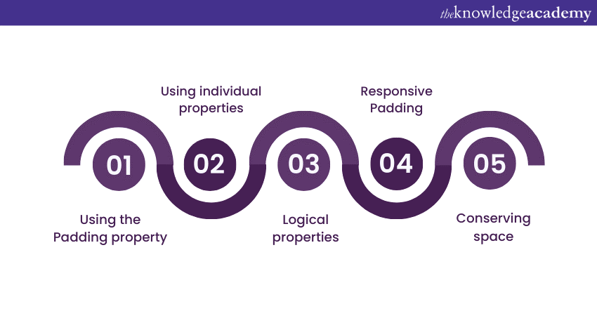
a) Using the Padding property: The Padding property sets Padding on all four sides of an element simultaneously. Use this property when you want uniform padding for an element.
b) Using individual properties: For more control, use individual properties like Padding-top, Padding-right, Padding-bottom, and Padding-left. This helps set different Padding values for each side of an element.
c) Logical properties: Utilise logical properties like Padding-block and Padding-inline to set padding along the block and inline axes, depending on the writing mode of the text.
d) Responsive Padding: When designing responsive websites, use media queries to adjust padding values based on the device's width.
e) Conserving space: Instead of adding Padding to multiple elements, apply Padding to parent containers to create spacing for their child elements. This helps preserve space and ensures a cleaner layout.
Conclusion
CSS Padding is a fundamental and powerful tool in Web Development. It enables developers to control spacing and create visually appealing web layouts. Mastering the art of Padding in CSS can empower you to optimise your web designs and craft captivating websites that leave a lasting impression on their audience.
Gain an in-depth understanding of styling techniques to create visually stunning websites. Join our CSS Introduction & Intermediate Course now!
Frequently Asked Questions
Upcoming Programming & DevOps Resources Batches & Dates
Date
 CSS Course
Thu 23rd Jan 2025
Thu 20th Mar 2025
Thu 22nd May 2025
Thu 17th Jul 2025
Thu 18th Sep 2025
Thu 20th Nov 2025


 Top Rated Course


 If you wish to make any changes to your course, please


