We may not have the course you’re looking for. If you enquire or give us a call on +918037244591 and speak to our training experts, we may still be able to help with your training requirements.
We ensure quality, budget-alignment, and timely delivery by our expert instructors.

Have you ever wondered if you could turn the complex chaos of numbers and data into a captivating visual story? Wonder no more because Data Visualisation in Excel makes it possible with just a few clicks. Whether you want to wow your audience or just simplify complex information for quicker understanding, data visualisation is a powerful technique for transforming raw data into insightful graphs, charts, and other visuals. This blog outlines the essential steps and tips for crafting engaging data visualisation in Microsoft Excel. So, dive in and master the art of creating visuals that speak louder than a thousand numbers!
Table of Contents
1) What is Data Visualisation in Excel?
2) Types of Data Visualisation in Excel with examples
3) Steps for visualising data in Excel
4) Data Visualisation Tips in Excel
5) Conclusion
What is Data Visualisation in Excel?
Data visualisation is the graphical display of information. Through the use of charts, maps, graphs, and similar tools, it offers an easy and intuitive way to interpret data, making it simpler to spot trends and outliers in datasets. It's important to remember that Excel uses the term "chart" to mean a "plot". For example, a bar plot is known as a bar chart in Excel terminology.
Data visualization can be done using various tools including DataWrapper, Tableau, and Google Charts. Additionally, creating a dashboard in Excel allows you to utilize different types of charts such as bar charts, column charts, pie charts, area charts, line charts, scatter charts, surface charts, and more.
Types of Data Visualisation in Excel with Examples
As mentioned above, Data visualisation in Excel transforms data into insightful graphics, making the analysis process intuitive and engaging. This section explores various types of data visualisations in Excel that enhance our understanding and presentation of data. Here, we use a sample dataset featuring sales of televisions, laptop computers, and cellphones from an electronic store, which you can Create a Chart in Excel to better visualize and interpret the information.

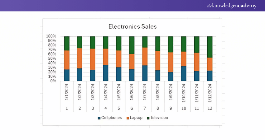
1) Column Diagram
A column diagram, also known as a column chart or bar chart, shows data in vertical columns. Each column here represents a category, and the height of the column indicates the value of the data. For example, you can compare the sales performance of numerous products over a period of time using a column chart.
2) Pie Diagram
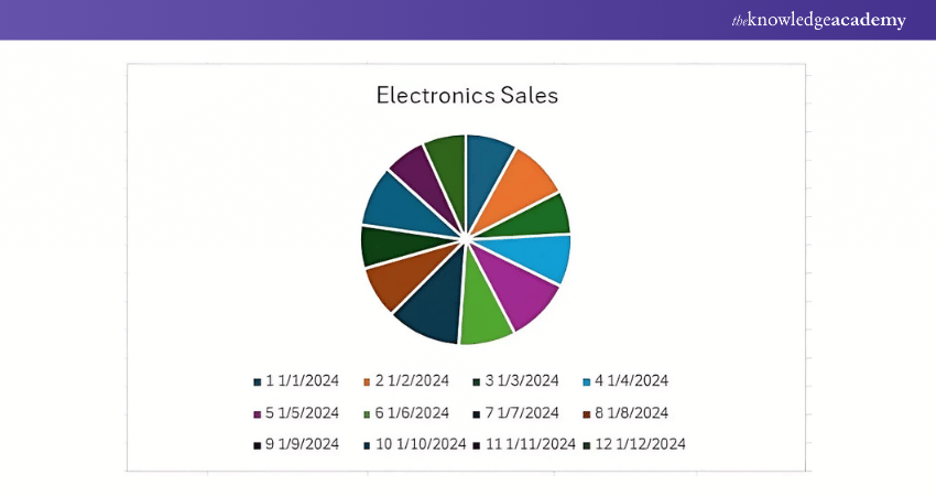
A pie diagram, or pie chart, displays data in a circular graph, which is divided into slices to represent proportions. Each slice corresponds to a category, and the size of the slice shows the proportion of that category relative to the whole. For example, you can use a pie chart to visualise the distribution of expenses in a budget.
3) Bar Graph
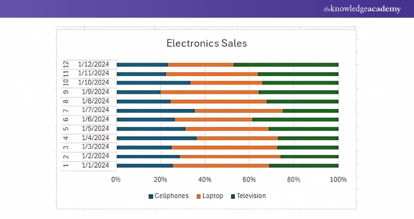
A bar graph, similar to a column chart, represents data using horizontal or vertical bars. Each bar represents a category whose length indicates the value of the data. You can utilise a bar graph to compare different categories or track changes over time, such as comparing monthly sales figures for other regions.
4) Line Diagram
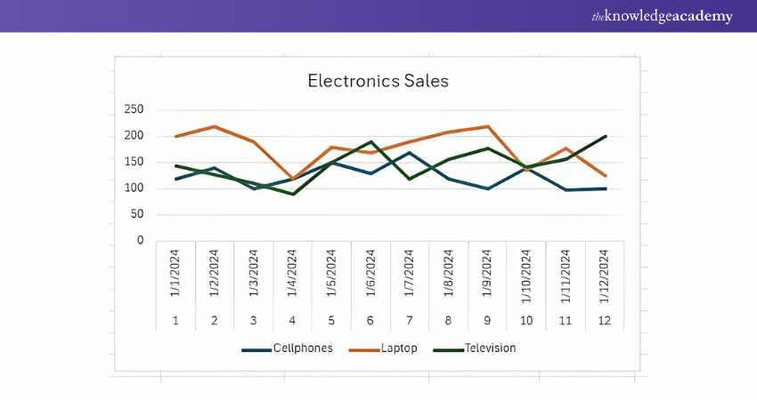
A line diagram, also called a line chart, illustrates data points with lines connecting them. It's commonly used to show trends over time. The example below shows how it works.
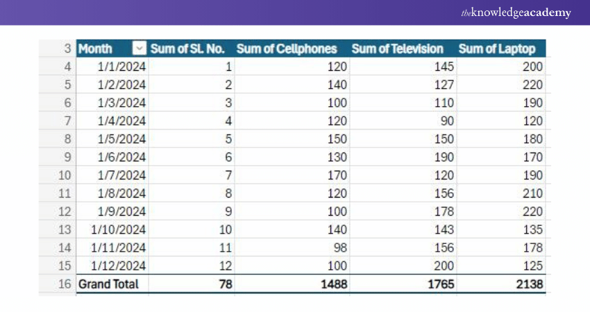
5) Pivot Table
A pivot table is a powerful tool for summarising and analysing large datasets. It allows you to arrange and summarise data dynamically, making it easier to analyse trends and patterns. Pivot tables can be used to create various types of visualisations, such as pivot charts, which provide a visual representation of the data summarised in the pivot table.
Learn to create and prepare Gantt charts by registering for our Excel Training With Gantt Charts Course!
Steps for Visualising Data in Excel
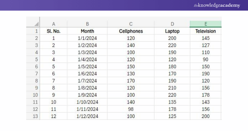
Visualising data in Excel involves several steps to ensure that the resulting charts and graphs effectively communicate the insights hidden within the data. Here's a breakdown of the process using a sample dataset comprising the sales data of an electronic store:
1) Organise the Data
2) Select the Data
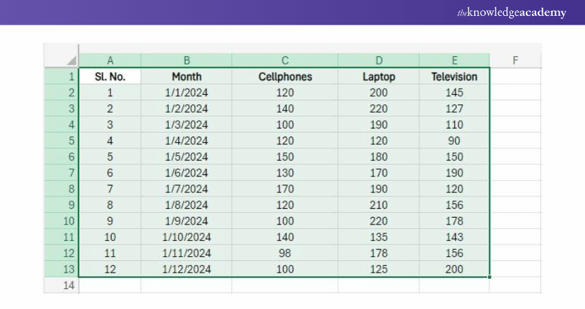
Click and drag your mouse across the sheet to highlight the data, including the row and column headers, to be included in your visualisation.
3) Select a Chart Type
Go to the Excel ribbon and click on the "Insert" tab. In the "Charts" section, you'll see numerous chart options such as Pie, Bar, Column, Line, Area, Scatter and more.
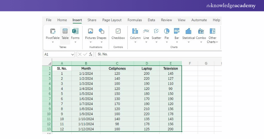
Click on the dropdown arrow right below the chart type, and pick a specific chart style from the options.
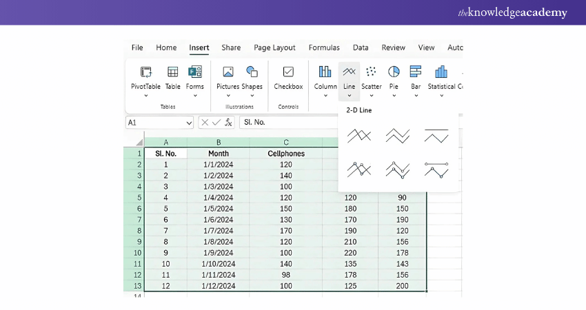
4) Insert the Chart
Excel will automatically create the chosen chart type based on your data and insert it into the worksheet. You can reposition the chart by clicking and dragging it.
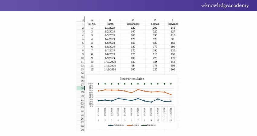
5) Customise the Chart
To edit the data visualisation further, click on the chart. Excel will display the "Format" tab containing two subtabs "Data" and "Format".
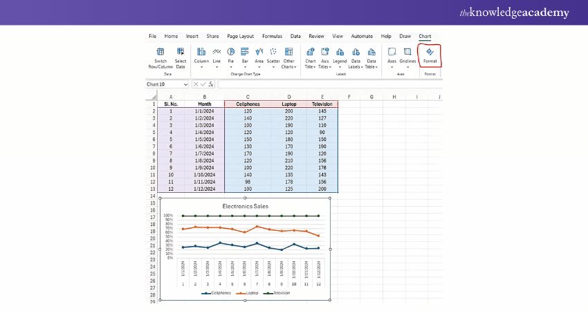
6) Edit the Data
If you need to change your data after creating the chart, edit the data in the worksheet. Excel will update the chart automatically to reflect the changes.
Discover vital Excel functions for Business Analytics with our Business Analytics With Excel Course – Sign Up today! .
Data Visualisation Tips in Excel
Data Visualisation is about more than just creating charts and graphs. It is about presenting your data in a way that is easy to understand and draws out meaningful insights. In Excel, there are various techniques and strategies you can use to make your visualisations more effective and impactful. Let's explore some key tips for mastering Data Visualisation in Excel:
1) Verify the Data for Accuracy: Your data visualisation can help organise and visualise the most complex data sets. However, for the best results, you must ensure accurate information. Verify that the correct data has been inputted from the original source into Excel. By removing inaccurate, irrelevant, or duplicate information, you can maintain data integrity.
2) Use Colour Coding: Using colour coding can help separate diverse data sets and make them easier to identify. You must use colour coding on visualisations such as bar graphs and histograms. Choose a cohesive colour scheme instead of using multiple colours that may confuse the viewer.
3) Provide Context: A legend or key that can identify some of your chart's visual elements can help viewers better understand what they are looking at and identify industry terms. Coupled with a visualisation title and titles for each axis offer context for the chart.
4) Convey a Message: Think hard about the message you want to convey with the visualisation. If you are trying to emphasise a trend, ensure the chosen data visualisation method enables you to communicate your message effectively.
For example, if you're trying to highlight that cell phone usage is more popular among a certain age group, this data can be displayed in a bar graph. The x-axis can be assigned to age groups, and the y-axis can show the average number of hours that each age group uses their cell phones.
Conclusion
Data Visualisation in Excel is about more than just making pretty charts and graphs; It's about transforming data into actionable insights. By mastering the art of data visualisation, you can unlock your data's full potential and confidently make informed decisions. The steps and tips detailed in this blog will ensure that your data speaks volumes through captivating visuals.
Enhance your professional skills with our comprehensive Microsoft Office Training – register today!
Frequently Asked Questions
What Is the Easiest Data Visualisation Tool to Use?

Microsoft Power BI and Zoho Analytics are two of the best data visualisation tools available now.
What Type of Table Does Excel use to Create Data Visualisation?

Excel uses a spreadsheet, an effective structure for analysing comparative data on classified objects. The classified objects are typically in rows, and the items being compared are input in columns.
What are the Other Resources and Offers Provided by The Knowledge Academy?

The Knowledge Academy takes global learning to new heights, offering over 3,000 online courses across 490+ locations in 190+ countries. This expansive reach ensures accessibility and convenience for learners worldwide.
Alongside our diverse Online Course Catalogue, encompassing 19 major categories, we go the extra mile by providing a plethora of free educational Online Resources like News updates, Blogs, videos, webinars, and interview questions. Tailoring learning experiences further, professionals can maximise value with customisable Course Bundles of TKA.
What is The Knowledge Pass, and How Does it Work?

The Knowledge Academy’s Knowledge Pass, a prepaid voucher, adds another layer of flexibility, allowing course bookings over a 12-month period. Join us on a journey where education knows no bounds.
What Related Courses and Blogs Provided by The Knowledge Academy?

The Knowledge Academy offers various Microsoft Excel Training & Certification Course, including Microsoft Excel Course, Excel for Accountants Course, and Business Analytics With Excel Course. These courses cater to different skill levels, providing comprehensive insights into Use of Excel in Business Analysis.
Our Office Applications Blogs cover a range of topics related to Microsoft Excel, offering valuable resources, best practices, and industry insights. Whether you are a beginner or looking to advance your Excel skills, The Knowledge Academy's diverse courses and informative blogs have you covered.
Upcoming Office Applications Resources Batches & Dates
Date
 Excel for Accounting Course
Fri 28th Mar 2025
Fri 23rd May 2025
Fri 25th Jul 2025
Fri 26th Sep 2025
Fri 28th Nov 2025


 Top Rated Course


 If you wish to make any changes to your course, please


