We may not have the course you’re looking for. If you enquire or give us a call on + 1-866 272 8822 and speak to our training experts, we may still be able to help with your training requirements.
We ensure quality, budget-alignment, and timely delivery by our expert instructors.

Do you want to captivate your audience with creative web designs? Do you wish to possess the ability to breathe life into your web designs and make them visually engaging and interactive? If yes, then it’s time to understand what CSS Animation is! Read this blog to discover the magic of CSS Animation in web design. Also, learn how to create engaging, dynamic elements that attract visitors.
Table of Contents
1) Understanding CSS Animation
2) Why use CSS Animation?
3) How to use CSS Animation?
4) CSS Animation examples
5) Conclusion
Understanding CSS Animation
CSS Animation, which stands for Cascading Style Sheets Animation, is an outstanding technique used to bring life and movement to web elements. Imagine you have a static webpage, like a picture on paper. Now, with CSS Animation, you can make parts of that picture come alive, creating delightful visual effects that catch your eye.
To elaborate further, think of CSS as the set of rules that dictate how elements on a webpage should look. Animation in CSS allows you to add rules that control how these elements change over time.
For instance, you can make a button gradually fade in when the page loads. You can also rotate an image continuously or make a bouncing ball. These animated effects help make websites more engaging, memorable, and fun to interact with.
Using CSS Animation doesn't require complex coding or heavy scripts. It's part of the styling language. You simply define what the animation should do and apply it to the elements you want to animate. This makes it a powerful tool for Web Developers and Animators to create visually appealing and interactive websites. It doesn’t need additional programming languages or plugins.
Why use CSS Animation?
CSS Animation offers a range of reasons for Web Designers and developers to incorporate it into their projects. This powerful tool adds an extra layer of dynamism and interactivity to websites. Here's why you should consider using it:
Visual appeal
Animations capture attention and make web pages more visually appealing, from a subtle hover animation on a button, a smooth transition between sections, or eye-catching loading animations. These visual enhancements can leave a lasting impression on users, making your website stand out from the crowd.
User engagement
Interactivity is a key factor in keeping users engaged. CSS Animation enables you to create interactive elements that respond to user actions. For example, you can animate buttons to change colour when hovered over, provide feedback when a form is submitted, or create captivating sliders that users can interact with.
Smooth transitions
CSS Animation allows for seamless transitions between different states of an element. This smoothness is crucial in providing a polished and professional feel to your website. Elements can fade in or out, slide into view, or transition between various sizes, making the user experience more fluid and enjoyable.
Performance
It often performs better than animations created using JavaScript. Browser optimisation for CSS Animations is generally more efficient, leading to smoother animations and better overall performance. This efficiency translates into faster load times and a more responsive website, especially on mobile devices.
Cross-browser compatibility
CSS Animation is well-supported across modern web browsers, ensuring a smooth experience for users regardless of the browser they're using. This reduces the need for workarounds and ensures that your animations work as intended for a broader audience.
Lightweight
Compared to some other animation techniques, CSS Animation can be lightweight, reducing the impact on page load times. You have more control over the performance impact by optimising animation properties, such as using hardware-accelerated transitions.
Transform your design skills by joining our Animation Masterclass now!
How to use CSS Animation?
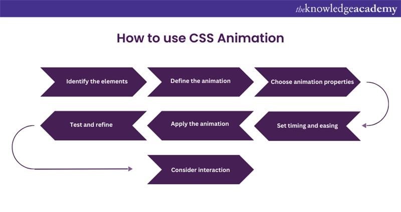
Using CSS Animation may seem intimidating at first, but it's a valuable skill that can elevate your web design and user experience. Let's delve into the step-by-step process of how to effectively use it to bring your web elements to life:

Identify the elements
Start by selecting the HTML elements you want to animate. It could be buttons, images, text, or any other element on your webpage. Consider the purpose of the animation – is it for visual appeal, user engagement, or conveying information?
Define the animation
Create the animation by defining keyframes. Keyframes represent the various states of the element during the animation. You specify the properties (e.g., position, opacity, colour) that change at different keyframe percentages.
Choose animation properties
Decide which CSS properties you want to animate. Common properties include:
a) Transform
b) Opacity
c) Colour
d) Margin
e) Width
f) Height
Each property offers a unique effect. For instance, you can use Transform for rotations, translations, and scaling.
Set timing and easing
Determine the animation's duration using the Animation-duration property. You can also specify the timing function using the Animation timing function, allowing you to control the pace of the animation (e.g., linear, ease-in, ease-out). Additionally, consider whether the animation should loop or occur only once, which you can set using animation-iteration-count.
Apply the animation
Connect the animation to your chosen element using the Animation property. Specify the animation's name, duration, timing function, and iteration count. You can also use @keyframes to define the animation directly in the CSS stylesheet.
Test and refine
Preview the animation in your browser. If necessary, make adjustments to the keyframes, properties, or timing to achieve the desired effect. Don't be afraid to experiment and iterate until you're satisfied.
Consider interaction
For more advanced use, think about adding interactions. You can trigger animations on user actions like hovering over an element or based on scroll events. As a result, you can create a dynamic and responsive user experience.
CSS Animation examples
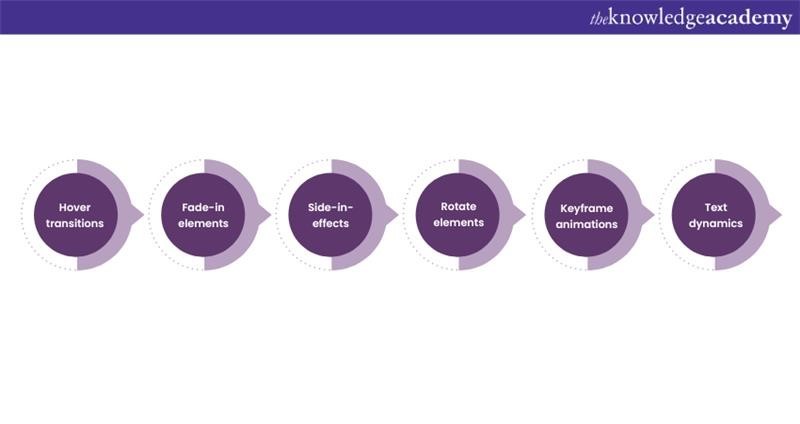
CSS Animation offers diverse possibilities to create captivating visual animations on your website. Let's explore some popular examples, showcasing how you can use animation to make your web design more engaging and interactive:

Using hover transitions
Hover transitions significantly enhance the user's engagement with a website. They achieve this by seamlessly altering the appearance of elements, such as buttons or links when users move their mouse cursor over them.
This interaction creates a dynamic effect that's visually pleasing and intuitive, as users instinctively recognise that these elements respond to their actions. The added touch of elegance provided by the smooth transition, which is often achieved using CSS transitions or animations, brings a sense of modernity and professionalism to the website's design.
These transitions are like a virtual invitation, prompting users to explore further. They give vital feedback, signalling that an element is interactive and ready for clicking. For example, when a user hovers over a Buy Now button, it might subtly change colour, reassuring them that the button is indeed where they should click to make a purchase. This animation is invaluable for guiding user actions, making it especially useful for call-to-action elements.
Master CorelDRAW and transform your design skills – Sign up for our CorelDRAW Training today!
Using fade-in elements
The fade-in elements technique is a smooth and friendly way to introduce things on a website. Instead of elements, such as images, suddenly showing up on the screen, these elements gently and gradually appear. As a result, they create a polished and pleasant transition that makes the website experience better.
When users scroll down the webpage or move their mouse, these hidden elements slowly come into view, like a curtain being pulled back. This gradual reveal not only looks stylish but also avoids that sudden and startling feeling when things pop up unexpectedly.
This animation is super useful, especially when you want to showcase images or important bits of content. Imagine a gallery of pictures, instead of the images just popping into existence, they appear smoothly as you scroll. This helps the page look more appealing. It's like a gentle unveiling, and it's also great for showing off details or telling a story.
Using side-in-effects
Slide-in effects bring a touch of class to web design. They involve elements gracefully sliding into view, creating an elegant and eye-catching presentation. Imagine notifications subtly descending from the top of the page or menu panels smoothly gliding out from the side when you activate them. These effects make your website feel more dynamic and engaging.
When a user triggers a certain action, like clicking a button or hovering over an icon, elements respond by sliding into view. It's like a little performance just for the user, creating a memorable and user-friendly experience. For example, a hidden menu sliding out when you click a menu icon is not only visually appealing but also practical, as it saves space.
The magic of slide-in effects is their ability to add smoothness. They give your website a modern, polished vibe, making it look and feel more professional. These effects are versatile, too. You can use this animation for all sorts of things, from displaying important messages to revealing extra options
Using rotate elements
The rotate elements technique adds a playful twist to your website, with a sense of fun and dynamism. With this technique, icons or images can appear to spin or rotate, making the website experience more engaging and livelier. This animation is particularly useful for creating loading animations or adding a dynamic touch to certain elements.
Imagine you're waiting for something to load on a website, like a video or a page. Instead of a static image or a boring progress bar, you see a delightful spinning icon. This not only keeps you entertained during the waiting time but also gives a sense that something exciting is about to happen. It's like a friendly nod from the website, saying, "Hold on, we're getting something awesome ready for you!"
Moreover, rotating effects can be applied to icons or images to catch the user's attention. Think about a special offer or a highlighted section on a webpage. By making these elements rotate or spin briefly, you naturally draw the user's focus, ensuring they don't miss important information. It's like having a little animated spotlight on the content you want them to notice.
Using keyframe animations
The keyframe animation technique takes web design to the next level by using a more advanced approach. It involves using keyframes, which are specific points in time during an animation, to create intricate and captivating effects. One example is making an element appear to bounce, giving your website dynamic and eye-catching interactions.
Keyframes act as the director of the animation, guiding the element's movement at each specific point in the sequence. You can make a button bounce by defining keyframes for its position at different moments in the animation. This creates a lively and engaging animation for your website.
Using text dynamics
The text dynamics technique is like adding a bit of magic to your website's words. It involves creating captivating animations with text, things like changing colours or making text subtly pulse. These animations are fantastic for directing users' attention to specific content, especially the important stuff you want them to notice right away.
Imagine you have a headline on your website that you really want people to see. Instead of just having it there, you can make it change colour or gently pulse. This movement is like a friendly tap on the shoulder, saying, "Hey, look at me! This is important!" It helps guide users to the key information you want to highlight, ensuring they don't miss the important bits.
Conclusion
CSS Animation is a tool that can make your website look more engaging. By understanding its functionality, you can use this tool creatively to make an impact on your web content. It is an opportunity to blend your artistic and technical skills together to make unique content. Similarly, asking Unique Interview Questions can help you highlight the distinct qualities of your candidates, just like how CSS Animation enhances the uniqueness of your website.
Want to take a step forward in your career? Join our Animation and Design Training to master animation skills!
Upcoming Office Applications Resources Batches & Dates
Date
 Articulate Storyline Training
Fri 23rd May 2025
Fri 18th Jul 2025
Fri 12th Sep 2025
Fri 12th Dec 2025
Fri 13th Mar 2026
Fri 22nd May 2026
Fri 17th Jul 2026
Fri 20th Nov 2026


 Top Rated Course


 If you wish to make any changes to your course, please


