We may not have the course you’re looking for. If you enquire or give us a call on + 800 908601 and speak to our training experts, we may still be able to help with your training requirements.
Training Outcomes Within Your Budget!
We ensure quality, budget-alignment, and timely delivery by our expert instructors.

User Interface (UI) is the interactive aspect of digital products that users use to perform tasks, access information, and navigate the application. It surrounds everything users see on the screen, including buttons, icons, text fields, menus, and other graphical elements. UI Elements on the other hand are the fundamental components that users interact with when using digital applications, websites, or software.
These eleents serve as the foundation of a UI, allowing users to navigate, input information, and receive feedback seamlessly. This blog explores a wide range of UI Elements that serve a specific purpose and can be customised to match your design aesthetics.
Table of Contents
1) What are UI Elements?
2) Types of UI Elements
3) List of UI Elements
a) Buttons
b) Text fields
c) Dropdowns
d) Checkboxes and radio buttons
e) Icons
f) Sliders
g) Progress bars
h) Navigation menus
i) Tooltips
j) Modal windows
k) Forms
l) Accordions
m) Carousels
4) Conclusion
What are UI Elements?
UI Elements contain everything, from buttons and text fields to icons and menus. These elements provide the means for users to perform actions, input information, and navigate through an application. They are the tangible components of the UI that make it possible for users to interact with digital products.
The significance of UI Elements lies in their ability to enhance the User Experience (UX). Well-designed UI Elements make it easy for users to accomplish tasks, reducing friction and frustration. They contribute to the overall usability and aesthetics of an interface, ultimately determining how users perceive and interact with a digital product.
Unleash your creativity and embark on a design journey with our UX/UI Design Jumpstart Course!
Types of UI Elements
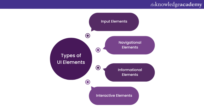
UI Elements can be categorised into different types based on their functions. Understanding these types will help you design interfaces that are both functional and visually appealing:

Input Elements
Input Elements are the core components of UIs, allowing users to interact with digital applications by providing data, making selections, or triggering actions. They serve as bridges between users and the software, enabling various forms of engagement and interaction.
Input Elements can take on diverse forms, including text fields for data input, checkboxes and radio buttons for making selections, buttons for executing actions, sliders for precise value adjustments, and more. Each Input Element serves a specific purpose in facilitating user engagement and communication with the interface.
Navigational Elements
Navigational Elements are fundamental components of UIs that guide users through digital applications, websites, or software. They play a pivotal role in helping users move seamlessly within an interface and access various sections or features.
These elements include navigation menus, buttons, tabs, breadcrumbs, and links, among others. Navigation menus, for instance, provide a structured hierarchy of links to different parts of an application or website, simplifying the user's journey. Buttons, on the other hand, offer direct paths to specific actions or destinations.
The design and organisation of navigational elements significantly impact the User Experience. Well-planned navigation enhances usability and user satisfaction by reducing the effort required to find information or perform tasks. In contrast, poor navigation can lead to user confusion and frustration.
Informational Elements
Informational Elements in UIs serve the essential role of providing users with information, guidance, and context as they interact with digital applications, websites, or software. These elements are instrumental in improving user comprehension and facilitating efficient navigation.
Informational Elements encompass a variety of components, including tooltips, icons, labels, images, graphics, and error messages. Each serves to enhance user understanding and engagement in its own way.
Interactive elements
Interactive Elements are pivotal components within UIs, enabling users to engage directly with digital applications, websites, or software. These elements foster dynamic interactions, allowing users to perform actions, make selections, or adjust settings.
Examples of Interactive Elements include sliders, carousels, buttons, checkboxes, and radio buttons. Sliders, for instance, empower users to select values within a predefined range, providing precision in setting preferences. Buttons trigger actions, such as form submissions or navigation. Checkboxes allow multiple selections, while radio buttons permit single choices. Effective use of Interactive Elements is essential for enhancing user engagement and providing a responsive and intuitive User Experience.
Unlock the digital universe's secrets – Register in our App & Web Development Training adventure!
Feedback Elements
Feedback Elements within UIs play a crucial role in providing users with information about the status of actions, tasks, or processes. These elements enhance transparency and user confidence by communicating outcomes and updates in real time.
Common feedback elements include progress bars, modal windows, and notifications. Progress bars visually indicate the progress of ongoing processes or downloads, offering feedback on task completion. Modal windows temporarily overlay the main content to display alerts, forms, or interactions, keeping users informed. Notifications provide timely updates and alerts to users about new messages, updates, or events.
List of UI Elements
In this section, we will explore a wide range of UI Elements such as buttons for actions, text fields for data input, and more. Each element serves a specific purpose and can be customised to match your design aesthetics.
Buttons
Buttons play a crucial role in UIs. They serve as Interactive Elements that guide users through an application's functions. Buttons are easily recognisable by their distinct appearance and clear labels, making them intuitive for users to click or tap. They facilitate actions like submitting forms, progressing to the next page, or confirming choices.
However, it's essential to use buttons thoughtfully. An overabundance of buttons can clutter the interface, overwhelming users with choices. Striking the right balance between providing necessary actions and avoiding excessive clutter is key to ensuring a seamless User Experience.
Text fields
Text fields are versatile components that empower users to input various types of information. They are commonly used for tasks such as entering names, addresses, search queries, or messages. Text fields enable user interaction, data collection, and communication.
Yet, they come with considerations. Text fields, especially for longer inputs, can be prone to user errors. Proper validation and error-handling mechanisms should be in place to minimise user frustrations and ensure smooth data entry.
Dropdowns
Dropdowns are efficient space-saving UI Elements that provide structured lists of choices in a compact format. They contribute to a cleaner interface by reducing visual clutter and offering users a convenient way to select from predetermined options. This enhances the overall User Experience by simplifying complex choices and conserving screen space.
Nevertheless, dropdowns have nuances. They may initially hide options from users until they interact with them. This design choice emphasises the importance of clear user guidance and intuitive design to ensure users readily discover the available choices without confusion.
Checkboxes and radio buttons
Checkboxes are interactive elements that allow users to select multiple options from a list. They are widely used for tasks where users need to make multiple selections simultaneously, offering flexibility and convenience.
Radio buttons, on the other hand, permit users to make a selection from a list of options. They are suitable for situations where only one choice should be made, providing clarity and preventing conflicting selections.
However, it's crucial to be mindful of their design and placement to avoid overwhelming users when presenting numerous options, as this can affect the overall User Experience.
Icons
Icons are compact visual representations of actions or concepts, enhancing UIs by offering quick and recognisable navigation aids. They are particularly valuable for conveying information without relying on text.
Icons can enhance the aesthetics of an interface while reducing clutter caused by excessive text. However, their effectiveness depends on users' familiarity with the icons used. If icons are unclear or unfamiliar, they may lead to user confusion.
Sliders
Sliders provide users with an intuitive method to select values within a specified range. They are ideal for tasks requiring precise control over numerical preferences.
Sliders are particularly useful when users need to adjust settings or make selections that involve numerical values. However, they may not be suitable for all types of data input and may consume more screen space compared to other input methods.
Progress bars
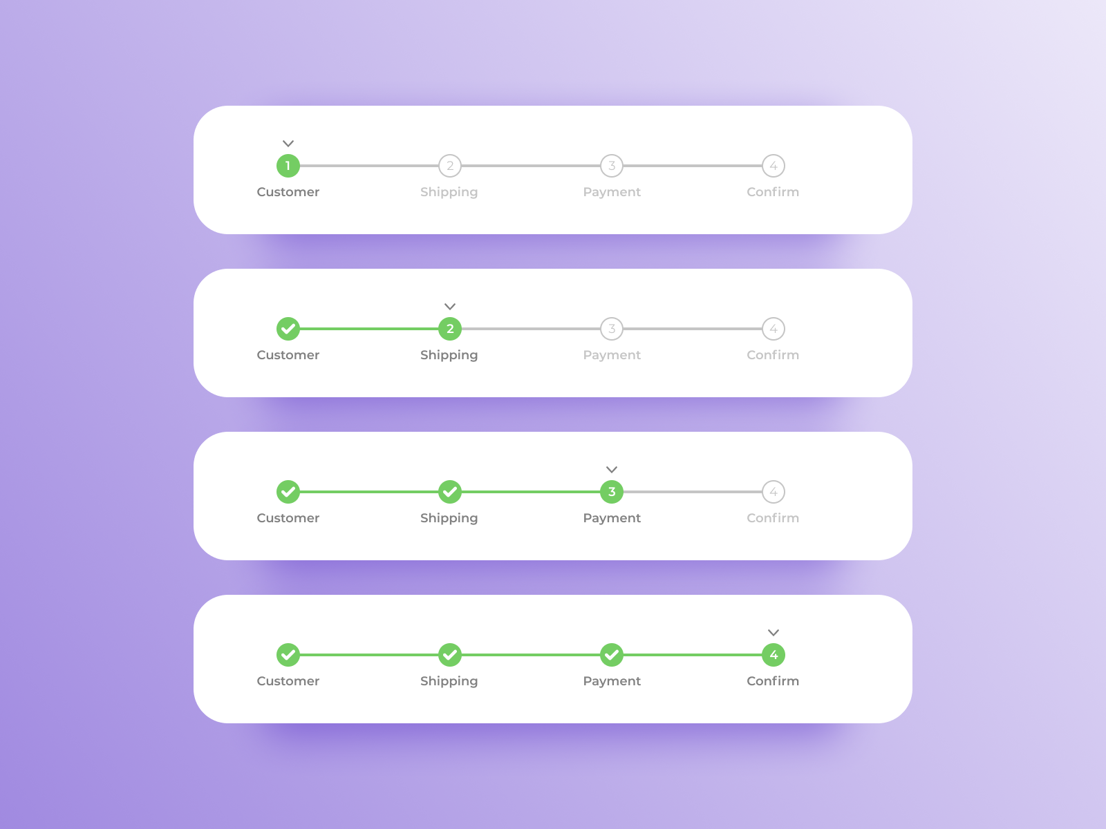
Progress bars are visual indicators that display the status of ongoing processes or downloads. They provide users with real-time feedback on the progress of a task, enhancing transparency and user confidence.
Progress bars are especially useful for tasks with indeterminate time frames, such as file uploads or software installations. However, overusing progress bars can clutter the interface and lead to user frustration, so their placement and design require careful consideration. Here’s an example for progress bar.

Navigation menus
Navigation menus are essential components for organising and providing access to different sections of a website or application. They serve as roadmaps, guiding users to their desired destinations.
Navigation menus come in various styles, including dropdown menus, sidebars, and hamburger menus for mobile devices. Well-structured menus streamline user journeys and improve usability. However, poor navigation menu design can confuse users and hinder their ability to find what they need.
Tooltips
Tooltips are small informational pop-ups that appear when users hover over an element. They offer supplementary information or explanations, enhancing the user's understanding of an element's purpose.
Tooltips can be valuable for clarifying abbreviations, icons, or unfamiliar terms, improving user comprehension. However, excessive or intrusive tooltips can be distracting and frustrating for users. Therefore, it's essential to use them judiciously and ensure they appear at the right time and place.
Modal windows
Modal windows are temporary pop-up dialog boxes that overlay the main content. They are commonly used for displaying critical information, alerts, or interactive forms while temporarily dimming the background.
Modal windows are effective at capturing user attention and prompting specific actions. However, they should be used sparingly, as too many modals can disrupt the User Experience and create a sense of interruption or inconvenience.
Forms
Forms are interactive elements used for collecting user input, such as registration details, feedback, or survey responses. They facilitate data submission and communication between users and systems.
Well-designed forms are user-friendly and efficient, making data entry straightforward. However, complex or poorly organised forms can lead to user frustration and errors. Careful consideration of form fields, labels, and validation is essential for a smooth User Experience.
Accordions
Accordions are interface components that organise content into expandable sections, allowing users to reveal or hide information as needed. They are valuable for presenting extensive content without overwhelming users with too much information at once.
Accordions can enhance user engagement by providing a sense of control over content consumption. However, their design and labelling should be clear to avoid confusion regarding what information each section contains.
Carousels
Carousels are dynamic elements that showcase multiple pieces of content or images in a rotating fashion within a confined space. They are often used to highlight featured products, news articles, or promotional content.
Carousels provide a visually engaging way to present diverse content within a limited area. However, they should be carefully designed and monitored to ensure that users have enough time to absorb the information and that the carousel does not interfere with accessibility or user navigation.
Conclusion
Proficiency in UI Elements streamlines the design and development processes. Designers can choose features and arrange them efficiently, improving workflows. Developers can implement these designs more effectively, reducing development time and costs. Ultimately, a well-crafted UI contributes to user satisfaction. Users will perceive the product positively When they find an application easy to use and aesthetically pleasing.
Turn your web dreams into reality – Sign up now for our JQuery UI Development Training and master jQuery UI Development!
Frequently Asked Questions
Upcoming Programming & DevOps Resources Batches & Dates
Date
 UI UX Design Course
Mon 10th Feb 2025
Mon 12th May 2025
Mon 7th Jul 2025
Mon 15th Sep 2025
Mon 3rd Nov 2025
Mon 15th Dec 2025


 Top Rated Course


 If you wish to make any changes to your course, please


