We may not have the course you’re looking for. If you enquire or give us a call on +60 1800812339 and speak to our training experts, we may still be able to help with your training requirements.
We ensure quality, budget-alignment, and timely delivery by our expert instructors.

Visibility is the most important factor in analysing data, and, using Excel Pivot Chart, one can turn his data into an impressive chart. So, if you have Are questioning yourself How to Create a Pivot Chart in Excel you have come to the right place!
Pivot Tables allow you to interactively examine a dataset by reporting and summarising the data through drill down, filter, sort, and catch up. Paired with the ability to learn How to Create a Pivot Chart in Excel, they make data storytelling easy, whether you’re working on complicated business reports or personal projects.
For this, the steps are given in this blog on How to Create a Pivot Chart in Excel that is both, great in utility value and aesthetically pleasing. Pivot Charts as a tool avails data for consumption in a very practical and almost real-life kind of way. Seems like the perfect time for me to get wet and the process begins!
Table of Contents
1) What is a Pivot Chart in Excel?
2) Steps to Create a Pivot Chart in Excel
3) How to Change Pivot Chart Types in Excel?
4) How to Filter a Pivot Chart in Excel
5) How to Modify a Pivot Chart?
6) How to Remove Fields Buttons From Pivot Chart?
7) How to Refresh Pivot Chart in Excel
8) Extra tips on Pivot Charts
9) Conclusion
What is a Pivot Chart in Excel?
Pivot Chart is a built-in programming tool that summarises your Pivot table data in an interactive dataset in an Excel spreadsheet. It is the visual depiction of a pivot table in Excel.
A Pivot Chart is a valuable tool, particularly when working with big volumes of data. For example, an XYZ corporation employs 200 people, and each candidate's working hours have been recorded in Excel by HR. They want to locate the employee who has taken the least amount of leave in the entire year. By doing this, they can honour them for sincerity and loyalty to the firm.
Manually going through the complete list would be time-consuming, and the findings may be erroneous. Here Microsoft Excel offers a built-in function called "Pivot Table" or "Pivot Chart" to help with similar jobs. Charts provide rapid visual restructuring and understanding of your data, easing the entire process.
Steps to Create Pivot Chart in Excel
There are two ways to create a Pivot Chart. One is to add Chart to your existing table, and the other is creating a Chart from scratch.
Create a Pivot Chart from Scratch
Creating a Pivot Chart from scratch is as simple like creating a Pivot table. All you need is a data sheet.
Step 1: choose any cell in the data sheet and click on the Insert tab, then go to charts and select Pivot Chart
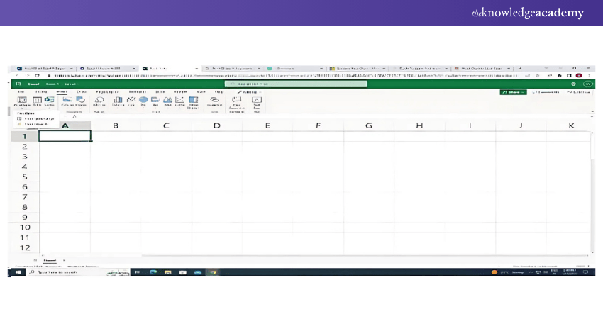
Step 2: The pop-up window automatically selects the entire data, and you have the option to choose the area where you want to insert the Pivot Chart

Step 3: Click OK. Now you have a blank Pivot Chart in a worksheet
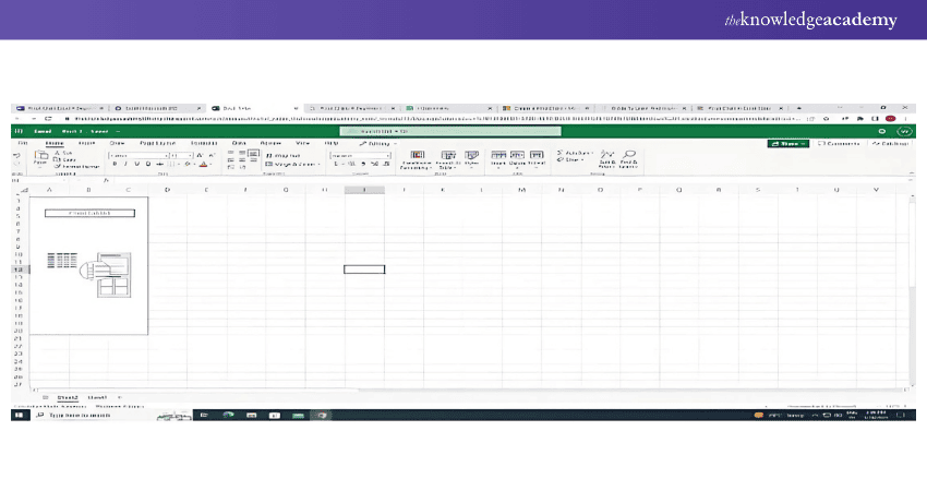
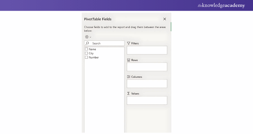
In a Pivot Chart, we have four components:
a) Axis: The axis in the Pivot Chart is the same as the rows in the Pivot Table
b) Legend: The legend in the Pivot Chart is the same as the columns in the Pivot Table
c) Values: We are using quantity as values
d) Report filter: It is used to filter your Pivot Chart
Learn the fundamentals of Microsoft Excel VBA and Macro. Sign up for our Microsoft Excel VBA and Macro Training now!
Create a Pivot Chart from the existing Pivot Table
If you already have a pivot table in your worksheet, follow these simple steps to insert a pivot chart.
Step 1: Select any cells from the Pivot Table

Step 2: Click on the Insert tab - Chart - Pivot Chart and click on the chart which you want to use
Step 3: Click OK
It will create a new Pivot Chart in the same worksheet. In addition, the Pivot Chart will use the rows of the pivot table as the axis and the columns as the legend.
Learn the fundamentals of Microsoft Excel. Sign up for our Microsoft Excel Training now!
How to Change Pivot Chart types in Excel?
You can use any of the Pivot Charts provided by Microsoft Excel to depict your Pivot Table data graphically. It helps to make data analysis more productive and aesthetically appealing. As a result, knowing how to build and filter a Pivot Chart is just as important as picking the right Pivot Chart for data presentation. You can alter the kind of Pivot Chart at any time.
Follow the given steps to change the Pivot Chart type in Excel:
Step 1: Select the previously created Pivot chart
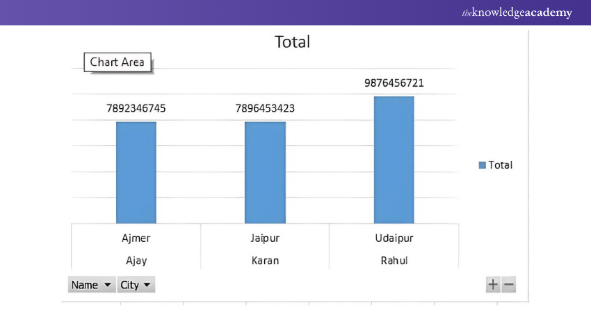
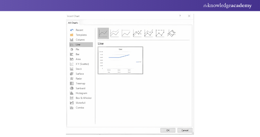
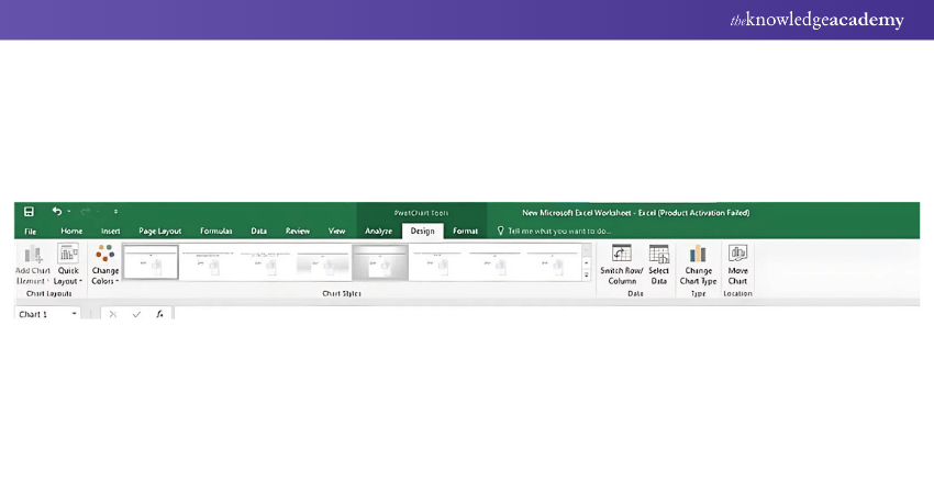
Step 2: Go to the Menu Bar - Design Tab - Type - Chart Type
Step 3: The following window will open. Select the chart type to represent your data more visually. Then, click on Ok
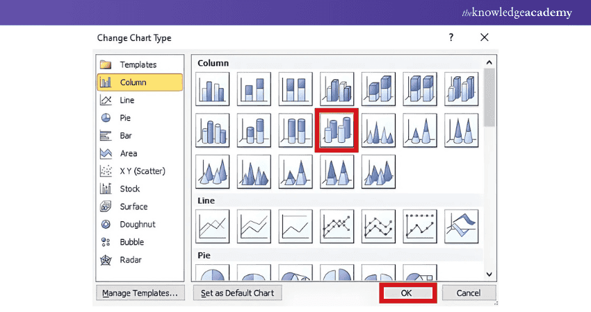
Step 4: Pivot Chart will be changed. MS Excel will immediately replace the existing Pivot Chart
Learn the fundamentals of Microsoft Excel. Sign up for our Microsoft Excel Course now!
How to Filter a Pivot Chart in Excel
Here followings are the steps to follow for filtering a Pivot Chart in Excel:
a) Add Filters to the Pivot Chart:
a) Guarantee the Pivot Table that is used to create the chart contains proper fields in the Filters of the PivotTable Field List.
b) Filters can be applied to different objects such as column, row or slicer.
b) Apply Filters:
a) You can use the Filter Field which is located above the chart or on the Pivot Table, to apply a filter, click the drop-down button.
b) Choose a mobility value or a condition to filter the values shown on the chart.
c) Using Slicers:
a) Locate the PivotTable Analyse tab (or the PivotTable Options in Excel 2003 or earlier). In the ribbon, click Insert Slicer.
b) Choose the fields to put into slicers, and these will be visible as the buttons to apply on your worksheet.
c) Deploy slicers to make a dynamic filter of the chart.
d) Using Timeline:
a) For key-based data, insert a Timeline from the PivotTable Analyse tab and block all but the keys of interest in your chart.
How to Modify a Pivot Chart
The following are the points to do for modifying a Pivot Chart:
a) Change Chart Type:
a) Go to the Pivot Chart and right click it to click on change chart type.
b) Select the preferred chart style (column, bar, line, pie and others).
b) Customise Chart Elements:
a) By going to the Chart Elements button labelled with a plus sign
b) You can add or change titles, data labels, gridlines or legends on the chart.
c) Format the Chart:
a) Select the particular chart feature you wish to format and right-click on it and from the menu that appears, click on Format (e.g., Format Axis, Format Data Series).
b) Format colours, fonts, or styles of the selected entry from the Format tab.
d) Update Data Fields:
a) In the PivotTable Field List, users need to be able to rearrange fields by simple drag and drop to modify the displayed data in the chart.
e) Adjust Layout:
a) To do that, go to the Design tab and you have tools like the Quick Layouts or changing the Chart Style to make it look great.
How to Remove Fields Buttons from Pivot Chart
Here are the pointers to remove fields buttons from Pivot Chart:
a) Locate Field Buttons:
a) Field buttons appear as small dropdown menus on the Pivot Chart for filtering or modifying the data directly.
b) Remove Field Buttons:
a) Right-click on any field button on the chart and choose Hide All Field Buttons on Chart.
b) Alternatively, go to the PivotChart Analyse tab and uncheck Field Buttons in the Show/Hide group.
How to Refresh Pivot Chart in Excel
Here following are the points to follow for refreshing the Pivot Chat in Excel:
a) Refresh the Underlying Pivot Table:
a) Pivot Table doesn’t allow users to carry out sub-total calculations for different group sets at the same time.
b) While Pivot Table doesn’t allow users to plot more than one Pivot Chart on the same chart sheet.
c) Whenever there is information that is dynamic in the Pivot Table Analyse tab select Data, then select the Refresh option.
b) Refresh All:
a) To refresh all the data source s Gor Pivot Tables ans Pivot Charts in the workbook, go to the Data button and click Refresh All.
c) Auto-Refresh on Open:
a) For now, click on any cell within the Pivot Table and right click then select PivotTable Options.
b) When you are under the Data category, select Refresh data when opening the file.
d) Shortcut for Refresh:
a) To refresh the selected Pivot Chart/Table you can apply a quick keyboard combination – Alt + F5.
Extra Tips on Pivot Charts
Learn three useful tips for Pivot Chart to create an interactive Excel Dashboard by reading further.
Add Expand/Collapse Button
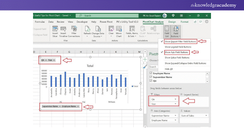
We can add an expand/collapse button on a Pivot chart to expand the Chart to the next level hierarchy. For instance, we can show the Agent and Supervisor wise chart or Year and Quarter-wise chart.

1) Choose the Pivot Chart and go to the PivotChart Analyze.
2) Go to the Fields Buttons.
3) Check the Expand/Collapse Entire Field Buttons
Add filter buttons
Filter buttons are useful for filtering the data on the Chart. These buttons are available on the Chart.
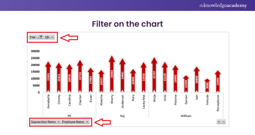
1) In the Pivot Charts Fields, there are option to add the Filters box
2) Check the Show Report Field Buttons in the Field Buttons

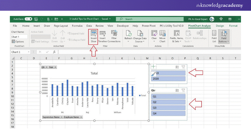
Connect with the Slicer
1) Go to the PivotChart Analyse after selecting the Pivot Chart
2) Click on Insert Slicers
3) Choose the Field name in the Insert Slicers window.
Learn to create and prepare Gantt charts by registering for our Excel Training With Gantt Charts Course !
Conclusion
In this blog, we have learned about Pivot Chart in Excel. It is a graphical depiction of a pivot table or a data source. It allows us to display the summary data in a graphical way using several chart types.
There are several possibilities for filtering, formatting, customizing charts, and adding alternative layouts. When working with a large quantity of data, an Excel Pivot Chart comes in handy, especially when creating a dashboard in Excel. It's highly beneficial during business presentations, offering features such as one-click filtering, time-based filtering, customizable computations, and more.
Enhance your professional skills with our Microsoft Excel Training & Certification Course – register today!
Frequently Asked Questions
What is the Difference Between a Pivot Chart and a Pivot Table?

A pivot table enables you to analyse data using pivot filters, rows, columns and values while presenting and summarising data in a tabular format. Pivot chart is an implementation of the Pivot table showing trends, patterns or comparison in form of a graph.
What is the Error While Making a Pivot Table in Excel?

Errors while creating a Pivot Table in Excel may include:
a) Blank or Invalid Data: Missing or non-tabular data can cause issues.
b) Duplicate Field Names: Fields with identical names in the dataset.
c) Data Range Issues: Selecting the wrong or incomplete range.
d) Outdated Cache: Cached data causing conflicts
What are the Other Resources and Offers Provided by The Knowledge Academy?

The Knowledge Academy takes global learning to new heights, offering over 3,000 online courses across 490+ locations in 190+ countries. This expansive reach ensures accessibility and convenience for learners worldwide.
Alongside our diverse Online Course Catalogue, encompassing 19 major categories, we go the extra mile by providing a plethora of free educational Online Resources like News updates, Blogs, videos, webinars, and interview questions. Tailoring learning experiences further, professionals can maximise value with customisable Course Bundles of TKA.
What is The Knowledge Pass, and How Does it Work?

The Knowledge Academy’s Knowledge Pass, a prepaid voucher, adds another layer of flexibility, allowing course bookings over a 12-month period. Join us on a journey where education knows no bounds.
What are Related Courses and Blogs Provided by The Knowledge Academy?

The Knowledge Academy offers various Microsoft Excel Training, including Microsoft Excel Masterclass, Excel for Accountants Masterclass, and Business Analytics With Excel Masterclass. These courses cater to different skill levels, providing comprehensive insights into What is Excel.
Our Office Applications Blogs cover a range of topics related to Microsoft Excel, offering valuable resources, best practices, and industry insights. Whether you are a beginner or looking to advance your Excel skills, The Knowledge Academy's diverse courses and informative blogs have you covered.
Upcoming Office Applications Resources Batches & Dates
Date
 Microsoft Excel Course
Fri 4th Apr 2025
Fri 16th May 2025
Fri 11th Jul 2025
Fri 19th Sep 2025
Fri 21st Nov 2025


 Top Rated Course


 If you wish to make any changes to your course, please


