


 Top Rated Course


We may not have the course you’re looking for. If you enquire or give us a call on +44 1344 203 999 and speak to our training experts, we may still be able to help with your training requirements.
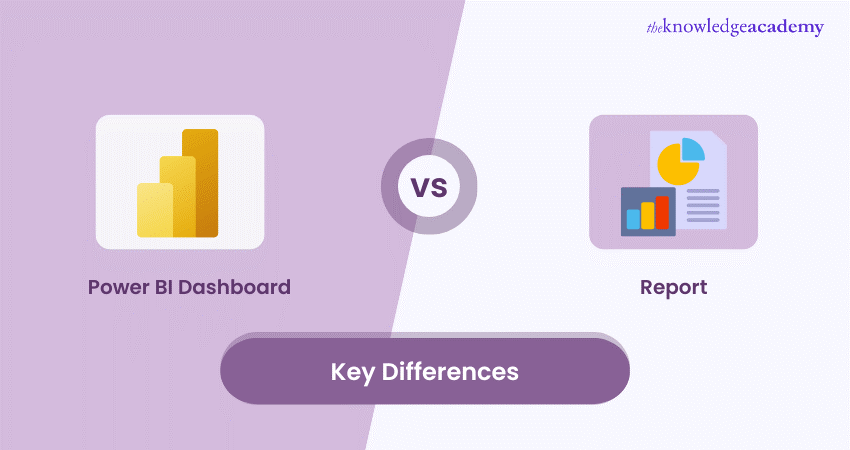
Power BI Dashboard vs Report: A Comprehensive Analysis
Sophia Ellis 18 November 2024Power BI is a powerful tool for creating and sharing Data Visualisations. But what are the differences between Power BI Dashboards and Reports? How do they serve different purposes and audiences? In this blog, we will explore these questions and provide a comprehensive analysis of Power BI Dashboard vs Report. Let’s dive in!

Training Outcomes Within Your Budget!
We ensure quality, budget-alignment, and timely delivery by our expert instructors.
Table of Contents
Data is everywhere, and it is essential for making informed decisions. But how can we make sense of the large and complex datasets we encounter daily? This is where Power BI comes in. With Power BI, you can create stunning dashboards and reports that tell compelling stories with your data. But what are the differences between Power BI Dashboards vs Reports?
In this blog, we will answer these questions by comprehensively analysing Power BI Dashboard vs Report. Read this blog to understand the differences between Power BI Dashboard and Reports.
Table of Contents
1) What are Power BI Dashboards?
2) Features of Power BI Dashboards
3) What are Power BI Reports?
4) Power BI Dashboard vs Report: Understanding differences
5) Conclusion
What are Power BI Dashboards?
A Power BI Dashboard is a single-page, interactive display of the most important information from your data. A dashboard can contain one or more tiles, which are visual elements that show data from various sources, such as reports, datasets, web pages, images, etc. A dashboard can also have buttons, filters, slicers, and other controls that allow you to interact with the data and customise your view. A dashboard is designed to provide a quick overview of the key metrics and trends that matter to you and to enable you to drill down into the details when needed.
Features of Power BI Dashboard
Some of the features of the Power BI Dashboard are:
a) You can create a dashboard by pinning tiles from existing reports or creating new tiles from scratch.
b) You can share your dashboard with different users or publish it on the web for public access.
c) Your dashboard is accessible from various devices, including desktops, tablets, and mobile phones.
d) You can set up alerts on your dashboard to notify you when the data changes or meets certain conditions.
e) Using natural language, you can ask your dashboard questions and get answers from charts or tables.
f) You can integrate your dashboard with other services like Cortana, Microsoft Teams, Power Automate, etc.

What are Power BI Reports?
A Power BI Report is a multi-page, interactive collection of visualisations that display data from one or more datasets. A report can contain charts, tables, maps, gauges, cards, and other visuals that show different aspects and insights from your data. A report can also have filters, slicers, bookmarks, buttons, and other features that allow you to interact with the data and create different views. A report is designed to provide a detailed and comprehensive Data Analysis and enable you to explore and discover new insights.
Features of Power BI Report
Some of the features of the Power BI Report are:
a) You can create a report by connecting to one or more data sources, such as Excel, SQL Server, web, etc., and applying various transformations and calculations to your data.
b) You can design your report by choosing from various visuals, formats, themes, and layouts and adding custom elements, such as shapes, images, text boxes, etc.
c) You can publish your report to the Power BI service, share it with other users or embed it into other applications, such as SharePoint, Power Apps, etc.
d) You can export your report to PDF, PowerPoint, or Excel or print it offline.
e) You can use the Power BI Desktop app, which is a free download, to create and edit your reports offline.
|
Power BI Dashboard features |
Power BI Report features |
|
Create a dashboard by pinning tiles or from scratch |
Create a report by connecting to data sources |
|
Share the dashboard with users or publish for public access |
Design report with visuals, formats, themes, layouts |
|
Accessible on desktops, tablets, and mobile phones |
Add custom elements (shapes, images, text boxes, etc.) |
|
Set up alerts for data changes or specific conditions |
Publish report to Power BI service |
|
Ask questions using natural language |
Share or embed reports in applications (SharePoint, Power Apps, etc.) |
|
Integrate with other services (Cortana, Teams, Power Automate, etc.) |
Export report to PDF, PowerPoint, Excel or print offline |
This table combines features from both Power BI Dashboards and Reports, providing a comprehensive overview of the capabilities offered by each.
Unlock your data-driven potential with our Microsoft Power BI Certification Course and supercharge your career in analytics today!
Power BI Dashboard vs Report: Understanding differences
Power BI, a Business Analytics tool by Microsoft, offers two primary components for Data Visualisation and Analysis: Dashboards and Reports. While they may seem similar at first glance, they fulfil specific purposes and address varied requirements in the Data Analysis process.
Here's a table outlining the differences between Power BI Dashboards and Reports based on the specified criteria:
|
Criteria |
Power BI Dashboard |
Power BI Report |
|
Definition |
A single-page canvas that provides a consolidated view of key metrics and data through visualisations. |
A multi-page document that contains various visualisations, tables, and data representations. |
|
Purpose |
To provide a high-level overview of Key Performance Indicators (KPIs) and critical data at a glance. |
To offer detailed insights and in-depth analysis of specific data sets with a focus on data exploration. |
|
Interactivity |
Generally limited interactivity, often used for monitoring purposes with predefined visuals. |
Highly interactive, allowing users to explore and analyse data in detail, apply filters, and drill down. |
|
Structure |
Single-page layout with a fixed set of visuals and tiles. |
Multiple pages or tabs with flexibility to arrange visuals and create a more structured and detailed view. |
|
Data updates |
Real-time or scheduled updates for streaming data. |
Supports real-time data but often relies on scheduled refreshes for periodic data updates. |
|
Use case |
Ideal for high-level executive summaries and monitoring. |
Suitable for in-depth analysis, detailed reporting, and data exploration by analysts and business users. |
Definition
A Power BI Report is a multi-paged document that presents data in a structured manner. It typically includes visuals like charts, graphs, and tables, allowing users to dive deep into specific aspects of the data. Reports are highly customisable and are designed to provide detailed insights into the underlying dataset.
On the other hand, a Power BI Dashboard is a single-page canvas that consolidates key visuals and insights from multiple reports. Dashboards are more high-level and are meant to offer a quick, comprehensive view of the most crucial metrics and KPIs. They act as a centralised hub for monitoring a business's overall health and performance.
Purpose
The purpose of a Power BI Report is to enable in-depth analysis and exploration of data. Data Analysts and Business Intelligence professionals often use reports to create detailed, interactive presentations of data trends, patterns, and outliers. Users can slice and dice the data, apply filters, and drill down into specific details to extract valuable insights.
In contrast, the purpose of a Power BI Dashboard is to provide a snapshot of the most important information at a glance. Dashboards are valuable for executives and decision-makers who need quick access to Key Performance Indicators without delving into the minutiae of detailed reports. Dashboards simplify complex data into visually digestible components, aiding swift decision-making.
Interactivity
Reports are designed for extensive interactivity. Report users can interact with different elements, such as choosing data points, implementing filters, and exploring a range of visualisations. This level of interactivity allows for a detailed and personalised analysis based on specific user needs.
Dashboards, while still interactive, are more focused on high-level interactions. Users can interact with the visuals on the dashboard, such as clicking on a chart to see underlying details. Still, the interaction is generally more limited compared to a full-fledged report. Dashboards prioritise simplicity and quick access to key information.
Structure
Reports are structured as multi-page documents, with each page containing different visuals, insights, and analyses. Users can navigate through these pages to explore various aspects of the data. The structure of a report is flexible, allowing for a detailed and organised presentation of information.
In contrast, dashboards have a single-page layout. The layout optimises the display of key metrics and visuals in a consolidated view. The goal is to provide a comprehensive overview without the need to navigate through multiple pages. The structure of a dashboard is more focused on simplicity and clarity.
Data updates
Reports are often designed to handle frequent data updates and changes. Users can refresh the data within a report to ensure the analysis remains up-to-date. It is crucial for dynamic and evolving datasets requiring real-time or near-real-time insights.
While capable of handling data updates, dashboards are generally geared towards periodic updates. The focus is on presenting stable, high-level metrics and making dashboards suitable for scenarios where real-time updates are not critical.
Use case
Power BI Reports are ideal for detailed analysis, exploration, and customisation scenarios. They are suitable for data professionals and analysts who need a comprehensive understanding of the data and want to create detailed presentations for stakeholders.
On the other hand, Power BI Dashboards are best suited for scenarios where decision-makers and executives need a quick, high-level overview of key metrics. Dashboards are valuable when time is of the essence, and users require immediate insights without delving into the intricacies of detailed reports.
Elevate your analytics game with our Microsoft BI Training today!
Conclusion
Power BI Dashboards and Reports are powerful Data Visualisation and Analysis tools but have different features, purposes, and use cases. Understanding the differences between Power BI Dashboards and Reports allows you to make the most of your data and create stunning and informative visuals. We hope this blog has helped you learn more about Power BI Dashboard vs Report and decide which is right for you.
Unlock actionable insights today with our Business Intelligence Reporting Courses - Elevate your decision-making!
Frequently Asked Questions
How can I switch between Power BI Dashboards and Reports?

You can switch between Power BI Dashboards and Reports by using the navigation pane on the left side of the Power BI service. You can also click on a tile on a dashboard to open the report it is pinned from or pin a visual from a report to a dashboard.
How can I share Power BI Dashboards and Reports with others?
You can share Power BI Dashboards and Reports with others using the share button on the top right corner of the Power BI service. Additionally, you have the capability to publish your dashboards and reports on the web or embed them seamlessly into other applications like SharePoint, Power Apps, and more.
How do Power BI Dataflows enhance analytics?
By centralising data preparation and transformation tasks, Power BI Dataflows streamline the analytics process. They promote data consistency, accuracy, and collaboration across teams, allowing users to leverage curated datasets for insightful reporting and decision-making within Power BI.
What are the other resources and offers provided by The Knowledge Academy?
The Knowledge Academy takes global learning to new heights, offering over 30,000 online courses across 490+ locations in 220 countries. This expansive reach ensures accessibility and convenience for learners worldwide.
Alongside our diverse Online Course Catalogue, encompassing 17 major categories, we go the extra mile by providing a plethora of free educational Online Resources like News updates, Blogs, videos, webinars, and interview questions. Tailoring learning experiences further, professionals can maximise value with customisable Course Bundles of TKA.
What is the Knowledge Pass, and how does it work?
The Knowledge Academy’s Knowledge Pass, a prepaid voucher, adds another layer of flexibility, allowing course bookings over 12 months. Join us on a journey where education knows no bounds.
What are related courses and blogs provided by The Knowledge Academy?
The Knowledge Academy offers various Business Intelligence Reporting Courses, including Microsoft Power BI Course, Tableau Desktop Training, and DAX Training. These courses cater to different skill levels, providing comprehensive insights into Power BI Charts for Data Visualisation.
Our Office Applications Blogs cover a range of topics related to Power BI, offering valuable resources, best practices, and industry insights. Whether you are a beginner or looking to advance your Power BI skills, The Knowledge Academy's diverse courses and informative blogs have you covered.
 If you wish to make any changes to your course, please


