We may not have the course you’re looking for. If you enquire or give us a call on +47 80010068 and speak to our training experts, we may still be able to help with your training requirements.
Training Outcomes Within Your Budget!
We ensure quality, budget-alignment, and timely delivery by our expert instructors.
- Quick Powerful Graphics with Power View, PowerPivot, Power Query, Power Map and Power BI M55164
- Microsoft Power BI for End Users 55400AC
- Retired : Designing and Implementing Enterprise-Scale Analytics Solutions Using Microsoft Azure and Microsoft Power BI DP500
- Microsoft Power BI Data Analyst PL300
- Microsoft BI Training

Data Visualisation plays a vital role in making informed decisions in today's data-driven world, and one such popular visualisation technique is the Heatmap. These Maps enable us to identify patterns and correlations within complex datasets. But do you know how to create them? Power BI stands out as a leading Business Intelligence tool when it comes to creating powerful and interactive maps, making Power BI Heatmap a valuable resource for BI professionals.
According to Statista, the Business Intelligence (BI) tools market will grow to 12.18 billion GBP in the next few years. Thus the knowledge of Heatmap is sure to help you with your future endeavours using Power BI. Power BI Heatmap is a map-based visualisation tool that displays data density. Keep reading this blog to learn how to use it.
Table of Contents
1) What is a Power BI Heatmap?
2) Uses of a Power BI Heatmap
3) Creating a Heatmaps in Power BI
4) Enhancing a Power BI Heatmap
5) Conclusion
What is a Power BI Heatmap?
A Power BI Heatmap is a dynamic and visually engaging data visualisation technique that uses colours and intensity to represent patterns, trends, and relationships within a dataset. It allows you to effectively explore and analyse data by providing a concise and intuitive summary of complex information.
The fundamental structure of Power BI’s Heat Mapping consists of a grid or matrix, where each cell represents a data point. The cells are filled with colours that correspond to the underlying data values. This helps create a visual representation that allows you to quickly identify areas of interest.
The colours used in Power BI’s heat mapping are carefully chosen to reflect the magnitude or density of the data values being represented. Typically, a gradient of colours is used, where cooler colours such as blue or green represent lower values, while warmer colours such as red or orange indicate higher values. This colour scale provides a visual cue that can help you understand the relative intensity or significance of the data.
One of the key advantages of Power BI Heatmaps is their versatility in handling different types of data. Whether it is numerical data, categorical data, or even geographical data, Power BI can effectively translate the information into a heat mapping format. This flexibility can help you gain insights and discover patterns across various domains and industries.
Power BI’s Heatmaps also offer interactivity and customisation options, allowing you to explore the data in a more personalised way. You can interact with the map by zooming in or out, filtering specific data points, or adjusting the colour scale to focus on specific ranges or thresholds. This interactivity enhances the analytical process and facilitates deeper exploration of the dataset.
Furthermore, Power BI provides a range of additional features to enhance heat mapping visualisation. You can incorporate additional visual elements, such as labels or tooltips, to provide context and further insights. It also supports drill-through actions, allowing you to delve into more detailed information by clicking on specific cells or regions of the map.
Uses of a Power BI Heatmap
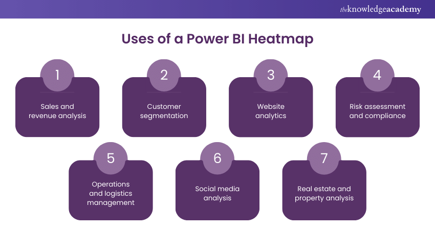
Power BI’s Heatmap offers a wide range of applications and benefits across various industries and domains. They provide a visually intuitive way to analyse and present data, allowing you to gain valuable insights and make data-driven decisions. Some key uses of Heatmaps are as follows:

Sales and revenue analysis
Heatmaps allow you to identify regions or territories with high or low sales performance, visualise sales trends over time, and uncover potential growth opportunities. By mapping sales data onto a geographic Heatmap, you can quickly identify hotspots and make informed decisions about resource allocation, marketing strategies, and sales targeting.
Transform data with Power BI Desktop. Start your journey to insightful analytics today!
Customer segmentation
Power BI Heatmaps help in segmenting customers based on various criteria, such as demographics, purchasing behaviour, or engagement metrics. By visualising customer data through Maps, you can identify clusters or patterns that group customers with similar characteristics or preferences. This segmentation facilitates targeted marketing campaigns, personalised customer experiences, and improved customer satisfaction.
Learn how to handle data with our Microsoft BI Training today!
Website analytics
Heat mapping is a valuable tool in website analytics. By visualising user interactions, click-through rates, or session durations on a web page, Power BI’s Heatmaps provide insights into user behaviour and identify areas of high engagement or drop-offs. This information allows website owners to optimise their websites, improve user experiences, and maximise conversions.
Risk assessment and compliance
Heatmaps play a crucial role in risk assessment and compliance monitoring. By mapping data related to risk factors, regulatory compliance, or security incidents, Power BI Heatmaps provide a comprehensive view of potential vulnerabilities or compliance gaps. You can quickly identify high-risk areas, assess the impact, and implement mitigation strategies effectively.
Unlock insights with Power BI filters! Dive into our easy guide today.
Operations and logistics management
By visualising data related to transportation routes, inventory levels, or production cycles, you can identify bottlenecks, optimise resource allocation, and improve supply chain efficiency. Heat Mapping enables you to analyse the spatial distribution of data and make data-driven decisions to enhance operational performance.
Social media analysis
Heat Mapping is valuable in social media analysis, helping you understand engagement patterns, sentiment analysis, or geospatial trends. By visualising social media data through Power BI Heatmaps, you can identify regions with high social media activity, monitor brand sentiment across different locations, and gauge the effectiveness of marketing campaigns.
Real estate and property analysis
Power BI Heatmaps are extensively used to map property prices, rental yields, or housing demand. Youcan identify areas with high property values, market trends, and investment opportunities. This information assists real estate professionals, investors, and homebuyers in making informed decisions.
Learn Data Visualisation in MS Power BI with our Microsoft Power BI Course!
Creating a Heatmaps in Power BI
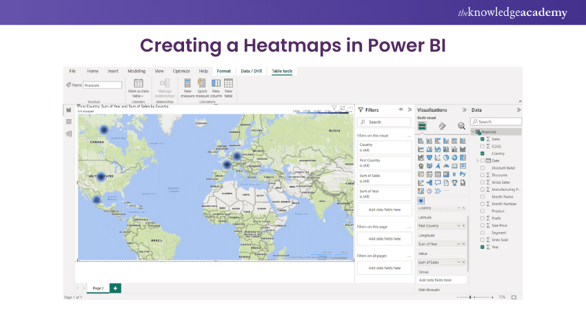
Creating a Heatmap in Power BI involves a step-by-step process that transforms raw data into a visually compelling and interactive visualisation. You can effectively leverage the capabilities of Power BI to create impactful Heatmaps, and the steps to do so are as follows:

1) Prepare your data: Ensure that your data is in a format compatible with Power BI. Common formats include Excel, CSV, or connecting directly to a database. Clean and organise your data to remove any inconsistencies or errors. Identify the relevant fields for your Heatmap, such as the dimensions (e.g., geographic regions) and the values to be represented (e.g., sales figures, customer counts).
2) Launch Power BI Desktop: Open Power BI Desktop, the robust Desktop application for creating visualisations. Select "Get Data" to import your prepared data into Power BI.
3) Import and load your data: Choose the appropriate data source option and connect to your data file or database. Follow the prompts to import and load your data into Power BI.
4) Create a new report: Once your data is loaded, click on "Report" to create a new report canvas where you will build your Heatmap.
5) Select the Heatmap visualisation: Locate the "Visualisation" pane on the right side of the Power BI interface. Choose the Heatmap visualisation type from the available options.
6) Map the necessary fields: Drag and drop the dimensions or categories (e.g., geographic regions) onto the appropriate fields, such as the "Axis" or "Category" field well. Place the values you want to represent (e.g., sales figures) into the "Values" field well.
Connect and secure your data with Power BI Gateway. Learn more about seamless integration
7) Customise the appearance: Use the "Format" options in the "Visualisations" pane to customise the appearance of your Heatmap. Adjust the colour scale, choose colour gradients, or define custom colour schemes that suit your data and preferences. Explore additional formatting options such as data labels, tooltips, or legends to enhance the readability and aesthetics of your Heatmap.
8) Apply conditional formatting: Utilise conditional formatting to highlight specific data values or ranges with different colours. Set thresholds or rules to determine which values should be emphasised or differentiated in your Heatmap.
9) Enhance interactivity: Utilise Power BI's interactive features to enhance your experience. Incorporate slicers or filters to allow you to dynamically explore and drill down into specific subsets of data. Enable cross-highlighting and cross-filtering to facilitate seamless data exploration across other visualisations in your report.
10) Save and publish your report: Once you are satisfied with your Heatmap visualisation, save your Power BI report. Publish your report to the BI service or share it with others for collaboration and access through the BI cloud.
Develop Necessary Skills for Data Analysis with Business Intelligence Reporting Course!
Enhancing a Power BI Heatmap
Enhancing a Power BI Heatmap involves applying various techniques to elevate its impact and effectiveness. One crucial aspect is colour customisation, where you experiment with different scales, gradients, and adjustments to create a visually appealing and balanced Map.
Conditional formatting is another powerful enhancement that allows you to highlight specific data patterns or values through colour scales or data bars. It aids in identifying significant trends or outliers.
Tooltips play a vital role in providing additional context and information. By customising tooltips, you can display relevant details like labels, values, or descriptions. This can empower you to gain a deeper understanding of specific data points. Interactivity and filtering capabilities are essential for enhancing a Power BI Heatmap.
Enabling cross-highlighting and cross-filtering between the Map and other visuals enables you to explore data relationships and uncover valuable insights. Incorporating slicers or filters empowers you to dynamically adjust the displayed data, focusing on specific subsets or time periods.
Leveraging advanced analytics capabilities can further enhance a Power BI’s Heatmap. Adding trend lines, reference lines, or forecast lines provides valuable context and facilitates data trend identification. Utilising clustering algorithms or statistical models uncovers underlying patterns or groupings, leading to deeper insights and informed decision-making.
Annotations and labels enhance comprehension and draw attention to critical data points. Including annotations offers insights or observations about notable patterns or trends, guiding you towards key aspects of the visualisation. Labels directly displaying values or percentages on Heatmap cells facilitate quick comprehension of the data.
Drill-through actions and hierarchies enhance user exploration and analysis. Implementing drill-through actions allows you to delve into detailed data by clicking on specific cells or regions of the Heatmap. Hierarchies enable you to drill down or expand data dimensions, revealing granular or aggregated information. These features provide flexibility, allowing you to conduct thorough analyses.
Optimising performance is crucial for a seamless user experience. By reducing unnecessary calculations and removing redundant fields, you ensure efficient data processing and improve overall responsiveness. Incorporating these enhancements transforms a Power BI Heatmap into a visually appealing, interactive, and insightful visualisation. It empowers you to explore, analyse, and derive meaningful insights from the data, ultimately enabling informed decision-making.
Boost your skills with our Power BI tutorial. Learn and create stunning reports today!
Conclusion
In conclusion, a Power BI Heatmap is a powerful visualisation tool that allows you to analyse and understand data patterns based on colour-coded representations. By leveraging the capabilities of this feature, you can create impactful maps that convey complex information in a visually appealing manner. Hopefully, this blog will aid you in using Power BI’s map to derive deeper insights, effectively communicate data stories, and unlock the full potential of their data visualisation efforts.
Learn to resolve data quality issues with our course in Microsoft Power BI Data Analyst PL300!
Frequently Asked Questions

The process of turning raw data into a Heatmap is a crucial step in Data Visualisation. Whether using Excel, Power BI, or specialised Heatmap tools, the methodology remains consistent. Structuring the data in a matrix format, where rows and columns correspond to relevant categories, is foundational. Applying colour gradients to cells based on the underlying data values enhances the visual representation. This systematic approach transforms numerical information into a visual narrative, aiding rapid interpretation of trends, anomalies, or relationships within the dataset.

Microsoft Excel's conditional formatting feature facilitates the generation of Heatmaps, making it an accessible option for users. By selecting a data range, navigating to the "Home" tab, and choosing "Conditional Formatting," users can apply "Colour Scales" to represent data variations visually. While Excel's functionality is well-suited for basic Heatmaps, it may lack the sophisticated features available in dedicated tools like Power BI.

The Knowledge Academy takes global learning to new heights, offering over 30,000 online courses across 490+ locations in 220 countries. This expansive reach ensures accessibility and convenience for learners worldwide.
Alongside our diverse Online Course Catalogue, encompassing 17 major categories, we go the extra mile by providing a plethora of free educational Online Resources like News updates, blogs, videos, webinars, and interview questions. Tailoring learning experiences further, professionals can maximise value with customisable Course Bundles of TKA.

The Knowledge Academy’s Knowledge Pass, a prepaid voucher, adds another layer of flexibility, allowing course bookings over a 12-month period. Join us on a journey where education knows no bounds.

The Knowledge Academy offers various Business Intelligence Reporting Courses , including Microsoft Power BI Course, Minitab Training and Business Objects Reporting. These courses cater to different skill levels, providing comprehensive insights into Importance of Marketing fo Businesses.
Upcoming Office Applications Resources Batches & Dates
Date
 Microsoft Power BI Course
Wed 15th Jan 2025
Wed 5th Feb 2025
Wed 9th Apr 2025
Wed 11th Jun 2025
Wed 6th Aug 2025
Wed 8th Oct 2025
Wed 3rd Dec 2025


 Top Rated Course


 If you wish to make any changes to your course, please


