We may not have the course you’re looking for. If you enquire or give us a call on +64 98874342 and speak to our training experts, we may still be able to help with your training requirements.
Training Outcomes Within Your Budget!
We ensure quality, budget-alignment, and timely delivery by our expert instructors.

Business Intelligence (BI) tools help you collect, transform, and present data meaningfully. Power BI is a popular BI tool that offers many benefits, but it also has some drawbacks. If you are looking for Power BI Alternatives that suits your needs and preferences better, then this blog is for you.
This blog will introduce you to the top 10 Power BI Alternatives and explain why they might be a better choice for you.
Table of Contents
1) Best Power BI Alternatives
2) Factors to consider while choosing Alternatives for BI
a) PolymerSearch
b) Tableau
c) Google Data Studio
d) Metabase
e) Holistics
f) Ubiq
g) MicroStrategy
h) DOMO
i) QlikView
j) Looker
3) Conclusion
Best Power BI Alternatives
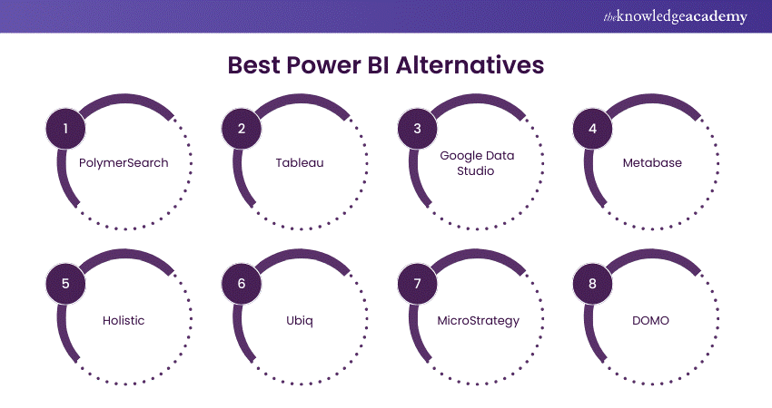
Power BI is popular. It is used to make interactive reports from data from different sources. However, it might not suit everyone. Here are some top alternatives to consider:
PolymerSearch
PolymerSearch is a new BI tool. It uses NLP and AI to simplify data analysis. With PolymerSearch, you can ask questions in plain English. It then provides answers through charts and summaries. Additionally, you can create interactive dashboards and stories. These tools help you understand your data better.
Some of the features that PolymerSearch offers are:
a) Natural Language Processing (NLP)
PolymerSearch incorporates NLP capabilities, enabling users to interact with data using natural language queries. This feature enhances user experience by allowing intuitive searches and queries without the need for complex coding or query language knowledge.
b) Advanced filtering options
The platform offers advanced filtering options, allowing users to refine and narrow down their data exploration process. Users can extract precise insights from their datasets with various modefilter criteria and parameters, improving decision-making processes.
c) Customisable dashboards
PolymerSearch provides customisable dashboard functionalities, empowering users to design and tailor dashboards according to their specific requirements and preferences. This flexibility allows users to create visually appealing and informative dashboards that communicate insights effectively.
Tableau
Tableau is a top BI tool, known for its power and popularity. It creates vivid, interactive visuals. You can easily add data, choose from many charts, and customize with colors, filters, and notes. Then, you can share your work on Tableau Online, Tableau Server, or Tableau Public.
Some of the features that Tableau offers are:
a) Drag-and-drop functionality
Tableau's simple interface lets users create visualizations easily. They can drag and drop items. This makes the process easier. It lets them make charts and dashboards they can interact with quickly. It doesn't need deep technical skills.
b) Wide range of data sources
When it comes to data connections, Tableau is fully capable of handling sources and formats like spreadsheets, databases, cloud services, and large data platforms all contained within file formats like Microsoft Excel, Google Sheets, and other types of databases. This flexibility helps users to include information from several types of sources into their analyses, therefore providing holistic strategies and interpretations.
c) Powerful analytics capabilities
Tableau offers robust analytics capabilities, including statistical analysis, forecasting, and predictive modelling. Users can leverage advanced analytical tools to uncover trends, patterns, and correlations within their datasets, facilitating data-driven decision-making and strategic planning.
Google Data Studio
Google Data Studio is free on the Google Cloud Platform. It lets you create and share dashboards and reports. These tools display data from Google Analytics, Google Ads, and Google Sheets. You can also connect to other sources using built-in or custom connectors.
Some of the features that Google Data Studio offers are:
a) Integration with google products
Google Data Studio integrates with other Google products, such as Google Analytics, Google Sheets, and Google BigQuery. This integration allows users to access and analyse data from various sources within a unified platform, enhancing efficiency and productivity.
b) Real-time collaboration
The platform permits real-time collaboration among team members, accomodating multiple users to work on reports and dashboards simultaneously. Users can share insights, make annotations, and collaborate on Data Visualisations in real time, fostering teamwork and knowledge sharing.
c) Customisable templates
Google Data Studio offers customisable templates and themes, enabling users to create visually stunning and professional-looking reports and dashboards. Users can decide from various pre-designed templates or customise their designs to suit their branding and presentation needs.
Metabase
Metabase is an open-source and self-hosted BI tool that helps you answer questions about your data without writing any code. Metabase lets you connect to your data sources, such as databases, CSV files, or Google BigQuery, and ask questions using a simple and natural language interface. You can also create dashboards and charts that visualise and share your data with your team or the public.
Some of the features that Metabase offers are:
a) Open-Source Flexibility
Metabase is an open-source platform that provides users with flexibility and customisation options. Users can modify and extend the platform according to their requirements, leveraging community-driven contributions and plugins to enhance functionality and capabilities.
b) SQL querying and visualisation
Metabase allows users to perform SQL querying and visualisation directly within the platform. Users can write SQL queries or use a visual query builder to extract data from databases and create interactive visualisations, facilitating data exploration and analysis.
c) User-friendly interface
Metabase features a user-friendly interface that caters to both technical and non-technical users. The platform's intuitive design and navigation make it easy for users to explore data, create dashboards, and share insights without extensive training or expertise.
Holistic
Holistics is a cloud-based BI tool that helps you automate and streamline your data workflow. Holistics lets you connect to your data sources, such as databases, files, or APIs, and transform, model, and analyse your data using SQL or a graphical interface. You can also create dashboards and reports that visualise your data and schedule them for delivery to your email, Slack, or webhooks.
Some of the features that Holistics offers are:
a) Data Modelling and automation
Holistics focuses on Data Modelling and analytics automation, providing users with tools and features to streamline data preparation and analysis processes. Users can create data models, define transformations, and automate workflows to ensure data consistency and accuracy.
b) SQL-based querying
The platform offers SQL-based querying capabilities, allowing users to write complex queries to extract and manipulate data. With support for SQL syntax and functions, users can perform ad-hoc analysis and generate custom reports tailored to their specific requirements.
c) Scheduled report delivery
Holistics enables scheduled report delivery, allowing users to automate the generation and distribution of reports to stakeholders. Users can schedule reports to be delivered regularly via email or other channels, ensuring timely access to insights and updates.
Ubiq
Ubiq is a cloud-based BI tool that helps you create and share dashboards and reports that monitor and analyse your data. Ubiq lets you connect to your data sources, such as databases, files, or web services, and build your dashboards and reports using a drag-and-drop interface. You can also customise your dashboards and reports with filters, calculations, and widgets. You can also share your dashboards and reports with your team or clients via email, web, or mobile.
Some of the features that Ubiq offers are:
a) User-friendly interface
Ubiq features a user-friendly interface designed to simplify the Business Intelligence process. The platform's intuitive design and navigation make it easy for users to explore data, create visualisations, and derive insights without extensive training or technical expertise.
b) Real-time Data Visualisation
Ubiq supports real-time Data Visualisation, enabling users to monitor key metrics and KPIs as they change dynamically. Users can create real-time dashboards and reports that update automatically as new data becomes available, facilitating timely decision-making and analysis.
c) Customisable dashboards
The platform offers customisable dashboard functionalities, allowing users to design and tailor dashboards according to their specific requirements and preferences. Users can choose from various visualisation options, layouts, and themes to create personalised dashboards that effectively communicate insights.
MicroStrategy
MicroStrategy is a powerful tool for making data-driven decisions. It connects to databases, files, and cloud services. Then, you can use tools like HyperIntelligence. You can also use Dossier and Report Services to analyze your data. It also lets you create dashboards and reports. These display your data. You share them with your team or stakeholders on the web, mobile, or email.
Some of the features that MicroStrategy offers are:
a) Advanced analytics and predictive modelling
MicroStrategy offers advanced analytics and predictive modelling capabilities, allowing users to perform complex analyses and forecasting. With built-in algorithms and statistical functions, users can uncover trends, patterns, and correlations within their data to drive strategic decision-making.
b) Scalability and performance
The platform is designed for scalability and performance, enabling users to process and analyse large volumes of data efficiently. MicroStrategy's architecture ensures high availability, reliability, and performance, making it suitable for enterprise-level deployments and mission-critical applications.
c) Mobile compatibility
MicroStrategy provides mobile compatibility, allowing users to access and interact with data on smartphones and tablets. With dedicated mobile apps and responsive design, users can view dashboards, run reports, and collaborate on insights anytime, anywhere, enhancing flexibility and productivity.
DOMO
DOMO is a cloud-based BI tool. It helps manage and boost business performance with your data. Firstly, you connect to data sources like databases, files, or APIs. Then, you use DOMO ETL to integrate, transform, and enrich the data. Next, DOMO Apps let you create dashboards and reports. These tools visualize data and track key performance indicators (KPIs). You can also share your dashboards and reports with your team or partners via web, mobile, or social media.
Some of the features that DOMO offers are:
a) Centralised platform
DOMO provides a centralised platform for data integration, visualisation, and analytics. Users can connect to multiple data sources, blend data, and create unified views to gain insights from disparate datasets within a single interface, streamlining the data analysis process.
b) Pre-built connectors
The platform offers pre-built connectors for various data sources, including cloud applications, databases, and third-party services. Users can easily connect to popular data sources without custom integration, accelerating time-to-insight and reducing implementation complexity.
c) Real-time alerts
DOMO enables real-time alerts and notifications based on predefined thresholds and conditions. Users can set up alerts to monitor key metrics and receive notifications via email, SMS, or in-platform notifications, allowing them to respond promptly to changes and anomalies in their data.
QlikView
QlikView is a desktop BI tool. It uses an engine to explore data in memory. You can connect to databases, files, or web services. Then, you load and transform data with QlikView Script. It also offers QlikView Objects. These tools create dashboards and reports. They show data visually and highlight insights. You can share these with your team or clients. You can use QlikView Server or QlikView Publisher.
Some of the features that QlikView offers are:
a) Associative data model
QlikView utilises an associative data model, allowing users to explore data interactively and dynamically. This feature enables users to make associative connections between data points, uncovering hidden relationships and insights that may not be apparent with traditional query-based approaches.
b) Powerful Data Visualisation
The platform offers powerful Data Visualisation capabilities, including interactive charts, graphs, and dashboards. Users can create visually compelling presentations of their data, facilitating communication and understanding of complex information across organisations.
c) Scalability and enterprise deployment
QlikView is designed for scalability and enterprise deployment, supporting large-scale data processing and analysis. The platform can handle massive volumes of data and concurrent users, making it suitable for organisations of all sizes and industries.
Looker
Looker is a cloud-based BI tool that helps you access and analyse your data using a modern platform. With Looker, you can connect to databases, files, and cloud services. Then, you can model your data using LookML, a SQL-based language. Next, use Looker Explore to create dashboards and reports. These tools provide actionable insights. Finally, share them with your team or customers. Use Looker Embed, a JavaScript library.
Some of the features that Looker offers are:
a) LookML for Data Modelling
Looker uses LookML (Looker Modelling Language) for Data Modelling and centralisation. This feature allows users to define and manage data models in a structured and reusable manner, promoting consistency and governance across analytics workflows.
b) Embedded analytics
The platform offers embedded analytics capabilities, allowing users to integrate data-driven insights directly into their applications and workflows. With embedded dashboards and visualisations, users can leverage data to seamlessly enhance decision-making and user experiences.
c) Data-driven workflows
Looker enables data-driven workflows by providing insights and recommendations within users' existing workflows. Through integrations with business applications and collaboration tools, users can access relevant data and insights at the point of action, driving productivity and efficiency.
Elevate your analytics game with Microsoft BI Training today!
Factors to consider while choosing Alternatives for BI
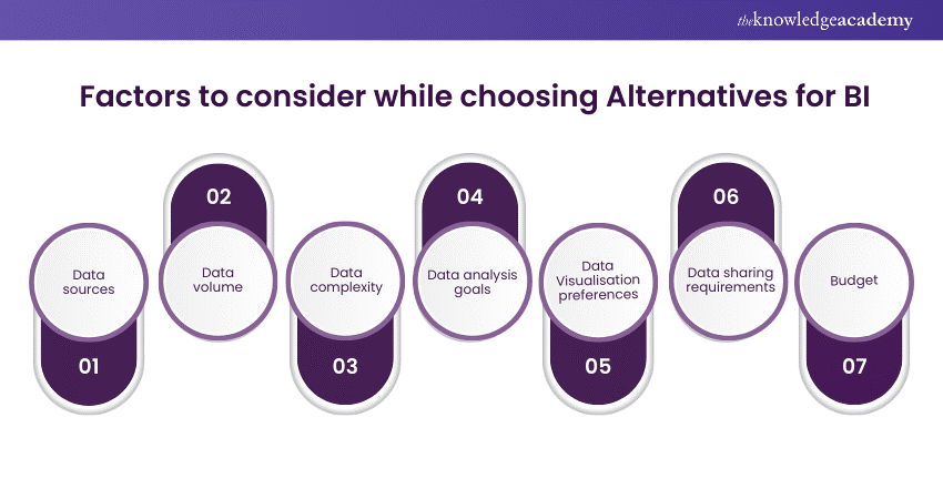
Choosing the best alternative for Power BI depends on various factors, such as your data sources, data volume, data complexity, data analysis goals, Data Visualisation preferences, data sharing requirements, and budget. Here are some of the factors that you should consider while choosing alternatives for BI:
a) Data sources:
You should consider the type and number of data sources you want to connect to and analyse. Some BI tools may have built-in connectors for certain data sources, such as databases, files, or cloud services, while others may require you to create custom connectors using APIs or SDKs.
You should also consider the compatibility and performance of the connectors, as some BI tools may have faster and more reliable connections than others.
b) Data volume:
You should consider the size and frequency of the data you want to load and process. Some BI tools may limit the amount and frequency of data you can load and process, while others may have unlimited or flexible options.
You should also consider the scalability and efficiency of the BI tools, as some BI tools may have more scalable and efficient architectures than others.
c) Data complexity:
You should consider the structure and quality of the data you want to transform and model. Some BI tools may have more advanced and user-friendly data transformation and modelling features, such as ETL, data preparation, Data Modelling, and data science.
In contrast, others may require you to write code or use external tools. You should also consider the transparency and flexibility of the BI tools, as some BI tools may have more transparent and flexible data layers than others.
d) Data analysis goals:
You should consider the type and level of data analysis you want to perform and achieve. Some BI tools may have more powerful and intelligent features for data analysis, such as natural language processing, artificial intelligence, machine learning, and predictive analytics.
In contrast, others may have more basic and manual features. You should also consider the ease and speed of the BI tools, as some BI tools may have easier and faster interfaces than others.
e) Data Visualisation preferences:
You should consider the style and format of Data Visualisation you want to create and present. Some BI tools may have more stunning and interactive features for Data Visualisation, such as chart types, chart options, chart formatting, and chart customisation.
In contrast, others may have more simple and static features. You should also consider the diversity and creativity of the BI tools, as some BI tools may have more diverse and creative chart options than others.
f) Data sharing requirements:
Consider the mode and audience of data sharing that you want to enable and reach. Some BI tools may have more secure and collaborative features for data sharing, such as data governance, monitoring, delivery, and embedding.
In contrast, others may have more limited and isolated features. You should also consider the accessibility and interactivity of the BI tools, as some BI tools may have more accessible and interactive platforms than others.
g) Budget:
You should consider the cost and value of the BI tools you want to use and invest in. Some BI tools may have more affordable and transparent pricing models, such as free, flat, or pay-as-you-go, while others may have more complex and expensive pricing models, such as tiered, per-user, or per-feature.
You should also consider the return and benefit of the BI tools, as some BI tools may have more value and benefit than others.
Learn the skills required to become a certified Power BI professional. Sign up for our Microsoft Power BI Course. right away!
Conclusion
Power BI is a great BI tool, but there are others. Many other BI tools offer different features, benefits, and experiences. In this blog, we have introduced you to the top 10 Power BI Alternatives and explained why they might be a better fit for you. Whether you are looking for a simple, fast, intelligent, flexible, scalable, user-friendly, or affordable BI tool, you can find it among these Power BI Alternatives.
Unlock actionable insights today with our Business Intelligence Reporting Course - Elevate your decision-making!
Frequently Asked Questions

The main differences between Power BI and its alternatives are their features, pricing, usability, and performance. Some features that Power BI Alternatives may have that Power BI does not are natural language processing, self-service data preparation, open-source code, and embedded analytics.

The best Power BI alternative for your needs depends on your data sources, data volume, data complexity, data analysis goals, Data Visualisation preferences, data sharing requirements, and budget.

The Knowledge Academy takes global learning to new heights, offering over 30,000 online courses across 490+ locations in 220 countries. This expansive reach ensures accessibility and convenience for learners worldwide.
Alongside our diverse Online Course Catalogue, encompassing 17 major categories, we go the extra mile by providing a plethora of free educational Online Resources like News updates, Blogs, videos, webinars, and interview questions. Tailoring learning experiences further, professionals can maximise value with customisable Course Bundles of TKA.

The Knowledge Academy’s Knowledge Pass, a prepaid voucher, adds another layer of flexibility, allowing course bookings over a 12-month period. Join us on a journey where education knows no bounds.

The Knowledge Academy offers various Business Intelligence Reporting Courses, including Microsoft Power BI Course, Tableau Desktop Training, and DAX Training. These courses cater to different skill levels, providing comprehensive insights into Power BI Slicers.
Our Office Applications blogs covers a range of topics related to Power BI, offering valuable resources, best practices, and industry insights. Whether you are a beginner or looking to advance your Power BI skills, The Knowledge Academy's diverse courses and informative blogs have you covered.
Upcoming Office Applications Resources Batches & Dates
Date
 Microsoft Power BI Course
Fri 10th Jan 2025
Fri 28th Feb 2025
Fri 4th Apr 2025
Fri 16th May 2025
Fri 11th Jul 2025
Fri 19th Sep 2025
Fri 21st Nov 2025


 Top Rated Course


 If you wish to make any changes to your course, please


