We may not have the course you’re looking for. If you enquire or give us a call on +971 8000311193 and speak to our training experts, we may still be able to help with your training requirements.
Training Outcomes Within Your Budget!
We ensure quality, budget-alignment, and timely delivery by our expert instructors.

Cascading Style Sheets have evolved significantly over the years, offering Web Developers versatile tools for creating responsive and aesthetically pleasing layouts. Among these tools, CSS Grid and Flexbox stand out as two distinct layout models. While both are valuable, understanding the differences between CSS Grid vs Flexbox is crucial for effective Web Development.
If you are curious to learn the differences between CSS Grid and Flexbox, then this blog is for you.
Table of Contents
1) What is Grid?
2) What is Flexbox?
3) Differences between CSS Grid vs Flexbox
a) Layout model
b) Direction of control
c) Alignment
d) Use cases
e) Nesting
f) Browser support
g) Complementary layouts
4) Conclusion
What is Grid?
CSS Grid, introduced in CSS3, is a two-dimensional layout system that enables users to create complex layouts by defining rows and columns. It excels at creating grid-based designs, making it ideal for creating symmetrical and organised layouts. Grid allows you to position items precisely within the grid cells, offering fine-grained control over the layout.
What is Flexbox?
Flexible Box Layout, or Flexbox for short, is another CSS layout model introduced in CSS3. Unlike Grid, Flexbox is a one-dimensional layout system that focuses on distributing space within a container along a single axis—either horizontally or vertically. It is particularly useful for creating flexible and responsive designs, such as navigation bars and card layouts.
Differences between CSS Grid vs Flexbox
In this section, we will explore the Differences between CSS Grid vs Flexbox. Let’s explore them below:

1) Layout model
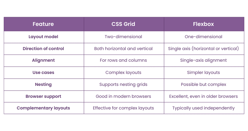
CSS Grid: It is a two-dimensional layout model, which means it manages both rows and columns, allowing you to create complex grid-based designs.
Flexbox: Flexbox is a one-dimensional layout model that works along a single axis, either horizontally or vertically, making it excellent for flexible and responsive designs.
2) Direction of control
CSS Grid: In Grid, you control the placement of items both horizontally and vertically. You can precisely position items in both rows and columns.
Flexbox: Flexbox offers control along a single axis, which means you can arrange items either horizontally or vertically, but not both simultaneously.
3) Alignment
CSS Grid: The Grid provides powerful alignment options for both rows and columns, making it ideal for creating intricate grid-based designs.
Flexbox: Flexbox excels in aligning items along a single axis, offering excellent control for centred or evenly spaced layouts.
4) Use cases
CSS Grid: Grid is best suited for creating complex layouts, like magazine-style grids or responsive grid structures.
Flexbox: Flexbox is more suitable for simpler layouts and situations where you need items to align along a single axis, such as navigation bars or card layouts.
Unlock the future of website designing with our Website Design Course – Sign up today!
5) Nesting
CSS Grid: Grid allows for nesting grids within grids, providing a powerful way to create complex layouts with different levels of granularity.
Flexbox: While it's possible to nest Flexbox containers, it can lead to complex and sometimes unpredictable layouts.
6) Browser support
CSS Grid: Grid has good browser support in modern browsers, but older browsers may require vendor prefixes or have limited functionality.
Flexbox: Flexbox enjoys excellent browser support, even in older versions, making it a safer choice for projects that require broad compatibility.
7) Complementary layouts
CSS Grid: Grid and Flexbox can be used together effectively to create complex layouts. You can use Flexbox within individual grid cells to further fine-tune your design.
Flexbox: While it's possible to combine Flexbox with other CSS techniques, it is typically used independently for simpler layouts.
Learn more about WordPress with our WordPress Essentials Course – Sign up today!
Conclusion
We hope you read and understand the differences between CSS Grid vs Flexbox. Both CSS Grid and Flexbox are valuable tools in a Web Developer's arsenal, and choosing between them depends on your project's requirements. CSS Grid is the go-to choice for creating complex, grid-based designs with precise control over both rows and columns. Flexbox, on the other hand, excels at creating flexible, one-dimensional layouts that adapt well to various screen sizes and orientations.
Master the CSS framework with our CSS Course – Sign up today!
Frequently Asked Questions

It's not a matter of one being better than the other; rather, it's about choosing the right tool for the job. CSS Grid is superior for complex grid-based layouts, while Flexbox shines in simpler, one-dimensional layouts. The best choice is based on your specific design requirements.

CSS Grid is preferable when you need to create intricate grid-based designs with control over both rows and columns. It offers a more versatile approach to creating complex layouts compared to Flexbox, which focuses on one-dimensional arrangements.

The Knowledge Academy takes global learning to new heights, offering over 30,000 online courses across 490+ locations in 220 countries. This expansive reach ensures accessibility and convenience for learners worldwide.
Alongside our diverse Online Course Catalogue, encompassing 17 major categories, we go the extra mile by providing a plethora of free educational Online Resources like News updates, Blogs, videos, webinars, and interview questions. Tailoring learning experiences further, professionals can maximise value with customisable Course Bundles of TKA.

The Knowledge Academy’s Knowledge Pass, a prepaid voucher, adds another layer of flexibility, allowing course bookings over a 12-month period. Join us on a journey where education knows no bounds.

The Knowledge Academy offers various App and Development Courses including Web Development foundation, HTML Courses, and Website Design. These courses cater to different skill levels, providing comprehensive insights into UX Researcher.
Our Programming and DevOps blogs cover a range of topics related to Web Development, offering valuable resources, best practices, and industry insights. Whether you are a beginner or looking to advance your CSS skills, The Knowledge Academy's diverse courses and informative blogs have you covered.


 Top Rated Course


 If you wish to make any changes to your course, please


