We may not have the course you’re looking for. If you enquire or give us a call on +65 6929 8747 and speak to our training experts, we may still be able to help with your training requirements.
Training Outcomes Within Your Budget!
We ensure quality, budget-alignment, and timely delivery by our expert instructors.
In Web Development, creating cohesive and engaging user interfaces can be challenging, often leading to design inconsistencies and longer development times. Learning how to create Bootstrap Buttons can help mitigate these issues. Bootstrap Buttons not only enhance the User Experience (UX) but also ensure visual consistency across web projects.
In this blog, you’ll discover everything you need to know about Bootstrap Buttons, from their creation to the various classes available. Let’s dive in!
Table of Contents
1) How to Create a Button in Bootstrap?
2) Bootstrap Button Types
3) Bootstrap Button Classes
4) Bootstrap Button Styles
5) Conclusion
How to Create a Button in Bootstrap?
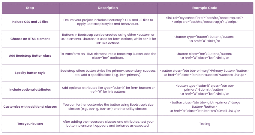
Creating a button in Bootstrap is straightforward and involves using HTML elements combined with Bootstrap's predefined classes. Here's a step-by-step guide:
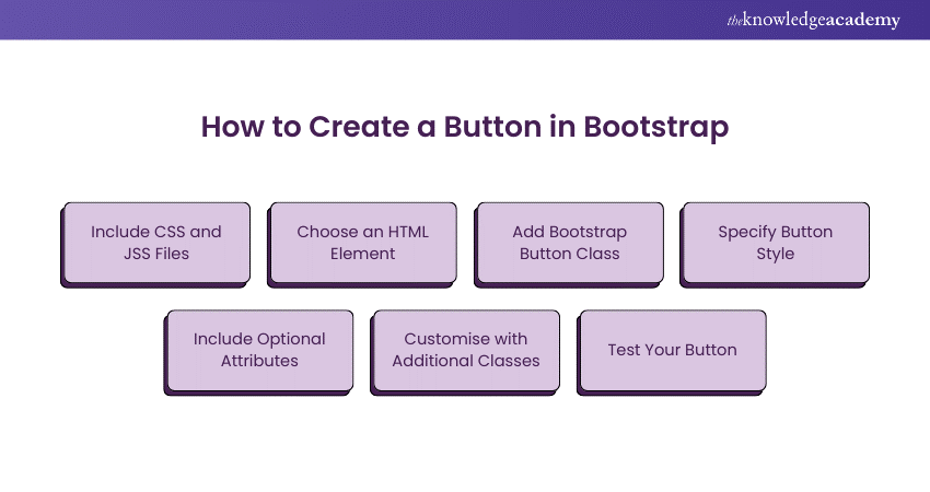
These steps will help you seamlessly integrate Bootstrap Buttons into your web projects, enhancing both functionality and aesthetics.
Bootstrap Button Types
1) Hierarchy
Buttons, being crucial UI elements, need a clear structure. Users should easily recognize the primary, secondary, and tertiary buttons based on their importance.
Primary buttons stand out the most due to their strong, filled backgrounds and shadows, making them attract attention prominently. Secondary buttons have a subtle backdrop with no shadows, making them perfect for less prominent actions.
2) Contextual
Contextual buttons use colours to convey meaning, such as success, danger, warning, and informational actions. Each colour represents a different context to help users understand the intended action.
3) Neutral
Neutral buttons don’t imply any specific action or importance. They are often styled with classes like .btn-light or .btn-dark to blend with the design without drawing too much attention.
4) Link
Link buttons look like hyperlinks but function as buttons. They use the .btn-link class, making them appear as standard links while retaining button functionality, useful for actions like “Learn more” or “Read more.”
5) Outline
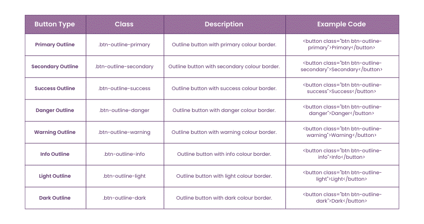
Outline buttons have a transparent background with a coloured border, making them less visually dominant than filled buttons. They use classes like .btn-outline-primary, .btn-outline-secondary, etc.
6) Rounded
Rounded buttons have rounded corners, giving them a softer appearance. This style is often used to create a more modern, friendly look and can be achieved with additional CSS classes like .btn-rounded-pill.
7) Rounded Outline
Rounded outline buttons combine the features of rounded and outline buttons. They have a coloured border with rounded corners, providing a less prominent yet stylish look.
8) Floating
Floating buttons are circular buttons that float above the content, often used for primary actions in an app, such as a “Create” or “Add” button. These are typically styled with CSS to position them appropriately and ensure they stand out.
9) Fixed buttons
Fixed buttons remain in a fixed position on the screen, even as users scroll. This is useful for persistent actions, like a “Back to top” button. These can be positioned using CSS properties like position: fixed.
10) Social
Fixed buttons remain in a fixed position on the screen, even as users scroll. This is useful for persistent actions, like a “Back to top” button. These can be positioned using CSS properties like position: fixed.
Bootstrap's Button Classes
Bootstrap provides a diverse range of button classes, each designed for different purposes and visual styles. Understanding these options allows you to choose the right button for your specific needs. Here's a breakdown of the most commonly used Bootstrap Button classes:
1) Primary Button

The Primary Button Bootstrap is designed for the most important actions on a webpage. This class is visually distinctive, typically styled in a vibrant blue colour, which is intended to draw the user's attention. It's often used for primary actions such as submitting forms, starting processes, or navigating to key areas.
The primary button stands out against other buttons, ensuring that users are drawn to the most important action they can take on a particular page. To use this class, simply add it along with the btn class to your button element in HTML.
For example:

This creates a button that is easily noticeable and signifies an action of primary importance to the user's journey on the site or application.
2) Secondary Button

The Secondary Bootstrap is used for actions that are less prioritised compared to those marked by the primary button. Typically styled in a muted shade, this button is designed to be less visually prominent, ensuring it doesn't compete with the primary button for attention.
This class is suitable for secondary actions on a page, such as a 'Cancel' button next to a 'Submit' button in a form. While it is visually subdued, it still maintains a clear and professional appearance, ensuring that users recognise it as an actionable element.
For instance, if you're creating a form with a primary action of 'Save', the secondary button could be used for 'Cancel' or 'Back'. To implement this in HTML, you would add the secondary class alongside the btn class, like the following:

This button provides a visually balanced option for secondary actions, ensuring a cohesive and user-friendly interface.
3) Success Button

The Success Class in Bootstrap is designed for actions that denote a positive outcome, like a successful operation or confirmation. This button is typically styled in a vivid green colour, universally recognised as a symbol of success or completion.
Commonly used in scenarios like form submissions that have been successfully processed, confirmations of successful operations, or to indicate a positive action, the success clearly communicates to users that the action they took had a favourable result.
For example, in a scenario where a user completes a task or a form, the success button could be used to indicate that they can proceed or that their submission was successful. To use this button class, simply add it along with the btn class in your HTML element:

This creates a button that not only stands out visually but also carries a positive connotation, enhancing the user experience by providing clear and encouraging feedback.
Elevate your Web Development career with our Programming Training – Sign up now!
4) Danger Button

The Danger Button in Bootstrap is specifically designed for actions that carry a significant risk or negative consequence, such as deleting a file, removing a user, or cancelling an important operation. This button is typically styled in a bold red colour, which is universally recognised as a signal of caution or danger.
Using this class effectively communicates to users that they should proceed with caution. It is particularly useful in scenarios where an irreversible action might be taken, like deleting data or closing an account. The red colour of the danger button acts as an intuitive alert to users, prompting them to consider the action carefully before proceeding.
For instance, in a user interface where you need to present an option to delete a record, the danger class can be used to highlight the potential risks associated with the action. To implement this, you would add the danger class alongside the btn class in your HTML element:

This approach ensures that critical actions are visually differentiated, helping to prevent accidental clicks and enhancing the overall safety and user experience of the application or website.
5) Warning Button

The Warning Class in Bootstrap is used for actions that demand caution. It features a vivid yellow colour, universally signalling a warning. This button is ideal for scenarios where users should approach an action carefully, such as confirming changes with potential consequences. By applying warning alongside the btn class in HTML, like the following:

You effectively prompt users to exercise caution, preventing hasty decisions and fostering a thoughtful user experience.
6) Information Button

The Info Class in Bootstrap is tailored for actions that provide information without requiring immediate user interaction. It's characterised by a light blue colour, symbolising neutrality and information.
This button is valuable for scenarios where you want to offer additional details or insights to users without prompting them for critical action. For instance, in a user interface, you can use the -info button for actions that open tooltips, pop-ups, or informational dialogues.
To implement this, simply add the info class along with the btn class in your HTML element like this:

This button encourages users to explore additional information in a non-intrusive manner, enhancing the overall user experience by providing access to valuable insights when needed.
7) Light Button

The Light Class in Bootstrap creates unobtrusive buttons with a very light, almost white colour. These buttons blend harmoniously with lighter backgrounds, making them ideal for actions where subtlety is key. They offer a clean and minimalistic appearance, ensuring that the content remains the focus.
Use a light button for actions like "Read More" or "View Details" to provide unobtrusive interactivity without distracting from the main content.
To implement the btn class in your HTML element, such as:

This button style enhances user experience by maintaining a clean and simple aesthetic.
Elevate your skills on Python with our Python Course – Sign up today!
8) Dark Button

The Dark Class in Bootstrap is designed to create buttons that stand out on lighter backgrounds. It features a dark, almost black colour, providing a high-contrast visual presence.
This button class is particularly useful when you need an action to be visually prominent, ensuring it catches the user's attention. It's ideal for scenarios where you want a specific action, such as "Sign Up" or "Submit," to be easily distinguishable.
To implement a dark button, along with the btn class in your HTML element:

This creates a button that contrasts sharply with lighter backgrounds, making it suitable for emphasising critical actions in your user interface.
9) Link Button

The Link Class in Bootstrap is a versatile option that transforms a button into a visually unobtrusive element resembling a hyperlink. This class removes the standard button styling, such as background and borders, allowing the button to seamlessly blend in with text or other inline content.
Use the link class when you want an action to appear as a text link within a paragraph or alongside other textual content. It provides a clean and subtle way to incorporate clickable elements without the traditional button appearance.
To implement a link button, add the link class along with the btn class in your HTML element like this:

This button style enhances the user experience by maintaining seamless integration with text, providing interactivity while preserving a natural flow in the content.
Bootstrap Button Styles
The following are the Bootstrap Button Styles:
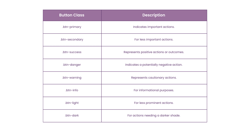
Button Colours
Bootstrap offers a range of predefined button colours to align with various contexts and actions:
Button Size
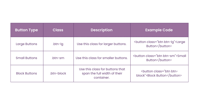
Bootstrap provides classes to adjust the size of buttons to fit various use cases:
Outline Buttons
Outline buttons have a transparent background with a coloured border, making them less prominent than solid buttons:
Conclusion
Mastering Bootstrap Buttons is essential for creating visually consistent and user-friendly web interfaces. By understanding the different types of buttons and their specific uses, you can enhance the user experience and maintain a cohesive design across your projects. Whether you’re using primary buttons for important actions, contextual buttons to convey meaning, or neutral buttons for less prominent tasks, Bootstrap provides a versatile toolkit to meet your needs.
Transform your career with our Bootstrap Training – Sign up now!
Frequently Asked Questions

The default size is medium. You can very easily change the button size by adding btn-lg or btn-sm class to it. These classes modify the button's padding and also the font size, and the CSS border radius.

Combine sets of button groups into button toolbars for more complex components. Use utility classes as needed to space out groups, buttons, and more. Feel free to mix input groups with button groups in your

The Knowledge Academy takes global learning to new heights, offering over 30,000 online courses across 490+ locations in 220 countries. This expansive reach ensures accessibility and convenience for learners worldwide.
Alongside our diverse Online Course Catalogue, encompassing 17 major categories, we go the extra mile by providing a plethora of free educational Online Resources like News updates, blogs, videos, webinars, and interview questions. By tailoring learning experiences further, professionals can maximise value with customisable Course Bundles of TKA.

The Knowledge Academy’s Knowledge Pass, a prepaid voucher, adds another layer of flexibility, allowing course bookings over a 12-month period. Join us on a journey where education knows no bounds.

The Knowledge Academy offers various Programming Courses, including Bootstrap, Object Oriented Programming (OOPs) and Python with Machine Learning. These courses cater to different skill levels, providing comprehensive insights into Programming Methodologies.
Our Programming blogs cover a range of topics related to Bootstrap, offering valuable resources, best practices, and industry insights. Whether you are a beginner or looking to advance your Programming skills, The Knowledge Academy's diverse courses and informative blogs have you covered.
Upcoming Programming & DevOps Resources Batches & Dates
Date
 Bootstrap Training
Fri 15th Nov 2024
Fri 17th Jan 2025
Fri 7th Mar 2025
Fri 23rd May 2025
Fri 18th Jul 2025
Fri 12th Sep 2025
Fri 14th Nov 2025
Fri 12th Dec 2025


 Top Rated Course


 If you wish to make any changes to your course, please


