We may not have the course you’re looking for. If you enquire or give us a call on +65 6929 8747 and speak to our training experts, we may still be able to help with your training requirements.
Training Outcomes Within Your Budget!
We ensure quality, budget-alignment, and timely delivery by our expert instructors.

Have you ever felt like your webpage needs breathing room, with some elements itching for personal space while others require a cushioning effect? This is where concepts like padding and margin help you master website layout control. While these two tools may seem related, they play very different roles.
While margins create space outside an element, padding brings a soft buffer to cradle the content. This blog dissects the essential differences between Margin Vs Padding, exploring everything, including their units of measurement and shorthand properties. Read on and transform your Website Designs from cramped to captivating!
Table of Contents
1) What is Margin?
2) What is Padding?
3) Key Differences – Margin vs Padding
4) Best Practices and Common Use Cases
5) Conclusion
What is Margin?
In the field of web design, the margin refers to the invisible space surrounding an element’s border. It's the equivalent of an individual's personal space in a crowded setting. Margins push other elements away, forming a separation and preventing the website from feeling cramped.

Units of Measurement
Margins in Cascading Style Sheets (CSS) can be defined through a variety of units of measurement. The most common ones include:
a) Percentages (%): Percentages for margins are calculated relative to the element's width, making them handy for responsive designs that must scale across screen sizes.
b) Pixels (px): This offers the most granular control over spacing, enabling you to specify precise distances.
c) Em: This unit, relative to an element’s font size, helps create proportional spacing that adapts to numerous text sizes.
d) Auto: This value enables the browser to calculate margins automatically. This feature creates equal spacing on both sides or centre elements horizontally.
Shorthand Properties
To streamline the CSS code, shorthand properties can be used for margin adjustments. Here’s how they work:
a) Margin: 10px 20px: It sets the top/bottom to 10px and the left/right to 20px.
b) Margin: 15px 20px 10px 5px: It sets the top, right, bottom and left margins, respectively (Clockwise from the top).
c) Margin: 20px: Applies 20px margin on every side.
Margin Collapsing
Margin collapsing is an interesting aspect to be aware of. In some situations, adjacent vertical margins overlap instead of adding together. For instance, if there are two paragraphs with a bottom margin of 15px and a top margin of 20px, the real space between them will be 20px, not 35px. This must be considered when precisely positioning elements.
What is Padding?
While margin controls the space on the outside of an element’s border, padding determines the space between its content and border. It is equivalent to the cushioning inside a package protecting its contents. In web design, padding creates breathing room within an element, making it visually appealing and easier to read.
Units of Measurement
Much like margin, padding values in CSS can be expressed through several units:
a) Pixels (px): This is for fixed, precise spacing.
b) Percentages (%): This creates padding relative to the element’s width, which is helpful in responsive scaling.
c) Em: It defines padding depending on the element’s font size and promotes proportional spacing.
Master coding fundamentals for responsive web layouts in our comprehensive Website Design Course – Sign up now!
Shorthand Properties
Just like in the case of margin, shorthand properties simplify the process of controlling padding:
a) Padding: 20px 15px 10px 5px: This sets the top, right, bottom, and left padding, respectively.
b) Padding: 15px 25px: This sets the left/right padding to 25px and the top/bottom padding to 15px.
c) Padding: 10px: It applies 10px padding on every side.
Background Visibility
One vital aspect of padding is its impact on the appearance of background colours or images within an element. The background will stretch into the padding area, visually filling the space between the content and the border. This is a great way to add stylistic effects or visual emphasis to a website’s elements.

Key Differences – Margin Vs Padding
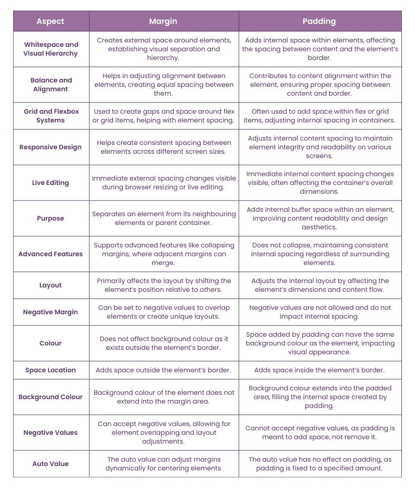
The following table summarises the key difference between Margin and Padding:

Want to elevate your web design skills? Gain insight into user-centred design principles with our UI/UX Design Course - Register now!
Best Practices and Common Use Cases
These accessibility best practices must be kept in mind when using margin and padding:
1) Readability: Generous padding and margin around blocks of text improve readability for everyone (including those with visual impairments).
2) Sufficient Space: Adequate spacing between elements, especially clickable items like links and buttons, helps accommodate users with limited dexterity.
3) Screen Readers: While margin and padding don't directly impact screen readers, the visual spacing makes it easier for screen reader software to interpret content structure.
It's good practice to be aware of how browsers handle spacing properties. Key points to remember are:
1) CSS Reset: Browsers have small default variations when applying padding and margin. Many developers utilise a CSS reset to create a consistent starting point for their styles.
2) Testing: It's essential to test the website on different browsers and devices to detect any spacing inconsistencies.
Let’s look at some of the most common use cases of padding and margin:
1) Navigation Menus: Margins separate individual menu items, while the padding adds space to each item, making links and buttons easier to click.
2) Images: Margins make space around images, separating them from text or other visual elements. Padding can create the illusion of a border around images.
3) Buttons: The padding builds the button's internal space, ensuring that the button text is readable and clickable. Margins can adjust button spacing within a group or separate buttons from other elements.
4) Forms: Margins separate form fields and labels, while the padding ensures form input areas have enough breathing room.
Conclusion
In conclusion, having a firm grasp on the difference between Margin Vs Padding is vital for effective Website Design. While both provide breathing room for a website, the margin impacts the outer space around an element, and padding adjusts its inner space. Mastering these two tools can help you excel in website layout control, resulting in cleaner and more visually appealing web pages.
Strengthen your foundation on website design with our HTML And CSS Course - Sign up now!
Frequently Asked Questions

Padding in web design serves several important objectives, such as improved readability, enhanced user experience and increased visual appeal.

Rules of margin in web design include:
a) Consistent spacing
b) Proper grid systems
c) White space
d) Content prioritisation
e) Accessibility
f) Visual Hierarchy

The Knowledge Academy takes global learning to new heights, offering over 30,000 online courses across 490+ locations in 220 countries. This expansive reach ensures accessibility and convenience for learners worldwide.
Alongside our diverse Online Course Catalogue, encompassing 19 major categories, we go the extra mile by providing a plethora of free educational Online Resources like News updates, Blogs, videos, webinars, and interview questions. Tailoring learning experiences further, professionals can maximise value with customisable Course Bundles of TKA.

The Knowledge Academy’s Knowledge Pass, a prepaid voucher, adds another layer of flexibility, allowing course bookings over a 12-month period. Join us on a journey where education knows no bounds.

The Knowledge Academy offers various App & Web Development Courses, including the Website Design Course and the UX / UI Design Jumpstart Course. These courses cater to different skill levels, providing comprehensive insights into What is Web Development.
Our Programming & DevOps Blogs cover a range of topics related to Website Design, offering valuable resources, best practices, and industry insights. Whether you are a beginner or looking to your web design skills, The Knowledge Academy's diverse courses and informative blogs have got you covered.
Upcoming Programming & DevOps Resources Batches & Dates
Date
 HTML and CSS Course
Thu 30th Jan 2025
Thu 3rd Apr 2025
Thu 8th May 2025
Thu 10th Jul 2025
Thu 18th Sep 2025
Thu 6th Nov 2025


 Top Rated Course


 If you wish to make any changes to your course, please


