We may not have the course you’re looking for. If you enquire or give us a call on 800969236 and speak to our training experts, we may still be able to help with your training requirements.
We ensure quality, budget-alignment, and timely delivery by our expert instructors.

When working on a Website's design, it's common to focus on how things look - like choosing the right shade of blue or deciding where to place the logo. However, it's important to remember some key Website Design Tips and not get too caught up in details like whether to use a big, animated GIF in the middle of the page. Check out this blog on Website Design Tips to elevate your web presence and leave a lasting impression on visitors with these invaluable tips.
Table of Contents
1) 12 Effective Website Design Tips
a) Keep your homepage clean and clutter-free
b) Select a colour palette that aligns with your brand
c) To separate text and other elements, use white space
d) Introduce texture for added personality and depth
e) Use pictures to engage and teach readers
f) Make sure your website is user-friendly
g) Create easily readable Website content
h) Maintain mobile friendliness
i) Display the items sequentially
j) Create subheadings with clear meaning
2) Conclusion
12 Effective Website Design Tips
Listed below are 12 effective Website Design Tips to enhance your popularity in internet.
1) Keep your homepage clean and clutter-free
The main message of your website's homepage should be immediately apparent. Since people tend to scan rather than read every word, it's crucial to appeal to emotions rather than focus on the word count.
Simplifying the content and minimising the need for extensive reading or clicking enhances the user experience. Designing with shorter attention spans in mind, as supported by web design statistics, and adopting a modern design approach increases the likelihood that users will engage with your content as intended.
2) Select a colour palette that aligns with your brand
Similar to typography, colour plays a crucial role in shaping our perception and interaction with content, influencing our emotional response. Therefore, your choice of colour palette should align with the considerations made for your website's typography. It should:
a) Reinforce your brand identity
b) Enhance readability and facilitate easy navigation
c) Evoke specific emotions
d) Look aesthetically pleasing
For example, Buzzfeed strategically employs primary colours such as yellow and red to capture users' attention and generate excitement about the content. The primary colour blue, associated with trust, is reserved exclusively for links and call-to-action buttons. This deliberate use of colours aims to elicit the ideal emotions for a media site.
3) To separate text and other elements, use white space
Whitespace, or negative space, pertains to the vacant areas within a composition. It serves to offer users visual respites as they navigate a website's design or content. It not only contributes to the aesthetic appeal but also facilitates the ease of user engagement. By reducing visual clutter, whitespace streamlines user focus, aiding in information assimilation and comprehension of key elements.
Consequently, leveraging whitespace proves beneficial in preventing information overload, while also accentuating crucial aspects on the page. This strategic use of whitespace can influence users to undertake specific actions, such as subscribing to a newsletter, exploring your latest collection, and more.
4) Introduce texture for added personality and depth
Imitating a tangible, three-dimensional surface, web textures help in creating and stimulating the visual senses. They serve as an excellent design choice over plain colour backgrounds, especially when aiming to infuse character into your website.
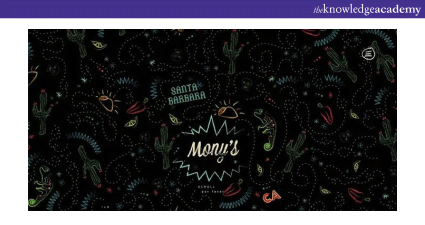
Observe the textured appearance on Mony's Tacos homepage, a Santa Barbara-based restaurant, to better understand this concept.

5) Use pictures to engage and teach readers
Achieving a harmonious blend of text and images is crucial in web design. The integration of visuals enhances content by making it more informative, engaging, and memorable. People recall only 20% of what they read but remember 80% of what they see. While the precise figures are subject to debate, the underlying concept holds true. Visual elements aid in the learning and processing of information for many individuals.
Elevate your digital creativity with our Website Design Course. Empower your skills and shape captivating online experiences!
6) Make sure your Website is user-friendly
Ensure your website prioritises user-friendliness for a positive online experience. Implement intuitive navigation, responsive design for various devices, and clear, concise content. Streamline the user journey by placing essential information prominently and employ a visually appealing layout.
Optimise page loading speed to prevent user frustration. Incorporate user feedback and troubleshoot potential issues regularly. A user-friendly Website fosters engagement, encourages return visits, and promotes a positive perception of your brand.
Regularly assess and refine the site's usability to adapt to evolving user needs and technological advancements. User-centric design enhances accessibility, satisfaction, and overall effectiveness.
7) Create easily readable Website content
"Readability" refers to the ease with which individuals can understand words, sentences, and phrases. When your website has high readability, users can effortlessly scan or skim through its content, making information intake effortless. Attaining optimal Website readability is quite straightforward. Consider following these essential key rules:
a) Contrast is key: Ensure there's enough distinction between text and background colours for readability and accessibility. While your colour scheme reflects your brand, use tools like Contrast Checker to guarantee ample contrast.
b) Opt for larger text: Small fonts can be challenging to read. A common guideline is to maintain body text at a minimum of 16pt, but this may vary based on your chosen fonts.
c) Choose fonts wisely: The typography provides various options. Decide between serif fonts (with projecting lines, e.g., Times New Roman) and sans serifs (without projecting lines).
d) Restrict font variety: Stick to a maximum of three typefaces on your website. While certain projects may demand diverse font combinations, excessive variation often results in a cluttered appearance, diverting attention from your brand identity.
e) Utilise text themes: Establish a clear structure by varying the size and weight of your written content. From large titles to smaller subheadings and even smaller body text, this practical design tip ensures there's always an element capturing the reader's attention.

8) Maintain mobile friendliness
All your website visitors should have an optimal experience, regardless of the device they use for browsing. Generate a mobile-friendly version of your professional website to cater to the growing trend of mobile browsing.
Conduct a thorough review of your site's mobile version from a user's perspective, testing every page, user interaction, and button. It's crucial to ensure that the mobile website is more streamlined and less cluttered compared to the desktop version. Consider minimising page elements and scaling down assets like the menu. Additionally, leverage unique mobile features to enhance your mobile design.
9) Display the items sequentially
Sequentially unveiling the elements builds anticipation and engagement. Each step unfolds, revealing facets with precision. This deliberate unveiling captures the user’s attention, allowing for a focused appreciation of each element. The sequential display not only enhances user experience but also imparts a sense of narrative for the reader.
This methodical presentation, be it a product, information, or visual content, cultivates a dynamic interaction, leaving a lasting impression. The sequential approach becomes a storytelling tool, capturing interest incrementally and creating a harmonious blend of discovery and immersion in the presented content.
10) Create headings with clear meaning
Headings play a crucial role in establishing the visual hierarchy particularly on content-rich pages. As users swiftly skim through your content, clear and concise headings serve as beacons, prompting readers to pause and focus on the relevant information. It's vital to strike a balance and utilise headings sparingly to demarcate distinct sections of your page.
Too much emphasis through enlarged and bolded text can diminish the effectiveness of this navigational aid. The objective is to guide users efficiently, ensuring that each heading serves as a signpost, directing them to the information they seek. Employing a judicious number of headings enhances the user experience that allows for a seamless flow throughout your content.
11) Minimise paragraph length and line width for readability
To enhance readability, it is advisable to keep paragraph lengths concise and limit the width of lines. Shorter paragraphs prevent overwhelming blocks of text, making it easier for readers to digest information. Meanwhile, narrower line widths prevent eye strain and aid in maintaining focus while reading. By adhering to these principles, you create a visually appealing layout that promotes a smoother reading experience, fostering better comprehension and engagement.
Master Android app development with precision with our Android App Development Training. Propel your career forward in the dynamic world of mobile technology!
12) Keep clear of accordions and tabs
Avoid the use of accordions and tabs to maintain clarity in your design. These interactive elements, while initially appearing neat and organised, can lead to user confusion and hinder accessibility. Opting for a straightforward layout without accordions or tabs ensures that information is readily visible, reducing the need for users to navigate hidden sections.
This approach promotes a user-friendly experience, as individuals can easily scan and access content without the additional step of expanding or opening tabs. By steering clear of accordions and tabs, you contribute to a more straightforward and intuitive interface, facilitating seamless interaction and understanding for all users.
Conclusion
These 12 Website Design Tips help you build a strong online presence. By incorporating thoughtful colour choices, strategic logo placement, and user-friendly design elements, you can build a website that not only looks appealing but also engages and retains visitors effectively.
Unlock your potential in app and web development with our courses on App & Web Development Training. Transform your skills and future today!
Frequently Asked Questions
How long does it take to build a website?

The time it takes to build a website varies widely based on complexity and features. A simple site might take a few weeks, while a more intricate one with custom functionalities could span several months. Factors like content creation, design revisions, and development complexities contribute to the timeline. Collaborative efficiency, prompt decision-making, and a clear project scope can expedite the process.
What if I need help on my site down the road?

If you require assistance with your website in the future, there are several avenues for support. Many web development platforms offer customer support, and you can also explore online forums and communities for advice. Additionally, hiring a web developer or contacting your site's original designer for professional help is a viable option. Maintaining open communication with your website's support network ensures that you can address any issues, implement updates, or seek guidance whenever needed.
How can I improve my website design?

To enhance your website design, consider these key steps. Firstly, focus on user experience by ensuring easy navigation and clear information presentation. Opt for a clean and visually appealing layout, balancing colours and images. Prioritise mobile responsiveness for a seamless experience across devices. Regularly update content and incorporate user feedback. Lastly, stay informed about design trends and technologies to keep your website modern and engaging.
What are the other resources and offers provided by The Knowledge Academy?

The Knowledge Academy takes global learning to new heights, offering over 30,000 online courses across 490+ locations in 220 countries. This expansive reach ensures accessibility and convenience for learners worldwide.
Alongside our diverse Online Course Catalogue, encompassing 17 major categories, we go the extra mile by providing a plethora of free educational Online Resources like News updates, blogs, videos, webinars, and interview questions. Tailoring learning experiences further, professionals can maximise value with customisable Course Bundles of TKA.
What are related App & Web Development Training courses and blogs provided by The Knowledge Academy?

The Knowledge Academy offers various App & Web Development Training, including Website Design Course, Android App Development Training etc. These courses cater to different skill levels, providing comprehensive insights into How to Build a CSS Website.
Our Programming & DevOps blogs covers a range of topics related to Website Design Course, offering valuable resources, best practices, and industry insights. Whether you are a beginner or looking to advance your Project Management skills, The Knowledge Academy's diverse courses and informative blogs have you covered.
Upcoming Programming & DevOps Resources Batches & Dates
Date
 Web Application Security Training
Fri 28th Mar 2025
Fri 23rd May 2025
Fri 25th Jul 2025
Fri 26th Sep 2025
Fri 28th Nov 2025


 Top Rated Course


 If you wish to make any changes to your course, please


