We may not have the course you’re looking for. If you enquire or give us a call on +61 1-800-150644 and speak to our training experts, we may still be able to help with your training requirements.
We ensure quality, budget-alignment, and timely delivery by our expert instructors.

Storytelling isn’t confined to creative writing; it can also be mastered in the realm of raw statistical data through Python Data Visualisation. Powerful Python libraries like Matplotlib, Plotly, and Seaborn enable the transformation of mundane numbers into insightful visuals, producing sleek charts, interactive graphics, and stunning plots.
This blog will guide you through Python’s extensive ecosystem of libraries, transforming raw data into visuals that are both informative and memorable. Dive into the world of Python Data Visualisation and discover the art of data-driven storytelling with Geopandas, NetworkX, Plotly, and more!
Table of Contents
1) Introduction to Python Data Visualisation
2) Customising Plots with Matplotlib
3) Creating Interactive Visualisations with Plotly
4) Visualising Data with Seaborn
5) Geospatial Data Visualisation with Geopandas
6) Network Visualisation with NetworkX
7) Conclusion
Introduction to Python Data Visualisation
Data Visualisation is a powerful technique that transforms complex data into meaningful and insightful visual representations. It is useful for:
1) Data cleaning
2) Exploring data structure
3) Detecting outliers and unusual groups
4) Identifying trends and clusters
5) Spotting local patterns
6) Evaluating modelling output and presenting results
Python, with its extensive collection of Data Visualisation libraries, has grown into a go-to language for creating stunning and interactive visualisations.
Python Data Visualisation libraries, provide a wide range of tools and capabilities to create various types of visualisations, from simple line plots to sophisticated 3D visualisations. These libraries include:
1) Matplotlib
2) Plotly
3) Seaborn
4) Pandas
These libraries come with user-friendly interfaces, making it easier for data analysts, scientists, and researchers to produce informative plots with minimal effort. In this age, when data is being generated at an unprecedented rate, effective Data Visualisation is paramount to harness the full potential of data.
Customising Plots with Matplotlib
Developed by John D. Hunter in 2003, Matplotlib is a 2D plotting library that replicates MATLAB's plotting capabilities in Python. It enables the creation of high-quality static, interactive, and animated visualisations. Over the years, Matplotlib has become an integral part of the data science ecosystem, making Data Visualisation highly accessible and straightforward.
Installation and Getting Started
Before using Matplotlib, it is essential to install the library. If you haven't installed it yet, you can do so using the following command:
|
pip install matplotlib |
Once installed, you can import Matplotlib into your Python script or Jupyter Notebook using the following convention:
|
import matplotlib.pyplot as plt |
Line Plot
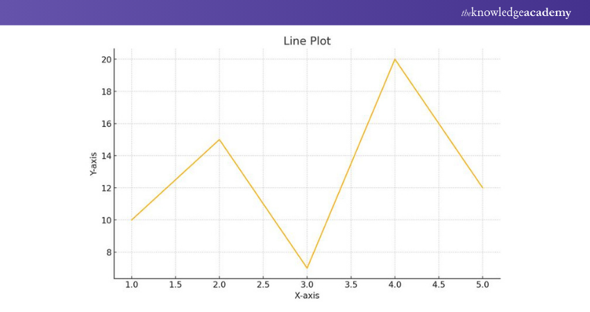
The line plot is one of the simplest and most used plots in Matplotlib. It is used to visualise the relationship between two variables, typically representing continuous data points. To create a line plot, you need to provide x and y data points, which are then connected by straight lines.
|
import matplotlib.pyplot as plt x = [1, 2, 3, 4, 5] y = [10, 15, 7, 20, 12] plt.plot(x, y) plt.xlabel('X-axis') plt.ylabel('Y-axis') plt.title('Line Plot') plt.show() |
Here’s the outcome:
Scatter Plot
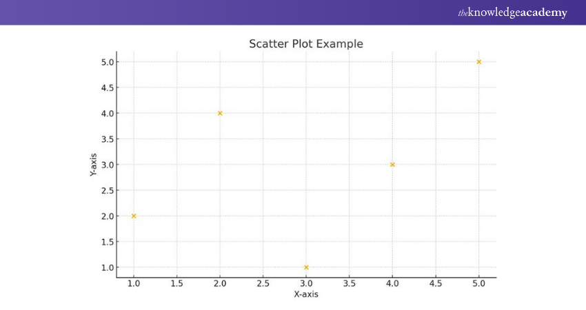
Scatter plots help in visualising the distribution and relationship between two variables. Rather than connecting data points with lines, scatter plots represent each data point as a dot. This allows you to identify patterns and correlations easily.
|
# Sample data for scatter plot x_values = [1, 2, 3, 4, 5] y_values = [2, 4, 1, 3, 5] # Creating the scatter plot plt.scatter(x_values, y_values) # Adding labels and title plt.xlabel('X-axis') plt.ylabel('Y-axis') plt.title('Scatter Plot Example') # Displaying the plot plt.show() |
Bar Plot
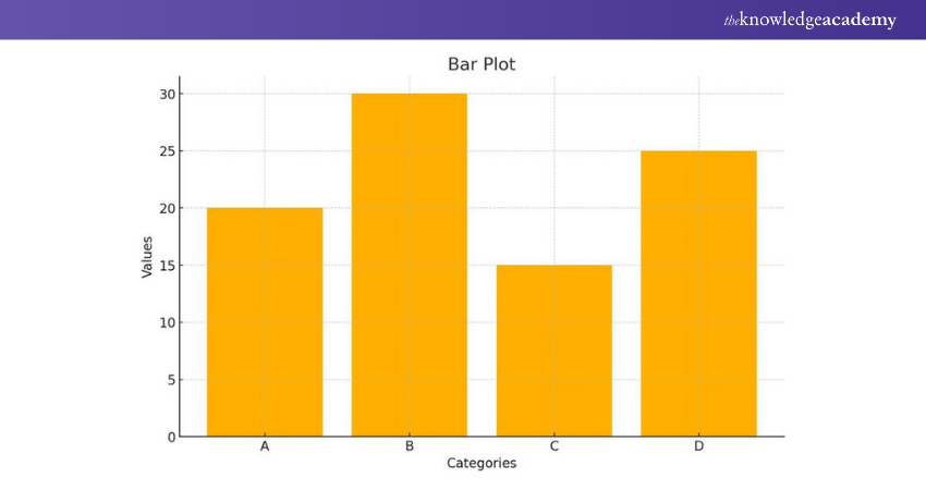
Bar plots are widely used for visualising categorical data or comparing different categories. They are effective in representing discrete data points and can be used to show counts, frequencies, or percentages.
|
import matplotlib.pyplot as plt categories = ['A', 'B', 'C', 'D'] values = [20, 30, 15, 25] plt.bar(categories, values) plt.xlabel('Categories') plt.ylabel('Values') plt.title('Bar Plot') plt.show() |
Histogram
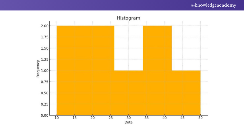
Histograms are used to visualise the distribution of continuous data and identify the frequency of data points falling within specific bins or intervals.
|
import matplotlib.pyplot as plt data = [10, 20, 15, 30, 25, 40, 35, 50] plt.hist(data, bins=5) plt.xlabel('Data') plt.ylabel('Frequency') plt.title('Histogram') plt.show() |
Pie Chart
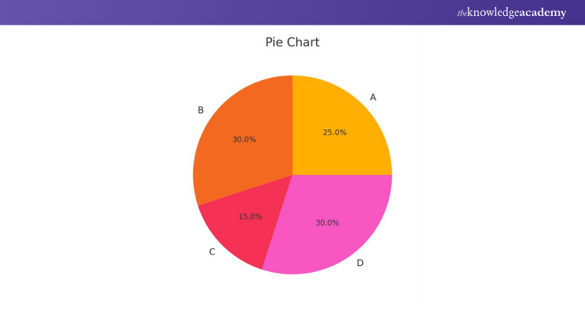
Pie charts are ideal for illustrating the proportion of different categories within a dataset. Every category is represented as a slice of the pie, with the slice's size corresponding to its percentage of the whole.
|
import matplotlib.pyplot as plt categories = ['A', 'B', 'C', 'D'] sizes = [25, 30, 15, 30] plt.pie(sizes, labels=categories, autopct='%1.1f%%') plt.title('Pie Chart') plt.show() |
Box Plot
Box plots, also known as box-and-whisker plots, are useful for visualising the distribution and identifying outliers in a dataset.
|
import matplotlib.pyplot as plt data = [10, 20, 15, 30, 25, 40, 35, 50] plt.boxplot(data) plt.title('Box Plot') plt.show() |
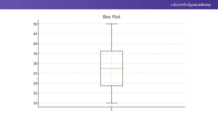
To summarise, Matplotlib is a versatile Data Visualisation library that enables users to create a broad range of plots. The most popular are line plots, scatter plots, bar plots, histograms, pie charts, and box plots. It's an indispensable tool in a data scientist's arsenal.
Unlock your coding potential by joining our Python Programming Course! Join this course today.
Creating Interactive Visualisations with Plotly
Plotly is an open-source Data Visualisation library developed by Plotly Inc. that provides an interactive and easy-to-use interface for creating various visualisations, including:
1) Line charts
2) Scatter plots
3) Bar charts
4) 3D plots
5) Choropleth maps
This library is used across industries, such as healthcare, finance, marketing and academia. Plotly can be used as both an offline and online tool:
1) In offline mode, the visualisations are rendered within the Jupyter Notebook or Python script, allowing seamless integration with data analysis workflows.
2) The online mode lets users store and share interactive visualisations on the Plotly Cloud platform.
Getting Started with Plotly
Before diving into interactive visualisations, it's essential to install the Plotly library. If you haven't installed it yet, use the following command:
|
pip install plotly |
To begin using Plotly, import the library as follows:
|
import plotly.graph_objects as go |
Interactive Line Chart
Line charts are ideal for visualising trends and changes over time. With Plotly, creating an interactive line chart is straightforward. You can customise the chart by adding titles, labels, and annotations to enhance its visual appeal and readability.
|
import plotly.graph_objects as go x = [1, 2, 3, 4, 5] y = [10, 15, 7, 20, 12] fig = go.Figure() fig.add_trace(go.Scatter(x=x, y=y, mode='lines+markers', name='Line Chart')) fig.update_layout(title='Interactive Line Chart', xaxis_title='X-axis', yaxis_title='Y-axis') fig.show() |
Interactive Scatter Plot
Scatter plots are used to visualise the relationship between two variables. In an interactive scatter plot, hovering over data points reveals additional information, making it easier to explore individual data points.
|
import plotly.graph_objects as go x = [1, 2, 3, 4, 5] y = [10, 15, 7, 20, 12] fig = go.Figure() fig.add_trace(go.Scatter(x=x, y=y, mode='markers', name='Scatter Plot')) fig.update_layout(title='Interactive Scatter Plot', xaxis_title='X-axis', yaxis_title='Y-axis') fig.show() |
Interactive Bar Chart
Bar charts are effective in comparing categorical data. In an interactive bar chart, you can hover over bars to view specific values, providing a dynamic way to analyse data.
|
import plotly.graph_objects as go categories = ['A', 'B', 'C', 'D'] values = [20, 30, 15, 25] fig = go.Figure() fig.add_trace(go.Bar(x=categories, y=values, name='Bar Chart')) fig.update_layout(title='Interactive Bar Chart', xaxis_title='Categories', yaxis_title='Values') fig.show() |
Interactive 3D Plot
Plotly also allows users to create interactive 3D visualisations. This is especially useful for visualising complex data and relationships in a three-dimensional space.
|
import plotly.graph_objects as go import numpy as np x = np.random.rand(100) y = np.random.rand(100) z = np.random.rand(100) fig = go.Figure() fig.add_trace(go.Scatter3d(x=x, y=y, z=z, mode='markers', marker=dict(size=5))) fig.update_layout(title='Interactive 3D Plot', scene=dict(xaxis_title='X-axis', yaxis_title='Y-axis', zaxis_title='Z-axis')) fig.show() |
So, Plotly enables data analysts and scientists to present and explore data interactively. By leveraging Plotly's features, users can quickly gain deeper insights and communicate complex data patterns.
Master web development with Python Django Training - Build dynamic and robust web applications with ease!
Visualising Data with Seaborn
Seaborn is built upon Matplotlib, which we've already explored. While Matplotlib provides a strong foundation for creating static visualisations, Seaborn expands its capabilities by providing higher-level interface with more sophistication and visually appealing statistical graphics. It’s another common choice among data analysts and scientists.
Installing Seaborn
Before using Seaborn, ensure that you have it installed. If you haven't installed it yet, you can do so using the following command:
|
pip install seaborn |
Once installed, you can import Seaborn in your Python script or Jupyter Notebook:
|
import seaborn as sns |
Scatter Plot
Scatter plots are useful for visualising the relationship between two continuous variables. Seaborn's scatterplot function makes it easy to create scatter plots with additional features like colour-coding data points based on a categorical variable.
|
import seaborn as sns import matplotlib.pyplot as plt # Sample data x = [1, 2, 3, 4, 5] y = [10, 15, 7, 20, 12] category = ['A', 'B', 'C', 'A', 'B'] sns.scatterplot(x=x, y=y, hue=category) plt.title('Scatter Plot with Seaborn') plt.show() |
Bar Plot
Bar plots are used to visualise categorical data or to compare categories. Seaborn's barplot function allows you to create bar plots with ease.
|
import seaborn as sns import matplotlib.pyplot as plt # Sample data categories = ['A', 'B', 'C', 'D'] values = [20, 30, 15, 25] sns.barplot(x=categories, y=values) plt.title('Bar Plot with Seaborn') plt.show() |
Histogram
Histograms are helpful in visualising the distribution of a single variable. Histogram in MATLAB can also be used to create similar plots, and Seaborn's distplot function combines a histogram with a kernel density plot, providing insights into the data's underlying distribution.
|
import seaborn as sns import matplotlib.pyplot as plt
# Sample data data = [10, 20, 15, 30, 25, 40, 35, 50]
sns.distplot(data) plt.title('Histogram with Seaborn') plt.show() |
Box Plot
Look no further than box plots if you are looking for the ideal option for visualising data distribution and identifying outliers. Seaborn's boxplot function makes it easy to create box plots with additional features like grouping data based on a categorical variable.
|
import seaborn as sns import matplotlib.pyplot as plt # Sample data categories = ['A', 'B', 'A', 'B', 'C', 'C'] values = [10, 20, 15, 30, 25, 40] sns.boxplot(x=categories, y=values) plt.title('Box Plot with Seaborn') plt.show() |
Heatmap
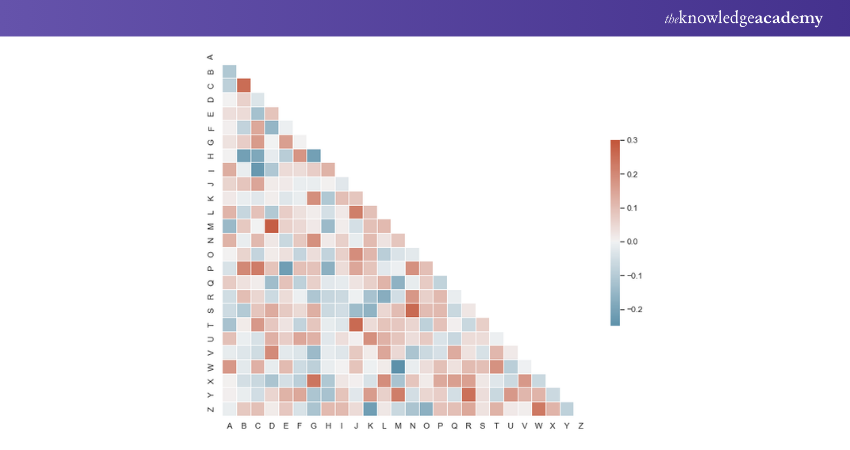
Heatmaps are used to visualise data in a tabular form, with colours representing the data's intensity. Seaborn's heatmap function allows you to create heatmaps to explore correlations or patterns in large datasets.
|
from string import ascii_letters import numpy as np import pandas as pd import seaborn as sns import matplotlib.pyplot as plt sns.set_theme(style="white") # Generate a large random dataset rs = np.random.RandomState(33) d = pd.DataFrame(data=rs.normal(size=(100, 26)), columns=list(ascii_letters[26:])) # Compute the correlation matrix corr = d.corr() # Generate a mask for the upper triangle mask = np.triu(np.ones_like(corr, dtype=bool)) # Set up the matplotlib figure f, ax = plt.subplots(figsize=(11, 9)) # Generate a custom diverging colormap cmap = sns.diverging_palette(230, 20, as_cmap=True) # Draw the heatmap with the mask and correct aspect ratio sns.heatmap(corr, mask=mask, cmap=cmap, vmax=.3, center=0, square=True, linewidths=.5, cbar_kws={"shrink": .5}) |
Customising Seaborn Plots
Seaborn allows you to customise plots easily. You can change colours, styles, and labels to suit your preferences or match your data's presentation requirements.
|
import seaborn as sns import matplotlib.pyplot as plt # Sample data x = [1, 2, 3, 4, 5] y = [10, 15, 7, 20, 12] # Create a scatter plot with customised colours and style sns.scatterplot(x=x, y=y, color='purple', marker='s', s=100, label='Data Points') # Add title and labels plt.title('Customised Scatter Plot with Seaborn') plt.xlabel('X-axis') plt.ylabel('Y-axis') # Show legend plt.legend() plt.show() |
Seaborn is a versatile and powerful Data Visualisation library that complements Matplotlib by providing a higher-level interface for creating attractive and informative visualisations. Its simplicity and aesthetic appeal make it a preferred choice among data analysts and scientists. In this article, we explored some commonly used plots in Seaborn, including scatter plots, bar plots, histograms, box plots, and heatmaps.
Expand your coding prospects with our Introduction to Programming with Python and Java Training!
Geospatial Data Visualisation with Geopandas
Geopandas is an open-source library built on top of Pandas, making it compatible with Pandas' DataFrame structure. This allows users to integrate geospatial data seamlessly with traditional tabular data and leverage the rich set of data manipulation functions offered by Pandas.
Geopandas simplifies the handling of geospatial data by providing a unified data structure called a "GeoDataFrame." A GeoDataFrame is essentially a Pandas DataFrame with an additional "geometry" column, which stores the geometric data for each spatial feature, such as points, lines, or polygons.
Installing Geopandas
Before using Geopandas, you need to install it along with its dependencies. Depending on your operating system, you may need to install additional geospatial libraries for proper functionality. For most users, the following command will suffice:
|
pip install geopandas |
Additionally, you can install Geopandas' optional dependencies for more advanced geospatial functionalities:
|
pip install geopandas[all] |
Getting Started with Geopandas
Once Geopandas is installed, you can import it and begin exploring geospatial data.
import geopandas as gpd
Geopandas can read various geospatial file formats, including Shapefiles, GeoJSON, and Geopackage. To read a geospatial file, use the read_file function:
|
# Read a Shapefile gdf = gpd.read_file('path/to/shapefile.shp') # Read a GeoJSON file gdf = gpd.read_file('path/to/geojsonfile.geojson') # Read a Geopackage file gdf = gpd.read_file('path/to/geopackagefile.gpkg') |
Geospatial Data Visualisation
Geopandas leverages the plotting functionalities of Matplotlib to create geospatial visualisations. By calling the plot function on a GeoDataFrame, you can create various types of geospatial visualisations, such as point maps, choropleth maps, and more.
|
import geopandas as gpd import matplotlib.pyplot as plt # Read a GeoJSON file gdf = gpd.read_file('path/to/geojsonfile.geojson') # Create a point map gdf.plot(marker='o', color='red', markersize=5) plt.title('Geospatial Point Map') plt.show() python Copy code # Create a choropleth map gdf.plot(column='population', cmap='OrRd', legend=True) plt.title('Choropleth Map of Population') plt.show() |
Geospatial Data Analysis
Geopandas enables powerful geospatial data analysis by providing spatial operations and manipulations. You can perform spatial queries, such as finding points within a polygon or intersecting geometries, using the built-in spatial methods.
|
import geopandas as gpd # Read a GeoJSON file of countries world = gpd.read_file(gpd.datasets.get_path('naturalearth_lowres')) # Find countries that intersect a specific point point = gpd.GeoSeries([Point(-74.0071, 40.7128)]) countries = world[world.intersects(point.unary_union)] # Output the intersecting countries' names print(countries['name']) |
Geopandas is a powerful and user-friendly Python library that simplifies geospatial data manipulation and visualisation. By combining the capabilities of Pandas with geospatial data structures, Geopandas provides data analysts and scientists with an efficient way to handle geospatial data and gain insights through geospatial visualisations and analysis. Whether you are working with point data, lines, or polygons, Geopandas offers a seamless integration with Pandas, making it an invaluable tool for anyone dealing with geospatial datasets. Its ease of use and powerful functionalities have made it a go-to for geospatial data analysis and visualisation in the Python ecosystem.
Unlock the Power of Data: Join our Data Analysis and Visualisation with Python Course Now!
Network Visualisation with NetworkX
Networks, also known as graphs, are a powerful way to represent and analyse complex relationships between interconnected entities. NetworkX is a Python library that provides tools for creating, visualising, and analysing networks. With NetworkX, users can explore various types of networks, such as transportation networks, social networks, biological networks, and more. NetworkX allows users to create, manipulate, and study the structure, dynamics, and functions of complex networks. It supports directed and undirected graphs, as well as multi-graphs, which can have multiple edges between the same pair of nodes. NetworkX also offers various algorithms for network analysis, such as centrality measures, shortest path algorithms, and community detection.
Installing NetworkX
To get started with NetworkX, you need to install it. You can install NetworkX using pip:
|
pip install networkx |
Once installed, you can import NetworkX in your Python script or Jupyter Notebook:
|
import networkx as nx |
import networkx as nx
Creating Networks with NetworkX
NetworkX provides straightforward methods for creating different types of networks. You can start with an empty graph and add nodes and edges or use NetworkX's built-in functions to generate specific types of networks.
Creating an Empty Graph
|
import networkx as nx
G = nx.Graph() # Undirected graph G = nx.DiGraph() # Directed graph |
Adding Nodes and Edges
|
import networkx as nx
G = nx.Graph()
G.add_node(1) G.add_nodes_from([2, 3, 4]) G.add_edge(1, 2) G.add_edges_from([(1, 3), (2, 4)]) |
Generating Specific Networks
|
import networkx as nx G = nx.random_graphs.erdos_renyi_graph(10, 0.3) # Erdos-Renyi random graph G = nx.random_graphs.barabasi_albert_graph(10, 2) # Barabasi-Albert preferential attachment graph G = nx.random_graphs.watts_strogatz_graph(10, 2, 0.3) # Watts-Strogatz small-world graph |
Network Visualisation with NetworkX and Matplotlib
Visualising networks is essential for gaining insights into their structures and characteristics. NetworkX integrates seamlessly with Matplotlib, allowing you to create visual representations of networks.
|
import networkx as nx import matplotlib.pyplot as plt # Create a graph G = nx.Graph() G.add_edges_from([(1, 2), (2, 3), (3, 4), (4, 1)]) # Draw the graph pos = nx.spring_layout(G) # Position nodes using the spring layout algorithm nx.draw(G, pos, with_labels=True, node_size=1000, node_color='skyblue', font_size=12, font_weight='bold') # Show the plot plt.title('Network Visualisation with NetworkX') plt.show() |
Network Analysis with NetworkX
NetworkX provides various algorithms and metrics for network analysis. You can compute centrality measures, shortest paths, and community structures, among other things.
|
import networkx as nx
# Create a graph G = nx.Graph() G.add_edges_from([(1, 2), (2, 3), (3, 4), (4, 1)])
# Calculate degree centrality degree_centrality = nx.degree_centrality(G) print(degree_centrality)
# Calculate shortest path shortest_path = nx.shortest_path(G, source=1, target=4) print(shortest_path)
# Detect communities using Louvain method communities = nx.algorithms.community.modularity_max.greedy_modularity_communities(G) print(communities) |
NetworkX is a powerful Python library for working with networks and graph-related data. It enables users to create, visualise, and analyse complex networks efficiently. With its seamless integration with other Python libraries, such as Matplotlib, NumPy, and Pandas, NetworkX provides a versatile toolset for network analysis and visualisation. Whether you are exploring social networks, biological networks, or any other interconnected data, NetworkX offers a user-friendly interface to study the underlying structures and relationships of your data.
Level up your programming skills with our comprehensive Programming Training today!
Conclusion
Mastering Python Data Visualisation can enable you to transform complex data into clear, compelling visuals that tell a powerful story. Whether you're using Seaborn, Matplotlib, or Plotly, these indispensable data analysis tools help you communicate insights effectively. With a firm grasp of Python libraries, you can transform raw data into compelling visual stories that aid in making informed decisions.
Elevate your Python skills by learning how to deploy Python applications to the Google Cloud Platform (GCP) - Sign up for our Python with Google Cloud Platform Training now!
Frequently Asked Questions
How can Python Help in Data Analysis and Business Intelligence?

Python offers flexibility, simplicity, vast libraries, and visualisation capabilities for working with large, complex datasets. Its scalability makes it a good fit for big data analytics and integrates well with business intelligence tools and databases.
What is the Difference Between Static and Interactive Visualisations?

Static visualisation refers to displaying data focusing on only a single data relationship. Interactive visualisation enables users to select specific data points to present findings and create customised visual stories to compare against each other.
What are the Other Resources and Offers Provided by The Knowledge Academy?

The Knowledge Academy takes global learning to new heights, offering over 3,000 online courses across 490+ locations in 190+ countries. This expansive reach ensures accessibility and convenience for learners worldwide.
Alongside our diverse Online Course Catalogue, encompassing 19 major categories, we go the extra mile by providing a plethora of free educational Online Resources like News updates, Blogs, videos, webinars, and interview questions. Tailoring learning experiences further, professionals can maximise value with customisable Course Bundles of TKA.
What is The Knowledge Pass, and How Does it Work?

The Knowledge Academy’s Knowledge Pass, a prepaid voucher, adds another layer of flexibility, allowing course bookings over a 12-month period. Join us on a journey where education knows no bounds.
What are the Related Courses and Blogs Provided by The Knowledge Academy?

The Knowledge Academy offers various Programming Courses, including the Python Course and the R Programming Course. These courses cater to different skill levels, providing comprehensive insights into Python in Excel.
Our Programming & DevOps Blogs cover a range of topics related to Python, offering valuable resources, best practices, and industry insights. Whether you are a beginner or looking to advance your Python Skills, The Knowledge Academy's diverse courses and informative blogs have got you covered.
Upcoming Programming & DevOps Resources Batches & Dates
Date
 Python Course
Thu 27th Mar 2025
Thu 29th May 2025
Thu 3rd Jul 2025
Thu 4th Sep 2025
Thu 6th Nov 2025


 Top Rated Course


 If you wish to make any changes to your course, please


