We may not have the course you’re looking for. If you enquire or give us a call on +1 7204454674 and speak to our training experts, we may still be able to help with your training requirements.
We ensure quality, budget-alignment, and timely delivery by our expert instructors.

In the fast-paced business world, managing projects efficiently is key for both large companies and entrepreneurs. This is the reason many professionals are turning to Gantt Charts in PowerPoint. These useful visuals help navigate projects to success and keep customers happier and satisfied. It’s all about staying on track and dwelling in the competitive market!
But the question that arises is why these Charts are beneficial in Project Management. Read this captivating blog to delve more into Gantt Charts in PowerPoint. Also, explore their benefits and the systematic process of creating these practical-oriented charts.
Table of Contents
1) What is a Gantt Chart?
2) How to Make a Gantt Chart in PowerPoint?
3) Integrating Gantt Charts Into PowerPoint Presentations
4) Tips for Designing an effective Gantt Chart
5) Gantt Chart Template in PowerPoint
6) How to Import a Gantt Chart from Excel to PowerPoint?
7) How to Import a Gantt Chart From Mac Numbers to PowerPoint?
8) Conclusion
What is a Gantt Chart?
Gantt Charts are visual representation that graphically represent project timelines, tasks, durations, and dependencies. They can be easily created in PowerPoint for visual project tracking. However, it's worth noting that PowerPoint does not have a built-in Gantt Chart feature.
Begin by dividing the project into individual tasks and positioning these tasks on a timeline. Every task is shown by a bar, and its location and length indicate when the task begins, its duration, and finishing time. Arrows or connectors can be used to illustrate the relationships between functions.
How to Make a Gantt Chart in PowerPoint?
Creating a Gantt Chart in PowerPoint allows you to visually represent project timelines, tasks, and dependencies. However, it's worth noting that PowerPoint does not have a built-in Gantt Chart feature. Following these step-by-step instructions can create an impactful Gantt Chart that enhances your presentations.
Step 1: Open Powerpoint and Create a New Slide
Firstly, you need to open Microsoft PowerPoint and create a new slide. Here’s how you can do this:
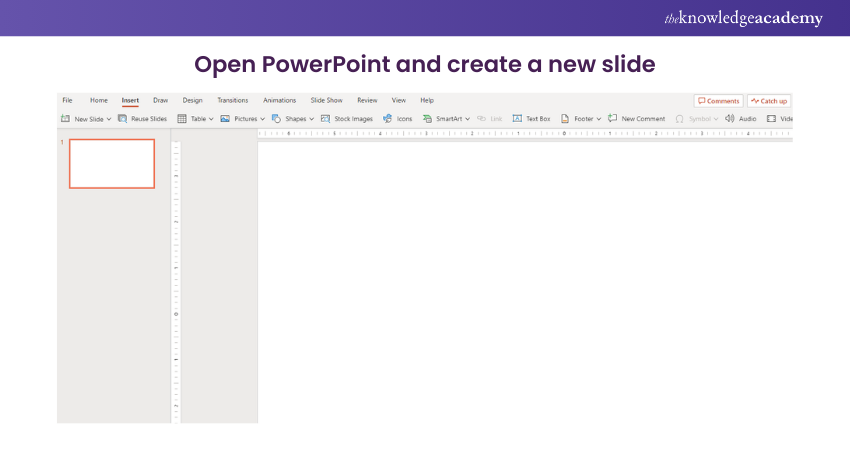
a) Launch PowerPoint
b) Open a new or existing presentation
c) Create a new slide where you want to insert your Gantt Chart
Step 2: Insert a Table
Next, you need to insert the table into your presentation. Here’s steps explained:
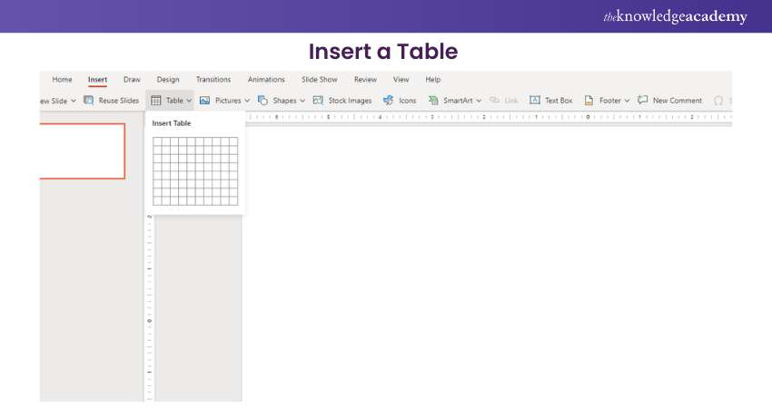
a) In the new slide, go to the "Insert" tab in the PowerPoint ribbon
b) Click on the "Table" button
c) Choose the number of columns and rows you need for your Gantt Chart
Step 3: Customise the Table
Following that, you will be customising the table. For this, you need to:
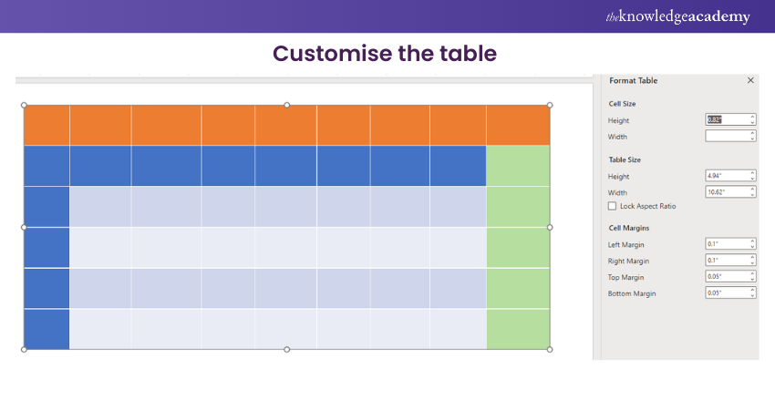
a) Adjust the column widths to accommodate your project timeline
b) You can also format the table by changing the font, cell borders, and background colours to match your presentation's style. The table will look like the following image:
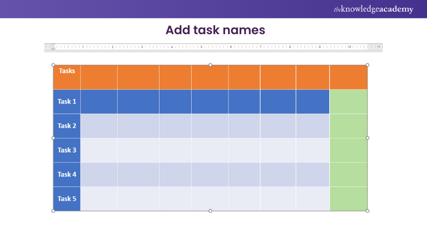
Step 4: Add Task Names
In the leftmost column of the table, enter the names of the tasks or activities that make up your project. Each task should have its row on the table. Your table will look like the following image:
Step 5: Define the Timeline
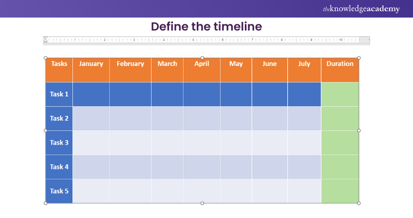
Across the top row of the table, define the timeline of your project. Each column represents a specific time, such as days, weeks, or months. You can choose the appropriate time scale based on the duration of your project. You will be presented with a new table:
Step 6: Add Task Bars
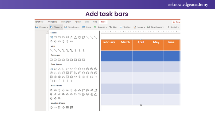
Select the cells corresponding to each task and its duration in the table. Format these cells to represent the tasks visually. One common approach is applying shading or fill colours to the cells to create horizontal bars representing the task duration.
Step 7: Include Milestones
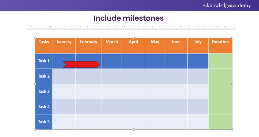
Identify significant milestones or deadlines in your project and mark them in the Gantt Chart. You can use symbols, icons, or different colours to highlight these milestones and make them visually distinct from regular tasks, as shown in the following image:
Step 8: Define Dependencies
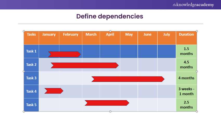
Arrows or connecting lines between the task bars in the Gantt Chart can represent task dependencies or relationships. These visual indicators show the logical order in which tasks should be completed and illustrate their dependencies.
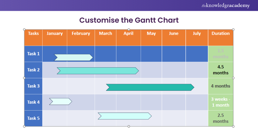
Step 9: Customise the Gantt Chart
You can customise your Gantt Chart further to enhance its visual appeal. Experiment with different colours, fonts, and styles to match your presentation's overall design. Ensure that the chart is easy to read.
Step 10: Update and Maintain the Gantt Chart
As your project progresses, update the Gantt Chart with the tasks' actual start and end dates. It will help you track the project’s progress and make necessary adjustments. Regularly maintain the Gantt Chart to keep it up-to-date and accurate.
You can create an appealing and informative Gantt Chart With Dependencies in Excel in PowerPoint following these ten steps. Remember to save your presentation to maintain the Gantt Chart and ensure it is readily accessible for future use.
Master the tools and techniques to make your presentations stand out. Join our Microsoft Office Training now!
Integrating Gantt Charts Into PowerPoint Presentations
Integrating Gantt Charts into PowerPoint presentations allows you to effectively communicate project plans, timelines, and progress to your audience. Here are some essential tips for seamlessly integrating Gantt Charts into your PowerPoint Presentations:
Slide Placement
Decide where you want to place your Gantt Chart within your presentation. Consider the flow and narrative of your presentation and determine the most appropriate point to introduce the chart. Ideally, it should align with the topic or section that discusses project planning, timelines, or progress.
Chart Size and Position
Resize and position the Gantt Chart on the slide to ensure optimal visibility. Ensure the chart is large enough for the audience to read and understand.
Note: It should be manageable enough to overwhelm the rest of the slide content. Position the chart prominently to draw attention and ensure it is easily visible to all viewers.
Contextual Text
Accompany your Gantt Chart with relevant text, captions, or explanations. Introduce the chart, explaining its purpose and highlighting key elements. Use concise and clear language to ensure your audience understands the chart’s context and how to interpret it.
Animation and Interactivity
Add animation effects to your Gantt Chart to enhance its visual appeal and engage your audience. You can reveal the chart gradually, element by element, to create a sense of anticipation and keep the audience focused.
Additionally, consider using hyperlinks or interactive features to allow viewers to explore the chart in more detail or access additional project-related information.
Consistent Design
Maintain consistency in design throughout your presentation. Ensure that the colours, fonts, and overall style of the Gantt Chart align with the rest of your slides. Consistency helps create a cohesive and professional-looking presentation that is easy to comprehend and visually appealing.
Real-Time Updates
Consider integrating real-time updates into your Gantt Chart if your project is ongoing. This can be done by linking your chart to project management software or spreadsheets. With real-time updates, you can dynamically reflect changes in task progress, timelines, or dependencies, providing your audience with the most up-to-date information during the presentation.
Proper Documentation
Provide proper documentation for your Gantt Chart. Include a reference slide or handout that explains the symbols, colours, or other elements used in the chart. This documentation is a helpful resource for your audience, enabling them to understand the chart even after the presentation.
Upgrade your Microsoft Office skills to the next level – sign up for ours Power Apps and Power Automate Training!
Tips for Designing an Effective Gantt Chart
Designing an effective Gantt Chart is crucial to ensure your project timelines are visually clear, engaging for your audience and easy to understand. Here are some valuable tips to consider when designing your Gantt Chart:
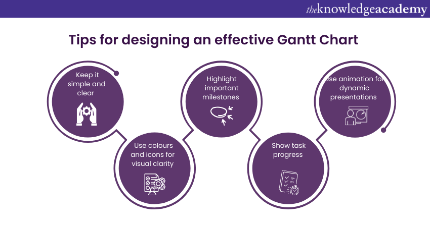
1) Keep It Simple and Clear
Simplicity is key when designing a Gantt Chart. Avoid cluttering the chart with excessive details or overwhelming visuals. Focus on the essential elements, such as tasks, durations, and dependencies. Keep the layout clean and organised, allowing your audience to grasp the project timeline quickly at a glance.
2) Use Colours and Icons for Visual Clarity
Utilise colours and icons to enhance the visual clarity of your Gantt Chart. Assign different colours to tasks or task groups to differentiate them visually.
Use icons or symbols to represent milestones, deadlines, or significant events within the project. This helps draw attention to critical elements and makes the chart more visually appealing and engaging.
3) Highlight Important Milestones
Identify and highlight significant milestones within your Gantt Chart. Milestones represent key achievements, project deadlines, or major events.
By visually distinguishing these milestones, you highlight crucial points in the project timeline. This helps your audience understand the progress and importance of specific tasks or events.
4) Show Task Progress
Illustrate the progress of tasks in your Gantt Chart. Use shading, patterns, or colour fill to indicate the completion status of each task.
This visual representation allows your audience to assess progress and identify potential delays or bottlenecks quickly. Clearly distinguish between completed, ongoing, and upcoming tasks for better comprehension.
5) Use Animation for Dynamic Presentations
Consider adding animation effects to your Gantt Chart when presenting it in PowerPoint or other platforms. Animation can bring the chart to life, revealing different elements gradually or highlighting specific sections. This dynamic presentation style engages your audience and helps convey complex information more effectively.
Google Slides vs. PowerPoint: Which is better for you? Compare features and choose the best for your presentations. Explore more now!
Gantt Chart Template in PowerPoint
Developing a PowerPoint Gantt diagram template will allow the display of the timeline and the tasks undertaken.
a) Slide Layout: Create a blank slide or the right one for you.
b) Insert Shapes: Use rectangular shapes to show tasks and milestones. Place these points one after another on the timeline.
c) Add Text: Create a card for each action and write its name and duration on it. Additionally, you can point out crucial details, including specific dates.
d) Timeline Bar: Draw the horizontal lines with the task fulfilment time. The lines should be extended to represent the time allotted for specific tasks.
e) Dependencies: Use arrows or lines to capture task dependencies. Connect shapes to convey the sequence of operations.
f) Colour Coding: Use colours to indicate the type of work or tasks and categories. This ensures effective communication and high readability.
g) Legend: Embed a key that explains the correlation of colours and symbols to the Gantt chart.
h) Title and Labels: Insert a Gantt Chart slide title and create representations of timelines, tasks, and milestones.
i) Customisation: You can achieve better results by personalising the design elements, fonts, and colours to match the presentation theme and the respective branding.
j) Testing and Review: Glance through the Gantt Chart template for any errors and finalise the presentation after it is clear.
Unlock the power of presentations! Discover the top Features of PowerPoint that will elevate your slides to the next level. Learn more now!
How to Import Data into PowerPoint Gantt Chart Templates?
To efficiently import a Gantt chart from Excel into PowerPoint, follow these straightforward steps to ensure your project data is accurately represented.
1) Select a Template: Choose a suitable Gantt chart template from PowerPoint or an external source.
2) Open the Template: Open your selected Gantt chart template in PowerPoint.
3) Input Project Data: Enter tasks, start dates, and end dates directly into the template’s table or chart fields.
4) Prepare Data in Excel: For a more seamless process, prepare your data in an Excel spreadsheet with columns for tasks, start dates, end dates, and dependencies.
5) Copy and Paste Data: Copy the data from Excel and paste it into the corresponding fields in your PowerPoint Gantt chart template.
6) Link Excel Data (if applicable): If your template allows for data import from Excel, go to the “Data” tab in PowerPoint, choose “Link Data,” and select your Excel file. This will automatically update your Gantt chart in PowerPoint whenever changes are made in the Excel file.
7) Ensure Up-to-Date Charts: Linking the files ensures your Gantt chart remains up-to-date with minimal manual adjustments, making project tracking and management more streamlined.
How to Import a Gantt Chart From Excel to PowerPoint?
Being able to include an already prepared Gantt Chart from Excel in your PowerPoint presentation, you may avoid long hours of topically working on timelines and project updates while visualising the information. Here's how to do it:
a) Create Gantt Chart in Excel: Assign the Excel Program as the tool of creating your Gantt chart with the activities, starting dates, duration and interdependence.
b) Select Gantt Chart: In Excel, pick all the areas that lie within the Gantt, including task names, dates, and the bars that show the time range.
c) Copy Gantt Chart: Make a right mouse click on the chosen spot and click on " Copy " or press Ctrl+C on your keyboard to do that.
d) Open PowerPoint: Since you can use the Gantt chart in the PowerPoint presentation, open it where you want to insert it.
e) Paste as Picture: Within PowerPoint, navigate to the slide needed for the Gantt Chart. Click and select the "Paste Special" option. Select the "Picture (Enhanced Metafile)" and click "OK."
f) Adjust Size and Position: Carry out a proportionate and placing adjustment of the pasted plan scheme picture on the slide as required for your layout.
g) Add Labels and Titles: Click here to label the bullet points and sets of sentences on the slide. This will help improve the clarity and context of the slides' content.
h) Update Gantt Chart: If you are going to come up with the changes in the Gantt Chart in Excel, make sure that you copy-paste them again in PowerPoint to make them into the latest version.
i) Review and Finalise: First, look at the Gantt Chart on the slide to ensure it is clear enough and accurately depicts the project schedule, then present it.
j) Save presentation: Save your PowerPoint presentation so you can access the Gantt Chart when needed.
Land the job with ease! Learn how to ace your PowerPoint Interview with tips to create slides that leave a lasting impression!
How to Import a Gantt Chart From Google Sheets to PowerPoint?
Importing a Gantt Chart from Google Sheets to PowerPoint proceedings lets you effortlessly share project timelines in presentations. Here's how you do it:
a) Create Gantt Chart in Google Sheets: You can use Google Sheets to create your Gantt chart and insert tasks, start dates, durations and their dependencies.
b) Select Gantt Chart Area: Choose the whole Gantt Chart layout encompassing task headers, dates, and stages that represent the task's timeline in Google Sheets.
c) Copy Gantt Chart: "Copy" this area or use the keyboard shortcut "Ctrl+C" by right-clicking on the place you selected.
d) Paste special in PowerPoint: Fix the PowerPoint slide on which you will place a Gantt Chart. Right-click the slides and choose "Paste Special". Select "Picture (Enhanced Metafile)", then "OK".
e) Adjust Size and Position: After you have pasted the Gantt Chart graph picture on the slide, adjust the size and place it in the position that will suit your layout.
f) Add Labels and Titles: Clarify your PowerPoint slide by inserting labels, titles, or any supplementary data that will make it clearer.
g) Update Gantt Chart: If you make changes to the chart in Google Sheets, you must repeat the copy-paste process in PowerPoint to update it.
h) Review and Finalise: Before presenting it, check the PowerPoint slide to ensure that the Gantt chart clearly portrays the project delivery timeframe as indicated.
i) Save Presentation: For future reference, keep the imported PowerPoint presentation.
j) Considerations: Make sure Google Sheets and PowerPoint are correct and suited to the importation without the formatting problems.
Take your Microsoft Office skills to the next level – sign up for our Power Apps and Power Automate Training!
How to import a Gantt Chart from Mac numbers to PowerPoint?
A Gantt Chart can be transferred from Mac Numbers to PowerPoint, the most effective method of relaying project timelines in speeches. Here's how to do it:
a) Create Gantt Chart in Mac Numbers: Use Mac Numbers to create a Gantt Chart for your work, with tasks, start dates, times, and relationships displayed clearly.
b) Select Gantt Chart area: Choose a whole area in Mac Numbers, from task names to due dates and the corresponding timelines of blue and red bars.
c) Copy Gantt Chart: Hold down the right mouse button and select "Copy" from the context menu, or use the keyboard shortcut Command+C.
d) Paste special in PowerPoint: Take your PowerPoint where you are supposed to place the Gantt Chart you want to insert. Click the slide's right-hand side and then go to Pasting Special. Choose Picture (Enhanced metafile), then click OK.
e) Adjust size and position: Move and organise the already pasted Gantt Chart picture on the slide and adjust its structure to match yours.
f) Add labels and titles: Seek clarity and support the audience by adding captions, titles, and other information on the PowerPoint slide.
g) Update Gantt Chart: If you change the Gantt Chart in the Mac Numbers app, repeat the copy-and-paste process in PowerPoint to update the chart.
h) Review and finalise: Make sure that the Gantt Chart legibly represents the project timeline and does not contain any timing discrepancies before showing it during your PowerPoint presentation by double-checking your slide.
i) Compatibility check: Make sure Mac Numbers and PowerPoint are aligned to prevent any shape issues when importing documents.
Conclusion
By understanding how to insertGantt Charts in PowerPoint and leveraging its capabilities, you can elevate your Project Management efforts and deliver compelling presentations that engage your audience and convey information effectively. By integrating Gantt Charts seamlessly into PowerPoint presentations, presenters can enhance the visual appeal and impact of their slides.
Learn how to create customised slide shows in MS PowerPoint with our Microsoft PowerPoint MO300 Training.
Frequently Asked Questions
Why Don’t I Have a Chart Option in PowerPoint?

You might not have the chart option in PowerPoint due to missing or corrupt Office files, outdated software, or incorrect installation. If such a situation arises, try repairing Office, updating PowerPoint, or checking if your organisation turns off the feature.
How Do I Apply a Chart Template in PowerPoint?

To apply a chart template in PowerPoint, select your chart, navigate to Chart Tools Design, tap on "Change Chart Type," and choose "Templates." Pick your custom chart template from the list and click "OK" to apply it.
What are the Other Resources and Offers Provided by The Knowledge Academy?

The Knowledge Academy takes global learning to new heights, offering over 3,000 online courses across 490+ locations in 190+ countries. This expansive reach ensures accessibility and convenience for learners worldwide.
Alongside our diverse Online Course Catalogue, encompassing 19 major categories, we go the extra mile by providing a plethora of free educational Online Resources like News updates, Blogs, videos, webinars, and interview questions. Tailoring learning experiences further, professionals can maximise value with customisable Course Bundles of TKA.
What is The Knowledge Pass, and How Does it Work?

The Knowledge Academy’s Knowledge Pass, a prepaid voucher, adds another layer of flexibility, allowing course bookings over a 12-month period. Join us on a journey where education knows no bounds.
What are the Related Courses and Blogs Provided by The Knowledge Academy?

The Knowledge Academy offers various Microsoft 365 Training, Microsoft PowerPoint MO300 Training, Microsoft 365 Administrator Training MS102, Managing Microsoft Teams MS700 Course. These courses cater to different skill levels, providing comprehensive insights into How to Make a Histogram in Excel.
Our Office Applications Blogs covers of topics related to the Gantt Charts, offering valuable resources, best practices, and industry insights. Whether you are a beginner or looking to advance your Microsoft Technical skills, The Knowledge Academy's diverse courses and informative blogs have you covered.
Upcoming Office Applications Resources Batches & Dates
Date
 Microsoft PowerPoint Training
Fri 11th Apr 2025
Fri 13th Jun 2025
Fri 8th Aug 2025
Fri 26th Sep 2025
Fri 21st Nov 2025


 Top Rated Course


 If you wish to make any changes to your course, please


