


 Top Rated Course


We may not have the course you’re looking for. If you enquire or give us a call on +27 800 780004 and speak to our training experts, we may still be able to help with your training requirements.
How to Make a Gantt Chart in Excel? A Step-By-Step Guide
Sienna Roberts 29 December 2022A Gantt Chart is a Project Management tool that helps you visualise timelines for your project at a glance by listing the tasks and deadlines that must be met. This blog thoroughly explores How to Make a Gantt Chart in Excel, outlining its benefits and drawbacks too. Read on and learn to track your project like a pro!

Training Outcomes Within Your Budget!
We ensure quality, budget-alignment, and timely delivery by our expert instructors.
Table of Contents

Are you looking to transform your project plan from a confusing mess of complex timelines into a vibrant roadmap for greater clarity? Look no further than a Gantt Chart in Excel. With this tool, you can juggle tasks, timelines and deadlines like a pro, and transform plain data into a dynamic, easy-to-read chart that tracks every stage of your project’s progress.
This blog explores How to Make a Gantt Chart in Excel, outlining all the essential steps you will need. So, read on, track the deadlines and dependencies masterfully, and bring your project to life, one timeline at a time!
Table of Contents
1) What is a Gantt Chart in Excel?
2) How to make a Gantt Chart in Excel?
3) Gantt Chart Template in Microsoft Excel
4) Advantages of Excel Gantt Charts
5) Disadvantages of Excel Gantt Charts
6) Conclusion
What is a Gantt Chart in Excel?
A Gantt Chart is a category of bar chart representing every task in a project. It’s a potent Project Management tool used to plan project schedules, enhance resource allocation, and remain up-to-date with project progress.
A Gantt Chart is structured around two main axes:
1) The vertical axis, which lists all the tasks.
2) The horizontal axis, which maps out the project timeline.
The chart itself features horizontal bars, each representing a task. The length of the bar shows when a task should start and end. This enables Project Managers to accurately predict the entire project timeline.
The Gantt Chart gained popularity in the early 20th century when Henry Gantt, a mechanical engineer, started using the model to record the progress of each task in the manufacturing process. This allowed supervisors to see if production schedules were on time, and in case they weren’t, they could make prompt changes to get things back on track.
Today, Gantt Charts have expanded their application beyond the manufacturing industry, finding utility in software development, construction, and other fields, helping diverse teams manage their project schedules.

How to Make a Gantt Chart in Excel?
Here’s a quick overview of what the process of creating a Gantt Chart in Excel looks like:
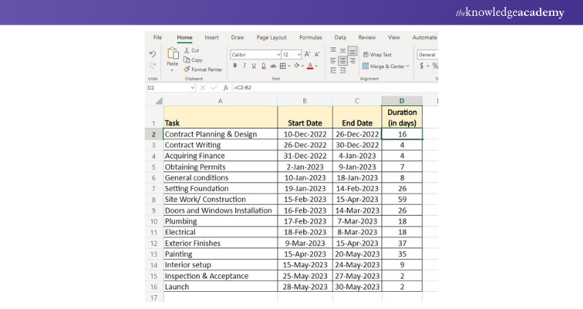
Step 1: Let’s create a Project table as seen in the image below.
Once you enter the tasks, start date, and end date, the duration can be calculated as follows:
Duration = End date – Start date
Step 2: Make a bar chart using the data in the Start Date column
Select the Start Date column range, B1:B16, in our example.
Now, click on Insert tab > click Bar in charts group > Stacked Bar.
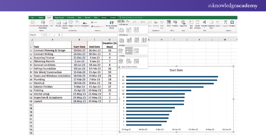
Step 3: This will result in producing the stacked bar as seen in the image below.
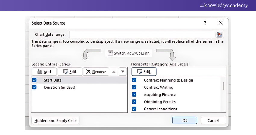
Right-click on the chart area and click on the 'Select Data' option.
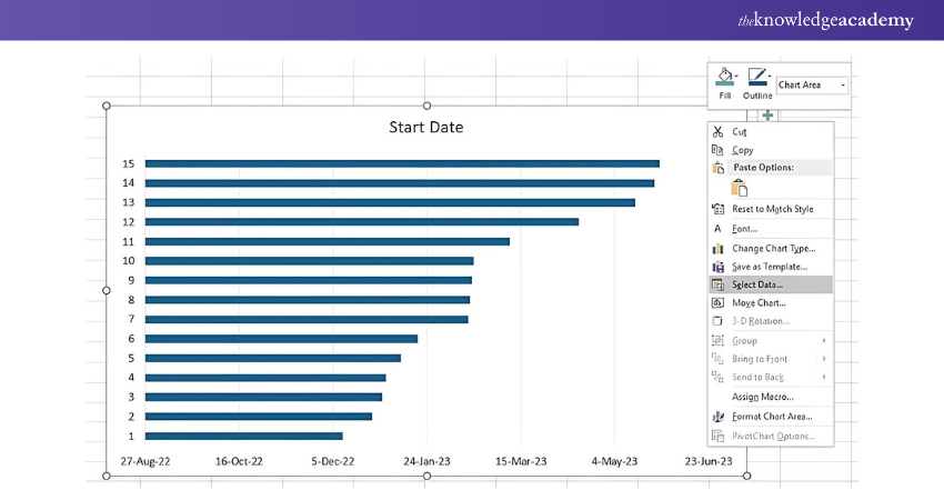
Now, click on the Add button to plot more data (Duration) in the Gantt Chart.
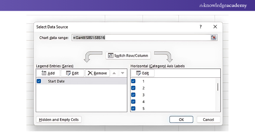
This opens an Edit Series window, where you can add the series name and series values as seen in the image.
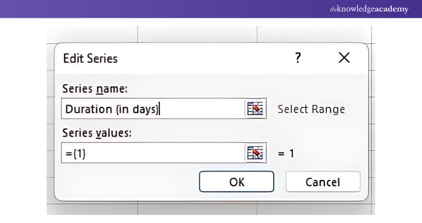
Add series values (D2:D16) as seen in the image. Make sure to not include a header or an empty cell by mistake. Once you have entered the details in the box, click the OK button for the data to be added to the Excel Gantt Chart.
The resulting bar chart will look like similar to the following image
Transform yourself into a professional Microsoft Excel expert with Microsoft Excel VBA and Macro Training- join now!
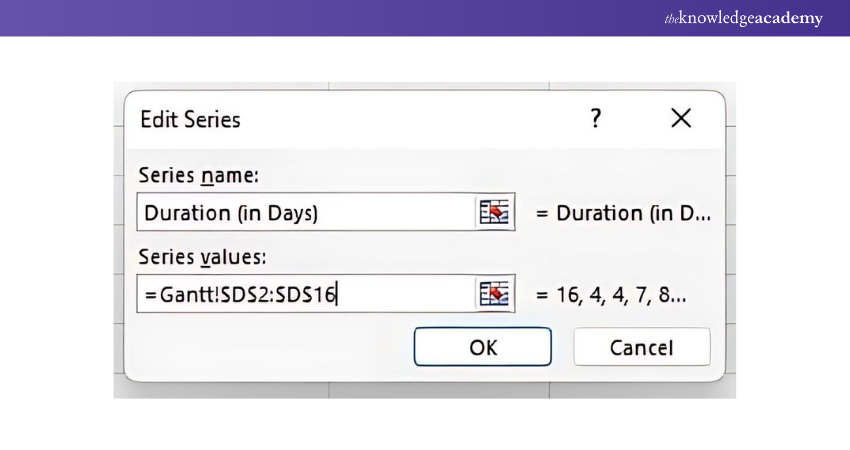
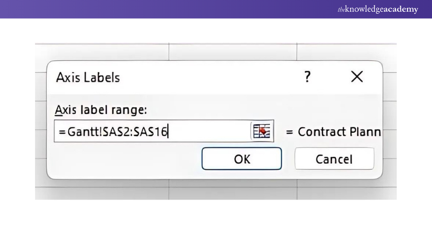
Step 4: Adding task descriptions to the Excel Gantt Chart. To replace the dates on the left-hand portion of the chart with the list of scheduled tasks:
Right-click in the chart area and choose the Select Data option to open the Select Data Source window.
Select the Start Date option from the left pane under Legend Entries and click the Edit button on the right pane.
An Axis Labels window opens, and you can select the range you selected previously for the duration column range. In our case, we will select the column range A2:A16 and click OK twice to close the open windows.
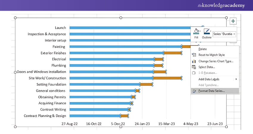
With all the task descriptions added to the left-hand-side (like the following image), the Gantt Chart at this point will look something like this:

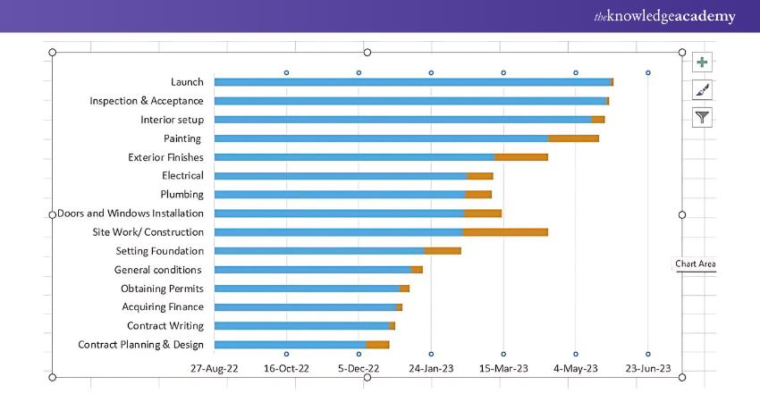
Step 5: Transforming the bar graph
Clicking on the orange or blue bar in your Gantt Chart will select them all, and you can right-click on them to choose the Format Data Series option.
The Format Data Series window will be something like the image below. You can use those options and experiment to see what changes happen to your Gantt Chart.
Register and become a skilled Microsoft Excel professional with Microsoft Excel Course now!
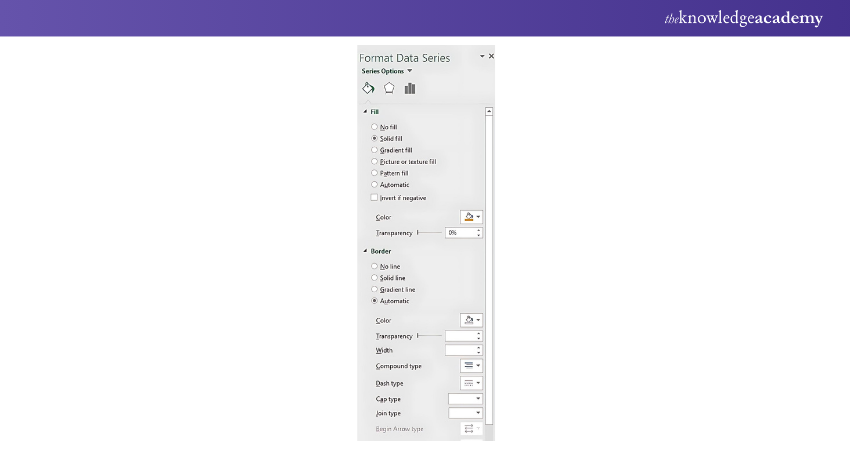
Now, click on the blue bar > Format Data Series > No Fill
Switch to Border > No Line
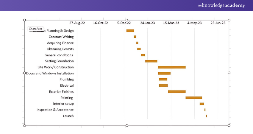
This will make your Gantt Chart look, as seen in the image below.
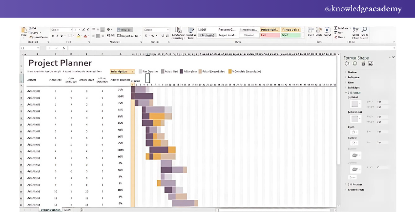
Gantt Chart Template in Microsoft Excel
Gantt Chart templates in Microsoft Excel are available in Excel 2013 – 2022. This template is ready to use and requires no learning curve once you click on it.
The Excel template displayed in the image is called Gantt Project Planner. The purpose of this project planner is to keep track of your project's progress for a set of activities.
Advantages of Excel Gantt Charts
Using Excel to create Gantt Charts offers several advantages, making it a popular choice for Project Managers and individuals involved in Project Planning. Here are some significant advantages of using Excel Gantt Charts:
1) Store all project information on one screen: An Excel spreadsheet stores all your project information in one location. You can open the spreadsheet to see your project tasks, deadlines, and milestones at once.
2) Excel is Easy to Use: Excel is an easy-to-use program for manually creating a Gantt chart. You can add the date range to the spreadsheet, highlight the relevant information, and select the 'Chart Wizard' button to add it to a Gantt chart. Then, the chart can be customised to suit your project.
3) Integration with Other Excel Features: Excel allows users to integrate Gantt Charts with other features such as formulas, calculations, and Data Analysis. This integration helps in a more comprehensive approach to Project Management within a single platform.
Disadvantages of Excel Gantt Charts
While Excel Gantt Charts are widely used for Project Management, they have several disadvantages that might impact their effectiveness in specific scenarios. Here are the significant disadvantages:
1) Keeping it Current can be Challenging. Since Excel isn’t a cloud-based platform, project information doesn’t update in real-time across devices. To update your team, you must manually send them the most current version of your static spreadsheet, making it harder for teams to remain on the same page.
2) Unable to Assign Tasks: In older versions of Excel, project teams can’t assign tasks to other users, making it harder for team members to know what they need to do and what their team members are working on.
3) Difficult to Collaborate with Project Team: Excel can make it challenging for project teams to collaborate while the project is live. Since Excel Gantt Charts aren’t accessible online, project teams can’t instantly access the project in real-time.
Acquire skills in Microsoft Excel for Data Analysis with Data Analysis Training Using MS Excel Training.
Conclusion
Learning How to Make a Gantt Chart in Excel is the ideal way to manage your project timelines with confidence and ease. From setting up tasks to monitoring deadlines, Excel offers a powerful arsenal of Project Management tools that makes overseeing projects a breeze. With the Gantt Chart in place, as outlined in this blog, you can stay organised and stay ahead in bringing your project to a successful and stress-free completion
Learn how to create advanced Excel formulas, macros and much more in our MS Excel training - sign up for Microsoft Excel Expert Training. Sign up now!
Frequently Asked Questions
How to Use Gantt Project for Career Development Plan?

Using a Gantt project for career development plan, you can:
a) Visualise career goals and milestones in an organised way
b) Set realistic deadlines and track your progress towards each goal
c) Break down complex projects into manageable tasks
d) Collaborate with mentors and colleagues to gain valuable insights
What Four Items are Shown on a Gantt Chart?
The four items that are shown on a Gantt Chart are:
a) Tasks
b) Task duration
c) Task start and end dates
d) Task owner or responsible person
What are the Other Resources and Offers Provided by The Knowledge Academy?
The Knowledge Academy takes global learning to new heights, offering over 30,000 online courses across 490+ locations in 220 countries. This expansive reach ensures accessibility and convenience for learners worldwide.
Alongside our diverse Online Course Catalogue, encompassing 19 major categories, we go the extra mile by providing a plethora of free educational Online Resources like News updates, Blogs, videos, webinars, and interview questions. Tailoring learning experiences further, professionals can maximise value with customisable Course Bundles of TKA.
What is The Knowledge Pass, and How Does it Work?
The Knowledge Academy’s Knowledge Pass, a prepaid voucher, adds another layer of flexibility, allowing course bookings over a 12-month period. Join us on a journey where education knows no bounds.
What are Related Courses and Blogs Provided by The Knowledge Academy?
The Knowledge Academy offers various Microsoft Excel Courses, including the Excel Training with Gantt Charts Course and the Business Analytics with Excel Course. These courses cater to different skill levels, providing comprehensive insights into How to Create a Project Plan in Excel.
Our Office Applications Blogs cover a range of topics related to Microsoft Excel, offering valuable resources, best practices, and industry insights. Whether you are a beginner or looking to advance your Excel Skills, The Knowledge Academy's diverse courses and informative blogs have you covered.
 If you wish to make any changes to your course, please


