We may not have the course you’re looking for. If you enquire or give us a call on +27 800 780004 and speak to our training experts, we may still be able to help with your training requirements.
We ensure quality, budget-alignment, and timely delivery by our expert instructors.

Looking to turn dull spreadsheets into visual delights? Excel's compelling range of charts makes it easy and exciting. Be it bar charts, pie charts, or radar charts, these amazing tools transform raw data into clear, visually appealing, actionable insights. Look no further than this blog for guidance on How to Create a Chart in Excel.
It encompasses everything from common chart types like column and area charts to industry-specific ones such as stock charts and filled map charts, helping you pick the ideal fit for your needs. So, read on and breathe new life into your data with just a few clicks!
Table of Contents
1) What is a Chart in Excel?
2) Steps to Create Charts in Excel
3) The Various Types of Charts in Excel
4) How to Change Charts Type in Excel?
5) Conclusion
What is a Chart in Excel?
A Chart in Excel is a visual representation of data, making it easier to understand and analyse information. Charts can help Project Managers and Business Analysts spot patterns, trends, and outliers in complex data.
From column and bar charts that help compare values across categories to scatter plots highlighting relationship between two variables, there are numerous chart options to choose from in Excel.

Steps to Create a Charts in Excel
Here are the essential steps to create Charts in Excel:
1) Select the data for which a chart must be created.
2) In the INSERT menu, choose 'Recommended Charts'.
3) On the Recommended Charts tab, select any chart from the list Excel recommends for your data. Click it for a preview.
4) Click on 'All Charts' if you can't locate a chart you like.
5) Click on the chart of your choice and click OK.
6) By clicking on Chart Elements, Styles, and Filters in the chart's upper-right corner, you can add elements like data labels or axis titles, customise the chart's appearance, or change the data.
7) Click on the 'TOOLS' tab to add additional design and formatting capabilities. Then click on the options you seek under the DESIGN and FORMAT tabs.
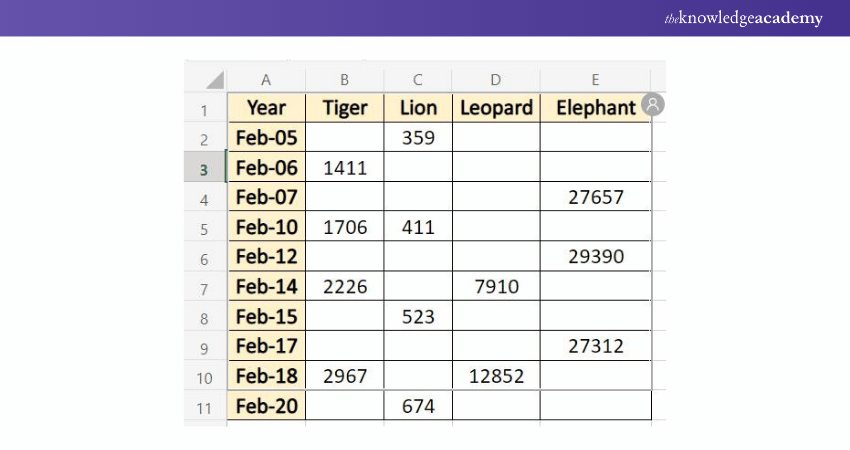
Let's explore these steps with an example. We’ll use the following data in the example to create Charts in Excel.
Example 1: Line Chart
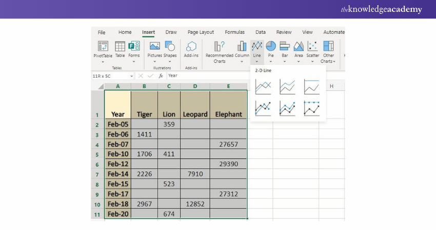
To create a line chart, select the data from A1 to E11 and click on the Insert tab from the Ribbon.
Once you click on the chart option, you will find multiple Charts to choose from on the screen.
Catalysing your Accounting workflow with our comprehensive Excel for Accounting Course - Sign up now!
Example 2: 2-D Chart
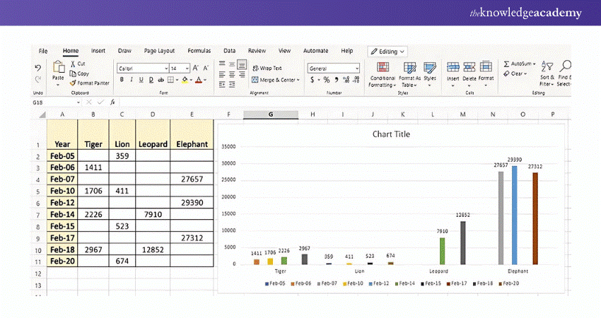
This example shows how to create a 2-D column Chart in Excel for the data provided.
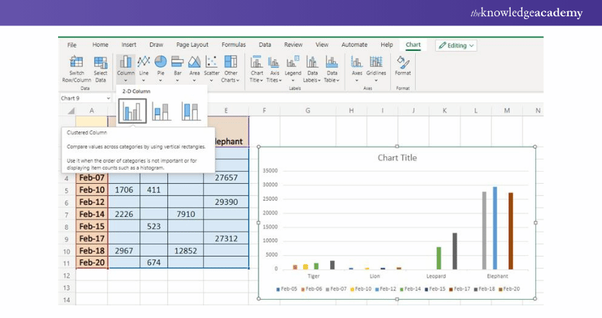
To insert the data labels, you can click from the options available in the dropdown, as visible in the image below.
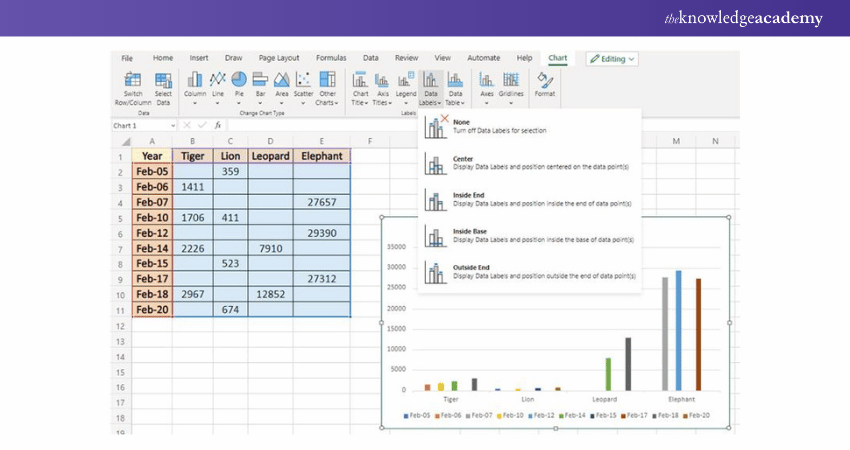
You can use the Outside End option, as shown above, to display the data labels in your chart. The result will be as shown in the below image.
Become a professional Microsoft Excel Expert with Microsoft Excel VBA and Macro Training - Join now!
Example 3: 3-D Chart
Now let us look at our second example of creating a 3-D Chart in Excel.
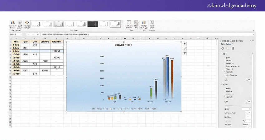
As we can see, the ribbon displayed in the image below has different visuals and arrangement patterns to sort out the features of the Charts.
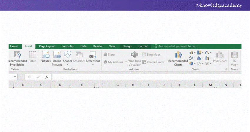
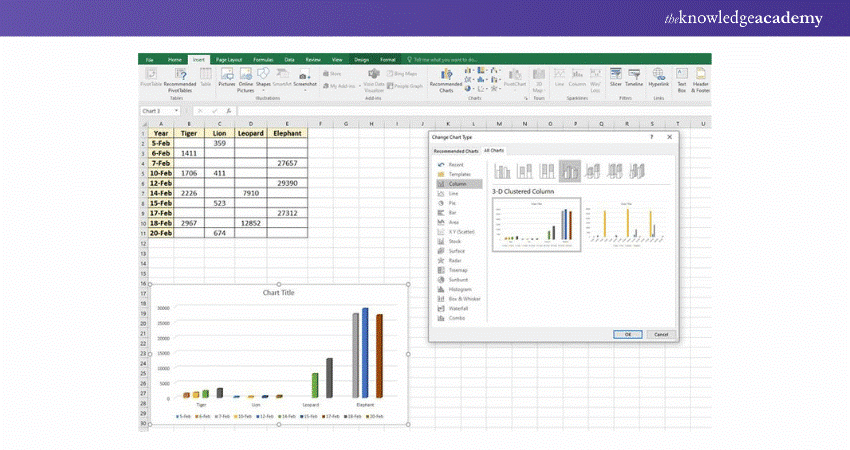
You can move through the different options provided in the Excel Charts type to see the preview of how your chart would look before clicking the OK option.
As seen in the example below, you can click on the design options available from the Design title to select a suitable design.
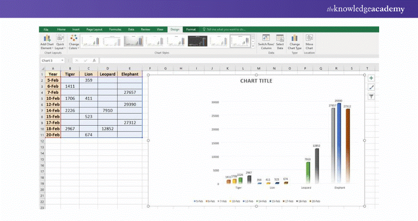
You can use multiple other options to format the data series created in the chart, as seen in the image, to make it look more attractive and visually appealing.
Make sure you give a meaningful name in the Chart Title which suits your data.
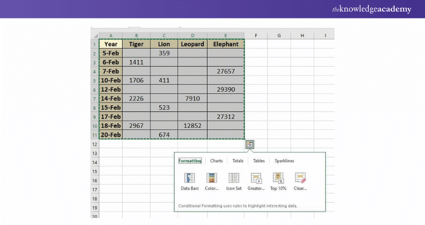
The Quick Analysis toolbar can also make quick changes in Charts, colours, icons, data bars and more. You can switch between the tabs (Formatting, Charts, Totals, Tables, and Sparklines) of the Quick Analysis toolbar to make the necessary changes and updates in the Excel Chart.
The Various Types of Charts in Excel
Excel provides a broad range of charts, each designed to present diverse data types. Each type serves a distinct purpose, from simple bar charts to complex pivot charts. Let's explore the common chart types and their uses.
Area Chart
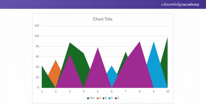
Excel area charts enable you to see trends over time or some other relevant variable. They’re a line graph with coloured-in sections that emphasise progression and give a sense of volume. You can also use stacked area charts, which allow you to showcase more information at once, such as tracking changes across different variables or comparing trends in multiple categories.
The New and Improved Bar Graph (Now Known as a Clustered Bar Graph)
A bar graph represents information horizontally and compares various data series. It allows you to see the proportions between various data elements.
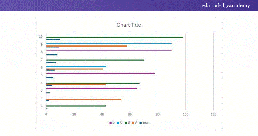
For example, clustered bar graphs can be used to compare the sales of different products in different store locations over months or quarters. This can help the seller understand which products are performing well in different geographies across the same time frame.
Streamline your Project Management process with our detailed Excel Training With Gantt Charts - Sign up now!
Column Charts (Renamed Clustered Column Charts)
While similar to bar graphs, column charts differ in one way: they are vertical, not horizontal. The vertical orientation allows viewers to rank different data elements. Column charts can compare data, display trends, and showcase proportions.
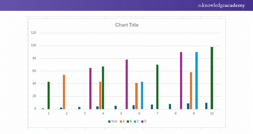
For example, if an individual wants to rank sales teams’ numbers in different states across a quarter, a clustered column chart can help visualise and see which team in each state is in the lead (Represented by the tallest among all clusters)
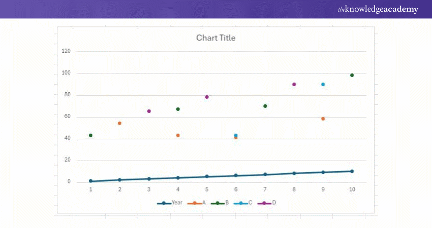
Line Graph
A line graph is a simple and highly effective way to visualise trends over time, even without bars, columns, or extra shading. For instance, the fluctuation in wildlife population across multiple years can be visualised easily through the line graph. Additionally, you can see the speed or rate at which the data set changes.
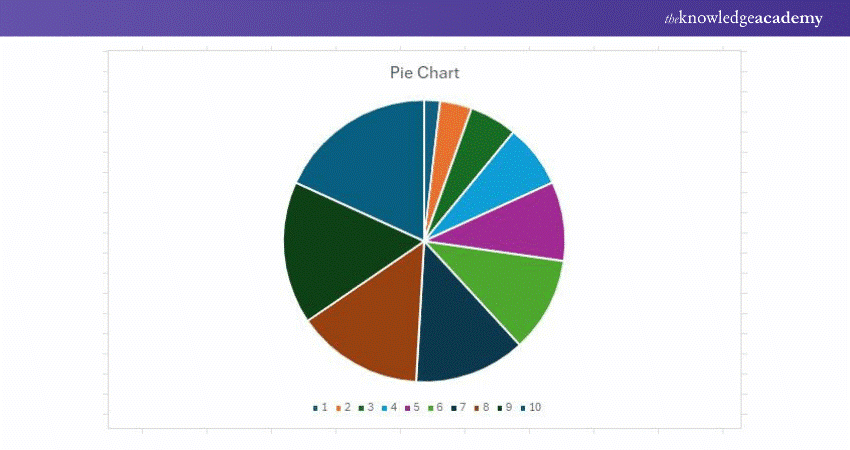
Pie Chart
A pie chart is a great way to see how different data elements proportionally compare to each other. Whether you want to see the percentage of organic traffic between two websites or your market share compared to competitors, the pie chart is the ideal choice.
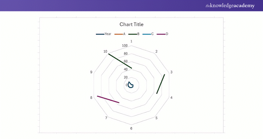
Radar Chart
Radar charts display data in a closed, multi-pointed shape whose individual points are called a spoke. Multiple variables can pull the spokes, and then shapes are stacked up for comparison.
This type of chart is well-suited for comparing different data elements, such as people, strengths, or weaknesses. It also helps you understand whether the data distribution is overly skewed.
Scatter Plot
Scatter plots help evaluate the relationship between two variables presented on the X- and Y-axes, enabling you to detect correlations and patterns between them. For example, you can compare the amount of organic traffic (shown on the X-axis) with the number of leads and signups (shown on the Y-axis).
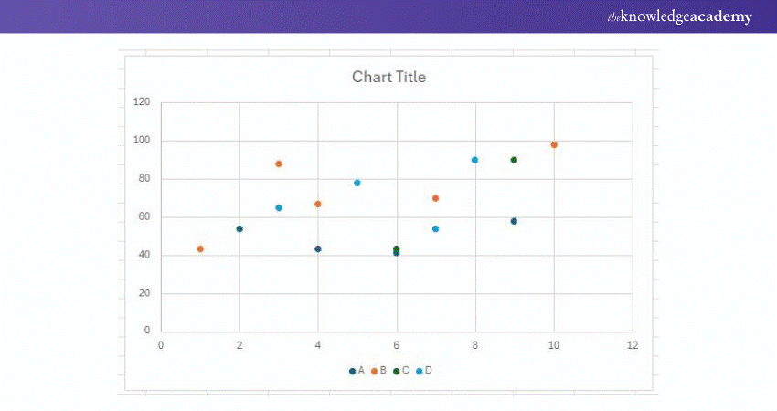
If the dots where the two converge show an upward trend, it indicates the effect an increase in organic traffic has on your leads and signups. Additionally, you can compare the number of leads and signups with conversions or daily sales.
Funnel Chart
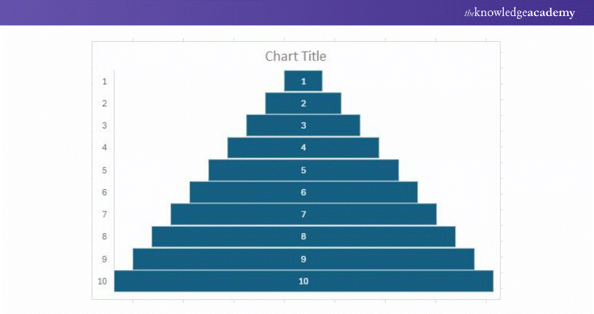
A funnel chart visualises data undergoing progressive reduction through different stages. It represents a series of steps, highlighting how the values decline as you move from one stage to the next. Funnel charts are commonly employed in marketing, sales, website conversions, lead generation, and event registrations to analyses and optimises processes and pipelines.
Histogram Chart
Histograms are a powerful option when explaining data that occurs in ranges. For example, a seller might want to show the clients the buying habits of different age demographics in a product niche. They may find that the target audience has moved, possibly even jumped a range up or down. The histogram chart can visualise it easily.
Advanced Excel Charts
These charts are more complicated and better fit for audiences who can already read advanced-level charts. These include:
a) Box and whisker chart: Used to display the statistical analyses helping to show how numbers are distributed in a set of data.
b) Sunburst chart: Visualises hierarchical data in a circular format.
c) Pareto chart: Used to show defect frequencies and prioritise improvement areas.
d) Surface chart: Used to visualise multidimensional data and often used in meteorology, to show temperature variations over a geographical area.
e) Treemap chart: Provides hierarchical view of data in the form of a tree.
Industry-specific Excel Charts
These Excel charts can be utilised for specific niches within specific industries. These include:
a) Stock Chart: Used to track variations in the price of traded assets like cryptocurrencies, stocks and commodities.
b) Waterfall Chart: Used to track and understand the effects of positive and negative values on cumulative performance.
c) Filled Map Chart: Used to showcase high-level chart data within a map.
d) Combo Chart: Enables the use of two or more chart types to visualise data sets of mixed data types in one chart.
How to Change Charts Type in Excel?
Excel gives the possibility of altering Charts if you want to change from one chart to another at any point of time. The steps to doing this are discussed below:
1) Select the chart which is created already in the previous instance.
2) Click on the Change Chart Type under Chart Design tab.

3) The Change Chart Type window opens. On the window, hover towards the left side of the panel window and click on any chart, which you want to select.

4) Finally, click on OK to make the changes.
Conclusion
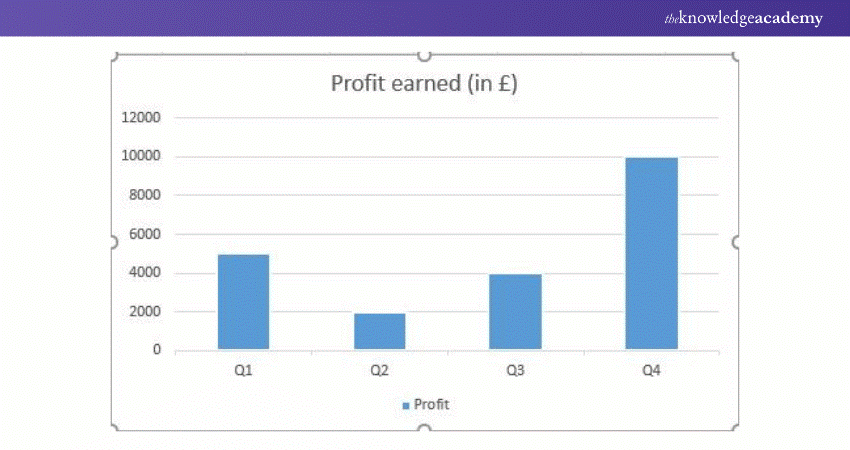
In conclusion, Charts in Excel are an effective and creative way of visualising and simplifying complex data sets. They are a powerful way to present data, be it cost, profits, or project progress, in a user-friendly and visually striking format. So, learning How to Create a Chart in Excel is an essential skill for modern marketers, Business Analysts and Project Managers.
Become an Excel Expert by learning how to create advanced Excel formulas, macros, and much more in our MS Excel training - Sign up for Microsoft Excel Expert M201 now!
Frequently Asked Questions
How to Create a Chart with Two Data Sets in Excel?

You have to select "All Charts" from the options in the "Recommended Charts" section. From the new dialog box, choose "Combo" as the chart type which lets Excel know you want to work with multiple data sets.
How do I add Data Labels to my Excel Graph?

Follow the following steps:
a) Click on the chart to select it and go to the “Chart Design” tab.
b) Click “Add Chart Element”.
c) Select “Data Labels” and where on the chart you want them to appear on the chart.
The data labels will show up next to each data point.
What are the other resources and offers provided by The Knowledge Academy?

The Knowledge Academy takes global learning to new heights, offering over 3,000 online courses across 490+ locations in 190+ countries. This expansive reach ensures accessibility and convenience for learners worldwide.
Alongside our diverse Online Course Catalogue, encompassing 19 major categories, we go the extra mile by providing a plethora of free educational Online Resources like News updates, Blogs, videos, webinars, and interview questions. Tailoring learning experiences further, professionals can maximise value with customisable Course Bundles of TKA.
What is Knowledge Pass, and how does it work?

The Knowledge Academy’s Knowledge Pass, a prepaid voucher, adds another layer of flexibility, allowing course bookings over a 12-month period. Join us on a journey where education knows no bounds.
What are related courses and blogs provided by The Knowledge Academy?

The Knowledge Academy offers various Microsoft Excel Training & Certification Courses, including Microsoft Excel Course, Business Analytics with Excel and Excel Training with Gantt Charts. These courses cater to different skill levels, providing comprehensive insights into How to Create a Project Plan in Excel.
Our Office Applications Blogs cover a range of topics related to Microsoft Excel, offering valuable resources, best practices, and industry insights. Whether you are a beginner or looking to advance your Excel Skills, The Knowledge Academy's diverse courses and informative blogs have you covered.
Upcoming Office Applications Resources Batches & Dates
Date
 Microsoft Excel Course
Mon 10th Mar 2025
Mon 7th Apr 2025
Mon 9th Jun 2025
Mon 8th Sep 2025
Mon 1st Dec 2025


 Top Rated Course


 If you wish to make any changes to your course, please


